Upgrading Mint for use with PHP 7+
This is a very niche post, but I’m posting it mainly to help people who might be searching Google for the solution to this problem: if you have been using Shaun Inman’s Mint for self-hosted website stats, you may have noticed that it no long works in PHP 7 and above.
When I noticed it broke, I spent several hours trying to figure out why and to fix it as quickly and easily as possible. Essentially, there are two reasons why it doesn’t work anymore:
- PHP 7 no longer lets you use
"=&"to “assign a new object by reference”. I don’t even really know what this means, but I do know you can solve it simply by removing the&. There is only one place you need to do this in Mint’s code and that is on line 3409 of/mint/app/lib/mint.phpwhere it says$DOM =& new SI_Dom($xml);. This problem was infuriating because it just makes the whole app fail silently, without throwing a single error. I spent a half a day deleting random code just to identify the culprit. - The MySQL API has been deprecated in PHP 7 and Mint uses it for all of its database work. You’re supposed to rewrite all of your queries to use the new
mysqliorPDO_MySQLAPIs, but after a few hours of trying to do this, I realized my PHP skills were not up to the task and I opted for an easier solution instead. There’s a wrapper you can just include with your Mint install that translates all of the functions on the fly for you. This method is generally “not recommended” by people who actually know what they’re doing, but for a quick fix, it worked perfectly for me. If someone wants to patch Mint correctly, I will gladly post a pointer to it here. Anyway, all you have to do is download that file, upload it to/mint/app/(next topath.php), call it something likemysql_bridge.phpand then add this line right above the firstincludestatement in/mint/index.php:include(MINT_ROOT.'app/mysql_bridge.php');
Voila! You’re done. The whole procedure should take only a few minutes.
Shipping vs. Learning
“What did you ship last quarter?”
“When is this going to ship?”
“Real artists ship.”
The verb “ship” has a long history in the software development world and before that, the physical world. In the physical world, it originally meant “to transport something on a vessel”, and in the software world, it meant “to press a tape/disk/CD and send it out to consumers”. Since then, it has come to simply mean “release”, and even then, usually not in any sort of final form.
Everyone inside tech companies loves shipping. It’s the culmination of a lot of hard work and creativity from designers, engineers, PMs, researchers, and any number of other people, and when it’s good it puts a dent in the universe. It is no wonder then that so much of the machinery of tech organizations is centered around shipping.
But should it be? Especially given how much shipping itself has changed in the last couple of decades?
Reboot!
It’s been 7 years since I last redesigned Mike Industries, and it feels like even longer. The old design still holds up considering the largely desktop audience it was designed for, but since it’s May 1st Reboot Day, and I’ve had some time on my hands since leaving Twitter, I thought I’d release a shiny new version today.
Say hello to Mike Industries, Version 3.
What is wrong with the old Version 2, you ask? Well:
- It’s not responsive.
- It ingests and displays all of my Tweets and saved Tumblr links, which seems like overkill now.
- Because of all the peripheral stuff being displayed, WordPress isn’t able to assemble the page very quickly and browsers are also slow to render it.
- It doesn’t take advantage of any of the great HTML, CSS, and related advancements that have developed in the last few years.
- It was just time for a change, and I felt like getting back into pixels and code again.
While I’ve spent the last few months putting this together, it only occupied a day or two of time per week. Lots of fits and starts, including periods of frustration and reflection where I’ve asked myself “Why am I not just moving everything to Medium?”
⇗ On Being A Senior Engineer
I think that there’s a lot of institutional knowledge in our field, especially about what makes for a productive engineer. But while there are a good deal of books in the management field about “expert” roles and responsibilities of non-technical individual contributors, I don’t see too many modern books or posts that might shed light directly on what makes for a good senior engineer.
Make Your Twitter Stream More Interesting with the Stellar Tweetbot
If you’re like me, you’re both particular about who you follow on Twitter and perpetually in search of more entertainment in your feed. The problem with following everyone who belches out a random good tweet is that you then have ten more ho-dum tweets a day from them in your feed. The disincentive to follow people on Twitter has never been higher than it is now, despite the fact that the service hosts more great content than it ever has.
I have a few ideas for fixing this problem, but one of them came to me a few months ago as I was using Jason Kottke’s excellent Stellar.io service (pronounced “Ste-LAH-ree-oh” by everyone except Jason). Stellar.io is a fantastic web-based service that lets you follow interesting people and receive a feed of all the tweets, Flickr images, YouTube videos, and other content they have faved on other services. In Twitter terms, imagine a feed that doesn’t contain your friends’ tweets, but rather the tweets that your friends have faved. In other words, one degree of separation away from your current Twitter stream.
Stellar is a great way to assemble this sort of feed, but if you’re like me, you’d rather see its output merged into your existing Twitter stream. To put it differently, when I open up my Twitter client, I want to see tweets from the few people I follow (as I do currently) and tweets from people I don’t follow which have been marked as favorites from people I do follow. Have I lost you yet?
To create this experience, I wrote a PHP script I call Stellar Tweetbot which runs every 5 minutes via a cronjob that checks my Stellar account for new faved tweets, and then retweets any new tweets to my zombie Twitter account @mike_stellar. Then, I follow @mike_stellar from my normal Twitter account @mikeindustries and I magically have a more interesting Twitter stream.
To see what sorts of things now appear in my Twitter feed, without having to follow any new people, peep the image below (or just follow @mike_stellar):
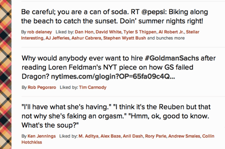
The first tweet is Rob Delaney making sure a can of Pepsi gets home safe. I don’t follow Rob so I would have normally missed this tweet. However, since I follow some people who faved it, I now see it in my Twitter stream.
The second tweet is to a really interesting article tweeted by Rob Pegoraro. I don’t follow Rob, but I do follow the person who faved it: Tim Carmody (not to be confused with Tom Carmony, who I also follow, but let’s not even get into that).
The third tweet is by the funniest person on Twitter, Ken Jennings. Since I already follow him, I won’t see this as a dupe in my feed. Magic.
So that’s it. The Stellar Tweetbot. I’ve opened sourced it on GitHub, and it’s the ugliest designer-written PHP code you’ve likely ever seen, but it works, yo! If you’re one of those propeller heads who writes much better PHP, feel free to rewrite it, and merge it into the GitHub Branch Repository Chamber Fork Commitment Thingamajigger.
Otherwise, feel free to do what I do and just use it. It will make your Twitter feed more interesting.
How to Permanently Prevent OS X 10.7 Lion from ever Re-Opening Apps After a Restart
While the latest version of Mac OS X, Lion, is generally wonderful, there is one “feature” that annoys thousands of people to no end: whenever your machine is restarted, every single application you happen to have open at the time is also relaunched and restored to the state it was in before you restarted. If you restart manually via the “Restart…” menu item, there is a checkbox you can uncheck which is supposed to shut off this behavior but it doesn’t always work. Additionally, if your computer restarts for any other reason — e.g. a power failure or a crash — you don’t even have the option of trying to prevent this behavior.
The downside of the behavior is obvious: it increases the time it takes to start up your machine into a steady state and it re-opens apps you may not be using anymore.
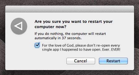
If you want to prevent this behavior entirely, there is now a foolproof, fully reversible way to do it. Simply:
- Quit all of your apps.
- Navigate to here:
~/Library/Preferences/ByHost/com.apple.loginwindow.*.plist(whereby * is a bunch of characters) - Click the file, do a
File > Get Info(or command-I if you’re a pro), and lock it using theLockedcheckbox.
Voila. You’ve now prevented Lion from saving what apps and windows are open. To reverse this setting, simply unlock the file!
Another helpful hint as well: Lion, by default, hides your ~/Library/ folder. To make it visible again without showing all of your other invisible files, simply open up Terminal and type:
chflags nohidden ~/Library/
Never Be Another

When someone dies, the phrase “there will never be another” gets used quite frequently. It’s one of those phrases that is both always true and yet almost always not true. It’s true that, yes, no other person will ever be exactly like any other person, but it’s usually false in the compliment it’s actually trying to pay.
In almost every case, when a public figure dies, there are plenty of his or her contemporaries ready to fill the void. A great guitarist died? Well we at least have hundreds of other world class guitarists to listen to. A basketball star died? Luckily we have plenty of those too.
The truth of the matter is that even best of the best in most fields, at any given time, is only a little better than the rest.
Counterexamples to this seem to happen only a handful of times per century. The number of times we lose someone whose impact was so dramatic and whose substitute seems so unfathomable is vanishingly small.
We lost that person yesterday in Steve Jobs, and we are only beginning to feel the impact of his absence.
What gets lost in all of these Steve Jobs tributes you read online is just how dark things were for personal technology only ten years ago. People forget that until the iPhone came out, “The Apple Way” was still largely on the sidelines. Windows PCs were unavoidable. Cell phones were unapproachable. There were even a few years around the turn of the century when many websites didn’t even work on Macs because developers only coded to PC Internet Explorer “standards” (airiest of air quotes there, of course).
It was just dark as hell out there; especially for those of us who wanted so badly for the story to end differently. The lesson that idealism and attention to detail could lose out to “good enough and a little cheaper” was not something we wanted to learn.
The long, but impeccably planned, turnaround that Steve Jobs has led over the last 14 years is impressive for thousands of reasons. None is more astounding to me than this one though: he was quite literally the one person on the face of the earth capable of pulling it off.
One. Out of 6,800,000,000 people.
He wasn’t just the best choice. He was the only choice. And that’s why we’ll miss him so much.
When people die after suffering from prolonged illness or pain, my thoughts are almost always positive. Death is not something I fear, and when it’s ultimately the relief method for someone’s pain and suffering, I feel happy for their newfound peace. I felt this way when Kurt Cobain died, for instance.
With Steve Jobs, however, I don’t get the feeling death was any sort of relief at all. Yes he was obviously at peace with the concept, as he expressed beautifully in his Stanford commencement speech, but SJ put the pedal to the metal until his final breath.
What would you do if you knew you had a short time to live? Most of us would quit our jobs. Many of us would travel. Some of us would relax and keep our stress levels down. What did Steve do? He hit the gas. He released the iPhone, unveiled the iPad, and led Apple to its current and still unfathomable status as the most valuable company in the world.
Just as incredibly, he was able to lift his body out of Apple without also removing his soul; on a day when many once feared AAPL stock would dive precipitously, it’s comfortably unchanged from the day before.
He had his flaws and he may not be the greatest person to ever live, but no one has ever left this world more on top than Steve Jobs has just left it.
Thanks for everything.
Cognition Comments Considered Harmful
I was looking forward to writing a post this weekend about Happy Cog’s new commenting system on their otherwise excellent new blog, but the sage minds at Full Stop interactive beat me to it. You should read Nate’s whole post. It’s spot-on.
It’s interesting to me that Happy Cog is trying to eliminate the negative things associated with commenting by encouraging brevity, while for several years, the secret sauce I’ve cooked up to prevent comment spam has involved just the opposite: measuring the amount of time you spend typing and only entering your comment into the database if you spend more than a few seconds on it. It works like a charm and eliminates 99.9% of comment spam before it even gets in the front door.
In my opinion, what Happy Cog has created is useful. Let’s just not confuse it with a commenting system for a blog.
It doesn’t encourage community, it doesn’t encourage conversation, and for the most part, it’s not accretive in any way. What it does do is create a lot of linkbacks to your blog on Twitter. Is this valuable? Sure. But is it as valuable as free-flowing, insightful, conversations which elevate ordinary posts into conversation pieces?
Not for me it’s not.
For all the great things about Twitter — and there are many — one of the worst things about it is that it’s making us lazy ambassadors of our thoughts. Why spend an hour on a blog post when we can tweet out our main thesis in ten seconds? Why allow conversations on our blogs when we can just hear the first 140 characters of our readers’ opinions?
We know short attention spans are bad for our intellectual development. We should be creating solutions that fight against this threat… not feed into it.
Another Nail in the Pageview Coffin
This weekend, msnbc.com launched a sweeping redesign of the most important part of their site: the story page. The result is something unlike anything any other major news site is offering and is a bold step in a direction no competitor has gone down (yet): the elimination of pageviews as a primary metric.
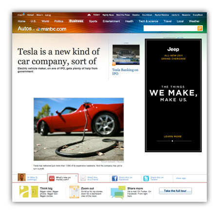
For many years, I’ve railed against tricks like pagination and “jump pages” as a means to goose pageviews. Honest people in the industry will tell you these are simply acceptable tricks to bump revenue a bit, while disingenuous or uninformed people will use “readability” as an excuse to make users click ten times to read ten parts of a single story. For this latest redesign, msnbc.com has decided to de-emphasize page views entirely and present stories in a manner that maximizes enjoyment and as a result, total time on site.
What do I mean by this?
Think of how a typical user session works on most news sites these days. A user loads an article (1 pageview), pops open a slideshow (1 pageview), flips through 30 slides of an HTML-based slideshow (30 pageviews). That’s 32 pageviews and a lot of extraneous downloading and page refreshing.
On new msnbc.com story pages, the above sequence would register one pageview: the initial one. The rest of the interactions occur within the page itself. Can msnbc.com serve ad impressions against in-page interactions? Sure, and that’s key to the strategy, but as a user, your experience is much smoother, and as an advertiser, the impressions you purchase are almost guaranteed to come across human eyes since your ads are only loaded upon user interaction.
This is the first time (to my knowledge) this sort of model has been deployed on a major media site with over a billion pageviews a month, and it has the potential to change the entire industry if it works. It’s also a big risk, as most advertisers are not used to thinking of inventory this way. We like big risks with big payoffs though and we feel that when you take care of the user and the advertiser at the same time, you’re probably onto something.
Ad model aside, there are also tons of other interesting things about the new msnbc.com story pages:
- Every form of storytelling (text, video, audio, slideshows, discussion, voting, and more) is now available right within each story page itself.
- The top navigation (nicknamed “the upscroll”) contains all basic elements when a page loads but if you scroll the page upward past its initial position, you get more interesting stories to read. It’s a great way of presenting a content-packed header without sacrificing screen real estate.
- A social bar at the bottom of the screen, powered by Newsvine, which lets you easier share content via Newsvine, Facebook, Twitter, and other services.
- An “annotated scrollbar” down the right side of the screen capable of teleporting you to any section of the page you desire.
- Bigger, easier to read text. Goodbye Arial, once and for all!
To be clear, the msnbc.com team is very proud of what’s been launched so far, but is under no illusions that things are perfect yet. Everyone involved in creating these new story pages is monitoring reaction closely and ready to modify anything that needs improvement. Since we have plenty of thoughtful design and development voices here on Mike Industries, I’d love to open this thread up for some reactions. What is working for you, and what, if anything, would you change? The team is listening.
Better E-Commerce Design using the Luhn Algorithm?
 I finally put in my pre-order for SimpleScott’s Designing Obama book a few minutes ago. I wanted to buy it earlier but never overcame the inertia until I got a chance to have beers with Scott and then listen to him speak at the excellent Webstock conference in New Zealand last week (by the way, thanks to Khoi Vinh for asking me to step in for him as a speaker). Can I also just say that Webstock is the best designed conference I’ve ever seen?
Scott’s a great designer, obviously, but hearing about the care that’s going into just the production of the book is going to make this piece of art a must-have. I may even order two and keep one suspended in formaldehyde.
While ordering the book, one part of the process stuck out to me as something I’d never seen before, even having ordered probably a thousand items online in the past: when I typed in my credit card number, a green checkmark showed up immediately after the last digit was entered. My immediate suspicion was that they were counting digits and gave me a check to indicate I had typed in enough of them, but again, having never seen that before, my interest was piqued. I tried deleting the last digit and replacing it with a 1, then a 2, then a 3, and so on. Only when I typed the actual digit from the credit card did I get the green checkmark again.
Further investigation revealed that no server calls were being made, which means this was some sort client-side algorithm that verified credit card patterns. Iiiiiiiiiinteresting!. Even more investigation revealed that this was the work of something I’d never heard of: The Luhn Algorithm.
The Luhn Algorithm is a formula which can be run in javascript, PHP, and most other programming languages that uses some mathematical rules to determine if a credit card number is likely to be valid. Apparently, credit card companies issue numbers according to this algorithm, and if a number doesn’t fit it, it’s definitely not valid. Before you say to yourself “wow, that’s some neat, new technology I can use!”, note that the Luhn Algorithm has been around since 1954!
Although using this algorithm in your own projects is clearly not a necessity, I see a couple of potential advantages and a couple of potential disadvantages:
Advantages
- Instant UI feedback is a great tool to help users correct errors
- The checkmark is a nice bit of instant emotional validation to make sure users complete the process
Disadvantages
- Is there a guarantee that every card will always follow this pattern? What happens if one or many stop following it?
- Since it’s an unusual experience, does it add a bit of suspicion in some users? Would a less technical user assume their number was being broadcast across the internet more times than necessary?
I’m curious to see if this catches on as a trend.