The Amazing Color Photography of Sergei Mikhailovich Prokudin-Gorskii

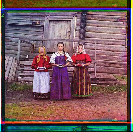
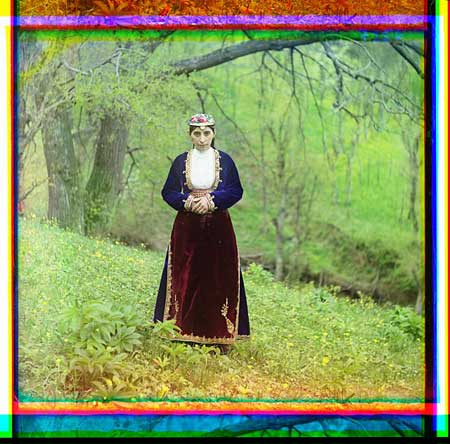
The Library of Congress has a spectacular collection of photos by Russian photographer Sergei Mikhailovich Prokudin-Gorskii that you must see. What makes them so amazing? Well, they are color photos taken about 100 years ago.

The process used to create and develop the photos is revolutionary yet simple. Essentially, three separate shots are taken, each with a different color filter over the lens: one red, one blue, and one green. The shots are then composited to form incredibly lifelike color portraits. It’s actually quite similar to color compositing in modern applications like Photoshop, but to see it applied to photos taken 100 years ago is mindblowing.

When I first saw this photo collection, my initial reaction was that it was fake, because these shots look like they could have been taken a few years ago. When you grow up in the modern color photography era, you’re subconsciously conditioned to actually think of the world as black and white around the turn of the 19th century because those are the only photos you ever see from that period. To see real-life scenes from back then in full color is surreal.

Prokudin-Gorskii’s collection is one of the most amazing I can ever remember seeing, and I’ve only gone through a few hundred photos so far. Here’s where to start:

Note: Kottke, as usual, is about 8 years ahead of me on this.

Like this entry? You probably shouldn't follow me on Twitter here. I recommend the RSS feed instead.

9 Responses:

  1. It’s definitely one of my favorite collections at the LOC.

  2. Don says:

    I remember watching the Thanksgiving parade at my Grandmothers house in color … blue cellophane on the top third, green on the bottom … it was a special treat she claimed …

  3. Collin says:

    Nice find! Thanks for sharing.

  4. That’s really cool. It really does look like the colors were just over saturated a little in Photoshop.

    Reminds me of one of my favorite Calvin & Hobbes comics:

    Calvin: How come old photographs are always black and white? Didn’t they have color film back then?

    Dad: Sure they did. In fact, those old photographs are in color. It’s just that the world was black and white then. The world didn’t turn color until sometime in the 1930s, and it was pretty grainy color for a while, too.

    Calvin: But then why are old paintings in color?! If the world was black and white, wouldn’t artists have painted it that way?

    Dad: Not necessarily. A lot of great artists were insane.

    Calvin: But… But how could they have painted in color anyway? Wouldn’t their paints have been shades of gray back then?

    Dad: Of course, but they turned colors like everything else did in the ’30s.

    Calvin: So why didn’t old black and white photos turn color too?

    Dad: Because they were color pictures of black and white, remember?

  5. [...] [Via] Link [...]

  6. [...] Mike Davidson – The Amazing Color Photography of Sergei Mikhailovich Prokudin-Gorskii – woah, colour photography – in 1911! Essentially, three separate shots are taken, each with a different color filter over the lens: one red, one blue, and one green. The shots are then composited to form incredibly lifelike color portraits. [...]

  7. Mike D. says:

    Larry: Hilarious!

  8. Jiah says:

    Not only a cool technique but also well composed. I really like the upright postures vs the slanted backgrounds.

  9. Ian Moir says:

    I saw the exhibit at The Russian Musuem of Art… It is absolutely stellar… My parents visited the Samakand and Tashkent region in the early 1970s. I printed a small selection of the images for them for Christmas – They were stunned and in absolute awe!

    So wonderful that LOC is able to share these withthe world!

Leave a Reply

Shared
How 3D works, and why it's back:

Great article on the ins and outs of three dimensional imagery. Still doesn’t change my opinion that well-shot conventional cinematography is more impressive than the novelty that is Avatar.

The Importance of Removing Features:

This is one of the most useful articles I’ve read in a long time. As we work on focusing, strengthening, and simplifying Newsvine, the concepts discussed by Lukas ring true. “Saying no” has never been a strong suit of mine. It’s very helpful to remember how important of a quality it is. (via fullstopinteractive)

Newly released video of the space shuttle Challenger disaster: It was 24 years ago, I was in 5th grade, but I remember it like it was yesterday. School was stopped immediately and they wheeled out televisions in every classroom for us to watch the news footage. It’s great that this video has been released, but holy crap, how do you tuck something that away for two decades???

A nicely done british parody of 60 Minutes style video journalism. It’s easy to miss how formulaic our news is sometimes. (via B-Tizzle, originally via E-Chizzle)

Colosseo: This is why Cameron is a king and we are all just pawns in his world. I can’t wait to get my hands on this poster. I will point out, however, that the outro credits on the video need some kerning. Someone is going to lose their right hand for that.

Spezify:

New ways of searching are almost never as useful as old ways of searching. Spezify is pretty awesome though. It’s a visually interesting, never-ending, horizontally and vertically scrollable, topic explorer. I don’t think I’d use it for digging deep on anything, but to get a quick visually rich sampling of a topic, it’s quite fun (via tiff, a long time ago actually, over email).

Realism in UI Design:

Reminds me of my favorite logo design advice: “Never waste a stroke”. (via gruber)

The best hockey team intro ever: Or as Tyler says “The Alaska Nanooks are my new favorite hockey team”.

jimray:

Rachel’s right, this is the best thing ever. At least, once you get the joke. Being the old fart that I am, I had no idea why this was funny until I spent about 30 seconds figuring out what a Team Jacob was and and then it was only a matter of time before, well… it would seem this poor girl confused Pat Robertson, douchebag supreme, with teen heartthrob and Twilight “star” Robert Pattinson.

Interesting. I just assumed “switching to Team Jacob” meant converting to judaism.

AWP Express:

I have no idea if these guys are any good or not, but this is the best example of a design agency site I’ve seen in a long time. It’s clean, extremely readable, very well-written, friendly, free of fluff and hyperbole, and contains clear calls to action. If you own your own agency and are trying to drum up work, you could learn a lot from how these guys present themselves. (via CSS Beauty)

Avatar: The Making of the Bootleg Makes me want to skip the whole 3D thing and support the Canal Street cinematographer’s guild.

Why Are Europeans White?:

According to Frank W. Sweet, it all goes back to cereal.

How to use CSS @font-face:

Very thorough writeup. It’s almost time to walk sIFR peacefully into the sunset. (via oxygensatchel)

A great HDR Tutorial from Wolfgang Bartleme (aka “The Austrian Wolf”). One of these days, I’m going to start shooting this way… probably after it’s an automatic function of the camera though.

Where Should I Eat? Fast Food Edition: A nice flowchart. Good to see Jack-In-The-Box getting some props. Pretty tough on Arby’s though!

Overshared
Aziz Ansari = Indian Mitch Hedberg on uppers
Arlo from this season of 24 looks a lot like Darren, Kramer's intern at Kramerica Industries.
Apparently it is impossible to get a serious answer to a question if the question includes the word "beaver". Lots of good stuff though!
Anybody know the best way to kill a mountain beaver?
Watching Undercover Boss. Very ironic that Waste Management's female drivers are apparently forced to urinate in cans.
@jlbruno Bud is a completely undifferentiated product. That's why they brand-advertise. Google has unique products to teach people about.
ESPN.com does not wear Trade Gothic well.
A lose/lose for Indy fans. Lost the game and didn't even get to play for perfection. You all should be livid with ownership.
@jw @andrewlin Maybe. Didn't seem like too transformational of an ad to me though. The coolness of auto-suggest was probably lost on many.
Does Google really need to convince people to use Google for searching? A Chrome ad would have been 100x more useful.
@zeldman By the way, make sure to catch Million Dollar Listing, also on Bravo. Just as entertaining, but for different reasons.
@zeldman It really is. There's something very entertaining about financially accomplished, socially awkward people.
@H_FJ Nah. Long ago he said amphibious, meaning ambidextrous. It stuck, so he kept saying it. "Layup with the left hand! He's amphibious!"
Marques Johnson just said "amphibious". Damn, I miss the Sonics now.
Wow, D.C. could get 30 inches of snow this weekend? The *real* Washington is jealous.