MSNBC Redesigns – Taste The Rainbow
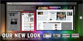 This weekend, msnbc.com began the multi-day process of rolling out their new redesign. It’s really, really nice… you should check out it.
Just so no one accuses me of kissing up to my new partners, I will say that I thought the last redesign several years ago was a bit of a step backwards from the landmark Roger Black look of the late 90s, but this newest redesign is not just a step forward, but a giant leap for newskind. It is not just a collection of features shoehorned together under one grid but a rather well orchestrated piece of communication design, worthy of further examination.
Let’s check out what’s going on under the hood:
Getting Rid of the Blues
Msnbc.com has always turned to blue as the primary color for its palette. Sometimes it’s royal blue, sometimes it’s electric blue, sometimes it’s subtle, and sometimes it’s dramatic, but it’s always been there — until now. The new palette is white, black, and grey with the spectrum of rainbow colors from the NBC peacock sprinkled tastefully throughout. It’s tough to pull off a rainbow palette in web design but this one is very sharp.
Speaking of blue, the shade chosen for all of the anchor text around the site is also very nice. For better or for worse, blue has become the de-facto apparel for hyperlinks on most mainstream web sites, but even the choice among blues is important. #0000FF is dated, unsophisticated, and highly lame, but there are still sites that use it. Interestingly, MSNBC and CNN have picked almost the exact same shade of blue in their latest redesigns, but hey, that just means they both have good taste.
Typography Tradeoffs
I’ve never liked Arial. It’s always seemed like nothing more than a font of last resort for those needing a widely available, compact sans serif. It’s plain, it’s unsophisticated, and it just screams “default” to me. For this reason, I was a bit disappointed to see the MSNBC redesign make such heavy use of Arial, particularly as display type. Surely something a bit more refined like Tahoma could be used. Or maybe even specify something like “Helvetica Neue, Corbel, Tahoma, Arial” so that users of OS X and Vista would get nicer sans serifs, most others would get Tahoma, and then Arial would be the font of last resort.
I asked Ashley Wells, msnbc.com’s Creative Director, about the Arial situation and he gave me a surprisingly satisfying answer: because msnbc’s new publishing system is very much WYSIWYG, editors are charged with not only writing headlines, but essentially designing them too. Meaning, how a headline wraps can have a dramatic impact on the presentation of the page. By using Arial, these wraps can be precise across most browsers. This is such a non-webgeeky way to think about publishing. I love it. Typesetting has always been something MSNBC has done a lot better than their competitors and it’s great to see that even as the company moves away from its Photoshopped-type-on-images style, the focus on typography is not completely lost.
Arial as a way to improve typography. Who would have thunk it.
BIg News, Big Treatments
One of the things I’ve always loved about MSNBC is that when big news happens, the layout of the front page adjusts to properly frame the importance of the story. At ESPN we called this “war mode” and it can only be accomplished by a mix of smart design and editorial participation. In the world of never-ending, unflavored news feeds we seem to be moving towards, it’s refreshing to see a news organization that still believes in the power and importance of layout.
Although the old msnbc.com had more layout flexibility than its competitors, the new site is several cuts above. There are dozens of layout options available for editors and that can increase infinitely as new ones are envisioned. So while most other news sites just pump their top stories into a standard headline-on-top-of-photo box, msnbc.com is actually designing their cover every time they publish. It makes checking the site several times a day that much more interesting.
Coding to Standards
As everyone who has ever worked on a big site knows, the longer you go between redesigns, the cruftier your code gets. Even the cleanest of redesigns tend to decay over time as more people get their hands on the code. WIth this latest redesign, however, MSNBC is debuting a totally new version of their home-grown publishing system (“WorkBench”)… one that is designed to — among other things — allow for feature extensibility without sacrificing the foundation of clean code that now anchors the site.
Before all of you standardistas and validatorians start piping up about inline CSS and random code oddities, realize that the site is very much in flux over these next few weeks as kinks get worked out. Also realize that a redesign of this magnitude requires the retrofitting of a lot of old code and templates that can’t always be eliminated with the flick of a switch.
As a result of the attention MSNBC is paying to web standards, the site now works equally well in all major browsers. It loads quickly, renders quickly, and is a joy to interact with.
An Open Dialog with Users
As part of the redesign process, MSNBC set up a blog to communicate with users about the redesign and all ongoing development efforts. These sorts of things are tricky because they tend to attract a lot of “drive-by” comments from users (e.g. “WTF! I hate it! Bring back the old!”). Once you filter out the inevitable noise though, there is usually plenty of insight to learn from. Having a blog to communicate with your users seems almost mandatory these days, but what I like about MSNBC’s is that it’s a sincere, serious effort. It’s just not a default TypePad installation that some PR flack pens to once a month. People from all sides of the organization have already written entries and answered questions, and it should be obvious to anyone who is paying attention that this is a company that cares about its community.
Newsvine Integration
I wish I could say that the Newsvine team had any significant role in this redesign, but we haven’t. This has been almost a year in the making and it’s all Redmond. That said, Newsvine did get a minor speaking part on the community page, and we look forward to further collaboration in the coming months.
The Bottom Line
This redesign is a perfect example of why “big media” is still alive and well, despite what some people would have you believe. It is thoughtful, it is innovative, and it is something no six-person company could ever produce. It is something, in fact, that most 300-person companies could never produce. As big media takes more cues from little media and little media returns the favor, both sides of the spectrum just get better. And that is great news for the news business and the news consumer.
Mike, your first link for the MSNBC site doesn’t work.
(Editor’s Note: Oops! Forgot a quote. Thanks, fixed.)
I also think the MSNBC.com design is really brilliant. I’ve poking through it and it definitely stands as my favorite amongst large, mainstream news sites right now.
One short word on the Arial thing: In theoroy anyway, Helvetica has the same proportions as Arial (actually, Arial has the same proportions as Helvetica — and intentional choice back when Arial was commissioned). I’m not sure if this holds true in practice when it’s displayed across many web browsers, but in theory anyway, you should be able to swap these two faces without changing the way things wrap.
According to Greg Storey’s RSS feed, apparently his Airbag Industries group had something to do with this redesign.
I love the redesign. Nothing but good things!
However, is it just me or has the site been extremely slow lately? It’s been taking up to 45 seconds to a minute just to load a story.
Oh yeah, one thing to note: they are not using a DOCTYPE.
Mike, I agree with you and your visitors that the redesign looks/functions quite well, better than anything I’ve come across of late.
However, I do have one gripe (of course): The masthead’s glowing bars travel down into the main stories. That’s very distracting. At first I thought my laptop was having a screen issue, as the glowing bars looked like artifacts; then I noticed all my desktop machines looked the same way – quite distracting.
Design elements aside (well, design that doesn’t impact the flow of “get me what I want in news”), the site looks/works well for me. Not sure if it will break into the power-13, but it’s a good start.
I like it a lot…. I’ll check it more deeply later… but just one query.
Don’t you think that such a big JS dropdown menu is a bit limitating?… I mean, you can’t just use Flash unless you set wmode, and I guess we all know the amount of bugs that generates. I know Flash is not such a widely used tool for mainstream news portals, but I think its very usefull for some interactive contents… also, you can’t use form elements… and I think there is no workaround for that, is there?
I would also put a bit of delay in the showmenu function… its a bit annoying that just by moving your mouse from the address bar to the content you get a huge div over what you are reading ^^
@Josh: Who cares? :)
Great work. I like it.
I’m with Cay for the “roll over” menu in the header. somehow annoying to get your mouse from the address bar to the content and having it covered up with a large box. Lot of large site does that.
When Mike says they pay attention to web standard, one would expect at least a doctype. heh
Beautiful! Interesting to note they threw a touch of ‘Lucida Grande, Tahoma’ in some headings… curious as to why.
RE: Airbag.
Yep, Greg and company helped a bit — mostly on the markup.
RE: Doctype declarations.
Yep, there’s a complicated answer to that one. If you’ve ever worked with big legacy systems, you know weird things like this pop up.
p.s. Ashley “Grid Machine” Wells is a genius.
At first I didn’t think I liked it but it really is a much better design. The simplicity of it is my favorite part I think. The glowing bars were a bit distracting at first but I think I like them. I especially like how they flow past the header. I don’t think it is distracting at all.
I think my favorite part of the site is the javascript menus, the manner in which they come out and open up to a ton of new data and news articles. The organization of it makes it extremely easy to find news articles that I am interested in. It is much better then having to go through multiple pages to find what you are looking for. No one likes having to refresh their browser, especially when I’m at work. We have an extremely slow internet connection at times.
Anyway, I still call shameless self(company) promotion.. Mike. Haha.
…Yeah, so, we’re still working on the top and left-hand navigation. Give me a bit more time, then you can have all the SEO, semantic :hover asynchronous onclick/onhover behavior you could ever want. The gears of the “newsmenu” churn a bit more slowly than the redesign timing. But as it is a team-wide grudge, trust me it’ll get done.
Beautiful, brilliant. My new news site.
@Cay: Uhg, my pet hate is flash for navigation elements. I rely on right-click, open-in-new-tab browsing, and a right click in flash 99% of the time gives you options to rewind, etc grrrrr.
It would have been nicer if we could actualy open links on those lovely and informative menus on the top – in a new window/tab like all other menus…
Its clean and convenient. The layot of content on the front is totaly wrong, for me at least. It makes scanning the content very hard and frustrating.
Btw. did anyone try to oncrease the text size on the front?!
You’ve got to be kidding me…
Such a big company and noone who knows css well. :)
@Jeff: Aren’t we all standards-based designers/developers? I think we should all care.
Visually the site looks great, but front-end development wise, it’s a nightmare. The ‘flux’ you speak of so passively, Mike, are huge flaws in the programming of this site. The HTML alone is over 138k in file size. Compare that to the cnn.com homepage which is 34k, and we realize just how off the target MSNBC has fallen with this.
Jade: MSNBC source = 137k, CNN source = 153k
… and MSNBC hasn’t even abstracted the inline stuff yet, for the reasons mentioned above. The flux should not be underestimated.
Also, gzipped, both of those file sizes are under 20k. Pretty negligible, even on slow connections.
Overall its a nice step forward. The flyout menu nav is a bit unruly – some of the flyouts simply take over the page – why not simplify the navigational elements and offer *less* choice. The “Show 0|5|10” action element is interesting – why offer that? Most everything above the scroll on the frontpage is well thought out, but below that the “flexible box” mentality just seems out of place.
Seriously, the flyouts gotta go – or changed…if a single flyout covers the entirety of your page, it’s time to rethink it.
I’m also surprised that there isn’t better integration and highlighting of msnbc’s cable news channel and shows. (One link for a flyout to get there? Give some love to the channel guys!)
Mike: My Firebug reports those sizes for the index file (I’m talking about just the index file, nothing else)…
http://rauenzahner.com/msnbc/
It just seems like this site was done in a rush and released before it was ready. You say this site has standards in mind, when it seems more like an afterthought, or something half-understood. You don’t forget something as basic and fundamental as a doctype if you’re at all interested in producing standards-driven code. You don’t include hundreds of lines of inline CSS and JavaScript, no matter how much of a crunch you’re in.
I have the feeling that many of us are letting perfection be the enemy of good.
The MSNBC redesign is huge step forward. There are things that they can improve on, but let’s not lose site of the bigger picture.
I think Dale has a point. This is a great improvement on their old site. I think the design still has a ways to go in terms of usability and information hierarchy, and I agree with Jade that there are non-trivial problems with their code all over the place, but I’ll certainly grant that it’s an improvement.
That said, clean code, clean design and standards compliance have been important issues on this blog in the past, so I think some of the readers’ negative response has to do with Mike’s easy endorsement of a site that doesn’t seem to meet the high standards we’re used to from him.
Jade: Couple of things –
1. Your file sizes are not accurate. It’s possible firebug is reporting one live and one from the cache, causing one to be evaluated compressed and one not. The safest way to check filesizes is to download to your hd and then check the sizes.
2. With regard to the site being done in a rush, yes, of course. All major news redesigns are. When business goals are at the forefront, time is always a major factor… as it should be.
3. With regard to doctypes, js, and css, i wouldn’t make assumptions about those things. There are reasons for everything. Some things take a bit more time to fully cut over. Its all too easy to assume that redesigning a site like msnbc is as simple as redesigning a wordpress blog. It’s not, and there are many moving parts and a ton of legacy sins to slowly work out of the system.
Jade: My point, when I said “who cares?” wasn’t to imply that having a proper DOCTYPE isn’t something we should strive for. It is. My point was more along the lines of: “Here’s a great new design for the most-trafficked news site in the world, and all you have to say about it is, ‘wheres the doctype?'”
Frankly, I think that’s a bit pedantic and lame. Where are the comments on the design? Where are the comments on how the design facilitates great journalism? Where are the comments on how the typography is 100% more readable than before? Where are the comments on how the use of whitespace really focuses the eye on the content?
It’s not that I don’t care about good, clean (X)HTML and CSS. I do. I care about it because it’s one tool that helps to meet an end goal: that of providing a great journalism experience to visitors. Valid (X)HTML, however, it not the end goal itself.
If the first question you ask yourself when you view a site like this is, “I wonder if it’s valid?,” your priorities are WAY out of whack.
@Dale: Perfectly said, man. Well-done.
@Jeff: I guess that comes from me being a front-end developer. If I were a designer it would be a different story, I would go on for hours on it’s wonderful ‘spectrum’ design header or how pretty that #147 blue link color is. But I’m not a designer. I spend my days writing standards-based html/css/js markup and so naturally I’m going to base my judgment on a site’s performance on that spectrum of the web.
I only got ‘pedantic’ about the situation once the words “Coding to Standards” came into play. I find that to not be the case, so I thought I would shed some light on that part of the review.
Overall – yes, It is a very well redesigned site, and it’s a massive step in the right way for msnbc.
@Jade I think you’re digging yourself in deeper. Telling Jeff Croft that you’re a front-end developer is like telling Derek Jeter that you’re a baseball player.
Hmm. I find the overuse of pop-up DIV’s a little bit annoying. There seems to be too much “hotspot” area that trigger them, and they seem kinda big to me?
@Jade: This time, Dale’s wrong. :) I do understand where you’re coming from.
I still think, though, that picking one line of the code (which you didn’t do — it was Josh who made the DOCTYPE comment that I responded to with “Who Cares?”) is being a bit pedantic and ignoring the big picture, here.
If I were to make an overall assessment about the standards-aware nature of the HTML and CSS, I think it’d be more accurate, probably, to say something like:
It’s not perfect, but it does show a great awareness of modern front-end web development and a clear attempt at Doing The Right Thingâ„¢. It’s a huge step forward, and MSNBC.com should be commended for that, not picked apart because of a few pesky errors leftover from decades past.
BTW, Derek Jeter has nothing on me. :)
Regarding the pop-up divs, I appear to be in the minority of commentors, but have to say that I find them very usable. Stay with me. One of the problems with fly-out menus has always been related to the ability for the user to hit the “sweet spots” for each menu—especially cascading menus—and mouse over the sub-categories.
The designer’s solution is somewhat related to what Amazon and other sites do with their top menu, giving related categories without additional fly-out menus. In this case, they’re related headlines and topics — all within a single div. At first, I thought that they should have a delay before the div appears, but my guess is that it would feel sluggish. If you notice, they do have a slight delay before the menu disappears, so my guess is this is intentional.
I’ll leave the talk about about Safari incompatibility within the video sections to somebody else (yes I know it works in Firefox, but still…).
You can disable the flyouts about halfway down the page on left hand side(under BROWSE category).
Not sure why they didn’t have the option to do that at the top.
What happened to Newsvine on the front page of MSNBC?
Just yesterday, there was “Vine” news – now is in the middle callout box – Newsvine is no longer listed as a source.
Personally, I think it looks awful. Way too much whitespace and a non-intuitve layout.
As someone used to say… Garbage.
[…] validate with the W3C and, a far greater sin, doesn’t even bother to declare a DOCTYPE. How, some have asked, can we say that we care about standards when we are missing these fundamental […]
Fine, I’ll write a stupid blog post about why we don’t have a DOCTYPE. I swear, I give and I give for you people…
The tooltips could be improved! For example, right now my local news section has a link
“Bonds Faces 30 Years For Fed…”
when I hover the mouse over the link I get a tooltip saying
“Bonds Faces 30 Years For Fed…”
couldn’t it be the full headline??
“Bonds Faces 30 Years For Federal Charges”
Loved the site when I first saw it a few months ago, and I’m still keen on it, though I had hoped the story pages would have been a bit more of a departure from the previous iteration.
And Ashley is perhaps the strongest proponent of the grid I’ve seen this side of Khoi Vinh’s office…
[…] redesign does not have a DOCTYPE specified (more on the redesign over at Authentic Boredom and MikeIndustries ) Spread the […]
After 2 weeks, I still can not get the new site to display correctly on my laptop. The “Explore Bar” does nothing. All links on it only reset the page to the top. None of the categories ( Local News, Business, Health, Travel, etc) display. Only the top of the page with the headlines. Only luck I’ve had is disabling JavaScript on my browser and then I get partial pages but other sites don’t work correctly. Anybody else having similar problems?
[…] Mike Davidson, MSNBC Redesigns: Taste The Rainbow […]
[…] MSNBC מייק דוידסון מעיר על העיצוב החדש של ×”×תר ×”×–×”, ובודק כמה ×“×‘×¨×™× ×©×§×•×¨×™× ×‘×ª×§×©×•×¨×ª הממוסדת ×•×‘×™×—×¡×™× ×©×œ×” ×¢× ×”×¨×©×ª. […]
Interesting your comment that craigslist.org still uses the “unsophisticated” blue. More correctly, your user agent uses that blue. Craigslist stylesheet specifies no color for the link text, leaving it to the browser’s settings.
So, depending on one’s browser and whether or not one has changed settings, it may or may not be blue.
[…] meanwhile, recently unveiled a new design and, late last year, purchased social news site […]
[…] redesign blog . On the other hand, with the new design we took (anticipated) shots for the usual suspects of issues and compromises that arise when you take on redesigning the surface of a massive website […]
[…] Website: MSNBC.com Mike Davidson: https://mikeindustries.com/blog/archive/2007/11/msnbc-redesigns-taste-the-rainbow […]
I love to see this kind of attention to details… a good lesson that we should always make design compromises for content, rather than compromising content for the sake of the design… it’s not all about good looks and pretty fonts.
The site is simply Awesome, the
Feeds are simply superb.