Keeping Up With the Markets
 One of the best qualities of great bloggers is their ability to act as filters for entire genres of content; finding great new stuff on the web, formulating insight on said stuff, and then publishing the results for your easy consumption via RSS.
This sort of intelligent content curation is extremely helpful should you decide you are suddenly interested in a subject you previously eschewed.
Interested in modern culture? Try Kottke.
Interested in Apple? Try Gruber.
Interested in media and pop culture? Try Rex.
Interested in emerging technological novelties? Try Waxy.
These sites are all well-known within the geekosphere, because most of the world’s RSS feeds are still consumed by us — hyperaware geeks. But what if you find yourself suddenly interested in a subject that is best curated by much less technical people? Something like botany, or philanthropy, or philately. Finding the best source on subjects like these can be tough.
One such subject is investing and personal finance. The financial world is chock full of some of the most uninteresting and meaningless stories on the web. Whenever the Dow drops a lousy 10 points it’s “Markets Crushed by Investor Worries”. And when it inches upward, it’s “Dow Rebounds On Rate-Cut Optimism”. These aren’t the sort of stories that will do anything for you as an investor. In fact, these days many of them are actually written by computers!
So where is a grasshopper to find the week’s most interesting and useful financial observations in one place? My new favorite place for such things is:
Charles Kirk’s The Kirk Report
Kirk provides a short post almost every day with some quick market observations and then a bevy of the most interesting financial links he’s read throughout the week. Things like how to bet on a dollar rebound by investing in Canadian lumber or what doomsday would look like for the U.S. economy. Interesting stuff.
It’s a perfect one-stop-shop for anyone wanting to keep up with market news and insights but lacking the time to check 100 financial news sites every day. I highly recommend it.
Why is Lobster Cheaper in Sushi Restaurants?
So I was at a sushi joint last night and ordered the “Lobster Bake” — essentially, a baked lobster tail, served on top of a very tasty chili aioli sauce. It was $15.
Upon paying the bill, I remembered that the last few times I’d ordered lobster at a Japanese restaurant, it had always been under $20, and the last few times I’d ordered it at a steak house, it was more like $60-$90.
What accounts for the difference in lobster pricing at steakhouses and Japanese restaurants? Does anyone know? I’ve searched around and haven’t found anything. Although I love lobster, I’ve always considered the quality differences of it to be mainly in the preparation. Is it the case that steakhouses are really buying expensive lobsters and Japanese places are buying cheap ones, or are they just marking them up differently because lobsters are not a main attraction in Asian cuisine?
MSNBC Redesigns – Taste The Rainbow
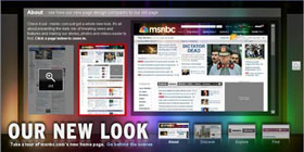 This weekend, msnbc.com began the multi-day process of rolling out their new redesign. It’s really, really nice… you should check out it.
Just so no one accuses me of kissing up to my new partners, I will say that I thought the last redesign several years ago was a bit of a step backwards from the landmark Roger Black look of the late 90s, but this newest redesign is not just a step forward, but a giant leap for newskind. It is not just a collection of features shoehorned together under one grid but a rather well orchestrated piece of communication design, worthy of further examination.
Let’s check out what’s going on under the hood:
Getting Rid of the Blues
Msnbc.com has always turned to blue as the primary color for its palette. Sometimes it’s royal blue, sometimes it’s electric blue, sometimes it’s subtle, and sometimes it’s dramatic, but it’s always been there — until now. The new palette is white, black, and grey with the spectrum of rainbow colors from the NBC peacock sprinkled tastefully throughout. It’s tough to pull off a rainbow palette in web design but this one is very sharp.
Speaking of blue, the shade chosen for all of the anchor text around the site is also very nice. For better or for worse, blue has become the de-facto apparel for hyperlinks on most mainstream web sites, but even the choice among blues is important. #0000FF is dated, unsophisticated, and highly lame, but there are still sites that use it. Interestingly, MSNBC and CNN have picked almost the exact same shade of blue in their latest redesigns, but hey, that just means they both have good taste.
Typography Tradeoffs
I’ve never liked Arial. It’s always seemed like nothing more than a font of last resort for those needing a widely available, compact sans serif. It’s plain, it’s unsophisticated, and it just screams “default” to me. For this reason, I was a bit disappointed to see the MSNBC redesign make such heavy use of Arial, particularly as display type. Surely something a bit more refined like Tahoma could be used. Or maybe even specify something like “Helvetica Neue, Corbel, Tahoma, Arial” so that users of OS X and Vista would get nicer sans serifs, most others would get Tahoma, and then Arial would be the font of last resort.
I asked Ashley Wells, msnbc.com’s Creative Director, about the Arial situation and he gave me a surprisingly satisfying answer: because msnbc’s new publishing system is very much WYSIWYG, editors are charged with not only writing headlines, but essentially designing them too. Meaning, how a headline wraps can have a dramatic impact on the presentation of the page. By using Arial, these wraps can be precise across most browsers. This is such a non-webgeeky way to think about publishing. I love it. Typesetting has always been something MSNBC has done a lot better than their competitors and it’s great to see that even as the company moves away from its Photoshopped-type-on-images style, the focus on typography is not completely lost.
Arial as a way to improve typography. Who would have thunk it.
BIg News, Big Treatments
One of the things I’ve always loved about MSNBC is that when big news happens, the layout of the front page adjusts to properly frame the importance of the story. At ESPN we called this “war mode” and it can only be accomplished by a mix of smart design and editorial participation. In the world of never-ending, unflavored news feeds we seem to be moving towards, it’s refreshing to see a news organization that still believes in the power and importance of layout.
Although the old msnbc.com had more layout flexibility than its competitors, the new site is several cuts above. There are dozens of layout options available for editors and that can increase infinitely as new ones are envisioned. So while most other news sites just pump their top stories into a standard headline-on-top-of-photo box, msnbc.com is actually designing their cover every time they publish. It makes checking the site several times a day that much more interesting.
Coding to Standards
As everyone who has ever worked on a big site knows, the longer you go between redesigns, the cruftier your code gets. Even the cleanest of redesigns tend to decay over time as more people get their hands on the code. WIth this latest redesign, however, MSNBC is debuting a totally new version of their home-grown publishing system (“WorkBench”)… one that is designed to — among other things — allow for feature extensibility without sacrificing the foundation of clean code that now anchors the site.
Before all of you standardistas and validatorians start piping up about inline CSS and random code oddities, realize that the site is very much in flux over these next few weeks as kinks get worked out. Also realize that a redesign of this magnitude requires the retrofitting of a lot of old code and templates that can’t always be eliminated with the flick of a switch.
As a result of the attention MSNBC is paying to web standards, the site now works equally well in all major browsers. It loads quickly, renders quickly, and is a joy to interact with.
An Open Dialog with Users
As part of the redesign process, MSNBC set up a blog to communicate with users about the redesign and all ongoing development efforts. These sorts of things are tricky because they tend to attract a lot of “drive-by” comments from users (e.g. “WTF! I hate it! Bring back the old!”). Once you filter out the inevitable noise though, there is usually plenty of insight to learn from. Having a blog to communicate with your users seems almost mandatory these days, but what I like about MSNBC’s is that it’s a sincere, serious effort. It’s just not a default TypePad installation that some PR flack pens to once a month. People from all sides of the organization have already written entries and answered questions, and it should be obvious to anyone who is paying attention that this is a company that cares about its community.
Newsvine Integration
I wish I could say that the Newsvine team had any significant role in this redesign, but we haven’t. This has been almost a year in the making and it’s all Redmond. That said, Newsvine did get a minor speaking part on the community page, and we look forward to further collaboration in the coming months.
The Bottom Line
This redesign is a perfect example of why “big media” is still alive and well, despite what some people would have you believe. It is thoughtful, it is innovative, and it is something no six-person company could ever produce. It is something, in fact, that most 300-person companies could never produce. As big media takes more cues from little media and little media returns the favor, both sides of the spectrum just get better. And that is great news for the news business and the news consumer.
RAM Arbitrage
 So I finally bucked up and ordered a black MacBook yesterday. It seems like Intel Macs have been out for 10 years now, but this will actually be the very first Intel-based Mac I’ve ever used. I tend not to upgrade computers more than once every couple of years, and the product cycle just happened to dictate the purchase of PowerPC iMacs in the office two years ago and a PowerPC 12-inch Powerbook around the same time.
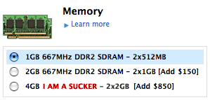
In configuring this MacBook at the online Apple Store, it struck me how much Apple *still* charges for RAM, and gets away with. This is not a new phenomenon as it’s been happening for many, many years, but the total cost difference between Apple-installed RAM and third-party RAM now stands at a whopping $730 for 4GB of RAM! Note that they are both third-party products, from a manufacturing standpoint.
In other words, to max out my MacBook’s RAM, Apple charges me $850, while if I go through my trusty RAM comparison shopping site DealRam, I am pointed to NewEgg, which ships me the same amount of RAM for $120. As a point of comparison, Dell charges $465 for an extra 4GB… still outrageous, but not a 700% markup!
That is just astounding to me. Surely I’m missing something, but is there another store in the world that charges over $800 for a product that can be had for under $150? And I don’t want to hear any arguments about quality of RAM either. If you happen to get some bad RAM, you can always exchange it (note: I’ve gotten bad RAM from Apple before too… it can fail no matter who makes it).
I suppose I can’t actually be mad about this since Apple makes it perfectly possible for informed consumers to buy their own RAM, but at these prices, I would love the ability to save an additional $150 (Apple’s price for one 1GB stick) by having my MacBook ship with no RAM whatsoever.