Gnomedex: No Stinkin’ Badges
Chris Pirillo’s Gnomedex conference kicked off last night in Seattle and the turnout looked fantastic. Lots of people from out of town, and a great venue to boot. The thing that pleased me more than anything else at the pre-conference party though was the design of the conference badges. Gnomedex badges are big and bold, with visual real estate doled out in almost perfect proportions. I wrote about the issue of carelessly designed conference badges a few months ago, and upon congratulating Chris on his conference last night, he informed me that the Gnomedex badge design was inspired by that article. Hooray for design evangelism!
Below is a photo of the badges snapped by Laughing Squid:
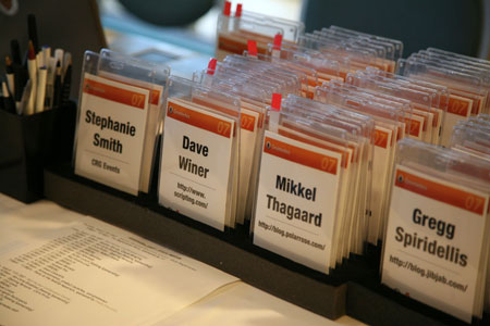
Positives:
- Attendee name is huge and readable from far away — set in
UniversHelvetica Neue Condensed Black, an extremely legibile, yet space-efficient typeface. - Attendee’s blog URL (instead of company) is listed below name. A nice touch considering the subject matter of Gnomedex.
- Title of conference and all other non-essential information is minimized.
- Sponsor (Polar Rose) is all over the lanyard instead of mucking up half the badge.
- Badge is two-sided.
Potential Negatives (Not many!):
http://could theoretically be lopped off the blog URL to increase the size and readability of the URL, but one could argue the prefix adds geek appeal.- A commenter on my previous entry suggested perhaps emphasizing the person’s *given* name so you know what to call them. This is more important in other countries though where names don’t always follow the “call me by the first name you see on my badge” rule. Not really fair to call this a negative, but it would be a nice potential issue to solve.
Oh, and there’s another big positive too. This has got to be the coolest badge ever. Party only! —
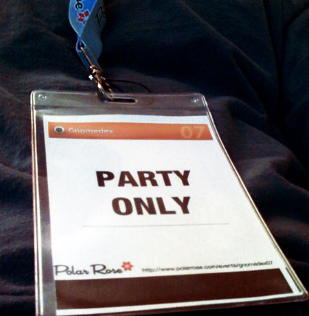
Mikey D is having an effect once again! I do agree it may have been better for readability to drop the http:// from the urls, and where can I get a badge that says “Party Only”?
More important what is the url for “Party Only”? They not only left off the http:// bit but the address as well. ;-)
Someday maybe I’ll be cool enough to be invited and well funded enough to go…
Are you sure that’s Univers? The K looks more like Helvetica’s to me. It’s hard to tell — parts are a bit blurry due to the depth of field — but my guess would be Helvetica Neue Condensed Bold. The sloppy kerning of “Party Only” make me think it’s set using Word, too.
God, I’m such a type geek!
Manx: Good call. It’s really hard for me to tell as well, but now that I look at the K, it curls just a tad more on the bottom which would be consistent with Helvetica Neue. I’m going to change it in the entry unless and until we hear otherwise.
I wish I was a type geek like everyone else seems to be. I can generally only recognize a few basics like Times New Roman, Arial, Helvetica, Trebuchet MS and Century Gothic. :(
Mike, NYTimes Magazine tomorrow has a feature on highway sign fonts, which I seem to remember being mentioned in one of your previous posts about name badge design.
Here is the link to the NY Times article; http://www.nytimes.com/2007/08/12/magazine/12fonts-t.html
It has a slide show relating to the history of road sign design and goes into the technique of making fonts readable.
Anton and Eric: Thanks for the pointer to the Clearview article! Great read. My favorite quote —
Thanks for your positive comments to the badge. Polar Rose was the official badge sponsor and I was responsible for the design. I was inspired by your blog post which Chris passed my way.
The only problem we had – and also our reason for having the badge in portrait format – was the un-availability of the plastic badge holders in a 6x4in landscape format.
In response to other peoples comments: The font is Helvetica Neue Condensed Bold and although the badge was designed in InDesign in the end it had to be output in Word format – so the kerning suffered a bit.