Building a Better Conference Badge
I just got back from the Economics of Social Media conference put on by Rafat Ali, Staci Kramer, and the rest of the PaidContent crew and it was really an excellent event. One-day conferences are great because there’s no filler. There’s no scrambling to populate 50 panels with people who may or may not be the best choices to speak. There’s also no deciding which of 6 rooms you want to be in every hour.
One track. One room. All superstars. (Needless to say, I wasn’t a speaker.)
For Rafat’s first conference, they really knocked it out of the park. Not every panel was an A+ but there were no duds and they clearly had the right people on stage in most cases.
The only awful thing about EconSM though — as is the case with most conferences — was the design of the conference badges. While talking to Andy Sternberg of LAist, at one point I interrupted him and said:
“You know what super-complicated innovation would double the amount of socializing going on in this lobby? Double the size of the badges. I can’t see anyone’s name!”
Andy agreed.
… which got me thinking about something Kottke has penned about several times in the past: what should a badge really look like?
As an attempt to answer this question, I present the EconSM badge as reference and my newly proposed S.O.B. or “Socially Optimized Badge” as a proposal. An Illustrator file of the S.O.B. template is provided free of charge at the end for any conference organizers who want to use it.
The EconSM Badge (Typical of 99% of badges in the world)
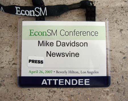
Crimes committed:
- Too small at 3 inches tall by 4 inches wide. Bump that puppy up to 4 by 6.
- First and last name on same line.
- Set in 25-ish point Arial: the worst font in the world and even more unreadable at that size and weight.
- Title of conference — the least important information on the badge — dominates the space.
- “ATTENDEE” is the boldest text on the badge. It’s not *that* important as speakers and attendees share 99% of the same privileges.
- Lanyard contains name of conference instead of being sold to a sponsor. No one cares what the lanyard looks like, so go ahead and sell it to Yahoo or something.
The S.O.B. or “Socially Optimized Badge”
The S.O.B. treats the conference badge like a highway sign, complete with a typeface modeled from U.S. highway signs: Interstate.
* Note: Contrary to popular belief, the actual typeface used on U.S. highway signs is FHWA Highway Gothic
Highway signs are designed to be read from as far away as possible and always present the most important information biggest and boldest. The S.O.B. allows you not only to minimize the awkward glances down while you’re talking to someone whose name you don’t remember, but also makes spotting people across the room a lot easier. The typical conference badge loses its readability at about 10 feet but from my own crack-testing, the S.O.B. appears readable from up to 30 feet away. Go ahead and try stepping away from your computer screen as far as possible and you’ll see the difference:

The Deliverables
As promised, here is the sample Illustrator file for the S.O.B. Use it with the knowledge that you are doing your part to bring people closer together at your conference. It really does make a difference. I’ve included the longest name I could think of (actually, Niall thought of it) so you shouldn’t have to reduce the font sizes at all as you print your own badges.
Newsvine Relaunches… Announcing Evergreen
Kelvin: One of the many subtle joys of the new Newsvine.
Call it a redesign. Call it Newsvine 2.0. Call it whatever you want, but today Newsvine is proud to announce the first major overhaul of our site since launching a little more than a year ago. It’s an exciting thing for the team and for the now 600,000 people who visit the site every month because it not only provides a hugely enhanced front page but also showcases a lot of the great technology we’ve been building behind the scenes over the last several months.
Newsvine Evergreen begins today with the relaunch of the front page but is part of a much bigger effort to spread the vine outside the walls of our own domain and into all corners of the internet and blogosphere; the goal being to bring the news to wherever it naturally wants to go.
So what’s new so far?
Modules!
The most common request we get on Newsvine is that people want to emphasize or de-emphasize certain parts of the front page. We have our own ideas for what the front page of a news site should look like and you have yours. Most major news sites attempt to solve this problem by maintaining their editorially imposed front page and then offering a “My” page which users can play around with and customize. The result of this strategy is almost always two-fold: 1) Barely anyone customizes. 2) Even among those who customize, there is hesitancy among users to give up their daily reading of the front page in favor of the “My” page. This is evident from sites like ESPN and Yahoo News, both of which have feature-rich “My” pages but do a ton more traffic on their front pages.
So the question for us became, how do we provide a front page that contains the ideals of a major news site but still allows for complete customization? The answer: modularization. The new Newsvine front page begins as we think many users would like it: big top story, most popular seeds up top, most active stories prominently placed, and so on down the list. But as you go down each column, you’ll notice tons of new things which you may like better than the things at the tops of the pages. If you do, just start draggin’ stuff around until you’re happy. Feel free also to close modules you don’t use or add new ones that aren’t in the default set.
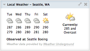
Local Headlines and Weather
Another frequent request we’ve gotten over the past year is to beef up localized content around the Vine. Since weather is a staple of any local news diet, we’re now automatically detecting your general location based on IP address and serving you up a 5-day forecast right on the front page, courtesy of Weather Underground. We are also now the only major news site that gives you the option to display your temperature in Kelvin.
Did you hear that? We said Kelvin! So now when it’s freezing outside, you can switch over to Kelvin and bask in the illusion that it’s a balmy 270!
We’ve also gone through and collected the local news RSS feeds from hundreds of newspaper sites around the country so we can automatically show you your local news in a module alongside the rest of your content.
Newsvine Live
Our live feed of all actions occurring within Newsvine now takes a seat at the grownups’ table with this redesign. Newsvine Live is a great way to discover new content before it gets popular, and it’s an easy way to get yourself some exposure as well.
The News in Pictures
Sometimes you’re not in the mood to read articles and would rather get a visual tour of what’s newsworthy on any given day. The News in Pictures is a continuously updated slideshow — with captions — of all the latest content coming in from the AP. Sure you’ll see the occasional unflattering mug shot of an escaped convict, but we’re actually quite surprised and pleased with the general quality of the photos that roll through this module on a daily basis. We have other plans for this module which include accepting user submissions, but for now, enjoy the first incarnation.
Newsvis
Newsvis is a visualization tool we’ve developed to help you easily identify how much of Newsvine you’re really covering. So much news flows through this place that often something extremely voteworthy or commentworthy can be missed entirely by casual users. Newsvis shows you a colorful map of all the latest popular stories and clues you into which ones you may have missed.
External RSS Feeds
Let’s say the Associated Press, The New York Times, The Washington Post, Techcrunch, and every other source linked to or hosted on Newsvine just isn’t enough for you. Let’s say you live in the tiny village of Podoliantsi, and the Podoliantsi Post-Intelligencer is the only news source covering your neighborhood. As long as they have an RSS feed, you can now add it to your Newsvine front page… along with any blog you’re interested in, any Twitter RSS feed, or any Del.icio.us linkroll.
Newsvine Group Showcase
Since introducing Newsvine Groups a few months ago, we’ve watched as people have self-organized into hundreds of social circles around interests, locations, and political ideologies. Groups has never had any marketing behind it or more than a small item in the navbar, but even in this semi-stealth state, it’s shown its popularity. With the launch of the new front page, however, Groups gets its own module to showcase a weighted random assortment some of the more active organizations around the Vine. The ultimate goal of Newsvine Groups is to take the pool of hundreds of thousands of people who visit Newsvine and create a vast array of smaller populations, with more meaningful personal ties between members.
Top Seeds from Source
Some of the best content on Newsvine comes from the New York Times, The BBC, The Washington Post, and ESPN, but up until now, there’s been no easy way to see it all grouped by source. We’ve started you out with a New York Times module by default so now you can see the latest New York Times seeds all in one place. Prefer Fish ‘N Chips to Pastrami On Rye? No problem… switching to the BBC is one click away.
Super Widescreen
With all of this new content, you can imagine that screen real estate could get a bit tight. For this reason, we’ve enabled users with gigantic monitors to expand their layout to four columns and a whopping 1300 pixels of width. If you’re so inclined, just click the little green button on the right side of the screen and spread out like a polar bear. Hint: We think the coolest two modules to push over there are weather and Newsvine Live. Give it a shot.
So What’s Next?
We can’t say right now, but it’s election-related and you can look for it in a few weeks. We hope you enjoy the new and emerging Newsvine, and if you’re already a member, we thank you so much for your patronage!
Pagination and Page-View Juicing are Evil
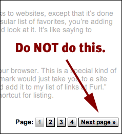 You’ve seen it a thousand times. You’re reading a great article on the web, you get to the bottom of the page, and there it is:
1 | 2 | 3 | 4 | 5 | Next >
The pagination tattoo. The mark of the beast.
Over the last several years, many publishers have convinced themselves that breaking up stories into sometimes as many as ten pages is an acceptable way to present content on the web. The realistic ones at least admit that it’s a cheap way to boost stats. The disingenuous (or naive) ones actually posit that they are improving readability and usability for their audiences by reducing scrolling. Because scrolling is so hard.
I’ve seen both rationales presented by colleagues, and frankly, I’m not on board with either one. There are really only two instances where I find pagination acceptable, and they both seem rare on today’s web:
- If an article is extremely long. Like 20 screens worth. And even then, it should be broken up by “Acts” and not necessarily word count. Break it up as if it were a play and try to never have more than a few Acts.
- Slightly related to item 1, even a short piece can be functionally broken up. Imagine a much shorter version of that great Washington Post article about the violinist in the train station. The article has several video clips strewn throughout. Those would be logical places to either start or end each Act.
Instead, what I’m seeing more and more of is ridiculous pagination for the sake of juicing page views. Take for example this article which was seeded sarcastically to Newsvine the other day. It’s from a site called Associated Content. The article is a lousy 1504 words and it’s broken up into four pages! I’ve read cover letters that are longer than that.
How is a reader to endure a user experience like this and feel respected by the publisher? Maybe if I’m reading Malcolm Gladwell, I’ll give the guy a break because I’m so lucky to be reading his masterpieces in the first place, but the fact of the matter is that 99% of content on the web (and in the world) is not stuff we’d bow down to, so we should at least hope to be respected as we’re trading our attention and associated ad revenue for some reasonably entertaining or educational text.
As the founder of a news startup, I’m fully aware of the constant pressure to increase page views month over month, but at some point you have to ask yourself if the page view is your most important metric over time. If you could choose only one of the following — long term — which would you choose: a user who consistently generates 10 page views a day on your site but spends only 5 minutes with you, or a user who literally stares slackjawed at the screen for two hours a day with your site running on it, generating only one page view?
Your accountants will always pick the former, but you should always pick the latter. In the long run, it’s not total HTTP requests that will determine how successful you are. It’s what percentage of any given population’s attention you earn. Don’t blow it by manipulating your readers.
Quincy Smith on Autoplay
In a two part interview (1, 2) with Quincy Smith on the developments occurring at CBS interactive, Staci Kramer says:
When I brought up autoplay as a way of piling up streams, Smith quickly replied: “That’s a cheap shot. We don’t do it. … Half of that is the decision of the content provider. … In my opinion, to open something and have it directly stream in your face and then count as a stream is a cheap shot.â€
Thank god someone important finally said that.
Business Cords

I was out at a bar with my good friend Corin this weekend when he laid some of his badass new business cards from design firm The Dept of Energy on me. They are badass because they aren’t cards at all, but rather functional, palm-sized electrical cords with with his logo and business information imprinted on them.
Very, very cool.
Not only do they reinforce the brand of the firm, but the novelty and tactile values are off the charts. The yellow cable is as pliable as a heavy-duty extension cord while the orange cable is more like a really stiff stress ball.
It’s the most interesting “card” design I’ve seen since The Blood Card and a whole lot less scary. But at 40 cents apiece, Corin is careful who he gives them to.
What are some other examples of creative business card design these days? I haven’t seen anything really jump out at me lately.
If You Don’t Have Anything Nice To Say…
Let’s say, hypothetically, that a blogger was sent a free product/service worth about $500 by the company who sells the product/service. There is no specific requirement that the blogger write about the product/service, but it’s apparent that that’s why the blogger was chosen to receive the product/service.
Now, let’s say that the blogger has an overwhelmingly negative opinion of the product/service. It’s not dangerous to the world or anything but the blogger would never, ever use it, based on its design/utility/etc.
Given that the blogger *would* write something positive if his/her experience with the product/service was positive, it is his/her responsibility to write something negative if the experience is negative? Going even further, if the blogger chooses to simply not say anything at all (out of respect for the niceness of the company who sent it) is that unethical?