Cash Machine Parallax
It seems like the percentage of cash machines which still suffer from button/screen parallax is still pretty damned high. This design problem has already been solved in at least three ways (touch screen, angled display, and low-profile screen bezel) and yet it seems like 90% of all ATM machines still look like this:
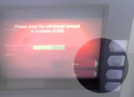
Kind of annoying.
Enjoy this? Subscribe to Mike Industries updates via email, or follow me on Bluesky @mikeindustries.com.
When I saw that image, all I could think of was the 2000 Florida Presidential ballots.
shudder
Palm Beach Ballot
Dude,
I love when buttons don’t line up, I can normally zip through things except until the point where I can’t tell which button lines up with which arrow.
By the way…300 bucks!!!!
Can I borrow 20?
Bank of America is the bombdiggity.
Everything is touch screen
$300? dude you should typed in $5000 and then took the picture to scare all your web 2 point blah competitors that read this blog.
Yes, that is annoying. See it all the time.
I’m also REALLY annoyed at the relatively recent trend of having ads on ATM screen — after I put in my card. WTF? I’m already paying you anywhere from $1.50 to $8.00 (in the strip club, of course) to use the ATM — why do I also need to see your ads?
Charge me or show me ads. Not both.
Almost as annoying as when you type a wrong amount and you want to correct the amount, but as soon as you click any button, the ATM throws your card out and you have to start all over…
stupid UIs…
I’d almost rather have ads, because its not like they are of any use to me, whereas a charge of $1.50 just to get my own money is also annoying, though I understand the charge – Like Jeff said, pick one.
Mike, you hit it right on the head. This has been a pet peeve of mine for a LONG time.
It’s especially bad if you are in one of the drive-through ATMs. Throws the angles off big-time to be below the screen (car) or above it (truck.)
ATMs are, as a group, terribly unusable.
They also have a big problem when it comes to “clear” vs. “cancel” buttons. For example, had you typed an extra “0” and it said $3000, it would be simple to hit the “clear” button (if there is one.)
But it’s too easy to just hit “cancel” accidentally and end up having to get your card back out, swipe it, then go through the whole process again.
And don’t even get me started about POP debit/credit card scanners. I can’t count how many times I’ve seen stores write on them with a Sharpie or tape over a button that people hit in error frequently.
Add that to the constant stream of questions – “Please enter your PIN”, “Would you like to add $1.50 to charity?” “Do you want cash back?” “How much” “Is ok?” etc.
And of course they put these questions in an order where you enter your PIN, “no”, “no”, “yes” – and if you anticipate a question, you end up cancelling the transaction or costing yourself extra money.
They should allow you to have saved preferences ala cookies. That way unless you designate differently, it skips the questions other than the your PIN and “is ok?”
Actually, there was a Bank of America ATM back in my old town I used quite a bit that did save my preferences. That was nice.
Do other tall people have to do the same lean back/slouch/crouch maneuver I do to double check that I’m pushing the right thing?
By the way, touch-screens rule.
Andrew: I’m not tall, but I always find myself crouching before I hit a button…
Amen!
That drives me crazy
Between this issue and the Sequence of Plastic Payment, I’m almost convinced the same people who invented popup ads have moved onto electronic purchasing interface.
Even touch-screen ATM interfaces are problematic for me. Often the button “touch-sensitive area” is offset from the graphical display of the button, and I end up indicating the wrong option or amount.
Maybe this has to do with the fact that I’m kind of tall and am not looking at the ATM at exactly the right angle — but the ATM designers should account for that by making the buttons farther apart, so as to reduce mistyping.
Adrian, I have to do the touch-sensitive where-are-the-buttons-really guessing game, too — and as you know, I’m not tall at all.
I used to see these everywhere here in Illinois but most of them in our area have been converted to touch screens. Now the problem is finding a fast food restaurant that has one of those order screens that actually works.
I also have the touch screen not lining up exactly problem (not that that’s a good term for it). When I push the button sometimes I find I’m off a bit and pushing nothing – so I have to slide my finger around a bit before finding it – kind of annoying. I just want a more intuitive push button system. The arrows on the screen never line up with the buttons I need to push so I’m not sure. Anyway..
I live in South Jersey and frequently work in Philadelphia. I regularly see every ATM design from 15 years ago through the latest cutting edge designs. Every time I use an ATM I have to really pay attention to make sure I know what I’m pressing.
It’s really nice to use the new ATMs.
@Mr. Croft: Is it just me being sleepy does the comment seem as if you are paying $1.50 for a cash withdrawal? That somehow seems quite outrageous to me as we Norwegians complain when we pay 16 cents for a withdrawal.
I’m tall as well, and suffer this problem. Here in Australia we also have quite stringent regulations regarding disabled access, so the machines are generally fairly low to enable wheelchair access. That exacerbates the problem when you’re tall like I am!
I’ve recently noticed another related problem with ATM design – on some of the newer ATMs over in Europe and here in Australia… Someone, somewhere, realised that big buttons and lots of spacing were useful, but then some other genius went and implemented the new design on the number pad _only_ and not the clear/cancel and selection buttons… So it’s still too easy to hit Cancel instead of Clear, but it’s near impossible to hide your PIN from behind because you’ve got to move your whole hand to get to each number…!
Mikey, you got to much time on your hands. Or maybe the opposite. Perhaps you are overworked. I can relate to that one. :-D
Back when my old bank was actually *at* a bank rather than inside a grocery store like it is now, the ATMs faced west. The displays were orange and from about two o’clock in the afternoon until sunset they were virtually unusable. Nobody could ever see what the screens said. In those days I had a student account which allowed me to use the ATM without charge but charged me $5.00 to have a face-to-face transaction with a teller. It was incredibly annoying. The ATM at my current bank faces north and at a much better angle, too.
The Parallax is mostly the same here in the UK. It made me chuckle the other day to see a Windows message box with an obscure error message on the screen of an ATM down the road from me. I wish I’d taken a photo now.
Eric, you’re lucky: charges here in South Africa are about 1% to 1.5% of the withdrawl amount.
And yes our ATMs have the same paralax problem, but worse my bank (Absa = Barclays) requires me to select a language everytime I insert my card! Every single banking customer in the country has had to positively identify himself to his bank (read female as required) to comply with new anti-money laundering laws… but my bank can’t even remember what language I spoke last time I visited?! I’ve even reported to their hotline with no success, not even a response.
Nicolas
I have always been a fan of the Braille instructions on the drive up ATMs. Nice of them to make the interface accessible to all the blind vehicle operators in the world. Brilliant!
Average fees in NE Ohio range from $2.00 to $2.50. We would love to see $1.50 back again.
Kevin, where are you at in NE Ohio? I’m from Cuyahoga Falls, currently living in North Canton, and most places I’ve seen are still $1.50.
I’m pretty happy overall with National City. Their online banking is superior to most everything else (even give me free images of my checks), their ATMs are free for their customers and offer to retain your preferences (touch screen, too!), and they generally don’t treat me like too much of an idiot.
I’m sure every branch is slightly different, no doubt.
When I lived in East Texas in 2004, I was unimpressed with the options there. Most banks were just beginning to offer free checking, too. My bank had crappy hours, and yet every time I tried to deposit something via the ATM in the evening, there were no envelopes in the machine or it was out of order.
The online banking was horribly ridiculous, as in “not even slightly production ready”. It looked like one of my high school programming projects done in VB. The main page was a big blank screen with about 8 green boxes at the top for navigation. No logo, no ads, no information about your account, nothing. Just a big blank screen. But yet again, most banks were just starting to offer online banking in that area.
I guess it comes down to competition. There wasn’t really a better solution in the area at the time, so why change it? Just having a 24/7 ATM, free checking, or online banking was huge! I mean, the sad conclusion of Mike’s entry is that most ATMs suck, but people use them anyway because they want their money.
I can see it now… a tiny flat-panel hanging on a wall at your local mall. No keypad at all, just a screen, a card slot, and spot for the money to come out. Touch screen, elegant white frame that almost blends in with the wall… the Apple iMoney.
Riiiiiight. I wish.
At least you have money to withdrawl.
:D
My biggest beef with usability of one atm in particular in my country (asb im looking squarely at you) has to do with balance readings.
Say i approach the cash machine, and i would like to pull out some money.
I dont know how much is in my account, so i would like a balance before i possibly overdraw the account.
So i go in, check balance with a receipt.
Now, everything would be dandy if it spat out a receipt right there, but nooooo…receipts dont come out until you are finished using the machine…. Then it throws this pearler at you:
“would you like to make another transaction?”
How the hell would i know!you havent given me my receipt yet! so i have to press no to get my receipt. If i find out i do have enough then i have to put my card back in and start again.
*butts head*
Here in The Netherlands, all ATM usage is free (well. actually, not all, you start getting them in places like McDonalds now, that do charge).
The new SunTrust ATMs have solved this with a very simple design. The buttons have a very visible white line that comes out of them, wraps around the edge of the screen framing and goes right up to touch the screen, and then all the appropriate screens have a corresponding on-screen line that meets right up with the physical one and links it directly to the on-screen choice. Makes it much clearer.
While we’re (off-topicly) comparing ATM charges, here in Australia I get charged $1.80AUD ($1.30USD) when I use an ATM other than my own bank’s. If I’m not near my own bank’s ATM, I get around this by getting cash out at the EFTPOS when paying by card at a store, who don’t charge extra (yet). Buy a 50c lollypop, save $1.30, and hey, bonus lolly! As far as usability goes, I thing most ATMs here are pretty good, apart from the valid point marc b (#28) makes, which is annoying.
Like PanMan said, in the Netherlands they don’t charge you for using an ATM. You can check how much money is on your account on the screen of an ATM and there’s a checkbox for ‘proceed to getting your money’. I never complained about the buttons. Well, some banks do have those flat ones. But the’re ok to me.
I’d rather not have a flat panel or something. I’d like some privacy when getting my cash. Also when I type in my PIN or check how much money I’ve got, I don’t want everyone to see that.
Internet banking is used more and more these day’s. It’s a relief not having te drive all the way to a bank the whole time paying my bills or making changes to my bank account. It’s secure, fast and they actually paid attention to accessability.
I usually just mash all the buttons at once and hope for the best.
Thats always bugged the hell out of me, especially when you take out the wrong amount.
Here in my country (Bulgaria), things are like this:
1) If you use a normal debit card issued by your local bank (Cirrus/Maestro, VISA Electron, etc.), either:
a/ the bank charges you EUR 0.15-0.30, if you are not using an ATM of the SAME bank, or
b/ charges you nothing or a very tiny amount, if the ATM is of the same bank.
(This applies to any cash withdrawals up to EUR 200,00.)
2) If you use a credit card issued by your local bank (AmEx, VISA, MasterCard, etc.), the bank either:
a/ charges you EUR 2.00-4.00 at least, depending on the amount you withdraw, if you are NOT using and ATM of the same bank, or
b/ charges you 1.00-3.00 at least, if you use an ATM of the same bank.
As I see, using debit cards, the taxes here are pretty low / as for tcredit cards, they are pretty high :-)
Other places in the world? ;-)
took a snap of what I was talking about with the SunTrust ATMs:
parallax solved
ATM machines, eh? :oP
Thank God, I’m not alone…
For so long, I cursed at the designers of these machines,
I thought I was the only one noticing the absurd way it was conceived.
If you’re higher than 1,50m, you’re screwed.
I’m amazed they even look like this overseas. We have the same design problem in South Africa. From the users perspective button and screen display are often out of synchronisation.
What’s really funny, is that I found this page while doing a search to determine why the Cancel button on an ATM is not working. Trying to fix it and all.
I work at a financial institution monitoring the ATMs. I recently took over this position and thought our screens look outdated. So I created new ones (where the buttons line up to the arrows on the screen) and with images so as to not be quite so dull.
Complaining about fees and ads…our ads show up at the beginning before you insert your card (and the machine doesn’t keep your card…the card swipes). Once you swipe your card, you do your transaction and then once done, ads appear again. As for fees, try a Credit Union. Most Credit Unions’ don’t charge fees for you to use their ATM (even if you are a bank’s customer).