Hacking A More Tasteful MySpace
"line-height: 1px" to "line-height: auto" in the body section of the CSS.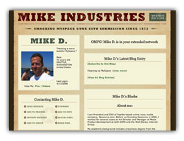 A guide to creating a more tasteful MySpace layout. Sample images and CSS are included at the bottom. End product: myspace.com/mikeindustriesThe social phenomenon that is MySpace is one I don’t fully understand, and yet, one I must fully respect. In fact, with over 50 million unique users, it is something everybody must respect. Any website which rolls up that amount of usership is doing something very, very right, and no matter what your thoughts on it as a vehicle for your own expression are, you must give it its full due for what it is to seemingly everyone else.
Several weeks ago, I finally signed up for an account, and within seconds I was instantly put-off by what had been created for me: a hastily-designed “profile page” with uninspired colors, misaligned tables, and a mish-mash of extraneous cruft and design elements which made this feel more like a halfway house than a “home”. Now, granted, I am a designer by trade so my tolerance for this stuff is orders of magnitude lower than most of the population, but clearly, this was not a place I even felt comfortable having my name on.
So with the default home page this underwhelming, what is a MySpacer to do? Customize, of course. One of MySpace’s greatest features is its ability to let you skin your own home page. Unfortunately, 99% of the customizations I’ve seen are chalkboard-screechingly awful, but what could a MySpace home page look like if some actual design thought went into it? That is the question I sought to answer.
But first — as Keith Robinson asked me when I first showed him what I was doing — “Ummm, why?” The answer is twofold. First, I love a design challenge. Second, we’ve been building a lot of new social components into Newsvine over the past several weeks and I wanted a good reference point for what is already done well online and what could be improved.
So without further ado, on with the surgery…
Sizing up the beast
The first thing I did was search Google for sites which specialized in MySpace customizations. Turns out MySpace customization is a cottage industry unto itself. Unfortunately, the first twenty sites I found produced nothing but crap. Granted, perhaps it is crap that people want, but I wanted to do better. There were mostly instructions on how to tile Ricky Martin backgrounds behind your Christina Aguilera autoplay music player, but nothing close to the brilliant piece of work Keegan Jones threw together a few months ago.
The problem with Keegan’s hack, however, is twofold: a) it violates MySpace’s Terms of Use by blocking advertisements, and b) it produces essentially a static, non-functional page by replacing all of MySpace’s code with your own.
What we really want to do here is simply decrappify our home page as much as we can without violating the Terms of Use and replace all evil design elements with a cleaner, more professional look. We also want to maintain MySpace’s actual HTML so our page is functional and not just a facade hiding our grotesque underbelly.
Enter the dragon
Like a biologist over a petri dish, I pulled out my copy of XyleScope and began observing the organisms at play within the MySpace profile page. How difficult was this going to be? Was everything coded semantically? Did the company provide enough hooks in the form of CSS classes and IDs for users to easily style most elements on the page? Was anything “off-limits”? Over the next several hours, I slowly identified every element on the page by its programmatic hook. The good news was that a lot could be done here. The bad news was that the CSS was going to be ugly, ugly, ugly.
If Dave Shea built the CSS Zen Garden, this was going to be the CSS Weed Patch; a block of code so semantically twisted that it would turn Joe Clark straight.
It was upon thinking of this analogy, however, that I really started to get psyched about this project. After all, it doesn’t take a genius to make perfect code dance. But it would be a real accomplishment to make a pig do the pachanga.
Step One – Learning the r001z
There are certain things you can’t do on MySpace. Autoplaying “Maneater” is perfectly ok apparently, but these things are not:
- Using the # sign anywhere in your CSS. This is to avoid you messing with ID’ed elements, but its brute force removal also precludes you from properly specifying hex values. Instead, you must do things like
color: FFFFFForcolor: white. Note also that because the pound sign is missing, you cannot use shorthand likecolor: FFF. - Specifying style rules for iframes. Apparently, this is to keep you from hiding MySpace’s banner ad, although it’s easy to do this anyway without touching the iframe. Don’t do it though unless you want your profile deleted.
- Placing comments in your CSS file. If you mark up your CSS file with standard (
/*whatever*/) CSS comments, they will get stripped. Other styles of commenting “kind of” work, like double brackets ([[whatever]]) but they end up messing up the CSS code in some browsers. Interestingly though, downlevel-revealed (but not downlevel-hidden) IE conditional comments work just fine. We’ll use these in our hack in fact. - Using shorthand for border styles. If you try something like
border: 1px solid FF0000, it will not work in Firefox. Interesting, it seems to work if you use a keyword likeredinstead, so this probably has something to do with the hex issue mentioned above. The unfortunate workaround is to always specify your borders in longhand. - Putting CSS anywhere but right smack dab in the middle of the content. You’d think it would be easy for the MySpace crew to let you specify your style rules in the
headelement where they belong, but nope, you have to stuff them into the “About Me” module which sits in the middle of the HTML. The result is an unavoidable FOBUC (or “Flash Of Butt-Ugly Content”) before your style rules kick in, but oh well. Such is life in the ghetto.
Step Two – Visualizing The Finished Product
As I saw it, there were mainly four things I could do here: a) clean up all of the margins, padding, spacing, alignment, type, and color issues, b) create a new background image and associated design theme, c) make a branded header, and d) add some extras with the magic of CSS.
I felt a Wicked Worn theme a la Cameron Moll would be pretty killer, so I mocked it up in Photoshop using various weathering techniques until it looked sufficiently unlike any other page I’d seen on MySpace. I then planned out how each piece of the design could be shoehorned into the Weed Patch with the most convoluted of coding schemes.
Step Three – Getting the ducklings in a row
The third order of business was to create CSS entries for everything I needed to style and group them into logical categories so I didn’t have to jump all over the place during the decrappification process. In a normal web design workflow, you have something like this:
.modules {

	background-color: #fff;

	padding: 15px;

}
.modules p {
color: #aaa;
line-height: 150%;
}
In MySpace’s world, it’s more like this:
table table table table td, table table table table tbody td {

	background-color: transparent !important;

	padding: 15px !important;

}
table table table table td font, table table table table tbody td font {
color: aaaaaa !important;
line-height: 150% !important;
}
That’s right. Almost everything you can do during the customization process relies on styling various nesting levels and hoping they don’t affect other areas of the page which may be similarly nested. In many cases, you have to go back and override the conflicting nests by specifying additional, more specific rules. And to top things off, the elements on the page which are “properly” classed are given names like lightbluetext8 and orangetext15. These are the sorts of things that give Steve Champeon heart attacks.
By the time your CSS is properly grouped though, you’re all ready to start customizing.
Step Four – Cleaning Up The Mess
Explaining all of the style rules associated with the general janitorial work performed here would take weeks, so since I’m providing my CSS file, just go ahead and examine them there if you’re interested. Everything is clearly commented and explained so you don’t have to go through the same long process I did.
Step Five – Injecting The Design
There are only four images used in the Mike Industries MySpace design layout. The first is the background image: an aged piece of parchment, centered horizontally and tiled vertically in a seamless manner.
The second is the branded header. This header unfortunately only works in non-IE browsers for the stupidest of all possible reasons: there is no Thanks to a negative margin solution by Daniel Stout, the branded header now works in PC IE!doctype provided on any MySpace pages. This doctype problem was probably the single biggest stumbling point in the entire project. There were certain really weird things happening in IE at every turn and I had no idea what was going on. The branded header is positioned absolutely with a width of 100% and for some reason in IE, it was inheriting the width of the table it was in, despite the fact that the table was not even positioned relatively at all. Such weirdness! I was beside myself for hours, until I finally noticed the lack of a doctype. These are things you just don’t think about when you write good code. By the way, if anyone can figure out a way around the IE doctype problem, let me know and I’ll post it. Specifically a way to get the branded header to show in IE. Until then, we have a graceful workaround below.
The third image is the “Contacting Mike D.” table. We’ve gone ahead and replaced MySpace’s default ugly GIF buttons with a background image that sits behind the now transparent button set. I first saw this on Ryan Sims’ MySpace page but have since seen it elsewhere as well.
The final image is my name: “Mike D.”. This was accomplished using a brand new image replacement technique I’m unveiling today: MIMSIR or “Mike Industries My Space Image Replacement”. The technique essentially takes a block level element (a span, in this case, with a display: block property), sets a static height, applies a background image with custom rendered text, turns the browser text the same color as the background, and shrinks it down to 1 pixel (effectively hiding it). The technique is intentionally gritty because this is a gritty place.
Step Six – Coddling IE
Since Internet Explorer (even version 7) is such a pile, we make a few quick hacks in our css to basically chew its food for it and rub its tummy to keep it from puking all over the place. There are two things IE can’t handle about our hacks: a) our newly aligned and nicely padded tables, and b) our branded header. Both are likely due to IE’s rendering behavior in the absence of a Thanks to Daniel’s header solution above, and my own ridiculously hacky solution for getting the tables to align perfectly, we’re now 100% IE compliant! Not sure I’m proud of that, but ok. If you’ve ever set a “strong” tag to display:block and given it a width, you’ll know the extent of this ridiculousness.doctype and both will be handled by a downlevel IE conditional comment at the end of our CSS code. To hide the fact that the table spacing isn’t quite right, we apply a new background image that is the same color as the tables and turn off the borders. This effectively hides the boundaries of the tables altogether and looks just fine. To get around the branded header issue, we simply don’t show the header and slide the rest of the content up to eliminate the void.
Step Seven (The Final Step!) – Add CSS Extras
When I first created my MySpace profile page, I was given one “friend”. Some guy named “Tom” who apparently started MySpace and can now buy and sell my entire family with what he makes in one day. Well done Tom, and I’m happy you’re my friend, but having one friend who isn’t even really my friend is kind of lame, no? Especially when there’s a big headline on my page that says “Mike D. has 1 friends.” How am I going to be one of the l33t d00dz on teh intarweb with only one friend?
Most people would take the obvious step and send e-mails to all of their friends asking them to join their buddy list, but why do that when you have the power of CSS generated content! Using this simple CSS rule, I was able to increase my friend count from “1” to “1 billion” in about ten seconds:
.redbtext:after {

content: " billion";

}
This is really great when you’re just getting off the ground, but it also scales very well. Now that I have 29 meatspace “friends”, my MySpace count shows “29 billion”… a number surely no CSS-ignorant friend-whore can top.
As one last cherry on this project, I thought I’d throw in another bit of CSS generated content. There’s a line at the top of everyone’s profile that says “_____ is in your extended network”. I could never really figure out what that means since everyone in the entire MySpace population appears to be in my “extended network” so I thought I’d at least make it sound a little more dramatic with the exclamation “OMFG!” before it. This can be accomplished with the following CSS rule:
.blacktext12:before {

content: "OMFG! ";

}
Final thoughts
So there you have it. How to hack your way to a more tasteful MySpace profile. Hopefully, my many hours of weeding will save you from having to fully examine the bowels of this beast. I’m providing my CSS file, fully commented, along with image files to use as templates for your own profiles. I do ask that you don’t use my exact theme but hopefully I’m providing you enough so that a few minutes in Photoshop is all you need to produce something you’re proud of.
Additionally, I will say this: after working this thing into a tasteful state, I find myself actually quite taken with it. Many MySpace outsiders knock the service because its garish appearance and overall clunkiness overshadow anything good that may be underneath. But imagine what a service like this could be with a professional makeover. Get a company like Adaptive Path or a few Bryan Velosos in there and you could open up a whole new world of user enjoyment and customization.
I’ve heard people say that the reason MySpace is so successful is because of its garishness, but I don’t buy that for a second. The freedom to be garish is certainly an advantage, but I hold that between garishness and beauty, most people will pick beauty for themselves if given the choice.
This theory will be tested as we roll more social elements and customization into Newsvine in the coming weeks.
Until then, however, you can have yourself a more tasteful looking MySpace page. Here are the sample images and CSS file to get you started:
Only time I will say this, but you are a god amongst teenagers.
Thanks for being my friend Mike. It wouldn’t be the same without you…nevermind, it would just be all hot girls on my friend list then.
You’ve proven that the audacity with which the place is coded can be overcome to produce something that is appealing. And yes, with some top names in the project it could be a better designed and coded place. But there is still the problem that half the time you can’t access parts of the site because the servers are choking.
So half the problem is solved… but it’s a half that probably about 50 of the 50 million users are capable of solving. And the other half? We can only hope the vast sums of ad revenue that they are making will go into better hardware.
I’m still not a fan. I’m impressed, but not a fan. However, MySpace, as you said, still demands and deserves full respect, which I give. But I see it as an “evil,” even if it is quite necessary to have a profile these days.
This is amazing work. You know what you have done? You have finally got everyone’s snooty web designer friends to join MySpace instead of staging protests in the name of good taste.
Sadly enough this sort of CSS work is very similar to what you would be doing if you were dealing with any sort of 90s-era behemoth of a CMS. It’s completely unreadable, unmaintainable CSS where every selector is like a little prayer.
Hours spent rebuilding a MySpace profile for no real reason other than ‘the challenge?”
It’s this type of “Love of the Game” that keeps us loyal readers coming back to your blog time and time again…
Well done. I ended up getting frustrated with mine and just throwing everything into the top left of the page, and leaving a few handy links. I read the best description of Myspace in someone’s Slashdot comment recently (paraphrased): “Myspace is like a nightclub with crappy decor & crappy music, but it’s where everyone else is so you end up there.”
(myspace.com/quisdotcc)
OMG LOL THAT’S SO DOPE LOL WTF!!11one!!11!!
Ahem. Sorry about that. MySpace makes my brain go a little strange.
Shame they can’t get the basics right. You would have thought in today’s internet that if you were going to allow people to customise something you’d make it easy, not prevent them (as far as possible) from using stylesheets. I can’t help but wonder if that’s costing them in bandwidth usage …
U R 5O onethreethreeseven!!one!11!!!!one!1!!
Sorry.
Dude, I was going to try to do this exact same thing about two weeks ago… But I lasted about 30 minutes before I thought, “This is such crap,” and went back to making Blinksale better. I’m very impressed though. Very very impressed.
This is the main reason that I signed up for MySpace and then deleted my profile about 2 days later. It’s ugly (nice work on the redesign) and I don’t have the time to put into making something sexy like Mike has done.
Kudos for having the patience to execute this ardous task. I still don’t know why you did it…but that’s probably because I just don’t GET MySpace. My brother is on it and has something like 150 friends. Maybe I just don’t have the number of friends to make it worth it. I have a blog. I have flickr. Do I really need those to occur in the same place?
Aside from just dropping the # from your colors, you could also go the long route and specify your colors in rgb() notation.
Hi Mike!
Nice work on your space! I, like you decided a few days ago to make a myspace, and yours is excellent, nice work.
That write-up was hilarious. I’m still laughing. Or in MySpace speak:
ROFLOL!!!!11
Mike, I’m pretty sure you’re going to start an internet craze with this blog post.
Now you’ve done it. Prepare for a non-stop slew of questions regarding my myspace profile. How do I sell a pixel at a time of my profile? How do I turn a paperclip into a house? Remember you brought this on yourself!
Thank god there’s a coder in the world brave enough to take on so many teenagers – and to have a well-written, well-explained description of what’s going on! (I was getting tired of finding only “Pimp my MySpace” sites out there!)
Well done again and again and again…
Your friend CoachA looks hot and you get to help her with a camera … hmmm. Never mind that marraige of 7 years she refers to.
Thirty one sounds so young to me … I’m getting worried about myself.
Interesting crap … pun intended.
Hehe… well, let me tell you, my brother (Tim Benzinger) actually designs MySpaces for companies and record labels…
Here’s his most recent MySpace work: http://myspace.com/thebled
You are limited with customization.. but you can always manage to work your way around them ;-). And by the way, we have been in contact with MySpace, we given permission to do what we pleased.. as long as the ad remains.
Hope you like :-) Wait till you see the MySpace Tim is working on now for his personal account (wow).
Thanks Mike.
I will say that while this does address the horrible default profile there are still way too many uability and design problems with MySpace that this can’t address.
As far as your recommendation of Veloso or Adaptive Path. Well, Brian is kind of out because he works for Facebook and, sheesh man, let’s keep it in the neighborhood. Blue Flavor would LOVE to help MySpace out.
;0)
You freakin’ rock. I recently joined MySpace to see what all the hub bub was about and had a similar reaction to yours… Now I have no excuse not to have a nice MySpace page… other than my 3 of spades to your ace of diamonds, guru-wise. Of course, I’m not exactly itching to be a MySpace junky, either – but bravo, man. That must have been a real pain in the heiny.
And once they add one more nesting table, the whole thing comes crashing to a halt. Sad, that.
MIMIR
Never waste an opportunity for a cheap and questionably-relevant backronym.
Hah, um.. I don’t think the world would want more of me. ^_^; Then, everything would be black and infested with “o_O;” Do you want that?! Would any sane person want that?! o_O;
* cough *
By the way, I don’t think there is a designer position at MySpace… nor do I think they care about it. But we already knew that. Stating the obvious I guess.
Oh yeah.. go Facebook!
“Brian Benzinger writes:
Hehe… well, let me tell you, my brother (Tim Benzinger) actually designs MySpaces for companies and record labels…
Here’s his most recent MySpace work: [here delete url to lousy music site]”
The whole site is broken when someone comments up some pictures it appears. He might want to add something to control overflow like that from breaking his “wonderful” design.
Music hurts my ears … well that music anyway :-)
Haha, I’m willing to admit I joined MySpace over a year ago. But I just recently hacked their 1998 style layout.
I spent way too much time on it so there are some IE bugs that I didn’t care to fix.
Also for colors you can use RGB instead of HEX (IE color: rgb(212,81,81); )
One thing I did different was I covered up everything from MySpace and handcoded my info in. Only thing I left was the comments of course. I also put the comment form on the home page rather than having to click a link to comment.
FYI: Be prepared to turn off comments here, you are going to get hit with a ton of myspace pedestrian traffic and they are going to leave stupid worthless comments, I saw it happen to thebignoob when keegan posted his layout.
“WHAT IS MIKE INDUSTRIES
Holy freaking crap.
I knew you were a great web designer, but to take on MySpace like this … it has to be somewhat equivalent to climbing Everest or something.
I might just have to give MySpace a second chance now. I dislike it for it’s apparent addictiveness, and as you’ve said garish appearance, but it seems I only have 1 good reason now.
Kudos for the hours of work you put in here, but, more importantly, kudos for the hilarious writeup that had me laughing out loud and garnering weird looks from my coworkers.
Amazing, absolutely amazing. I’m always impressed when someone takes archaic code and makes it beautiful, but smashing the system from inside… it goes beyond impressive.
I made some feable attempts to clean up the design but didn’t make much progress (I’m lacking nice Apple toys like XyleScope). I also found the extended network box useless, so I used
to hide it. Great work, and thanks for the cheat codes!
You have finally got everyone’s snooty web designer friends to join MySpace instead of staging protests in the name of good taste.
screw that, i frigging love myspace. its’ trh same thing as watching cartoons with four bowls of cap’n crunch.
mike, kudos for doing what i’ve avoided for ages. i simply couldn’t tolerate the idea of dealing with all that trashy code. i’ve tried several tiems, but just closed the window down because i really don’t care what myspace looks like.
Actually Bryan there is a designer position at MySpace… I used to be it! The only thing is, Tom doesn’t want the site to be redesigned. While I was there I not only worked on a new design, but also at removing all the tables from the site. Needless to say, that never actually happened while I was still there, since it still hasn’t happened.
Actually Bryan there is a designer position at MySpace… I used to be it! The only thing is, Tom doesn’t want the site to be redesigned. While I was there I not only worked on a new design, but also at removing all the tables from the site. Needless to say, that never actually happened while I was still there, since it still hasn’t happened.
Mike,
Nice job on the profile.
Is the CSS supposed to be filled w/extra spaces? (or is this something to do w/opening it on a PC instead of a mac?).
I wasn’t sure with whether or not that was intentional, i mean you never know with myspace….
good work though!
I kind of want to pat you on the back for this, and I kind of want to punch you in the shoulder. Maybe both at once.
Beautiful job, Mike. I had to do something similar for a little viral marketing I took part in last year, but at some point they went through and changed some stuff around and some of my code got replaced with .r{}. Yeah, I don’t know either.
Either way, I know exactly what you went through. MySpace is like the internet from 1999.
Wish I could conceal my ignorance by editing my comment, but alas…
Here is the link yet again to my “Davidson Inspired” somewhat modified profile…okay so I only really modified the header, but it’s a dang sweet header!
i am a loser…
Steven Ametjan:
I’m glad to know that they at least had a designer position. But you’re right, it goes back to the problem of convincing the higher-ups about the importance of correctly designing and coding sites.
Thankfully we were able to get Mark to accept standards early on.
Hacking MySpace is a freakin’ challenge. You can’t use ID’s for hooks — all the hash marks are automatically translated into periods, rendering them useless — and there aren’t too many classes explicitly named and/or appropriately placed.
My MySpace layout doesn’t look as slick as Mike’s, but it shows you can get some level of control by using CSS descendant selectors. And a lot of experimenting.
Splendid work sir. I had the same idea a while ago, but after realizing that the concept of “classes” and “id”s were nowhere to be found in the source, I went down the path of nesting like you.
How you didn’t go insane is beyond me. After deducing 4 levels of nested tables my mind turned mushy and I began to spew monosyllabic words.
So I was wondering what it would take to write a greasemonkey script to make myspace pages less offensive. Then I realized someone probably had, so I Googled greasemonkey myspace that led to:
http://userscripts.org/scripts/source/997.user.js
Not bad!
I took one look at the template system and hid in the corner crying like a little schoolgirl. Mike thanks for giving me the corage (and knoledge) to give it another shot.
It will be unfortunate when myspace add’s a well placed TABLE to its document template and causes all your hard CSS nesting work to dissepear in an instant!
I’m so friending you — you better not diss me.
Mad props to you Mike. I think my mind would hae turned to puddy after looking at so many nested tables. I’ve avoided my space since it was such a horror show, but now you given me a way to make it pretty.
mike, you rock dude!
I’ve been on myspace for a while, since several friends of mine wanted me to join. but as the resident web designer of the group, I’m always complaining about the rampant problems and blatant disregard for “web standards,” and they merely respond with a glassy-eyed stare…
but with this… I will make my point in a mighty way. ;)
i never really “got” myspace either so i never did anything with it after signing up yrs ago. but your writeup compelled me to pretty it up and your example made it a breeze! thanks!
http://www.myspace.com/tae710
Wow, thanks. I finally care what my profile looks like. I figured there was a way to do what you did, but I’d be damned if I had the time to do it myself. Thanks a million for the cheat docs. I’ve added you as a friend, btw.
Now, if you could just design a MySpace without the inane and pointless social networking.
MySpace 2.0: BlankPage.
Amazing work on the design – funny writeup too. Mucho kudos.
Tom is *not* my friend. ;)
Oh. My. God. I laughed so hard at the “1 billion friends” and “OMFG” bits. My wife thinks I’m nucking futs.
On the plus side, I, too, have been exploring MySpace. I’ve bookmarked this so I can create something less fresh, but even more my own than my current page (which was also hacked to hell).
Thank you. If I actually cared enough about my page over there (I do have a very good excuse for even signing up, but nevermind that), I would spend the time to clean it up. Great job on this, by the way. Should I decide to change my mind in the future (mercurial beast that I am), I will be back here to take advantage of all the hard work you’ve done.
*pats Mr. Mike on the shoulder*
XINERGY
That is exceptionally hot. Thank you for doing your part to make Myspace less annoying.
thanks for the add.. hit me back with a comment jake
oh wait wrong site. :-\
Wow, great to see what can be done. I took a minimalist approach on mine ( http://www.myspace.com/earreverends ) – stripping the whole profile design down to a minimal set of colors and blocks helped a lot (IMO), and was relatively quick to implement. Though, seeing your profile makes me want to do another round on mine…
One thing to say about My Space is that the web, as a popular medium, is fundamentally about people’s crap. The last few years (and web 2.0) has seen a lot of social sites and tools that, by design, rein in that crap and organize / decorate it in a sanitized fashion.
And, My Space is a nice relief to that, and IMHO, a continuation of the web’s core appeal.
Great work as always Mike.
I’ve had friends bugging me for a while to join the myspace beast and this may have pushed me over the edge. I’m not sure if that’s a good thing or a bad thing…
Very nice, but I still think http://www.myspace.com/xenologics, a friend of a friend (and another UW alum) is the best example of myspace wrangling I’ve seen, yet.
Nicely done. I passionately hate MySpace because of how unreadable and messy it is. As a college student, I prefer Facebook which is extremely clean and simple.
One of my favorite bands has a terrible myspace site that you can bairly read http://profile.myspace.com/index.cfm?fuseaction=user.viewprofile&friendid=9159474
You shouldn’t have submitted to the MySpace peer pressure… My NewsCorp demographic gold Space.
Also, Braveheart is not a good movie.
Sorry
Looks hella cool man, I got to try it out!
Thanks,
oh thank you Mike!!!
MySpace has got to be one of the UGLIEST things on the net.
Sure, my webpage ain’t exactly roses, but you’ve at least shown me not all myspace pages need to be pink with grotesque tiled backgrounds!!!
Another one bites the dust. :)
You’ve seem to have brought out the people who swore they would never be on myspace…before giving in for the css hack challenge. Last year I went the “toss out the tables and ads, start fresh” approach to a myspace layout. Tim Benzinger is the first one I know of who showed an example, but he didn’t give such a detailed write up.
Hell, why not have a (zen garden like) myspace layout contest? Smack some design sense into that place.
<clearThroat>
whoot! ROFLOL!!! whoot!
</clearThroat>
That is a bold statement, one that makes me laugh.
Thanks for the hacking, I appreciate it. If you see a chicken asking to be your friend that is me?
Seems to have stopped working properly already! (Unless it is just temporary). The margin that is pushing the content down for the header is now aslo pushing the ad down so that the header partially overlaps the ad and there is too much whitespace below the header.
Mike, you will now begin receiving floods of “can you customize my profile for free” messages. From MySpace hacker to MySpace hacker: ignore them.
This seems like a futile endeavor. You will never make MySpace an aesthetically pleasing place for anyone but a limited number of people who value such things as aesthetics or beauty. This does nothing to solve the millions of amateur rock stars and porno goddesses who see fit to decorate their pages in the finest of 1990s rejects — Huge animated Gifs, obnoxious music, eye-searing tiled backgrounds… The list goes on and on.
QUOTE FROM ABOVE: Seems to have stopped working properly already! The margin that is pushing the content down for the header is now also pushing the ad down so that the header partially overlaps the ad and there is too much whitespace below the header.
Know how to fix this? Thanks!
Sorry… working on some tweaks to make this more rock solid. I have a feeling something very minor changed in the MySpace code today that only affects this layout because of how I’m accomplishing it. I did manage to tweak the CSS to fix the spacing problem and the new file is live (just re-download and replace), but I’m working on some other stuff which gets around the IE problem as well, so that should be posted tonight.
mike, you rule. that fixed the height issue, but now the title image is off-center… check mine to see.
“Step Six – Coddling IE
Since Internet Explorer (even version 7) is such a pile, we make a few quick hacks in our css to basically chew its food for it and rub its tummy to keep it from puking all over the place. ”
ROFLMAO, wow. I even had to paste that to a few people that never read the article. They were confused, but still, I laughed.
I didn’t see a warning or discalimer, is it alright if I use your links for the background imag etc?
http://www.myspace.com/69801881
Wow.
Who cares if he didn’t give a disclaimer?
You should just hate the fact that your Myspace isn’t original to your own thoughts and creations..
I wen through this a year ago when I first started on the damned thing, and eventually went the static page route. At one point I’d replaced my entire profile with a 1000×650 Mac OS X “desktop”, complete with top menu bar that had all the Myspace links (even the Spotlight icon was linked to “Search”). In order to make this work without using # signs, I had to completely rewrite image mapping in CSS and then adapt it for Myspace. I had a pretty sick profile for a while, but eventually removed it all because it was taking too much functionality out of my page — that is, I write too much crap on there as it is. It was definitely visual and not practical for content.
Alas, tons of fun though. Love what you’ve done with your page.
http://www.bbzspace.com is a guy named Mark who runs the BBZ profile editing group on Myspace, and I completely swear by his stuff. His coding comes up with a few interesting tricks while staying inside the legal lines, and it’s about as clean as you’ll get on a place like this. I initially used his profile generator, then expounded on my own. Have a look.
MySpace: the mullet of the net. Just because everyone does it doesn’t mean you have to ;)
Wowza, that looks REALLY nice. Has a slightly worn look to it. I’m put off a lot of the time browsing through MySpace, as it’s really harsh on my senses and a lot of the pages look the same even tho they’re owned by different people. This, is dirty, and stands out nicely!
Whilst these CSS hacks are elegant, they’re not perfect.
IE6, XP SP2.
Open a new browser window, maximise it. Hit Alt+D, paste in http://www.myspace.com/mikeindustries , hit Enter. Page loads.
Double click on top bar to ‘restore’ it from its maximised state to windowed state, and OOPS! the main banner goes all wonky, at least on this widescreen laptop, the way that IE works with the width and alignment values, and the way that the CSS is using them, makes the banner go horribly off-centre.
It fixes itself though, after you restore/maximise/restore/maximise a couple of times it suddenly realises and all is well. I’ve managed to replicate this problem a couple of times, but not in exactly the same way (the first time, the banner shuffled left and began in negative pixel space on the left of the viewport, subsequent attempts have made the banner shuffle to the right and go off the right hand side of the screen).
The only flaw in an otherwise-very-nicely-done myspace profile. ;)
Do you think the musician profiles have different rules than the regular profiles? I tried putting your CSS in verbatim and editing the images, but I have some spacing problems at the top.
http://www.myspace.com/donmak
Thanks!
DM
Let me be the be the 76th person to tell you how brilliant this work is – great job. I too just recently joined MySpace; I got caught up in the idea of being able to be friends (albeit fake internet friends) with some of my favorite bands. I was immediately put off, however, by the bad default layout and the horrendous layouts most others had. I can’t wait to play around with what you’ve put together. Thanks for sharing it!
Todd – Check out populicio.us. With 420+ new del.icio.us bookmarks in the last 24 hours (not to mention 75 comments in that amount of time), I’d say people probably read the article. The numbers speak for themselves.
todd: to answer your question…440 people subscribe to Mike’s feed according to my Bloglines count (I’m sure that probably 5-10 times that many people read his site). Don’t be a moron.
Todd has site envy.
The point is that mike is a CSS Ninja and he has just climbed up the Eifel tower and invited us all to join him.
As Homestar would say “BAAAAALETED!”
love this little nugget
.redbtext:after {
content: ” billion”;
}
http://www.myspace.com/selftitledstudio
Matt & Shane: Thanks… i just deleted that guy’s comment. First troll we’ve had in well over 20,000 page views to this page though. Not a bad ratio. Man, I *never* delete comments either… oh well.
Unbelievable work, Mike. I implemeted the style, with my color changes, to my MySpace this morning. The one thing holding me back from joining MySpace was the look of the profile pages, and you made the fact that I broke down and joined a few days ago worth the while.
When can I add Maneater to my Newsvine page? That would be hawt.
I’ve been trying to work this with minor success for a while now, just by starting with a profile builder and going from there. But this is brilliant!
I tried to paste the css into the About Me panel and it gave me an error that said: Javascript is not allowed. Do not use HTML/CSS to cover MySpace advertisements.
I didn’t change any of the CSS, I just copy and pasted it in there. The style changes work in the “Edit My Profile”, but not when I go back to my profile page. Am I doing something wrong?
Dave: That’s not an error. It’s just the standard message telling you not to use Javascript or cover up ads.
Awesome work Mike! Thank God someone finally had the patience to sit down and go through it all. I’ve just been adding more paint to the old burned up crack house behind the quick mart to make it look pretty, not knowing what else to do with the ugliness. But now I actually have a reason to “do something” with MySpace instead of just yell at it. The ghetto thanks you.
I’d send you a box of condoms to help with the amount of MySpace whores that will inevitably end up here wanting to ask you to pimp there space for them, but there isn’t enough condoms in the world. Or at least not that I can get for free.
In other words:
OMFG!!@!!! U LIEK TOTALLY RAWK!!!22111!@@@! CAN I B UR FRND!112??!@@
Your not kidding, those designs are UGLY. Thanks for taking the charge!
Thanks for the quick response–it’s good to know that it’s not an error.
One more question (I promise!): How do I get the changes to “stick”? I add the CSS, submit it, and when I click on “Home” to go back to my homepage it just stays as the default design. The only way I even see my layout in the new style is if I click “View My Profile” while editing “About Me”, but then it doesn’t stick after that.
I’m obviously a MySpace n00b; your post on hacking the MySpace design convinced me to check it out. Thanks!
okay, so this is bugging me. no matter what i change on there, the ‘header’ is now bumped to the left – but it still looks correct on your page. the only differences i make in your css are that i change the jpgs to gifs.
and Dave above me, you have to be sure to fully ‘submit’ your changes. the first time you sumbit it is simply a preview…
shane: What I ended up doing was simply moving the image to the right 1 pixel in photoshop
Alternatively in the CSS you could change the “margin-left: -425px;” to -424, but I haven’t tried that
Great stuff. I’ll be sure to use this.
Only odd thing. When I open your style sheet on a PC with TopStyle Pro, every character is double spaced. So words l o o k l i k e t h i s. Opening the file in dreamweaver is fine though.
Thanks again.
hey
is it possible to change the width somewhere to fit a band site… it seems to be a bit too wide.
thanks
Do you mean the background?
Of course, you can, it’s just an image.
Great article, incredibly easy to read and follow. Ive got my page up check it out below.
http://myspace.com/lawsy9
beautiful
Great job, looks very clean and professional.
I’ve been playing around with tweaking Myspace for a while and finally came up with one I like, but it involves placing my design on top of the default Myspace page. I just wanted more flexibility than the default gives you. It allows for some great band designs, too.
I intend to develop one of those online “layout” applications, but one that doesn’t suck, and lets people do these “overlay” type designs. Yeah, one of these days. :)
Regarding the use of the pound sign…Pound signs in ColdFusion (with which MySpace is written) designate variable output:
Regarding the Firefox border longhand issue…I’ve notice that the Firefox 1.5 JavaScript console throws an error on many shorthand borders though it displays them fine.
This is great, definitely gonna save some cash on Rogaine, since I didn’t have to pull out all my hair trying to get something decent looking. I had started my own trials and errors at getting myspace tamed, for friends that wanted something nicer, but then I stumbled onto your blog. Now I can move on to other things.
Thanks…
Mr. Davidson, you’re a wonderful man. Your CSS + notes gave me enough of a start to figure out how to make a non-crappy profile. Mine is not too exciting at the moment, but it’s much, much better than it was.
Thanks too much!
Thanks, buddy… the title of my myspace page reads “My grudgingly constructed my space page” and I owe it all to you!
This will silence my friends who live and die by myspace.. //shudder
Well played Mike!
I was using your method, or a similar one, up until a few months ago when the pure messiness of it annoyed me into making an overlay. Wish I had some older screenshots, but I guess it’s too late for that now…
I like overlays much more than the default profiles, and duplicating the original features is pretty trivial: http://myspace.com/samryan
What font did you use on the header?
I’d like to use this to make my own MySpace page (set up so as to access the pages of friends that use it) look a little nicer, even if I don’t end up doing anything with it. Unfortunately, when I try to open the text/css files, I get nothing but two odd characters: þÿ.
Is the file corrupted, perhaps? I am in Linux, but Linux can read files made in Windows just fine; the only problem that crops up normally is caused by how the two systems handle line feeds.
Any suggestions?
Mike, I can not agree with more! Most of the pages on MySpace not only look terrible, but are impossible to read due to the hyperkinetic color/texture vomit beneath their info. Kudos to you!!
good work Mike, very impressed. Not a big fan of myspace but being forced to use it these days by friends. Thanks for making it easier for us. (My page needs a bit more but it’s getting there, this css is a minefield!)
Something to consider is that unless there’s an official redesign campaign, it’s impossible to fix the horrid code the site is based on. There are probably at least a couple million customised layouts now, so modifying the HTML would result in a lot of angry users.
Yet another example of why one should always do things well from the beginning, rather than having to correct them later.
Doesn’t your hack also violate ToS, because you removed the ad that is normally between your default picture and your blog listings?
David: Not sure what you’re talking about. This hack doesn’t remove any ads and I’m not even aware of an ad that goes between your picture and your blog listings. In fact, your picture and your blog listings are on opposite sides of the page, no?
Mike — just add me to the list of impressed readers who has successfully implemented your hard work. Well done, sir.
My … er … space on Myspace
You’re right. It’s only your page when you’re logged in and on your home page. Guess I’m used to that view, and not the normal view. Feel free to delete my other, erroneous comment.
Thanks a lot for cracking this stuff and explaining everything very clearly,
Kids are gonna wreck some design havoc on their spaces very soon.
Your hard work motivated me to learn what the hell CSS is anyways (I had seen the term in passing and did not really care before now).
Using Appleworks Paint and Photobucket — and of course your invaluable service work for netizens everywhere — I was able to hack together a decent looking Space in under three hours.
Word. Great work on all of your design work too.
B-
thanks Mike!
ahh i am another one of the few so far that have posted to say something along the lines of, “man i started doing this once, and gave up half an hour into it”
good job!
FABULOUS piece of work.
Nice nice nice…
I’ve tried to add some css at http://myspace.com/3stripe to tame those huge images that people seem to love adding to your comments:
tbody img {max-width: 100%;}
This doesn’t play nice in all browsers though, wonder if there’s a better way to do it?
Mike, I have a feeling that you will live to regret ever mixing with the users of MySpace. Its like accidentally making a bunch of new friends at a party, only to find out that you can’t get rid of them later!
Personally, I don’t understand MySpace at all. The users all seem to speak in some weird language and make these short comments on each others pages, which truely seem to serve no practical purpose. It must be my age.
Mike, while I haven’t gotten around to customizing it yet, I must be one of the very few teens actually using your template, it seems like all of the others have yet to stumble upon this treasure. Keep up the good work.
oh, and out of boredom, I added everyone who used your template and left a comment here.
Even if you are not using Myspace, there is stuff to be learned here.
Good stuff Mike.
fun stuff tho I cant get the body text to be anything othr than black. any suggestions?
Jordan said: “Yet another example of why one should always do things well from the beginning, rather than having to correct them later.”
I disagree Jordan. From a business person’s standpoint it would make more sense to get the product out there, warts and all. Had they waited to build a logical OOP and standards compliant application, Tom and his partners might have missed their grand window of opportunity to get users.
Then, MySpace would have fallen into the cemetary of beautiful standards-compliant applications that nobody uses. (And believe me … there are TONS of them out there.)
A shovel is a shovel. Whether it’s pretty or not doesn’t really matter. What matters is that it gets the job done.
-dm
… and let me add ….
I wouldn’t be surprised if they aren’t already working on a redesign or V2.0 of MySpace. Sure it will be a 12-18 month pain in the ass eventually getting everyone migrated over … possibly on a voluntary basis at first with a hard deadline for moving over to 2.0 … but it could happen.
Right now the inmates are running the asylum … and while it continues to grow like mad, nothing is wrong with that.
-dm
http://www.myspace.com/kiyoshi
look at this one
This is great! So glad someone wrote all this up!
The only problem I’ve found in editing MySpace (http://myspace.com/ksdavies) is in changing the font family of links. I’ve got the code right, but it does nothing. I’m guessing there’s some other place this should be, although the other font changes work there.
I’ll second Josh’s comment. I thought a few times about analyzing what could and could not be done with a MySpace profile, but never got around to it. I’m glad you got to it before I did though. You’ve provided more insight into that dreadful code than Alton Brown does about the science of cooking. My…uhh…space is the result of a about an hour of tinkering with one of those awful pre-existing templates. Thanks!
Quick update: If anyone (especially Linux people) were having trouble opening my text files, the problem was that they were saved out with UTF-16 encoding. I’ve changed the encoding to a standard UTF-8 so they should be fine now. If they worked fine for you earlier, there is no need to upgrade.
Wow. You sure have a lot of time on your hands for a CEO of a hot web company. Or, I guess you just use your time wisely. Eiether way, If every page on Myspace was half as nice as yours then I wouldn’t mind spending a little more time there.
What will happen to your nice Myspace page whenever someone decides to add a 600px wide image in your comments or if someone adds a auto run video that plays some anoying music video?
http://www.myspace.com/shueytexas
Thanks!
Hi Mike:
Thanks a whole lot for this hack.
I signed up with Myspace a couple of months ago, and had planned on customizing my profile, but took one look and gave up.
There was just too much crap to try to deal with.
I’ll be implementing your hack when I get off work, and hunt down some images to use.
I wonder what this will do for accessibility?
I use a screen reader, and the normal Myspace really wreaks havoc with that.
Inspiring, I downloaded your example CSS and had a workable theme going in about an hour and a half.
Just giving you the heads up that the “withnotes” version is still encoded in UTF-16. The “without notes” version is in 8. My win xp machine was really having a hard time interpreting the early version, showing lots of spacing between each character in Homesite.
Mike –
WOW! Great work man! Giving hope to a once hopeless MySpace!
MySpace is the slowest, hardest-to-use, most counter-intuitive site with 60 million users ever! Thanks for sharing your code – maybe now, I’ll actually MySpace a bit, instead of wanting to run like hell away from the nightmarish ugliness. AnalogPanda
You are completely amazing. How you could sit through that code… boggles the mind. Your stomach (and eyes) must be made of steel.
oops… the link in my comment above should be to my MySpace page – now I feel like I’m just spamming you :( myspace.com/analogpanda
One question… The CSS lacks a semicolin at the end of the last item for each rule… I never knew this was okay to do (perhaps it’s a product of using XyleScope?), I suppose it could shave off a tiny bit of file size, but it mostly seems like a habit that could lead to troubles. I’m wondering what everyone else thinks…
Thanks again for slaying the hideous beast and posting your code!
you are pretty much my hero. thank you, thank you, thank you.
Hey Mike,
I really like this layout that you have, and thanks for putting it out there! I applied all the coding to my page, and changed the names and banner, but the only thing is that it looks great on Firefox, but looks like IE doesn’t want to play nice…I followed your instrucstions and everything!
http://www.myspace.com/MarlonT
Stumbled upon your blog on del.icio.us…thank you for giving us skeptical myspace users with an eye for design an alternative than those gawdy “customization” pages all over the net.
The entry made me laugh, the comments made me giggle and the prospect of having almost as much control over my MySpace profile as I do over a blank .html file makes me giddy. Thanks very much. =)
Mike,
Has anyone posted an image along with their comment onto your page yet? The alignment of my layout was all messed up until i deleted all posts with images. Ultimately the images inflated the size of the comments box. I noticed that your profile still looks nice and tidy and that all of the comments residing on the page are just text. So, have you come across this problem yet…or is this a ticking timebomb that is yet unknown for ya’???
The alignment of my layout was all messed up until i deleted all posts with images.
Just delete the comment.
I too think I may have peed my pants when I read OMFG Mike D is in your extended network. Hahaha. Many, many kudos to you Mike, you have actually created a profile page on the site that can be read.
In other words, OMFG!1111 YOU ROXXORS1!11!!
Well unfortunately you can’t just delete the image and leave the rest of the comment be. It’s either delete the whole image or nothing at all. A few problems arise because of this. 1.) You can’t control what your friends write or place in their posts; nor can you control how wide it is; 2.) By deleting all posts that have images in them you run the risk of offending people who think you are just deleting their posts; 3.) It is not a solution to have to maintain your comments list just to keep the layout of the site in order. Mike (and everyone else here who cares about their myspace profile page) doesn’t want to have to upkeep his page like a Zen Garden (no pun intended).
The obvious solution would be to allow images in comments, but not have them break the layout or the site. Can this be done? I don’t know.
nick and others:
As to the question of ginormous images uploaded to the comments section –
Number one, I have no problem deleting stuff like that and in fact, banishing that person from my friends list for being such a tool.
Number two, I just hacked in a little piece of code to limit the width of images that go in there. It’s a two parter… one for the regular section of the CSS, and one for the non-IE section of the CSS at the end. It goes like this:
Regular Section –
table tr td table tr td.text table tr td.text table tr td table tr td img {
width: 75px !important;
}
Non-IE section –
table tr td table tr td.text table tr td.text table tr td table tr td img {
max-width: 250px !important;
width: auto !important;
height: auto !important;
}
In IE, it has a slight side effect of making other images in the right column 75px, but the stock ones already are anyway.
Wow.
That about sums it up. I got so fed up in the past with trying to organize and style every rediculously nested element that I made everything black. Have to say, what you’ve done is simply amazing.
Mike you are a CSS-Archaeologist! Where others stop, you keep on digging through nested table after nested table until you discover what is the Golden Rule of Myspace! Hats off, my friend!
The sad thing is that all of this would be unnecessary if they had just included a customization panel that would allow you to change all of this dynamically rather than hacking it through the “About” panel with a bunch of CSS.
nick, you could always try this:
http://www.picgames.com/forum/myspace-layout-editor.php
First of all, I am your debt, Mike, for helping me get rid of the nast on my page. The time and effort you put into this is amazing and most appreciated.
However, I’m having trouble changing the main font for the body of the modules. I have these lines in my .css:
But the color and font-size change seem to be ignored when viewing my page. BTW, I’ve only viewed the page in the latest versions of Camino and Safari on my Mac. Any ideas?
Mr. the Snake on MySpace
Snake,
For the headers of each module you have to change the color/size properties for the following elements:
.whitetext12
.blacktext12
.btext
.orangetext15
i believe those are all the headers. yes it is ridonkulous that they couldn’t just give them all a class of say… “module-header”?
for the text in the comments box i think i set: table table table { color: whatever;}
Oh and also don’t forget:
.redtext
.redbtext
Those are some more of the headers. .redbtext taking care of the number of friends you have.
Thanks for the explanation, nick. I see that those change the headlines at the top of each module, but I was trying to change the text in the module, i.e. the text entered as your interests, about me, schools, networking, etc. I was hoping I could do that with the .text tag, but any changes I make to that don’t seem to have an effect on the page.
For now, I just added a little HTML in the actual text fields to increase what I could, but I can’t change the font size for the text in the schools or networking modules.
Mike! The little people are in your debt…
…I had to sit there looking at my friend’s code for her layout just to figure out which points to which (I don’t think mySpace provides this). But you have helped cleared some things out for me, and I have to thank you for this tid-bit!
This is a great site, by the way. Very user-friendly. I think I’ve bookmarked you before too, but lost the link at one time or another.
On with the editing…
Amazing! I’ve been wanting to do some simple *tasteful* customization to my band’s MySpace profile for years but haven’t had the time to dig down into it’s horrible code. Thank God for Mike! I’m going to go dive into the CSS file now….
thanks for the useful info
Excellent guide. It’s pretty ridiculous how difficult crafting a myspace customization is.
hi mike- simply amazing. i’m glad ppl like you are still out there sharing….
one problem i am having tho is actually accessing the css file you provide in the download… it’s not there? only a jpg image… and i get an invalid error mssg when trying to look at at least that…
is the zip file busted? any advice? would love to implement this… thanx!
s
Mike I think you are the best your are also so smart Why can’t all guys be like you.You speak your mind your are someone who understands peoples problems and help them with them. It’s great the way you you’re still out here doing your own thing!!!!!!! bye got to go Autumn!!!
I’m having trouble using the piece of code that prevents images of a certain size from being posted, can someone help me out with that? It seems to work in IE (!?) but not in Firefox, where do I put that line of code? Thanks!
Number two, I just hacked in a little piece of code to limit the width of images that go in there. It’s a two parter… one for the regular section of the CSS, and one for the non-IE section of the CSS at the end. It goes like this:
Regular Section –
table tr td table tr td.text table tr td.text table tr td table tr td img {
width: 75px !important;
}
Non-IE section –
table tr td table tr td.text table tr td.text table tr td table tr td img {
max-width: 250px !important;
width: auto !important;
height: auto !important;
}
I think this one takes the cake – check it out here:
http://www.myspace.com/timbenzinger
nm, got it! thanks mike!
ahh – never mind my post about a broken css link – the issue was on my end!
s
This is great, Mike. Very well done.
I understand CSS reasonably well, but was unable to have this tag show up on my page. I added it in the ‘About Me’ section like this:
.redbtext:after {
content: ” billion”;
}
Any suggestions?
Thanks in advance, and once again, very nice work.
I just noticed that the tags didn’t show up in the post. I did include them on my About Me page.
Just wanted to clarify.
Ahhh, I just figured it out. The code ONLY works in Firefox. I tried your page and mine in IE and it doesn’t display the OMFG! or BILLION text.
Any solutions for this?
Cheers-
amazing. simply amazing!
this could be used as a basis for a kick-ass myspace profile layout generator (i can imagine the generator allowing one to change the colours, borders, fonts, backgrounds etc; and i envision it paired with an app that could dynamically generate images with text with the desired font for the things like the “contact me” section). do you have any interest in trying to make one? and if not, would you allow someone else to make one, with an appropriate licence?
in any case, hats off to you for this remarkable accomplishment. (i’m still shaking my head over the lack of a DOCTYPE!!)
I noticed that the “1” Billion isn’t working on your page as well as others too.
(Editor’s Note: Don’t use IE. It is harmful to your health.)
I agree with you Chandler & Mike. IE is bad for your health, but unfortunately….roughly 80% of all Americans use IE to browse the internet, and for MySpace as well.
Therefore, the VAST majority of viewers don’t see the two scripts…it would be nice to create one that works in both.
Any thoughts/ideas?
Great work Mike. I’ve had a mySpace account for over a year and done nothing with it because I thought it was ugly, nor did I have the time to fix it. Your template, some quick image creation, and now I only hang my head 1/2-way in shame for being a social sheep. Kudos!
And on a somewhat related topic, here’s a mySpace hack I’ve been *dying* for…
Would there be a way using CSS to force the system to drop the “s” in the possessive noun instances of my name?
For ex…
The correct way = “James’ Blurbs”
The mySpace way = “James’s Blurbs”
My mySpace site reads like an illiterate 8-year old, and there doesn’t seem to be anything I can do about it.
Sigh.
–James
http://www.myspace.com/houseojames
Great stuff. I wonder how to replace all the text in each headings with an image.
i cant get the header_myspace to work. i double checked everything and its seems to be right. any one have clue why this might happen?
tha billion thing isnt working do u just put it in like a html code??..if so its not working…can someone help me??
great article , will be great help for myspace customization
this beats the heck out of the dumb “pimpmyspace.com” and other sites that I’ve seen. do you have any more work that dumb people like me (who are addicted to myspace but can’t figure out codes) can use? i’d love something a lot like it, but since i’m a girl, i’d rather do differently…
what would really be cool (and marketable) is if you could make a wysiwyg site for people to make their own webpages!
how do i get rid of those myspace ads on top of my profile
Trying to remove the ads on the top of your MySpace profile as actually a violation of their Terms of Service you agreed to when you signed up, and they can (and often do) cancel your account for doing that.
I orignally wanted to know to what extent you could customize a myspace page, but now realize the possibilites are limitless. I’ve realized I can also create customized forms and buttons, cursors and images (with filters). You can add as many “” tables as you wish. You can also target just about any table, image, or text in order to customize it. You can break myspace till it actually resembles something designer friendly.
-Thanx.
-K!ng.
http://www.myspace.com/kngzero
dude i love this, thanks for making it! I still can’t get my tables to line up nice and neatly like yours though. am i doing something wrong?
Jesus. Thank you so much. I considered man-handling the myspace code, but after looking at the page source, I began trembling in fear. No longer will I be the last person on the planet to hack their myspace page in the most hideous and disgusting way possible!
Again: Thank you.
I’ve made some animated gifs, now how do I upload them as my profile picture? I know how to put them everywhere else, just not under the title of my band.
I’ve followed the header .masthead instuctions but its just not showing in myspace. All i see on top of the profile is a huge blank space where the image is supposed to be. This is wat i have in my About Me section:
.masthead {
width: 850px;
height: 100px;
position: absolute;
margin-left: -425px;
left: 50%;
top: 162px;
background-image: url(http://zhin.byethost.com/zhin/header.jpg);
}
body table {
margin-top:104px;
}
very helpfull……
nvm i got it working…
Hi.. thanks for this article thing, it helped me alot.
mainly i just sifted throuh it and pieced the bits i wanted in with my original CSS code on myspace.
i have one problem though
on my profile your .masthead header works fine.
however while putting one onto my girlfriends profile everything worked fine except that the image didn’t appear, it’s thre when i preview it but not when i or anyone else views the actual profile.
here is her profile http://www.myspace.com/romantic_kisses
the margin and everything is there, just no image.
it’s really annoying at the moment.
i would appreciate it alot if you could look into this for me..
i have limited CSS knowledge, i was thinking perhaps it is layered behind her background. but i don’t know.
thankyou and please get back to me.
I’m definitely out of place here, as I’m not a graphics or web designer by any means. However, I truly thank you for what you’ve done with Myspace. I’ve been on this site for awhile now, and just never had the stomach to change the horrendously generic look that comes with it. Everytime I went to a customization site, it was a bunch of glittery images and extra garbage that was ironically worse than the default layout.
So last night a friend of mine gives me this flash player to put on my profile and I go ahead to update it. Then I remembered seeing the CSS Zen Garden awhile back and wondered if there was anything like that for Myspace. That’s when I came across your site, and after reading everything, I’ve finally got the courage to attempt doing about this craptastic page I’ve got. Maybe then I can get some fake Myspace friends!
Thanks again, and definitely continue to create more great works like these.
Naturally…I just knew I’d run into a problem. For all of you who really understand this:
I made the necessary url and color changes that I wanted to put in my profile, and everything seemed fine. The preview in Myspace was completely trashed though, with paragaraphs squashed together and really misaligned tables. I took a leap of faith and saved the changes anyway. The layout worked, but all of the tables that are on the left side are pushed completely to the left, and the same thing is happening to the tables on the right. Which leaves me with a huge gap of wasted space in the center of the page. I thought I might have done something wrong, so I removed the custom code and went to the default layout, but even that is messed up. I’m using Firefox 1.5.0.2 and that’s how it appears. IE 6.0.blah.blah doesn’t have the wasted middle space, but instead has everything shifted to the left of the page and extends the tables on the right side all the way to the margin.
Does anyone have any clue as to what would be causing this? Even when I used Mike’s untouched code, everything is still messed up. Any advice would be helpful. Thanks!
HI – Loving your work!.
Can any one shed any light on how to change the color of the main text.
Eg.
1) The comments text that your ‘friends’ leave.
2) The music + films you like
3) The “About Me” bit
I can change everything else I need to but not the main text colour!
I’ve looked through the ‘withnotes’ CSS & tried everything I can see, but it doesn’t work….
Any suggestions?
Thanks
This is what i was looking for. I do css dev work where I work at and I have tweaked my myspace the best i could. This gives me a better insight as I am an aspiring designer and also to create kick ass css code.
Thanks for posting this.
Excellent work Mr. Davidson, I’m one of the many who was compelled to do something like this:
http://www.myspace.com/jerbau
FYI: I only add women to my list… haha (If it’s not that obvious)
Mike, you do know that ‘#’ isn’t the pound-sign, right? Otherwist, great!
Cheers
(Editor’s Note: It’s not the British pound sign, but it’s the shorthand for “pound”, meaning weight, in the U.S.)
I began reading this, keen and interested in improving my myspace account. ^^ Looking at the scrollbar to the right, and not knowing that there were comments on the side I almost left thinking the tutorial was too long.
But I’m glad I read till the end. I shall implement some of the discoveries you’ve made on my myspace account. Thanks heaps.
I also love how the numbers are the backgrounds.
Sorry to constantly annoy people here. I created another site to test the code on, and it actually is the pictures that’s messing everything up. Exactly where do I place the code that’s listed here to constrain the images placed in comments?
Mike,
Great idea, love it. Just reading through the comments and saw a few people posting other MySpace examples. I came accross a pretty interesting design about a week ago. myspace.com/godsgirls. This is more than likely NSFW so visit at your own risk.
In response to the post above by Freddy:
“Mike, you do know that ‘#’ isn’t the pound-sign, right? Otherwist, great!”
The “#” is actually called the pound-sign. Peep the link: What Is The # Called?
Thanks Again,
Jake
that is cool
I didn’t have the luxury of the time you did – It took me about 3 hours to fix my patient up, all told. In fact, I’ve only just left the theatre after having sown the casualty back-up. Consequently, it’s rather sickening to have just read your post!
Understand however, the operation I conducted was more analogous of one carried out in a theater of war. Consequently, with that haste comes a lack of regard for the finer ethics and boundaries:…
… Perform a quick rudimentary x-ray of my patient and you will quickly find where I left most of the tools of my butchery… still within the chest cavity (your honour).
In my defense however… the patient is alive and out of the warzone.
I will no doubt perform a clean-up operation at some point but I don’t guarantee to remove the fiddly bits of bog roll I used to stem the loss of blood.
You’ll still be my friend wonch’ya?!
ROFL
… in fact, I’ve just looked at it in Firefox and can only say that if you do too, you’ll be wondering why I needed even 3 hrs! :D
God bless IE, RARRRR!
I figured it out, and my site’s up and running. Thanks again for the great code. I’ve got one minor problem to figure out with the [Names]’s friend space. For some reason, the ” ‘s friend space ” has dropped down a line and is separate from my name. I’ll keep working on this and learn some CSS while I’m at it.
mike, they changed the code on listing your friends, so the ‘span’ tag only wraps your name, unfortunately it drops the rest of the text one line below.
Mike D.’s Friend Space
Mike,
When I attempted to add you to my friends, I clicked the link only to be redirected to my inbox. Is this your idea of a sick joke? If so haha. Kinda funny but none the less decreasing functionality, which from reading your article is against your design parameters.
(Editor’s Note: No idea what you’re talking about. Must be MySpace weirdness.)
Hello Mike D… and Thanks for everything
the 1 “billion” friends isn’t working
but today I just noticed that
Mike D.
‘s Friend Space (this line is dropped down below the Mike D)
Mike D. has 80 friends.
Maybe it was always this way and I just noticed today…
Is there a fix or something just to live with?
Ok, you’re right, myspace does strange things from time to time. It worked when I tried it this time. Thank you sir.
Hello… just installed your CSS, awesome work. By the way I noticed the same problem Chandler has written about, the ‘s Friend Space” being dropped down below the name. Seems to be a text that is not contained in the orangetext15 span class, if anybody knows how to fix the problem…
see here http://www.myspace.com/christofunk
Hey I have a question for you – I noticed this on your page and when I “borrowed” your code. Right above where it says “Mike D has 80 Billion friends”, the Mike D.’s Friend Space is on two separate lines with two different styles… Shouldnt that be like the rest of the headings?
Boy, I’m dumb. I waded through most of the messages, and didnt see any of them about this. And yet there is one right above mine. Disregard.
Thanks for the heads-up, enofds. And now begins the game of dealing with little ridiculous changes in MySpace’s HTML. I don’t think I’ll deal with this one because I’m not sure it’s even dealable, but I could change my mind.
it’s OK now… title of the box says “XXX’s Friend Space” in one style…
Looks like you fixed the mention error with the (‘s friends) line being a line lower… Fixed at least on your page
now I also notice on my page it says this to view my groups:
View All&bnsp;Chandler’s Groups
is there something I missed or messed up or again MySpace dong their magic?
thanks
u rule
any hints on how to make the masthead clickable?
Mike, first off I have to tell you that you’re an internet hero! You inspire me to try new stuff, and I appreciate all the stuff you offer to the community. Newsvine is also a daily reader for me, so thanks again.
I took the files you posted and came up with this:
http://www.myspace.com/danalmasy
I came across this today:
http://www.myspace.com/custombandspaces
Do you have any idea how to make something like this, or change the code on the band pages? I can’t see to figure out how to insert code because it’s a different layout.
I appreciate all of you work. Thanks a lot.
Dan,
I had the same questions about the music myspace accounts. All of Mike’s code works perfectly if you insert it into the “BIO” section of the band profile. You basically go to edit profile then “band details” post all of Mike’s code into that section and it all works great. The one problem you run into is the masthead is up too high. If you look at any artist page you see there is a second navigation bar below the standard myspace navigation bar at the top. To solve this problem simply copy and paste this code over the current masthead code Mike wrote:
.masthead {width: 850px; height: 100px; position: absolute; margin-left: -425px; left: 50%; top: 182px; background-image: url(https://mikeindustries.com/myspace/header_myspace.jpg);}
This will pust the mashead down enough to uncover the myspace music navigation bar. (don’t forget to change the url for your header!)
Otherwise you are set. Everything else looks great and works with this code. Hope this helps!
Jake
Any reason the image resize code for the comment section isn’t working for me?
Any help would be sweet!
Jake
I was wondering if maybe you could help me make my extended network banner clickable, I tried the clickable thumbnail way but it ends up misaligned with other browsers like IE. (I had it working perfectly for firefox)
the code below just gives me a non clickable banner.
(i broke the code with spaces in the tags)
table table table td {vertical-align:top ! important;}
span.blacktext12 {
visibility:visible !important;
background-color:transparent;
background-image:url(“http://www.????.com/435×75 image.jpg”);
background-repeat:no-repeat;
background-position:center center;
font-size:0px; letter-spacing:-0.5px;
width:435px; height:75px; display:block !important; }
span.blacktext12 img {display:none;}
is there any way to make the banner itself actually clickable, so i can link my friends to a url of my choice?
please help, im tired of crappy code :(
sorry to double post here but i thought this is worth mentioning for my fellow Firefox users.
if your have the “noscript” extention and ever tried to click say “edit profile” you get redirected to a seemingly random profile and clicking other things in myspace would do other similar things like this. eventually i noticed it stoped doing that when i had NoScript set to temporarily allow MySpace (all the URLs that pop up while on your home page)
so if you have buggy problems like these try temporarily allowing myspace scripts and you should be fine.
Wow, I’m going to have to play with this. Thanks for getting the ball rolling! Your page looks great. Now I have to figure out how to accomodate the embedded music player that comes with each band page….
Wow! Thank so much for the info! It has been very interesting and fun to manipulate my profile.
I just have a question about the:
.redbtext:after {
content: ” billion”;
}
I did not use ALL the info you put out, but I don’t know how to add this code to what I have already. Say I just opened my account, and this BILLION friends this is the ONLY thing I want to change on my whole page, how would I manage that?
Hey, Mike, I’m glad to have read this. You’re quite an idol to me, and from what it looks like, to so many others as well. I will check your website often for new things.
And thanks for the friends thing!
Very cool. You should also check out ifbyphone’s Voplace, a new social network all by voice. It’s easy to set up an account on the website at http://ifbyphone.com. I find it much easier to use than the web based social networks like My Space, and you can access it from anywhere with any telephone.
Mike,
I am soo computer illiterate. Can you please explain to me how I put my header and my name into the places you have programmed for the design?
Do I cut and paste it into the code somewhere?
UrggH!
Mike, you just saved me from tearing out what’s left of my hair…
Bless you.
Mike,
I noticed that the “OMFG!” doesnt work in IE… I’m sure you knew this, just wondering if there was a work-around.
Thanks,
http://www.myspace.com/56975194
Hello!
Kudos Mike!
I really got excited about customizing my MySpace profile after reading this article, but I guess I overestimated my skills…
It is a complete disaster.
http://www.myspace.com/captainspeaking
All I did was to copy the CSS code and change the URLs, I guess the mistake is somewhere in between, or some step I missed.
If anyone could enlighten me, I would appreciate…
Thanks!
Sorry for the repost, but I fixed the table alignment problem, but I still can’t figure out why the background doesn’t stay on the center…
Hey! You have a really nice page! i just got into CSS recently so I’m a real beginner.
The masthead… I just don’t get it. It looks totally fine on your page, but when I try to put my own in, it just won’t. I realize other people already asked this, but it’s really starting to irritate me. I played with the css for about 3 hours before I finally gave up.
Could someone help me out?
Thanks
Oh crap, I just figured it out now in about 4 seconds….
I HATE it when that happens. What a waste of three hours.
Care to share, Andrew? If I copy/paste the CSS from the mikeindustries myspace page, without changing a thing, the masthead still doesn’t show up for me.
I am getting a 1-pixel drift (left) in IE for the masthead… is anyone else? Is there a fix for this? Thanks.
Is there any way to use a secondary background image in place of the colored region on either side of the center image?
Thanks,
http://www.myspace.com/56975194
Oh wow! This is genius.
Forgive me for my impatience, but does anyone know what happened to my background?
http://www.myspace.com/captainspeaking
I’ve copied and recopied the entire code, to no avail. I have no clue what happened, and I’ve been trying to tweak the code for the last hour, but no luck.
Thanks
Isaac, try replacing
background-position-y:center
with
background-position: top center;
… for the body style
Wow Mike this is stunning. I’ve been searching all over the web to find a decent MySpace layout and I finally found you. I’m planning to create free MySpace layouts for my blog readers and you’ve just made things a lot easier for me. Thanks a bunch mate.
I’ve featured you here: http://www.digitalsurgery.net/archives/2006/05/14/dissecting-myspace/ I hope you don’t mind! :)
a few questions regarding my page…
is there a way to make the left column narrower while making the right column wider?
in the comments box, can the portion that shows friends names and icons be made smaller? it doesnt need to be as wide as it is right now.
and ive set a max width on images… is tehre a way to have the height change accordingly?
thanks much
Wow!!!
It worked!
Thanks a million Leo!
No problem… but all thanks goes to mix master Mike :-)
Indeed. Thanks a billion Mike!
=)
Thanks for putting in the time on the layout and sharing it. I haven’t really settled on a theme, but now my page looks way better! :)
Hey there, I was wondering if you could perhaps shed some light on a bit of CSS trouble I’m having.
I want to streamline my MySpace profile so that the box that says “Mercedes is in your Extended Network” is GONE, and the “Mercedes’ blurbs” box sits at the top of the page instead. And I don’t want it to say “Mercedes’ blurbs” either (‘cos ‘blurb’ sounds like something you do after drinking too much cheap tequila).
I’d also like to delete select, space-wasting headlines (“About me”) without having to resort to unreliable font tricks like setting the text color to background and making the font size really small.
I would also like to change the order in which the sections are presented (for instance, I might want to put “who I’d like to meet” at the top of the table instead of “about me”)
There’s just too much unnecessary crap that MySpace inserts in there by default and I was wondering if perhaps you could shed some light on this CSS conundrum.
Thanks,
Mercedes
Mercedes: I know this is not a complete solution–because it only works in Firefox (and maybe some other compliant browsers, but not IE)
To get rid of Blurbs, add this to your styles:
td.text>span:first-child {display:none;}
I didn’t do much testing, so I am not sure if this breaks anything else. I may look into it a bit more later… to see if I can find a browser-wide solution.
to those who are having trouble changing the color of the body text, i went to one of those other myspace customizers and it spat out this line of css:
td, table, tr, span, li, p, div, textarea, DIV {color:FFFFFF;}
this code works in firefox and IE. i don’t know which tags are actually changing the color, so i left the whole line in there to be safe.
Thanks so much Mike!
I was hoping someone could help me out with a small problem though…
In the MySpace URL box on the left, the text remains black. Problem is, my background is very dark gray and text is light gray, so you can’t see my URL. I went through the CSS with a fine-tooth comb and can’t figure out how to turn the URL text the same color as the rest of my text. My page is here:
http://www.myspace.com/brooke_l_n
ALSO, while I’m here, can anyone help me to center my Friends Space and comments sections? I had inserted some code that centered it just fine before, but then I added a custom Friends Space which allows me to display more than 8 friends. After that, I couldn’t get those sections to be centered anymore. Any suggestions?
Thanks.
Silly me! Just after I posted the above, I took stAllio’s suggestion, plugged that code in and it worked to fix the problem with my URL box.
Thanks!
I have a question about the profile Pic. I noticed that the default pic on the profile page has a specific ID. I am not really well versed in CSS, but would like to replace the IMG tag with my own html? Like say an OBJECT tag, that would make my profile pic an animation, even if only on my profile page?
i need to get on this site!!
hi, can you tell me how to simply make my whole myspace page wider for bigger screens?
i won’t to go on myspace please because there’s nothing wrong on it
Thanks for the tutorial/tips/etc =) I wanted to revamp my profile page, as quite a few of my friends were now actively using MySpace, but I didn’t have the patience to pull through the mess that is MySpace again.
hi mike
could you please tell me how you get your name at the top of your profile to be in a different, really big font??
would be great if you could help!
thanks
:]
Thanks, the example file was a great help. One question, is there anyway to change the default ‘s on various headers to just an ‘ for names ending an s.
Hey, I loved all the help…I’m just getting into CSS I mean JUST I don’t completely understand it all yet….Could you tell me what I need to delete from ur code to make the javacript objects or whatever it is that won’t play? I have a stickam on there and it won’t play since I used ur code….Thanx for all the help.
Hi
Could someone tell me why my page is looking like this at the moment?
http://www.myspace.com/homecounties
I restored everything to default before entering the code.\
Thank you
edit:
I use osx and camino as my default browser – I just checked in Safari and the spacing is slightly different (but still incorrect) however mikes default page displays correctly.
Just wanted to let you know I used you code and was able to do a design that I think you’d appreciate. Even got the blog to match, sort of. But I’m trying to explore that tab system that noob had but haven’t had time to make it work correctly. had problems targeting the IDs of the navigation so I might need to make my own imagemap later when I have time. I think Firefox Developers edition really helped me out in stuff like getting relative coordinates, identifying tables, etc. I recommend everyone get it if you plan to do some of this stuff.
Heres my page: http://www.myspace.com/namsterdamus
Also I started a post in my regular design group. I’ll keep you posted on how they progress with their ideas.
i so agree on the fact that myspace has by far one of the most ugliest site designs and a shoddy interface. overall experience on the site is so much effort and time consuming.
But hats off to them on its popularity, they are doing an awesme job on the purpose and not the product. which in everyway is working for them at the moment. but one has to wonder how long before someone comes up with a myspace thats a user friendly one? and how long does it take for people to migrate? on the web as we’d like to believe is there such a thing called loyalty on a free service? it didnt take the world long to move from hotmail to gmail now did it.
I just have to mention, by reading comments and viewing links, that most other MySpace customizers don’t/can’t make their layout cross-compliant… which in turn, their layout looks like crap through ‘other’ browsers. On the other hand, like you, I test my designs/code with all the most popular browsers out there and I’m not satisfied until it looks roughly the same throughout.
So, my hat tips to you Mike. You are one of the few coders/designers that has taken the time to do things right and your source code will hopefully travel through MySpace like wild fire. I hope to see less of the pre-fab junk on there. As it’s been said before, I just wish everyone would lay off the mega-gifs and videos. I curse at them everytime MySpace acts up. I’m kind of interested in Googling odd parts of your code and see how many MySpacers have used your layout. I’m sure there are a great number and it would also be interesting to see how they further customized it.
As for me… I do like the layout, but I’ve got a few new projects on the go. I don’t have the patience as you do though. I just covered the ‘stock’ layout with custom DIVs, I just like the creative freedom that way. I guess by resorting to cover ups, it’s sort of like soaking up dog piss with newspaper. I must say though, that poor MySpace Tom. With that ugly hardcoding, it must have him running ragged while MySpace is always seemingly blowing fuses. I’ll bet he wishes he had done things different right from the very beginning. lol
Best Regards
Well, homecounties, your current layout definitely shows problems… It’s bad via IE, but it’s in big time shambles via Firefox. Best bet… revert to the stock layout and reload Mike’s codes again. Something has apparently went South there and the tables are scattered in all directions. :(
hey before I try it and screw everything up. what happens when you apply this code to band webpages?
I’ve been working at the masthead without any hope. Could one of the people who’ve figured it out after having the same difficulty please comment on what they did to get it to display? Please?!!!
Yeah what about band myspace profiles?
@Looking for some Masthead:
It looks like you have some crazy stuff going on with code. Why is it all broken up? put it all in one set of tags. I think myspace is butchering your code… the masthead code isn’t even showing up. Are you using quotes in the code?
The masthead code doesn’t work anymore, but i figured out a “quick fix” in about 15 minutes.
If you just create a new DIV layer in the “about me” section with the correct w/h/position/etc. for your image you can get it to work.
You can use the code below, just remove the *’s
the div tag didn’t show up. Here’s a link to a css file…
http://www.isaymeow.net/masthead.css
what do you mean that “The masthead code doesn’t work anymore” ?
Mike: thanks for the layout, it’s incredible.
Everyone: I threw Mike’s layout up on my site, but I’ve ran into a slight problem with it — it renders perfectly on Firefox, but on Internet Explorer there appears to be too much space in the center, off-centering the columns. Take a look at:
http://www.myspace.com/skinnyirishbastard
Any suggestions?
Thanks.
Got mine up here – http://www.myspace.com/alexandercurtis , thanks Mike.
Anyone know if there is a way to round the corners of myspace tables?
Rock on. Nice work.
I am in a band and I would like to make a banner with a link on it so if someone clicks on the banner it would bring them to our profile…could you help me…is it possible??
Does anyone know how to get rid of the 1-pixel masthead drift that is seen in IE? Does anyone know what I am talking about ?? When viewing a profile in IE, then slowly resizing the window, the masthead background image will not move completely in-sync with the background… causing a 1-pixel misalignment every now and then.
I dont know if THIS is what ur talking about, but when I made my profile my masthead was FAR too close to the left so instead of leaving the code as is… I changed the size, cause it was far too large and instead of leaving it Left: 50% like I think it WAS… I had to little by little adjust the percentage, and it ended up being centered at 6.5% so this is what my “Masthead code looks like”
.masthead {width: 700px; height: 100px; position: absolute; margin-center: -425px; left: 6.5%; top: 162px; {then it goes on with my Image URL}
Jessie… thanks for the suggestion, but that doesn’t really work. You should look at your profile in firefox and internet explorer on a computer that displays a higher resolution than 1024×768… your profile gets pretty messed up at those higher resolutions.
anyone else know what I am talking about?
(read two posts up)
I hope you dont mind me saying that your thoughts on this topic are quite preposterous and horrendous! How can you say such things? Do you not have any ethics?! Anyway, have nice night.
Uhhh, I don’t mind, no… but what on earth are you talking about?
Yeah I also hacked my myspace page a while back. I mostly used Keegan Jones code in my css. But instead of covering the whole page with a div tag I covered up everything except the comments and the banner. Where Keegan place an image I placed a flash document. This would give me the links I needed. It also allowed me to make a sharpie marker write my last name. I then was able to make my comments scrolling. The only problem to be faced was to get rid of my top 8, which was hidden by the div tag. But now that my comments were scrollin they appeared in the scroll frame. I found some code on the net that was ment to customize your top 8 and tweaked it to hide my top 8. Finally I used a div style tag to give my scroll frame a cusom background. I think it looks pretty good, but doesn’t look as good as yours.
Hi Mike!
First I have to thank you so much for posting this information. I just could not find any other layouts there were ‘me’ and I LOVE this as a beginning layout!
My trouble is – I added some other things to the page and in the process I somehow messed thing up. Take a look – HERE and you will see that my FRIENDS and COMMENTS boxes have been moved into strange locations.
Any tips on how to fix this without going insane? Should I just start over LOL?
I will understand if you are too busy to reply – but I was hoping someone on here may be able to help! AGAIN – THANKS!
Teresa
PS: The addy is: http://www.myspace.com/50156057
I think you should delete that teddy bear comment and get rid of that slide show. Before I actually take a look at the css on your page you should get rid of those two things. Large pics seem to mess up the alignments. If that doesn’t work tell me and I’ll take a look at the css in your page.
I just deleted them again to give it a try and it worked this time!
That solves that problem! Thanks for the suggestion!
Blessings,
Teresa
I don’t know… I’ve stripped out the banner coding in my profile and have yet to be deleted. I also know hundreds of users who do the same and have never been deleted as well… and their profiles have thousands of hits as well as friends…. so I think that assumption of their T.O.S. is a bunch of hype?!
Anyone know whot to make your comments table stretch across both columns?
And where do people get those long questionnaires that they post in their profiles?
Also, if anyone knows how to change that ‘online now’ image I’d appreciate it.
this isn’t a myspace help page alexander curtis…there are plenty of pages on the internet that tell you how to do both those things. freakin google search it why dont you.
Wow. Thats so cool
Erm, the ccs that can alter the friends, is that the exact code coz’ it dont work 4 me ((im a n00b)but shitty sites dont help)
can ye post the code again or w.e and which bit in profile its gotta go in?
=/
tom
I think it’s about time for me to shed some light on why myspace is so popular and such a piece of trash at the very same time. I have been using myspace to keep in touch with my high school friends; yes I still am in high school. It has been as blessing learning ahead of time when certain meetings were for activities, much easier than a telephone call. All your friends are in one place. I do think myspace is totally retarded for what a lot of people use myspace for. The uses of myspace really have four categories that I can see, and those are: keeping in touch with friends, finding new friends, advertising, and finding people to have sex with (this mostly includes pedophiles). I think the first and third are completely all right and the second usually leads to the fourth.
So now that I have examined the uses of myspace I also need to look at why myspace sucks so much. Now for about a week I had one of those ugly looking profiles that most teens had. You know three songs, six or seven videos, alpha tables, a background with the same color as the text and pictures that are so large they force you to scroll for five minutes to piece together what the picture looks like because its too damn big for you to see it all at once. Eventually I think the web designer in me wanted to scream in agony, but after seeing so many hideous profiles I think most teenagers are use to ugly profiles. I see them all the time; in fact once I read a profile that made my eyes burn for about five minutes. It was like staring at the sun. Here the beauty is: http://myspace.com/16411485
So like I said I eventually realized just how ugly my profile was and decided to change it. Now I was not as good at CSS as Mike Davidson of course so I instead turned to what I knew best: flash animation. I decided to completely destroy everything on my myspace and replace it with flash. “But how?” I said. First I found Keegan Jones’s beautiful hack. Like Mike said there were only two problems with this hack: it covers the banner, and is static. So all I had to do was overcome these problems. How to now cover the banner ad? How about moving the div down to not cover the banner ad. That works! I had already solved the second problem when I decided on using flash. Flash can have external links!
Within a couple of days of flash design I had my new myspace page running. The actual CSS was much simpler than anyone else’s myspace. All it did was basically disable myspaces gay formatting. Many people ask why the default myspace page looks to retarded. Such a rich company and that’s all they can think of. Well you have to remember myspace wasn’t always popular. Whenever you create a new account it uses the same layout for your page as it did when myspace was first starting out. They never built in a way for them to change all their users profiles at once. And they never will. Why? Because the problem fixed itself when people learned how to change the style of their layouts.
Eventually though a new website will be start (my the creator of myspace or someone else) that is much more functional and has the same services as myspace, but until then we are stuck with the web designers nightmare. By the way here my profile: http://myspace.com/73357272
Mike M, nice manifesto, but your profile doesn’t scale well. It doesn’t fit a 1280 (or lower) pixel horizontal display… making it cumbersome for 90% of internet users to navigate.
+
Theres a layout grabber here: http://www.myprofilesupport.com/myspace-generators/layout-grabber.html
which ‘steals’ users layout code.. goodluck using it :)
I understand your frustration. Right now, it looks like I may be accepting an offer from myspace. Cleaning up their markup and making them realize the benefits of standardized markup and the consequent savings in bandwidth cost is a major initiative I want to take on.
Please understand that myspace is still a very small company ( ~240, very little has changed w/ Murdoch’s purchase besides a new campus we will have in Beverly Hills ) dealing with challenges that the employees and any potential employee have never dealt with. I can guarantee you though that the focus is to stay profitable by continuing to improve the user experience.
And I also guarantee that I will continue to monitor blogs such as this.
~PJ
I’ve been having a problem with my MySpace account…it seems to be miscalculating the number of friends I have. Suffering from OCD this problem has been driving me crazy far too long…and to the point where i’ve deleted all my friends…YET, i’m still listed as having 8 friends that do not exist (this is the current state, please use the URL to view for yourself). I would just like the number to be correct, can you help or point me in the right direction so that this might be fixed? Also, the MySpace “help” page suggests that the number will update itself “soon”…apparently “soon” is more than a couple of years…
Hope you can help,
A MySpace Fan
Wow. Serious props on figuring out that convoluted layout.
Here’s what I did to my band’s myspace with it.
Thanks again.
HOW CAN I ADD MORE FRIENDS TO MY TOP 8…HAVE MORE THAN 8??? SOME PPL HAVE UP TP 20 OR MORE…
how do you create a band profile on myspace? I can only create a personal one.
to pete: At the http://www.myspace.com home page, click “Music” in the navbar along the top, then in the music section, the link on the far right is the Artist Signup link.
Brilliant. Thank you so much.
And yes, I cant imagine how nice myspace would be if it were properly hooked like CSS Zen Garden or the like … since its so popular and obviously making money (the ads make that obvious) you would think they would take a second to actually learn some web skills or hire someone that can …
Excellent work! Thanks for doing this, you saved lots of people lots of headaches! Everything is so clean from the layout to the code itself…you sir, are the man.
Here’s what I did…
thanks for the excellent layout code Mike!
Here’s what I put together…
http://myspace.com/etaixyhpsa
Oh the joys of hiding their layout with divs.
You, my good man, are an honest-to-god legend. I’d previously divved over their crap, but this is a nicer solution =)
I had a bit of trouble with your direct copy n paste script. Straight into ‘About Me’, with all my old code removed, but my site is ‘wider’ than it should be. Yours displays fine, but the individual boxes on mine are out of line.
slight problem with the masterhead…but cool tutorial..learned a lot from it.
i want to know how you put the layout in ur myspace so people can get the layouts you make
plz help me!!!!
Can anyone who found a fix for the issues with a left-ward shift in the boxes please help me?
baronlsn [at] gmail
Wow, this really did make me want to acutally start using my myspace that i made last year. It makes myspace so much better. But also, the “XX billion friends” thing doesnt show up in IE. Only firefox. Just wanting to let you know how awesome this all is. Thanks alot.
http://www.myspace.com/reynoldsj
ok, can someone PLEASE help me….
The layout on my page is all messed up, I posted about this earlier and was told to reset/delete everything and paste the code again.
I have done this multiple times in various browsers and it still does not work.
I have disabled html in comments and deleted any already existing pictures.
I created a music myspace page and the same code worked perfectly so there must be something nasty floating around in my profile but I cannot find it.
Mike, or someone similarly skilled, can you please look through my code and help if you get the chance.
Thanks
myspace.com/homecounties
This is an amazing hack…Thanks for posting and making it available.
It’s distressing to think how many kids will grow up thinking MySpace CSS is correct. (Assuming that one considers webdesign to be important…actually, I do.) It’s like an old Steve Martin joke about how he likes to “talk wrong” around children, so that in school they’ll raise their hands to go to the bathroom and say “May I mambo dogface to the banana patch?”
i need to know if thier are links or some how to hack or get in to My space because some school dont let people get into my space i need it ergent email me thank you
What is the code for making your own header below the myspace advertisements. On your sample site it says”your header here”
Thanks
I already emailed this to Mike, but if anyone else would like to take a stab at it I’m sure he wouldn’t mind unless he wants all the credit…
Rounded Corners with CSS
There’s a few non-image based solutions posted, some that include javascript/CSS/DOM, just CSS, etc, but I won’t post the whole link here. Might be quite snazzy if someone could put a quick hack into say, his existing CSS file (which is so greatfully supplied on this page ;-]), with some additional instructions if it’s possible.
In any case, I’m sure the myspace community is more than thankful for your existing contributions!
I’m not asking for someone to fix my page but I am interested in learning how singer Sophie B. Hawkins (http://profile.myspace.com/index.cfm?fuseaction=user.viewprofile&friendID=11684282) got her comments to appear at the bottom and to be so wide.
Hey Mike,
What a great thing you have done for all of the world!!! I love the classic clean look that you have given us to emulate. I work for a comedian and I recently found layout generators and spiced up his MySpace page. I was looking at the code in your CSS, and I’d like to thank you for the comments.
My question is, do you know what the table code is for each box that MySpace has created? The way I have the background image on our page it is centered with the top. I’d like to push all of the tables that are on the right to “float” or become right aligned. If I knew what the table code was for each box that MySpace uses I could acomplish that.
Is there anyone out there that is familiar enough with MySpace that would know this? We are using a “Band” profile, so I am not sure if there are drastic changes in the code. I’d love to change the size of the comments section too so that it aligns left and maybe puts the comments in two colums with word wrap. If anyone can figure that out, it would be fantasic.
Take care and thanks again for the time you took to do all of the work,
Don
Director of Marketing and Promotion
http://www.bmarley.com
Thanks for the tutorial Mike. If you fellas have time please check out my Myspace page, its a work in progress.
Send me some feedback please
I cleaned up my girlfriend’s MySpace page (I don’t have one, yet) and here is what I came up with using Mike’s work and some other stuff:
http://www.myspace.com/asyana
Feedback is very welcome…
I just can’t understand (yet) why the tables are larger on IE than they are on Firefox. It looks definitely better in Firefox…
If I feel like it, I will make the NOTEs more detailed, because I had a helluva (but fun) time figuring out the color for the text (like the “z” fix).
Thank you Mike!
gìo_
thank you. i was looking for a cleaner way to change my layout.
http://myspace.com/doloveira
check me out.
peace.
I just started using your CSS template last night and was planning on tweaking it to my own style today, when lo-and-behold, I see that it is no longer working!
Yours was the first classy look I had ever seen, and your mapping out all the CSS was so essential. Thanks for sharing, even if it only lasted a a day.
Same problem’o here, its bullshit if they block this, Who is with me on this?
Its working now, Check out my page
I can’t believe people are hassling you for help — that layout is idiot proof. You are a giant among men.
See my adaptation of it here
I can’t believe people are hassling you for help — that layout is idiot proof. You are a giant among men.
See my adaptation of it here
It’s working again!
=)
Everybody: Please don’t post here if MySpace isn’t loading for you for some reason. It has nothing to do with CSS. If you aren’t used to MySpace acting strangely from time to time, you don’t use MySpace very often.
“If you aren’t used to MySpace acting strangely from time to time, you don’t use MySpace very often.”
That would be a good thing wouldn’t it?
Also, I found another site with very cool stuff that just works off of CSS code(no images, JS), in case anyone could find a way to integrate some of these effects too!
http://www.stunicholls.myby.co.uk/
is it possible to make my extended network banner a link
yeah jenni…
i think thats tha code
There are MySpace layout tweaks that allow you to hide the “details” box, the extended network box, and so on.
Unfortunately, they don’t seem to work with your code.
I’m happy to note that you can hide the “extended network” box as noted in Stephen’s comment, but is there a way to do the same for the “details” box?
He hid the extended network text by using this:
table tr td.text table tr td .blacktext12 { display: none; }
Since, as far as I can tell, .lightbluetext8 refers to the details and interests box, shouldn’t doing the same thing with it that he did with blacktext12 get rid of the details/interests?
When I use it, however, it just gets rid of the interests box.
Do you know if there’s a way to get rid of the details box, or, alternatively, to replace it with an image?
I wrote about this exact same problem in my article at http://www.wackomenace.co.uk/metablog/2006/05/myspace_is_not_pimpable_enough
Customisation seems like one of the biggest problems with MySpace – there seems to be no proper customisation field as you say, forcing you to use the “About Me” box. Plus, some of the CSS rules are *dirty*!
Can’t they just reorganise the whole customisation system and allow proper CSS in the proper head section of the HTML while also marking up the page HTML to allow more freedom?
i like MikeIndustries’ CSS Hack for MySpace.
it’s nice, clean and his generosity is appreciated by all.
i just want to know how to hide the “MySpace URL” box with this CSS hack.
i’ve tried the various “Hide MySpace URL” hacks, and it does hide it….BUT it still draws the table with blank content.
i would prefer:
– no table, and a completely ‘invisible’ Myspace URL box
– if it has to draw a table, with blank content, then i would like to place an image in there as a placeholder or even a banner advert….but i can’t figure it out !
:(
.q
This is the code I referenced earlier..
http://paste.css-standards.org/1126.
The question regarding Mike’s Layout + nifty in a pastebin. I’m trying to figure a way to merge the two…
Please do not post requests to fix your MySpace layouts here. Thanks… The Management. :)
How Do i Fill in the Header? I looked at this web page and others and I cant seem to find the answer
Where do I go to ask questions ? Because I’m stumped about on thing..Even though I can’t figure out the code..Hey thats really cool the little preview down there and btw I really love the layout..I changed it for my own taste. I would proved the profile But I don’t wish to spam. I have provided my email address. So if you wish to contact me I’ll elaborate on my problem. If you wish for me to contact you let me know what or how to get in touch with you..Once again I really like the layout.
Is there a secret to getting animated GIFs to work as your profile picture on MySpace?
The picture is animated if I post it anywhere, as well as on photobucket, but when I try to upload it from my computer it does not animate.
I appreciate any help…
i want to go on myspacee douchebag(=
unblock it from Schuyler Colfax Middle Schooll… like now !
(Editor’s Note: Thanks. Let me get right on that. In the meantime, how about you go do some ABCs?)
What the previous person fails to realise is that they are, in fact, rather stupid.
WORK IN PROGRESS
Rounded Corners in your myspace profile
Is the ability to customize MySpace a side effect rather than by intention? It seems to me as if some users just realized that because they could post HTML they could hack the design. As much as I still hate the layout, and all the autoplaying junk it forces on you, I have conceded defeat and signed up because you cannot doubt its success.
Anyway, I just wanted to share the code I used to remove the useless “extended network” box. Naturally it does not work on IE, but that is no reason for anyone else to suffer.
br+table[id=”Table1″] { display: none; }
Michael.
I’ve basically read every comment on here and I love this myspace layout hack.
One thing that i couldnt find the answer to was: the fix for the “billion friends” for IE. i know it works with firefox but is there any fix for it to show on IE?
Thanks for the help.
Mo
Does anyone know how to sneak html code into the “extended network” box?
Alright, I have really enjoyed taking a couple of your ideas and CSS and putting them on my myspace page…THANKS!
But I have not found ANYWHERE, what I really want to do to my myspace profile…
I actually want the simple, myspace layout, BUT instead of light blues, dark blues and oranges…how about purples and pinks??? (Kind of a girly-girl) I tried stealing the actual “original” myspace code, but couldn’t get all the codes….I want my whole page just like the original, but change the colors….think you could help?
Amazing. I put special text into the textbox of this entry with the *express* purpose of keeping people from continuing to post hopeless requests for help on their MySpace layouts and yet, the requests have not only continued but increased.
it appears the levels of literacy on MySpace are lower than I thought.
Whoever emailed me, send me another message. I can’t reply to comment-notifier.
Fantastic write-up. I took one look at the embedded CSS for Myspace about 6 months and ago and immediately opted for the pre-made layouts. The way things are done are thoroughly disgusting and should be fixed, especially which such a large fanbase. I made my own simple layout after about 2 hours of trolling through the CSS, but I barely scratched the surface of course.
My one question is this before I begin completely overhauling my page. Does anyone have any idea on how to automatically scale-down images both horizontally AND vertically. I’ve managed to half-way find a way to do it, but it distorts images and doesn’t give a true “to-scale” look. I’m sick of people posting extremely large images, which manages to throw off the centering of my page.
Nice work Mike, this has made my own page much more aesthetically pleasing!
I’m not sure the negative margin solution works properly as the header_myspace image is out of line on mine in IE. I can alter the margin-left: -425px value to -424px which seems to fix it in IE but breaks it in firefox.
I tried to add this into the IE conditional bit to no avail, but theres a high probability I’ve gone wrong seeing as I have no experience in css at all. But any help from anyone would be greatly appreciated, sorry if people bugging you for help is slowly wearing away your sanity…
Thanks!
Mike, Thanks for saving me from the myspace page-style monotony! I’m lovin’ my new look!
Alignment issues due to large pics (in the comments section) can be remedied by adding the following code. Remove the “*” in the style tags to enable this code.
td.text td.text table table td img {max-width:260px; width:auto;}
td.text td.text table table table td a img {width:100px;}
td.text td.text table table table td div img {width:80px;}
td.text td.text table table td div img {width:80px;}
* html td.text td.text table table td img {width:260px;}
* html td.text td.text table table td a img {width:90px;}
* html td.text td.text table table td div img {width:80px;}
Many thanks to http://www.modmyprofile.com/
Hmmm, Looks like the blog stripped the style beginning and end tags. Add those to the code above and you’re all set. Please excuse my ignorance in relation to code jargon, I’m just stumbling through this.
Michael, you mentioned that the code you posted does not work in IE, but in my comment from April 18, I posted a hack to hide the extended network box that works in almost all browsers.
Hey Shawn,
I appreciate that the help. That is similar to what I had somewhat concocted with my own tinkering. The issue that I’m having is with the following line:
* html td.text td.text table table td a img {width:260px;}
I would like to change it to:
* html td.text td.text table table td a img {width:260px;}
I would like to account for the fact that most picture comments are hyperlinks to photobucket or similar. The problem here is that people’s pictures are also hyperlinks. So when I adjust this value to 260, the people’s pictures are blown up!
Any ideas on a hack around this?
Nice job Mike. Trying to reverse-engineer MySpace CSS styles would have taken me weeks to figure out. I’m glad someone was brave and skilled enough to take this on.
Thanks Again,
Jesse
Thank you so much, I had tried to do this on my own and ended up with crazy code like “table[bg-color*=”00ffcc”][width=”435″] {stuff;}” and basically things that normally make me cry. Granted, it worked, but was completely unreadable, plus it didn’t play well across browsers.
Thank you! Thank you! Thank you! Although not a professional designer, I too cringed at the traditional MySpace Layout, thank you for your help…
Thank you for upholding standards, compliance and aesthetics via MySpace. I’ll do my best to addon some additional script to try and block image comments that overflow and eff up the layout.
Is there an easy way to apply my main myspace page settings to the blog section? I’ve tried a couple different CSS variations, but it just doesn’t seem to come out right.
How did you get the comments to have numbers as the background? On this page, I mean.
for some reason i am getting a wicked wierd pop up whenever i go to my profile?? is anyone else getting this?? is it because of the code?? , is there a modification to the code i need to know about ,
http://www.myspace.com/cosmicfuzz
Nice Job, Mike.
You can get rid of the “extended network thing” (in Firefox only as far as I’m aware), by adding this line of CSS:
table[id=”Table1″][width=”435″]
{ display: none; }
For IE users, you could just cover it with a sign telling them to get Firefox.
I know it’s been said ad infinitum but, thank you so much.
hey this is awesome. i don’t know what i’m doing wrong, but for some reason I can’t get the “contacting” table changed. anyone have and tags I can use or tips?
thanks
Leo, thanks for the Blurb fix… unfortunately it also ended up nixxing my name image and messed up the spacing between commentor’s images and their comments. (In Safari) :(
Jaclyn, you know… i noticed that a while back… sorry I didn’t post it on these boards… but yeah, in FF it got rid of more than just the ‘blurbs’ top level headers. so sawwy:-/
It’s all good!
If you find a better way to do it, please let us know. I want to get rid of it because I can’t even figure out what “blurbs” are, or why there’s a field for them in the first place…ahhhh, MySpace.
Hi My names is tamilla and im really interested in Css and html in general but being self thought pretty much everything about computers, i get lost in long explanations and complicated instructions..is there any website which breaks down CSS codes and gives explanations for them..thanks
love this page… gave me a start on my myspace… hated the dull look of the default and now I have inspiration to do so much more…
One nore did any one come up with a way to minimize the use of people signing the guestbook with images far beyond your design specifications?
Hey Mike,
Excellent tutorial. I particularly liked your “masthead” code, and i ended up taking it a tad further and realised that you could actually customise any node that exists in the html tree structure using css (meaning i could cut the unneccesary stuff out of the rendering view, but still retain a “comments” box) I guess in that respect, the whole exercise was a learning experience.
Nice advice on Xyle Scope as well. I dig it.
Ben.
(www.myspace.com/harrypotter2k5)
Is it possible if you can show me how to upload more than 4 songs on my music page??
http://www.jeroenwijering.com
Hey matt try adding this MP3 player to your myspace site, you’ll need to rent space on a server to store your mp3s, or you can try File Den . Really simple to use, Read the Forums for more info, or email me if you are stuck, I can try to point you in the right direction. But do note that asking for help here can piss people off (mike).
Hey Mike!,
Good work, Will try out the code for our band profile. Have avoided myspace till now because we couldn’t stand the default design or the ad header. I don’t know what’s worse –the cheesey ‘U of Phoenix’ ad or the smileys.
FWIW, I have been told (anyone correct me if I’ m wrong) by some people that myspace takes a pretty dim view of the account holder futzing with their ads and they kick you off.
Now we live in mortal fear that ‘our space’ is going to have this great (we hope) page ruined by the whirling, flashing thingie on top and there’s nothing we can do.
The ad blockers I tried stopzilla, squsi, and adblock all work. In fact, your page looks better without the ‘highly relevant and targeted’ ad from H&R Block (seriously). Guess it makes sense to block Block.
Will try your code first thing. Thanks
Anybody have any idea why the borders show up so differently in IE than they do in firefox? For example, check out http://www.myspace.com/scopeproductions in firefox (how i’d like it to look), then check the borders in IE on the same page.
Its inexplicable, and driving me nuts.
Hit me up at andrewjstone (at) gmail.com if you have any ideas or fixes… thanks.
PS… this layout is the coolest i’ve seen that doesn’t just cover the whole mess up and render it useless.
This was too easy, Mike. Thanks for sharing this info with us.
Though I really do appreciate what you have done with myspace on the battlefront dude, this comment is for all the dudes that posted back, whining and complaining about how the simple tags didnt work.
He went to the freakin trouble of pasting you code to the site, the least you boys and girls can do, is learn some basic css from an online tutorial to make him feel like he isnt completely being used.
To those that contribute to dude, congrats your smart. Also this post does not apply to mentally challenged people of the world.
Thanks for trying to make these guys lives easier dude. Your a god send. Ill stick to playing with generic code for my site because I like ghetto. I use a little Css, but I just rather expend efforts on a real web page.
Til next time..
Johnny J. (A.K.A. AwEsTrIkE)
Sidenote- Ill let you guys know my new site, when I have it completed, preferably soon.
Awesome… thanks
Thanks Johnny J.
Good disclaimer as well. :)
No problem, although I will say half to 90 percent of the people on myspace suffer from some kind of mental disease, they have proven themselves capable of cutting and pasting. I personally was taught how to cut in paste in second grade on a really shabby Apple. When I say apple I mean apple, not macintosh. None the less I give sympathy to the fact, not everybody was as “super” as me. I am far from an expert at web design, but anything I dont know I make an attempt at learning the language before I engage in the conversation.
As far as I am concerned the internet is the new language. English, spanish, esperanto, german, russian- all do not apply here. Color codes and tags are the only thing that matters. Any site can be translated- but only if the core language of the page is written in correct Netlish.
So in summary I apoligize for ranting, but I am tired of great computer tacticians being used by less than par computer users. It hurts inside. Thats why I post these, is for the evolution in the right direction of all future Netericans everywhere.
Mike,
Can you help me with my MySpace layout?
I’ve blatantly copied all of your code and graphics bit by bit, but I’m still having troubles.
Mike Hortobagyi at MySpace
(Editor’s Note: You are officially the stupidest person to post a message here. Congratulations.)
Thanks a bunch for doing this. Wanted something clean and tidy, and you provided. Thanks a lot, appreciate the work. Feel free to check it out.
hey i just made myspace for my band but i dont know how to customize i cant use HTML or i dont know were tu paste a code. Cuould u help me out.
tnx
For better or worse, this comment thread seems to have aggregated a community, that may even have reached the threshold to become self-sustaining. And, it further appears that one of the things people want to do here is look for help from other community members on their layouts. Of course, this is Mike’s space, and if he doesn’t want that here, we shouldn’t do it.
I wonder if there is any practical way to move this community to a more appropriate venue without breaking it.
Just a thought,
-Steve
Here’s the thing: There are 50 million people on MySpace. At least 10 million of them could use help on their profile. If they all posted personal pleas for layout advice here, the place would be an asylum. Not to mention, I get an e-mail every time someone comments.
So yeah, I’m happy to talk about MySpace here. I’m not so happy to solve HTML questions for even a thousand people. Understandable, I hope. :)
Not to mention, at 374 comments, not many would even bother to read everything that’s already been said. So there are obviously just a lot of people skimming the article, doing some cutting-and-pasting and then asking a bunch of questions. This just isn’t the ideal format for a support forum.
I have novel idea. It kinda fits into the Myspace community theme. Heck ill even put it up there for personal sh*ts and giggles and to relieve dude from stress a little bit.
–Starting a myspace group for this, yes there is such a thing. Wait a minute…..
….Done, there is a group for it now…
http://groups.myspace.com/csscafe
The only way this so-called community can survive off of this page, is if everybody uses the forum, to post their stuff.
As for Mike, post on there if you want or dont, but that should relieve some of your stress. But it sounds like a better solution than having 5,000 post on your page. When myspace can handle it for you.
This is the product after tweaking with your codings.
Just thought I’d let you know :)
Thank you!
Mike that is an amazing layout! As for the comments here about myspace being crappy and what not. They recently recoded in ASP.net. The site is faster now, and they reduced their loads and made their server farms smaller. The “crappy” part is only the peoples profiles and how they tweak/mod them. I run a myspace customization site, and we provide good quality layouts, and codes. Unlike most of the “pimp sites” out own site is even standards valid and accessible. Check it out if you wish – Myspace Layouts
Excellent article I hope to put this to use immediately… one question though. Is there a program such as Xylescope available for Windows XP users? I’ve been wanting a program like that for years and was saddened to find out it was Mac only. :(
Mike,
Brilliant work. The best layout I’ve seen for myspace. I’m using it now.
I went about it just a little bit different. Check it out and let me know what you think.
Pedro’s Myspace
Pedro, while your space looks pretty, it is not standard (images for everything), not dynamic (adding friends/comments won’t show up automatically).
I think the point of Mike’s Method was to fully integrate better design into the myspace way of content creation and usability.
Again, your space is pretty, but at the expense of the myspace mojo ;-)
good job.
Leo,
I totally hear you. I agree with you that it is not standard. I was going to keep the default text and just populate the normal way and incorporate the design that way, but I figured myspace is so haggard with its code and look so I just wiped it clean and put in my own way.
I will be getting the comment section up soon, I just have not tackeled that part yet. The viewing all friends part, I have not set up the link for that yet either, but will be done very soon. I set it up so that I can update friends/content very easy.
All in all, I was just trying something different to be honest. It was fun to do and not only that it was fun digging in the CSS and mark-up to try to get it to work across all browsers.
Yeah, I see what you are saying… there are a few people going the div-overlay route:
http://myspace.com/hyalineeston
http://myspace.com/d0401
thebignoob
they look nice
Does anyone know how to resize JUST the comment area? I just want a larger comment area, while keeping the other tables’ sizes the same. Is there any possible CSS selector sequence to do that??
Thanks a lot
Phil
working on:
http://myspace.com/themonkerydesign
I am still going with the ghetto fab feel mixed with a totally revamped outlook on the page. I wanted to make mine look good regardless of resolution, which I am not entirely great at yet.
http://www.myspace.com/jc_johnson
But it aint your everyday myspace page. I will be cleaning it up a bit soon. Let me know if you like it.
Big King: Are you sure the ASP.net conversion is anywhere close to done? In hovering over the top nav, every single section except “Browse” still leads to Cold Fusion generated pages. And even the Browse feature seems super slow to me.
Brian G.: Unfortunately I am not aware of a PC equivalent to XyleScope. Time to get a MacBook maybe? :)
Pedro: Yeah, standard div overlays have been around for awhile now, as Leo said.
Mike,
Wow, tremendous article!! Spent a happy afternoon playing with all the code you so generously provided.
Here is my new mySpace page:
Thanks for all the groundwork you did. I actually like my page now.
Jamey
Sorry for the double post:
http://www.myspace.com/jameydavis
thanks,
Jamey
how do i get rid of the bottom table with all the myspace links in it? Id rather just have the footer at the bottom of the page
Amazing that these requests keep coming in despite the pre-populated text in the comment box here. I’m thinking about closing comments because some people apparently just can’t read.
WTFLOLOMFGBBQ!!111!one!
Nice going, Mike. This is now a myspace message board. Just wait until the myspace webcam chicks show up…
forgot password
forgot mypassword
Carla: How unfortunate. Let me retrieve that for you. Look for a smallish wooden box, wrapped in purple velvet, on your doorstep tomorrow morning. Inside, you will find a parchment. Unwrap the parchment. On it you will see your password.
Lazaro: Unfortunately, I cannot help you. Perhaps you can use your sister Carla’s account instead?
I wrote a real time layout editor using parts of Mike’s code here:
http://myspacepg.com
I’m taking suggestions on what features to add.
I made a test profile that shows my efforts. Although none of the MIH stuff is in there, it should help those who want this type of layout/style on their site. I also posted it in the myspace CSS group that’s been created in honor of Mike’s hard work.
http://www.myspace.com/testroundbox
I put the code in there without any of the >’s but I trust one should be able to decipher where they’d go.
Forgot to include a plug for Alessandro Fulciniti’s hard work. I simply modified his code just a little to fit into myspace.
Dope. We love rounded corners. But you may want to check your page in Firefox and other non-IE browsers… it’s jumpin all over the place.
I’m confused about how to insert my own image into the space instead of your code. Yours seems to start with a url. Do I have to have a web site first? How do I load my own ?
Mike, yeah I guess it helps to read your article all the way through first too see your opinions on everything. Seems I took more of the Keegan approach which you did touch up on. Either way, it was still fun. Have a good one.
Finally, I can have a myspace page that doesn’t make everyone’s eyes bleed ;p Now I wonder if I will get any work work done or any sleep for a while…. Something fun to do!!!
And one more thing: I like reading these informative comments / articles and I would like to continue to do so. Please head Mike’s advice and don’t ask for any more help on your profiles. Get a book. Read it. Google knows all. Do some research and figure it out on your own! It’s the only way to make that knowledge somewhat stick :)
I remade my Myspace editor using Mike’s code. Here it is:
JX Myspace Editor.
Every change you make shows up instantly on the page.
the comment before wasn’t anything to fix or help me with mine own… but to get a basic idea on how it works… so i can run with my own creativity… i just need the concept of making it with no boundaries… and then turning around and making it totally my own.. with photoshop and such..
=] youre a god
Its not finished yet but it no longer makes the eyes bleed ;p Thanks for this, we owe you :)
Vic’s New MySpace
Awesome! I used your CSS as a base for my profile … I wanted a slightly different look, though, so parts a different. Take a look:
cH: Connor’s MySpace
Does anyone have suggestions for how I could improve it even more?
@ Connor
Too bad your page is set to private.
@Gilbert: It’s not actually private. The problem seems to be that MySpace doesn’t allow members younger than 18 to make their profiles truly public. The only options are ‘friends only’ and ‘anyone under 18 on MySpace’.
I’ve uploaded an exact copy to my server…
An exact copy of Connor’s MySpace
Myspace is the schoolyard of the internet.
I recently discovered myspace(yeah I’m a late bloomer) and found it “happening” with all the youth jammed onto unseen blocked highways of self expression and attention seeking. While I am learning the nuances of navigation and setting up my page, with the help of a friend(hannah, the ninja girl), I have soon discovered it’s about how many friends and comments you can get. Myspace.com hit on a chord with these kids, I don’t know if they’re geniuses or just plain lucky. I’m thinking of buying stock in myspace. It is rocking cyberspace, where other companies are scratching their heads trying to figure what happened, this company is rocking and rolling.
Myspace is built on friendship. Now how simple is that? You don’t even have to be a good friend, or a real friend all you have to do is call me your friend and let me call you my friend and suddenly we’re connected! Easiest way to make friends in the world. They can see right away if you’re the kind of person they may want to hang out with. They get to read about you and listen to the song or video you have selected. They’ll still be your friend even if you’re a nerd, because they want you on their list and they want you adding comments, it’s all about numbers, just like the big people world. You can be anyone and that’s what makes it so fun. It’s for everyone and anyone. Though I think it may be mostly younger people, I know some older folks that are getting in the groove and having a blast. It’s fun.
Now some people getting downright dirty or creepy but isn’t that how some people are? Just don’t be their friend if you don’t like them. How elementary is that? If you say the “f” word on your profile then I’m not going to be your friend, so there. If I say the “J” word then you can talk bad about me behind my back and call me a closed minded hypocrite, because myspace is the SCHOOLYARD OF THE INTERNET and schoolyards are not pretty places.
It’s been some time since I’ve been to school, but now I can hang pictures in my locker(my pics page), swoon over a star and maybe even talk to him. I can be like Marsha Brady and actually have my favorite singer show up at my house! I can talk to my friends and make cliques, I can try to be the most popular by getting the most friends and the most people talking to me. I can play the coolest music, post the coolest pictures of myself and talk about me all day. What’s better than that?
Now all we need is a cyberProm. I wonder if anyone will ask me to go?
the css I’ve found most helpful, has been:
.class {visibility: hidden;
display: none}
I’ve changed my layout a few times… I keep wavering, between supporting IE or just letting the stupid little child die. Right now, I am keeping the css really really simple…. oh, also; you can place the css tags in the general intrest section, it loads before “about me”
I saw a writ eup on your solution to the myspace issue in Print Magazine. Nice work and nice work! My friends and I teach web/graphic design and were just discussing this last week. Thanks for sharing your hard work.
-Ted
Love the code but I’m having problems with the text colour. I want to make it white but it doesn’t seem to work =(
http://www.myspace.com/jenniesaunders
Kinda crazy…I went on Nelly Furtado’s myspace page and she used your coding also. I can tell because your default template is still there. Check it for yourself:
http://www.myspace.com/nellyfurtado
Anyway, thanks so much for helping to create tasteful myspace pages :)
Hi all, just wondering if anyone could give me some advice on banners… I’d like to make one for my band that people could copy and paste the codes for into their own Myspace profiles, allowing THEIR friends to link to our profile…
Thanks in advance ;-)
Christopher
HOW CAN I ADD MORE THAN 4 songs to my band profile?
Indeed.
A fundamental change is MySpace default setup is what’s needed. And integration with existing market leaders in respective categories (Flickr, webmail accounts linked to the profile itself so that MySpace mail is not seperate from email, customization of other items, etc)
There’s lots of room for improvement.
I saw a writ eup on your solution to the myspace issue in Print Magazine. Nice work and nice work!
Love the code but I’m having problems with the text colour. I want to make it white but it doesn’t seem to work…
Just after I posted the above, I took stAllio’s suggestion, plugged that code in and it worked to fix the problem with my URL box.
Has a slightly worn look to it. I’m put off a lot of the time browsing through MySpace, as it’s really harsh on my senses and a lot of the pages look the same even tho they’re owned by different people.
Mike,
Holy cow man, thank you so much, I’ve been looking for a way to hide my band page’s ugly reddish color myspace music navagation bar for a month, and your code with the header, hides it!
I just have to say, you’re amazing. I love you.. woah… I’m way too happy
Thanks for the awesome article. Hope to cruise through your example and see what i can pick up/learn… sucks self teaching ones self but it gets one by
inspirational
try to hack without footprints in the snow
You are absolutely brilliant and I applaud you for taking the time to attack this monster also known as Myspace. Your css files helped me immensely on my Myspace, so I’m not ashamed to have my name on it!
If you would take my word, as appreciative as many people are, I think it may be best for you to disallow comments on this post as the majority of people cannot read, nor do they bother to. The repeat of stupid questions is becoming sick.
Here’s a screenshot of the (more girly) layout I managed with your help.
You are by no doubt my new hero.
Your a coding expert…. Mike FTW !
Seriously though, thanks alot for your work on that one, been looking to spice up my myspace for while, but havent been bothered to figure out how i can edit everything…… Youve done all the hard work (most which i wouldnt have had a clue how to do)
Also, great writing really great blog post.
I really do appreciate you. It’s nice to see people who also get headaches from stuff like bad code. Much love, brother.
Great work…Although i didn’t use your layout. But i think your layout is one of the cleanest looking ones, (while still sticking to myspace rules/cross browser compatibility)….as well as one of the easiest to manipulate…..anyhow cheers man, it’s people that share information willingly, and take time out of their everyday lives to help others that makes the internet a great place…Take care ,
J.T.
on another note, this blog layout/design etc. is awesome the script to change the theme is nice!! also…you should add up xgl/compiz/’nux ,
and make it 11 things to be thankful for!
Thank you for wading through the morass of myspace code so I don’t have to. Here’s what I did with your css: http://www.myspace.com/jenburgess
Thanks again!
Here are a few examples of what I’ve been doing for friends and stuff:
myspace.com/18661232 (fun and colorful)
myspace.com/6561481 (promotional)
myspace.com/leoport (mine, div-overlay method, very experimental)
I’d love to hear what you guys think.
how could i upload more than 4 songs on my bands music myspace?
Leo
great work.
I love what you did here on this one myspace.com/6561481
Great tips thanks a ton
Thanks Shuki.
…it was a rough weekend for myspace. That “power-outage” ended up reverted profiles back to the default because, somehow, it removed most of the “Interests & Personality” entries/code in the profile (even Mike’s profile has reverted to myspace-default-layout-hell).
I think they are working on recovering the deleted info, but I went ahead and republished the code. So, now, the other two should show up.
Gawd. Now that MySpace is customizable, it has stole my soul.
Thanks a lot Mike ;-)
Leo
I was wondering about how the power outage would or did change some of the profiles. It seemed funnny that mike’s was the old default but now it makes sense.
Thanks for the framework to help make my MySpace profile so much better! Unfortunately I was doing alot of my editing during the period of MySpace downtime and lost some of my work. Nearly everything is back to normal now though, thanks to my browser’s cache. :(
Nevertheless, you rock.
BTW, I think MySpace is using ASP.net fully now, despite all of the ColdFusion-looking URLs. For example, I recieved the nefarious “Server Error in ‘/’ Application” all over the place during the recent downtime along with several error pages that reference files like “/Modules/Splash/Pages/Index.aspx” and so on. They just have some clever server-side magic to keep the old URLs around, AFAIK.
“Mike D. writes:
Carla: How unfortunate. Let me retrieve that for you. Look for a smallish wooden box, wrapped in purple velvet, on your doorstep tomorrow morning. Inside, you will find a parchment. Unwrap the parchment. On it you will see your password.
Lazaro: Unfortunately, I cannot help you. Perhaps you can use your sister Carla’s account instead?
# July 12, 2006 12:14 AM”
I almost spit my coffee on the monitor laughing so hard.
I think I love you.
P.S. How do I clean coffee off the monitor? ….. KIDDING!
well I think I read all the comments and I don’t think this has been addressed, but 400-some-odd replies tend to blend together after a while.
Is there a way to link the masthead image with the banner ad so it will stay centered when pages aren’t viewed in maximized windows?
You should create a gallery of Myspace sites that use your code!
I was reading the CSS file that is annotated with notes but I didn’t find the explainations very descriptive. Is there a different file available that more deeply parses the functions of each of modules?
Hey Mike…thank you so much for doing this site…I agreed with you on the simple default code, and have been trying for weeks to try to figure out how the heck to change this. It makes it hard for me since I am still in school learning web design/computer graphics, but I knew I wanted something different. I’ve figured how to add new tables to your profile and if anyone would like that code, I would be glad to give the info. Thanks again for taking on this amazingly difficult task. You’re a god in my eyes! And to anyone who wants to do something different to their profile.
They deleted my account. Somebody told me it was because I lied about how many friends I had. Whats the deal?
Hey Lisa, I would love to see that code! Does it let you choose which column it goes in? I’m trying to figure out how to move the “About me” section to below the contact table so maybe I’ll be able to figure it out with some good tasteful code.
Cheers
Thank you so much!!! I recently set up my MySpace account and had seen what others had done with their sites and so figured that the site must be fairly easy to change…. heh. When I saw the source code my eyes about popped outa my head and rolled into the corner to cry. I only found your article in my last search before digging into it myself (and I wouldn’t have done nearly as good a job as you have finding all the little nuances). I’m off to work at it! :-D
Michael…..
Just email me @ rogue2299@yahoo.com. The code does let you place the table wherever you would like (in the interest section, about me section, etc.), however I have been looking for a way to put it on the bottom underneath companies….if you have an idea on how to do this…please let me know…the extra table does look very nice, and you can of course change your properties the way you want it too.
Lisa
Good job. :]
You are-Da-Man….With da-master plan.
Nicely done thanks
1st to Leo, you have a very clean page, atleast when I look at it in firefox. I dont even bother with ie. I will end up having a pop up box telling people to download firefox or die.
Secondly to everybody, Hi how ya doin. Just thought I would say Hi, hows the weather. Ok now I am just being a smart pumpkin.
– Just wanted to say though I have never asked for any help, you have a lot of cool stuff to read on this comments blog, and while I would be smart to keep this to myself. Mike you should make this comment blog alone into a book. It would be a new york times best seller. Let it go for like 200 more comments, and publish it. Anyway nice seeing you all again, I figured I would post because I have been gone for a while. Have fun all.
This WHOLE blog was greatly enjoyable to read.
I find that many blogs drop off at the first paragraph or so.
Your tactics of wrestling with myspace’s many faults just to attempt an aesthetically pleasing page is extremely relatable.
I found myself fumbling for excuses when my parents asked what was causing all the ‘teehee’ing from the library.
No, mom and dad, I’m not talking to a pedophile.
Laura
MySpace – the bane of my online existence. Well done with the hack. As a designer, there was really only one way to go in my mind – make the myspace page completely overwhelmed with multiple animated .gifs and overlapping audio files. And yet, I’ve been unable to pull this off yet.
At least now I’ll be able to ditch that option.
I found you in PRINT Mag. by the way.
I thought this would apply greatly to this man. While Mike may not go down in any history books, he has inspired a portion of the myspace generation.
In this words of Dwight D. Eisenhower
“Leadership: The art of getting someone else to do something you want done because he wants to do it.”
Keep doing it guy, because while there are many people that will do this. There will also be people that try different avenues. Keep in mind the smarter of the myspace world is in your hands. Change the world, myspace isnt neccesarily your means, but it is an avenue to that means. Take social connectivity, take the love of art, take the love of people wanting to be completely and totally connected with no bounds to a place where it needs to be. With no boundaries and no sense of circumstance. I want to see you be the man, the one that makes a difference in how people think about being civalized.
Or I am overthinking it, and you should just rock on.
BAM. and easy to implement (lunchbreak about half hour total), trying to get pics together and dealing with an issue from my host). will get home and waste even more time tweaking it.
# to you, maybe we’ll meet one day.
I took the simple DIV overlay method and modified it a little bit more.
Let me know what you guys think.
Well kyle, other than the fact that the people you adore look like a bunch of freaks when they get in bed. (That is not a bad thing.) I think you used a whole lot of great ideas. Superb, Yes Indeed, Superb.
Is anybody else getting an error during the unpacking on MAC OS X Tiger? I even tried in the terminal with no luck.
I just wanted to download again to make a new profile page! Thanks Mike for this.
I have no experience with web design, but I am starting school for it this fall, and I have been teaching myself as much as possible. I did my best with this layout, and it is definately still in progress, but if anyone could give me some input, I would appreciate your opinion.
Here is the site I have been working on since I read this:
http://www.myspace.com/shawnalynn6284
And here is my page I had before I read this:
http://www.myspace.com/shawnalynnrocks
Thanks!!
i’m just wondering how to make my commments go underneith my “who i’d like to meet.” pan all the way to each side of my profile.
Thanks
Gavin
Mike…just a quick note to say thanks. You have made our page on myspace pretty…well, maybe pretty isn’t the right word…maybe cool. :-) Anyway, hope has been brought-en.
http://www.myspace.com/splinterwear
Also, limiting the size of comment pics in the code also helped keep it from getting squirrely when someone decides to put a ginormous pic of themselves in spandex singing into a microphone.
Thanks again…
Cheers,
Josh
Thank you so much for the excellent tutorial. Keep doing what you’re doing. It’s appreciated.
Hi Mike,
Just wanted to echo what everyone else is saying here: Thanks for this brilliant framework! I hadn’t given myspace a second thought because I just hadn’t seen any good looking pages, but after I read this blog, I HAD to make one myself. After a fair amount of tweakage, I’ve arrived here:
http://www.myspace.com/linesandwaves
Thanks for your help, and i will definitely be spreading the word!
Take a look at my URL. THis isn’t my default profile, but something I designed. I happened to read this and realized how long ago it must have been written.
@cody
ohh lookie there, another div overlay. This is not a div overlay scene dude. and get rid of that crappy itunes theme. j/k……..well not really.
Hey gilbert, while I understand your frustration with people using overlays- thats another option for designing ones page. If he wants to show off his work, let him. It myspace, not brain surgery.
Ill put it this way, by you saying that about overlays your acting like myspace. Like them setting these god awful coding rules that we have to follow to pull a nugget of beauty out of a page. I thought when I started posting on here, that the people were about throwing myspace’s rules in their face.
I use overlays sometimes, and css customization other times. I think both are sound options. I personally like combining the two. But if you walked into everybodies house, and every house looked exactly the same, or just a derivative of the same design, wouldnt that get a bit annoying- just a thought.
Forgive me, it was just one of my drunken rants. But i wasnt kidding about the itunes theme
stop ripping yourself off with itunes. Try http://www.ALLOFMP3.com
Fantastic piece of work Mike! Many thanks.
It seems there was an alignment issue with the header that was fixed, however I’m having exactly the same problem as Nick mentioned on # June 20, 2006 09:06 AM, as follows…
Has anybody else expereicned this too?
Mike – thank you so much. You have taken the leg work out of what was going to be a daunting and rather unpleasant job.
I added you on MySpace.
Gilbert, anything mac doesnt sit right with me, so I totally understand. I prefer limewire, LOL. Drunken rants can produce great results, such as novels, scientific experiments that include keys & kites, myspace layouts made out of pure div codes, the bible, and so on.
Since the title of this article does have the word hack in it, I have an idea that would fix all of the problems with web design. Is there a worm we could design that would obliterate all traces of Internet Explorer, and silently install firefox on all computers worldwide without hurting peoples computers? Its an idea, and we have alot of minds here to pull it off.
Thanks so much for the work you did! Like many others here, I once tried to reverse-engineer the Myspace DOM but gave up. This let me clean up my profile a lot. :)
http://www.myspace.com/nicwaller
hey mike,
you rule on a million different levels for coding all of this, it is awesome!
i am using your code and trying to edit it to customize it for myself, but i have one problem…
i know i will get banned or deleted i guess for posting this, but it’s driving me nuts, so im gonna post it anyway.
the “contactable section” table is slightly less wide than the rest of the tables above and below it. does anyone here know the fix to it?
I have read almost every comment here and looked at almost every example other people have done, and it seems all of theirs are exactly even.
I haven’t seen any questions about this either, so im sending out an sos (cue the police)
sorry for being a lame jackass, its just driving me nuts.
thanks much and again, great job on doing this mike, it’s making alot of web alot etter looking!
nevermind, padding.
thanks for not deleting my comment.
you rule!
Wow, I’ve been trying to do this for weeks. Good job and very in-depth!
Oh! Thank you, thank you! I wanted to figure this stuff out, and I knew it would be a huge hassle. I can’t wait to play with your hacks and come up with a myspace page that doesn’t make my eyes bleed.
Thank you for making this easier – I had actually set out to do this all myself. What a task that was going to be, I see now!
PS: ♥
Mike, you are a legend! You have helped me turn an ugly as sin page into a pretty one – you are a diamond sir…
http://www.myspace.com/jamspazz
Marvellous.
I hope you get lots of business from this work you did – really very cool.
Well done!
Cheers dude I’m in pain… I’m laughing so much this is supa!
I just wanted to write and say thanks. I hate the canned myspace formats and now have been able to branch out and “find myspace.”
http://www.myspace.com/94632225
I love the funny comments you have written in response. The instructions at the top of this page along with the css files were very easy to follow and i had a good laugh at the same time as improving myspace. The hack about the daft giant pictures is the best.
I thought blogs were lame until I read this post. Well done and I like how you put myspace in such a good perspective. Its huge, they did more than a few things right .. unfortunately not with css.
My space is still lame .. but its getting there.
Oh btw – you might want to edit your post, myspace has grown from 50 million users to at the very least, 118 billion. It must be true, I read it on your myspace. lol.
pura vida de costa rica.
Hi! Just wanted to say thanks for the CSS for my space. I changed it a bit putting in my graphics and it came out super!! You are so right about how bad myspace themes usually are! I really don’t care much for myspace (which is why i made the space for my dog instead of for me – just wanted to try out your css!). Anyway thanks again. Oh you can see the result here: http://www.myspace.com/102564440
Thanks for the valuable info. I only dabble in web development and your guide saved me a lot of research time. I still haven’t found time completely cleaned my own profile up, but knowing how to do so is the key. Now, do I really want to do a DIV or not? ;)
You know what’s crazy? I spent all of yesterday adapting Mike’s awesome CSS code to our movie’s MySpace.
It looks perfect in Safari and IE, but is all messed up in Firefox! That doesn’t make any sense.
http://www.myspace.com/reddoors
Any one have any thoughts?
Michael, mine is just the opposite…mine looks great in safari and firefox, but IE is messed up. LOL..just the different servers. You can take one website on firefox, and compare it to IE and notice all the little differences. I’m not sure why that is, but it is weird.
Lisa,
Isn’t that the funniest thing. I could care less about IE, and would prefer that the Fox crowd demo be checking out our page.
It’s so goofy seeing as how everyone else posting here has had great FF results.
The hilarity of the internetz!
Great tutorial; I hope I have a chance to play around with it sometime soon. Hope I can figure out how to make my corresponding blog there look nice, too.
Hey Mike, I just wanted to thank you for taking the time to create this tutorial. And you’re halarious, so the whole time I was reading , I was lmao. Anyways, thx again and be safe. :)
In case you feel like seeing what I’ve done w/ my page, here’s the link:
http://www.myspace.com/webqueen
—Natasha
The Question of the ages is “WHY MYSPACE?”
It’s simple really, myspace is ..a cell phone…
Think about it…
It is a cell phone.. BUT it’s the Ultimate cell phone, customization, free, communication.
Anything you are interested in is there. You can join any club you want.
As far as pedophiles are concerned… they are everywhere. Some people are dumbasses…
I’m not just talking about the kids, but thier parents too..
Hello!!! …check your kids….
It’s not Myspace that gets them…it’s the fact that the parents don’t check and see what’s going on.
Now I saw that and know what I’m talking about because I have 6 kids. I built their pages. I can check them whenever I want.
Why…because I never set the presedent that childen are intitled to privacy… Sounds messed up to young people, but look at it this way. It’s my job to make sure my children are safe. period. that is what I do. They get messages, I rarely read them. Very rarely, well the older kids anyway… I keep track of where they go and who they are with. Yea I know kids lie.. So do I, but like I said I’m doing my job… so far my kids are safe. That is not myspace’c responceability. If something happens it’s not on the company. It’s on us… All of us…
Myspace is fun…it really is… can’t sleep? get on line and talk to someone in the Uk or Japan…
Need advice? Drop a bulletin
Want to learn something new?… It’s on there just ask.
I see alot of bashing about my space.
I say this about it… I’m not going to bash your opinion. Your intitled..
But I’ll tell you like I tell the rest of the worldwide cencorship…
~Don’t turn on the song, or the movie. Don’t read the book or go to the web page.~
Follow that simple piece of advice, and then it’s not your problem.
~H
Ps..Yea I know I can’t spell worth crap.. got a LD…
Great tutorial, got me started on my way to something at least decent looking. I used a commentors masthead div trick to get that working, but the contact table does the same. Styles on Mikes source look good, but pasting the code in does nothing to make the image appear.
Mike, in a word, THANKS! Like many others I tried this myself, but wow, you did a much better job. Within minutes of creating the images I needed, I had a respectable MySpace profile design (at least I think it’s respectable).
I finally finshed with my page on MySpace…
http://www.myspace.com/corrina5
I haven’t seen it through IE yet but after reading these comments, I’m a little scared!
As for the problem with people posting huge photos and what not in the comment area- I completely disabled HTML in my comments so they are not able to put anything but text there. Problem solved. :-)
Thanks again for going through the work the rest of us really didn’t want to- and for figuring out things we never would have. Well, most of us wouldn’t have.
Thanks Mike, the example file was a great help.
Hey can I get some help on my myspa…
Just kidding! Awesome article. Forgive me, though, I’m CSS illiterate. I mean, like a drunk golfer, I can hack the course on weekends, preferably in front of some old-timers who don’t move so fast, but I’m just one of those “Queer Eye for the Straight Site” kinda guys who dug Myspace for BOTH its garishness and the ability to market to bazillions of people at once.
Now you guys might rule the online world, but I rule the offline world, particularly bedrooms…that’s as much as I’ll explain but trust your overactive imaginations this one time. No, really, it’s ok this time.
Some of the bedrooms I’ve seen were a panapoly of lemon-lime, red, pink zig-zag up-down, posters socks and whatever else wasn’t tied down or at the bottom of the trash can that day. YET… YET… something about each has been, almost without exception, COZY. It’s not the site…it’s the PERSON that makes the site.
Now let’s not go to extremes here and say that even a cool person with an Elephant-Man site won’t make the site appealing, but c’mon, I’m talking about the reality of people coolly falling somewhere in between.
I thought your Mike site was awesome…crisp and clean and so orderly, just like the G-d of all right-wingers likes his world, right? But it made me feel that I couldnt sit on the couch and sprawl out like I like to for fear of muddying up the cushions.
Are ya gettin’ it yet?
I hope I’m wrong, but your article reminded me of guys who had all their pencils in a row and the moment they’d turn away, I’d push a pencil out of line at about a 10 degree angle. And “boom” went the dynamite! These guys just couldn’t deal with disorderly and did you know, if you whip out any book on “The Enneagram” and neatly thumb over to the section titled, “Type 1: The Perfectionist”, you’ll find that this person has a super-obsessive driving need to be perfect in order to be able to express his/her anger.
WOW! Say that again? This is gettin’ deep.
Well, there’ll be no quiz, just use what you can. I may be a messenger of [can’t say], but even He can’t save me from time’s jaws.
Ok, enough silliness. Your article was thoroughly enjoyable. I originally came here seeking a way to make the “Extended Network” section CLICKABLE. I thought it would entail the usual entering of the generator codes for a background of choice, but then putting some kind of totally transparent image over it that a href’d to a site of my choice.
Still don’t know how, but I heard you loudly and clearly and I don’t dare ask for help. Not one iota. I will not ask for help on how to make the Extended Network box area linkable. BUT, if you happen to send me an answer anyways, I promise not to rub the hypocrisy in your face. We’ll just call it something simple like “a change of heart.”
(but that is not a request!)
;-) Bye again, and thanks!
Sam
ps. “Posted by” link at bottom of comment page is missing space tween name and “on”…
Very, very nice. I’ve seen firsthand that Tom (or whoever he hired) sucks at coding HTML and CSS, but you’ve provided us with hope that it is hackable. Thanks for all your info!
You are awesome! I still need to tweek my layout, but I’ve enjoyed browsing all the nice looking layouts that people have done based on your template! I want to friend them all! (although, why should I? I already have 40 Billion friends! )
I’m no frickin genius (what movie is that from?) but I agree that the generic MySpace layout blows hard. I’ve made weak attempts at trying to redo mine and at least take out some of the crap I don’t like. I self-taught myself HTML back in the day (throught the marvels of “Cut-and-paste” and “View Page Source”) but I don’t think I’m up to learning too much about this CSS stuff (though I certainly have the interest).
I’ll have to try your code out on another profile and see what I can learn from it. Thanks for posting it!
Sweet I was post 500! And I put the wrong URL in for myself. What a ‘tard I am.
Here’s just another one who want’s to say thanks for this CSS file. Without having known anything about HTML or CSS one week ago I’ve now managed to create quite a decent profile page. Would never have been possible for me without this blog…
Just another random person what wants to say thanks for taking the time to do this! I started down this path once, and was shocked and appalled at the code I encounted. I lost interest and forgot about it, so glad you didn’t.
Thanks Mike, great code. I’m no whiz at css, but I worked it in about 30 mins without ANY problems. Still trying to get it to work for the Music pages, but that’s what experimentation is for.
Then I decided to read all of the posts. I plodded through all 503 posts in an all nighter. Good lord people are stupid:
Password requests, how to hide ads, how to upload more than four songs, how to make animated gifs, what’s a pixel, do you know who my real mommy is…
Classic.
I absolutely hated the extended network banner, and like you I noticed that everyone else was on my extended network–no point having that there. However, the CSS code you provided gave it a little kick. I just put it into my profile, a friend checking out my page has just seen it and is already asking how I did that. All that credit is yours, and so is my thanks. So… Thanks!!!
This is the first CSS tutorial that I laughed repeatedly at. Thanks for the enlightnment and CSS reference!
Hey,
Nice one, the best part is the time it saves you trying to guess all the CSS tags used! Thanks.
Wow! Great Guide!!!
Time to rip my MySpace up!! :D
Wow, thank you so much for your tutorial! It is amazing that you took the time to figure out which of their elements did what. Thanks for doing all the hard work for us!
Um.. yea, your myspace page doesn’t look anywhere NEAR as good as someone with a DIV overlay, or someone with a Flash profile.
(which is possible despite myspace’s attempt to filter flash links, simply place a clear div at a higher z index with the link embeded over the flash)
So while I appreciate your effort to explain many customizing options, there are MANY VERY NICE profiles out there on myspace
Don’t judge all of myspace profiles by the idiots that you’ve seen… I mean how many idiots do you see daily in RL? Does that mean everyone is an idiot?
Thanks to myspace being so easy to use, even an idiot that barely functions in RL can have a myspace page
To: ParentalAdvisoryGirl
Before striking down the obviously clean and simplistic layout mike and his team have created, you should have a look at our own page.
So while it is true that there are nice profiles on MySpace, Mike’s being one of them, YOURS is very clearly not. Here’s a few hints:
Research: Compression and graphical artifacts
Reaserch: Proper transparency usage
Look up some color theory. Pink+Black != appealing
The whole fake counter wasn’t funny 10 years ago and it’s not now.
Most of your group links…don’t work.
There’s plenty more I could say about your particular page, but bottom line is that you are in NO place to criticize.
My apologies, I mean to say YOUR own page, not our own.
To Jedi:
Hon, she did not say her page is great. She said that there are a few other nice looking designs out there. I’ve seen several too.
It’s just that Mike’s design is the most functional out of them all.
Jedi –
You are RIGHT ON!!! I couldn’t have said it better. Since following this thread I have looked at every myspace page that was posted using some variation of Mike’s css. And most were so very much better than the standard pimped layouts. But this pink/black thing … tsk tsk tsk … ok well you said it much better than I could, Jedi (Flower says “if you can’t say something nice don’t say nuffin at all” ). Anyway I think Mike’s css is great and I learned a lot from it (and I wasn’t really in the market for learning LOL) so I’m very thankful!!
Keep it up Mike! and Jedi, tell us how you really feel hehehehe :)
Jan (for mazin – the high maintenance porkie-yorkie)
http://www.myspace.com/102564440
(why oh why does my dog have a myspace???)
don’t delete this!..your so awsome! tell me how to change my name..i’ma blonde :(
Brilliant – a quick and elegant makeover (found your article via MetaFilter). Many many thanks!
Just wanted to say thanks for this. Without this, I’m positive I would have spent days trying to wrangle myspace into something decent and eventually failed. See, I don’t know css, and I’m not good at code of any kind. Thankfully, I came upon this article, and now I was finally able to focus on the photoshop end of things, get the look I wanted and you know the rest of the story.
Either way, here’s the end result: thanks for the help. You rock:
http://profile.myspace.com/index.cfm?fuseaction=user.viewprofile&friendid=282118
I’LL DO MY BEST TO PERSONALIZE WHAT YOU HAVE PROVIDED. I HATE TO PLAGIARIZE, BUT IT WAS JUST WHAT I WAS LOOKING FOR! THANKS SO MUCH.
PEACE!
TOFER
Hi Mike, just like many others I wanted to say a big thank you for doing such a great job and then sharing the wealth with everyone else. Before I found your article I going mad battling with CSS trying to keep everything tidy and aligned :)
Just wanted to add to that I also had problems with the .masthead code and my banner not showing up straight away. I couldn’t find anyone else that had posted a resolution when they’d had the problem so I thought I’d share what I found – namely that it was complete user error! :) I had cut and pasted the code from Mike’s HTML rather than downloading the zip file. I consequently missed the vital extra DIV entry which needs to inserted at the beginning of the code in the About Me box. Doh! If you download Mike’s zip file you won’t have this problem because it’s all in there!
cheers,
Alex
Thanks so much for a HUGE leg up to those of us who dont know enough to start from scratch on our own.
I understand that we can’t post for help with this css , but is there a forum or a link/email where we can post questions? b/c this isn’t easy
OMG, that was simple, turns out that when I click on “preview page” it looks completely different. I just have to save changes so i can an accurate way on whats the page going to look like
Hi Mr. Mike,
I just wanted to thank you for the great tutorial. I modified it a bit for myself, and just thought you might like to know that I was able to change the “extended network” to fit in with your format. (thought this may not really be considered a big accomplishment anymore) I think I may have found a way to make it clickable, and if it works out I’ll let you know. In the meantime, it’s at http://www.myspace.com/peonproductions.
To my dearest Jedi..
As was pointed out, I in no way implied MY site was all that fantastic. In fact in my about me (which you obviously looked at since you checked my group links) I clearly state that I am a beginner at DIV overlays and in no way a pro-coder or designer.
However, I am LEARNING from people with fantastic layouts..
I am sorry you don’t like my page, but as it the 2nd DIV overlay I have done so far I can see my own improvement and am happy with my current page at this current time.
I’m glad that you felt the need to rip apart my profile tho… just makes me all warm and tingly inside.
Thank you tho for pointing that out about my group links, I had not noticed that and apparently none of my friends had either…
It came from coding the profile in word and copying and pasting the code into myspace..
For some reason it turned my ” into unknown characters…
That was however your only constructive critism..
Pink and Black, happen to be my favorite colors, and as NO ONE has the same taste.. we will have to agree to disagree on that…
And if I compressed my image anymore I wouldn’t have kept the sharp angles on the vector of the bar.
I need to learn image slicing, but I didn’t think I was quite ready for that yet, so I will be trying it on my next DIV…
I am LEARNING…
My only point was that all Mike managaed to do was change some colors… he is still using the default myspace layout… making his page more palatable but still UNORIGINAL
I was in no way attacking your fearless leader.. I was only pointing out that what he has provided here is BASIC!!!!
And that his judgement of the myspace world was short sited and unkind to those who have OUTSTANDING pages…
I could provide you link after link of pages that I aspire to eventually be able to design as well as, but that seems pretty pointless.
As I have now fixed my group links why don’t you visit DIV space…
ParentalAdvisoryGirl: As others have pointed out, you’re somehow missing the point entirely.
At the risk of starting a flame war, PA Girl, you began tearing apart Mike’s page without having an ounce of design experience. I was pointing out that you have no right to criticize without demonstrating any expertise on the subject. Sure, everyone has their own opinion, but there are certain design standards and practices that developers adhere to. Mike didn’t set out to re-order and redesign the myspace layout. He very specifically went to edit the EXISTING css stylsheet to change backgrounds, text colors, borders, etc…
You, however, chose to metaphorically cover up the mess with a div instead of making the existing code look better. The brilliance of mySpace is that it gives users this kind of flexibility. Unfortunately, it’s also its downfall. The fact is that a good developer, familiar with programming and design, has little reason to use mySpace, leaving most mySpace users at best, novices.
Even the back-end was created by amateurs who had no right in creating a web page, let alone a social networking site. The ColdFusion is sub-par, customer service is non-existant and their user policies are rarely enforced, but I digress.
Back to the subject at hand. You’ve compressed your images too much. You have artifacts around your text, making it difficult to read. Your favorite foods might be Asparagus and Vanilla ice cream, but that does not mean you should be serving them together (i.e. Pink and Black). Mike wasn’t out to do anything original, except to decipher the craptastic CSS used by the system. To clarify, Mike isn’t my ‘fearless leader’ but his work at cracking said code is certainly admirable and you seem to be the only person who hasn’t either tried to put it to use or at least appreciate the effort.
All sarcasm aside, it’s good that you want to learn, but criticism from an unexperienced user is not going to result in happy comments. Here’s a few more tips for you:
When you post your opinion, you have to expect a difference of opinion and linking to your page is going to lead to people visiting and expressing their own opinion. I’m really not a bad guy, but nothing rubs me the wrong way more than when someone blabbers on about a topic they know nothing of, to the point of berating those that do.
Mike, have you been following this at all? lol!
I would like to point out that you can also use RGB numbers for colors.
Such as color: rgb(48, 51, 28)
I use topstyle for my css and html so its fairly easy to do. Currently I am using a div layout for myspace. I think I am gonna have to try this one since its a pain to constantly manually update the page.
http://www.myspace.com/waxingartistic
I love you
yo yo yo! what is goin on peeps!
just stoping bye to show some luv
how can i hack into my boyfriend myspace accout! please help me please…help me out my email is…………..sowetandready@{hidden}
how can i hack into my boyfriend myspace accout! please help me please…help me out my email is…………..sowetandready@{hidden}
how can i hack into my boyfriend myspace accout! please help me please…help me out my email is…………..sowetandready@{hidden}
Dear tisha,
Asking three times isn’t going to fix the situation any faster. I know your love life is frustrating right now, but trust me, when your boyfriend gets his driver’s license in a couple of years, things are going to get even worse. Hacking into his MySpace account is only a temporary fix. I recommend kicking him to the curb instead and finding yourself a boy who is ready for someone as “sowetandready” as yourself.
Things to look for:
1. If he opens the door for you, he was probably raised with a proper respect for girls.
2. Never underestimate the importance of good penmanship. Make sure his cursive looks nice and he uses a #2 pencil in class.
3. Does his lunch pail contain milk or boxed juice? Milk is essential for the growing of healthy bones and the last thing you want as you move together into your golden years is for osteoporosis (sorry about the big word) to limit your active lives together.
Anyway, those are my words of advice. Best of luck and don’t forget to drink that milk. That’s one to grow on…
You should start a group, a self-help group (but … um… yanno the ‘selves’ in the ‘group’ of the self-help group aren’t actually self-helping, but that’s a minor technicality) for those with myspace problems, both technical AND bf (or bff… myspace decoder ring says bf=boyfriend while bff=best friend 4evah).
Everyone can stand up (or *cyber stand up*) and say, “hi, my name’s ____, and i’m a myspace-aholic” or whatever droll thing they like “i can’t get coldplay’s song to play so my ex-biaotch knows she hurted me bad” or whatever OTHER droll thing.
Oh… wait… I’m dangerously close to being one of those people (i.e. “hi, my name’s sue, and i’m enjoying feeling mildly superior to myspace geeks”… argh low bar!
Anyhooooooo… still laughing after all these comments… and the TRULY sad and amusing thing is… I’ll keep returning every 100 comments or so to giggle.
Keep on rocking the myspace free world!
Your wit and cleverness crack me up! “MIMSIR” and “L33T d00dz” had me rolling. Thanks for the laughs!
this website is full of shit fuck you mike i thought you was a real person that could help me out!!!! so fuck you!!!!!
FUCK YOU MIKE
U
C
K
Y
O
U
M
I
K
E
That’s very creative TISHA! I like how you did the letters all vertically and stuff! Very kewl!
You no wuht wood be the bomb? If every line made up like a word to a poem or sumthing. I’m thinking sumthing like this:
Frustrated
Unstable
Children
Keep
Yelling
Ostentatiously:
“Underaged
MySpace
Imbeciles
Know
Everything.”
Wow — I just started trying to work over my myspace page this week, and after wading through about 100 sites of “MySpace codes” that were all the same stuff copied by a gazillion opportunists, it was refreshing to read intelligent, original commentary and wisdom on such a pervasive phenomenon as MySpace profile enhancement. My page (http://www.myspace.com/LGBTees) is thus far the beneficiary of one of the MySpace layout generators plus original graphics, but this article gives me a big leg up on tweaking and embellishing that code! Thanks tons!
I agree wholey wih your comment about disliking Myspace due to it’s uglyness. I’ve never been a huge fan but I have one because a few people I know are on it.
Anyway, I found your tutorial interesting and I hope to use it as a basis for my employer’s new Myspace layout. With all new graphics of course.
I WAS going to ask for help from any of the readers (not you Mike)….but based on your note in the comments…. decided NOT! Thank you for your code. For a newbie it was challenging figuring out what was what and what did what. Basically happy with my end result. Anyone reading this who would like to know what my problem is … please message me @ myspace and you have my sincerest thanks too.
Thanks again Mike. I’m happier with what I now have than what I did have.
With due respect to Mike’s wishes of NOT converting this into a MYSPACE tech support board IS there anywhere else on the web where people can discuss his CSS tweaks???
Thanks in advance.
http://www.myspace.com/kilabeat
Thanks christine and DJ. It’s not even that I mind people talking about CSS and hacks and what not. Talk away. It’s more just the mindless “Dood, iz there any way I kan hide the ad?” or “can you hack into my akount” or “how doo I chanj the red colored text to black?” I get SO many of those messages on here and every time someone leaves a comment, I get e-mailed.
Wow. Talk abot a detailed post. Thank you very much for this. This explained the nesting of styles pretty well for me.
Great work Mike D!
I modified your hack that limits the sizes of images in the comments section so that it will work with music myspace accounts.
/* Limit the width of pictures in FRIENDS COMMENTS (and FRIENDS SPACE) */
/* Non-CSS2 compliant browsers */
table td.text table table table table a img {width:90px !important;} /* pix in friend space */
table td.text table table img {width:75px !important;} /* pix in friend comments */
/* CSS2 compliant browsers */
table td.text table table table table td[width=”25%”] a img {width:90px !important;} /* pix in friend space */
table td.text table table td[width=”150″] a img {width:75px !important;} /* pix in friend comments – left side */
table td.text table table td[width=”260″] img {width:260px !important;} /* pix in friend comments – right side */
NOTES (for the geeks):
(1) Rather than categorize browsers as IE and non-IE types, I prefer to categorize browsers as those that are CSS2-compliant and those that are not. The method of placing non-compliant code in blocks may not work as intended for three reasons:
(a) Some browsers such as Opera identify themselves as IE and will act on blocks although they are in fact capable of executing CSS2 code.
(b) Likewise, I understand that IE7 beta is CSS2 compliant, but since it is IE it will execute blocks.
(c) Some browsers need instead of and (that is, downlevel-hidden vs. downlevel-revealed comments). Unfortunately, myspace.com strips or alters these comment-like constructions.
(2) As a lucky side effect (rare for myspace.com!) of the non-compliant code, code must be written for the compliant browsers to differentiate between the pictures on the left side of the comment box and those on the right side. You can specify different sizes for both. Since the pictures on the right side are not always inside of a link, you will note the absence of the “a” selectors in the CSS code.
(3) An unlucky side effect of the non-compliant code is that the max-width declaration cannot be used in the compliant section. A fixed width must be used instead. This will stretch small pictures as well as shrinking the large ones. I chose 260 pixels since that is the intended width of the table cell.
MY BAD!!!
In my previous post I forgot to check that the angle brackets appeared properly, ie, <![if IE]> and <![endif]>
Great work Mike D!
I modified your hack that limits the sizes of images in the comments section so that it will work with music myspace accounts.
/* Limit the width of pictures in FRIENDS COMMENTS (and FRIENDS SPACE) */
/* Non-CSS2 compliant browsers */
table td.text table table table table a img {width:90px !important;} /* pix in friend space */
table td.text table table img {width:75px !important;} /* pix in friend comments */
/* CSS2 compliant browsers */
table td.text table table table table td[width=”25%”] a img {width:90px !important;} /* pix in friend space */
table td.text table table td[width=”150″] a img {width:75px !important;} /* pix in friend comments – left side */
table td.text table table td[width=”260″] img {width:260px !important;} /* pix in friend comments – right side */
NOTES (for the geeks):
(1) Rather than categorize browsers as IE and non-IE types, I prefer to categorize browsers as those that are CSS2-compliant and those that are not. The method of placing non-compliant code in <![if IE]> <![endif]> blocks may not work as intended for three reasons:
(a) Some browsers such as Opera identify themselves as IE and will act on <![if IE]> <![endif]> blocks although they are in fact capable of executing CSS2 code.
(b) Likewise, I understand that IE7 beta is CSS2 compliant, but since it is IE it will execute <![if IE]> <![endif]> blocks.
(c) Some browsers need <!–![if IE]> and <![endif]–> instead of <![if IE]> and <![endif]> (that is, downlevel-hidden vs. downlevel-revealed comments). Unfortunately, myspace.com strips or alters these comment-like constructions.
(2) As a lucky side effect (rare for myspace.com!) of the non-compliant code, code must be written for the compliant browsers to differentiate between the pictures on the left side of the comment box and those on the right side. You can specify different sizes for both. Since the pictures on the right side are not always inside of a link, you will note the absence of the “a” selectors in the CSS code.
(3) An unlucky side effect of the non-compliant code is that the max-width declaration cannot be used in the compliant section. A fixed width must be used instead. This will stretch small pictures as well as shrinking the large ones. I chose 260 pixels since that is the intended width of the table cell.
Ok,
i read that u get alot of these comments but i REALLY need ur help. all my info and friends are on one profile for my myspace, except that my email that i used for myspace is old and theres no way to get into it if i forgot my password. i have eail myspace at least 15 times. and yet they will not give me the answer i wanted.
i wanted to know is there anyway i myself or u can hack into my account and change my password to dotted1????
hey man u may be very busy with all this stuff but someone decided to really fuck with me and now its just getting old plus this page i just gave u is really fucked and someone chose my name just because that person is a bitch
I’ve been fooling around with mine for a bit and decided ultimately I’d rather just have one big hot linked image and the comments. Anyway, nice work here. You have no idea how many profiles I see with the same style as this. Kudos.
i need help hacking a myspace BACKK.
someone got into a friends myspace, and they are doing very unruley thing on her myspace.
does anyone know how i can get it back!?
please e-mail me ASAP
im beggin you!
hey! thanks a lot for the css help! check out my band’s myspace for the results, I’m rather pleased with the outcome!! thanks again!! -keil
Thanks so much for the CSS tips on how to get my MySpace page looking halfway decent. :-)
You can see it at:
http://www.myspace.com/debbieohi
Thanks again!
Hey thanks for the layout! I used it for our company to clean up the page a bit, what a difference!
Check it out at http://www.myspace.com/dliveo
Thanks for the tips Mike. I have successfully done my personal page:
http://www.myspace.com/kd360
but when I tried to create a similar effect for a firends band on a band page it just will not work. Any thought guys and gals?
ok this has got nothing to do with that other place what i’m tryin to do is figure out how to pull pics off a digital cam that ive allready deletteed can this be done ive pulled them from the devise thinkin they were on my computer well there not any help wood be wonderful
i have a feeling i’m getting in over my head, but i like order & the tables in my layout REALLY irritate me by not lining up. that’s all i was trying to figure out how to do, but your layout looks so damn good i think i’m gonna start over with your code. just gotta get my colors right. wish me luck!
I can not remember my myspace password and its been a whole day with out me getting on it i will seriously go nuts if i cant figure out my password how can i get it back??
I can not remember my myspace password and its been a whole day with out me getting on it how can i get it back
You are A hero. A Few months ago I started a myspace for my band. But i Gave up on it quite quick because everything looked like Crap. With some minor mods to you file and Some new Textures Tittles and such I finaly got something i like. Thank you For Saving My Crap myspace.
Ok, technically, I’m asking for a code, not myspace help. What code do u add to make a space, the equivalent of enter, on ur profile?
So Wat, you are probably asking about either the
good luck.
OMFG I’m in your Extended Network!
I seriously took a minute to laugh at that. I love your sense of humor, thank you for improving teen society.
IMPORTANT: BEFORE YOU COMMENT — Realize that any comments asking for help on their MySpace layouts will be deleted immediately.
Thank you SOOOOOOOOO much for the download and the tips! Thanks also to those who have answered questions above; they helped me a ton as well.
I’ve used the modifications to spiff up my band Musicspace page:
http://www.myspace.com/urbantapestry
Debbie
The completist in me has to ask… in your delvings into the hellish underworld that is MySpace, did you discover whether it’s possible to apply the sorts of FrankenSpace improvements that have rendered your excellent demo visually palatable to the ‘My Pics’, ‘My Video’ etc pages? You may have decided ‘enough already’ by the time your main page rose from the slab… but the illusion is horribly shattered when the ‘blue goo’ returns on clicking to any of these subsections.
If anyone else is more familiar with how/where changes can be applied to these, pipe up (I’m guessing I’m not the only one with a musician client who has discovered the Awful Truth and wants in…)
I just want to know who was responsible for inserting a few non-breaking-spaces before some of the whitetext12’s because that is so annoying. You basically have no choice but to center those… or be annoyed. P.S. The comment preview below is awesome!
If I’ve learned anything from wading through 569 posts, it’s this:
Society as a whole looks awfully bleak if the children using MySpace ever grow up.
God forbid they learn how to use the alphabet to create words and then take those words to make sensible sentences. I can visualize future generations reverting to hieroglyphics as the means of the written language.
Mike and other contributors- Thanks for the knowledge. Great to see people actively doing things to make the world a prettier place.
Best,
Dave
I saw this some time back when there were not so many posts and I used it and it worked great. I was more less looking for a nice way to remove that stupid banner ad until I could get around to sawing the head off the guy who made the screaming little smiley faces that you hover over by mistake now & again in the middle of the night with the sound as loud as it can go. “BLAST”. anyway after a while of messing around I finally removed the banner ad thank god. So today I used your code with that code and some cover ups here & there and it looks pretty sweet. It dosen’t even look like a myspace page. Anyway, just wanted to thank you for the code & say maybe we can share notes sometime, I have come up with some stuff that works pretty nice with yours. I’ll send ya an add request & thanks again for writing this, your the man!
after reading the whole thing, all i can say is wow. ur damn right about that stupid css code they put on it. i mean its very hard to modify the codes simply because you have to guess what kind of combination would work on what part of the profile. i like your idea of rebuilding it. it certainly is a challenge but most people, especially teenagers, wouldn’t dare to try it unless they are highly skilled in css programing. by the way, your myspace profile looks awesome without the ads. thanks for the code, i’ll look into it in my spare times.
ps sorry i didnt want to include my email address and my url. couldnt leave it blank :(
For years I boycotted myspace, I really hated the layout so much that i ignored the power of myspace. But you gotta respect it… its so funny how people are so addicted to it.
As i got started to do my layout, i didnt understand how to customize it… anyways thanks for the tutorial….
I think the reason why people are so addicted to this site is because of the number of members. Now since there are over 100 million users (..not necessarily unique users..), you have the ability to search for friends and family, network with others sharing the same views, opinions, likes, dislikes and a whole array of other different things..Also adding the ability to personalize..through pre-made template or template that is made by that myspace user..it makes people feel “powerful”, and “..in control..” of their page. The fact that you can leave comments, rate, show pictures, add as a friend are other features that have added to MySpace’s success rate..for every one person that joins..five more people are waiting in line to join as well..hit f5 or whatever ‘refresh’ is on your browser and watch myspace jump hundreds, thousands of users in a second–crazy..
In the end there will be MySpace as a large player in the Internet Networking relm of the internet..but like everything else when competition arrises, the power changes hands if the competition has better features to offer..
Hey Mike. Well after ****ing around with DIV overlays for a while I decided to see what I could yield with your code. I have to say it is wonderful as usual. I still like div overlays but will keep my main page clean by using the base code you provided. Opera still has a hard time with the flash player I added. Also Internet Explorer is being stupid as usual, but alas I do not care. My page is meant for Firefox users which make up the more intelligent people on myspace or in web design in general.
I did some tweaking and cleaned up a few problems I had when I started with your code. I asked no questions, and looked at no tips if that makes anybody laugh. But I will say to everybody I love you all for being cool enough to care about what your page looks like.
I have had three additional offers for sex since I started using your code over what I usually get per month. So I endorse Mikes quality product. If you use Mikes design code you will get more sex. Love ya’ll, talk to you later.
For the most part the customization of MySpace layouts is played out now. The thing that’s really crap in MySpace is their damned blogging code, and no one is fixing that. It doesn’t have a calendar, you can’t subscribe to your own blog, and it doesn’t even have navigation tools worth a damn to go through your own entries. I think I might try to hack something out to fix that myself.
Just wanted to say thanks for the great code. It is and you are appreciated.
I admire what you were able to do with myspace. I came up with the following selector to control image sizes in the comment section:
td[width=”260″] img{
max-width:260px;
}
It works perfect in fire fox but for some reason not IE7 I was wondering if any one might have any idea why?
Much thanks to you, Mike! For allowing us the opportunity to do something good with our MySpace Sites. I was able to make a more tasteful memorial site for my sister and I owe it to your magnificent mind!
Thanks so much for the tutorial & code! I used it to beef up this (new) profile. The colors may be scary to some, but there are no polka dots, pinstripes, flaming skulls, rainbows, or glittery things. :)
My suspicion is that it goes something like this … they screwed it up by giving everyone Tom as a default friend, which of course joins the “real” friend networks of anyone that doesn’t bother removing him. So even if you ditch him, if just one person in your “real” network hasn’t, you’re still linked through them to him and by extension to everyone else, making it a complete waste of time.
Mike — this is WONDERFUL. Thank you so much!
I just wanted to say THANK YOU! for this blog. I have some middling skills with sylesheets and CSS and was about to try to disect what is going on so I could customize my page. Thankfully you did it already, and did a much better job than I would have.
The only thing I have noticed, and maybe I missed it, is the style for the text in comments and blog titles. I have changed all the colors and no matter what, those stay black. Eventually I will find it. ;)
Thanks again!
maynne myspace is the best n i hope u all get that in ur head…. u meet new people n everything…..n if u r stupid n decide to go to their house not knowin` who it is then thats ur fault…so kids who get raped from that shit …..r stupid dumb and retarded……n dass wussup….
Hello all, and espcially you Mike. I’m back to see if anyone has tweaked the MI MS code for the band pages. What line of css handles the default player on the MS band pages? I would love to move it around. Anyone have an answer on that?
Love and such – Lord Metal Afro
No useful comment, except a gratutious: THANK YOU! THANK YOU!
You saved me from design hell. Before I treated my Myspace page like an ignored property due for demolition due to it’s layout nastiness.
Thank you. That is all.
hey!
first of all and most importantly, thanks for very helpful tutorial on editing myspace!
i only read some of the comments so apologies if these were already covered:
– those with music accounts should offset the “header_myspace.jpg” banner some more as it sits on top of the music links bar, in “.masthead (…) top: 162px” replace 162 with big enough number.
( you can use wider/higher banner/background image or make them line up better vertically if you edit the values in the .masthead{} entry, and the offset of the rest of the page in “body table {margin-top:???px;}” )
– you can control the color/alignment/size of the text in “MySpace
“table table table td div {color:rrggbb;text-align: xxx;font-size: ?px;}”
— if you are using black/dark background, you can:
-change the color of text on the search-button
“input {background-color:transparent !important}” ->
“input {color:rrggbb; background-color:transparent !important}”
-change the color of text in the “Details” box:
“table table table td {color:rrggbb;}”
Does anyone have any idea on how to access the table html for the comments and for the friends, specifically the TD tags for each individual entry?
Wow – awesome – you should make myspace layouts that people can use with the html code already done. Because that is way too complicated for me.
Very nice- I too am a web designer and I’ve always believed that less is more. I recently got myself a myspace page and I’m horrified at the cacophony of a design they give you for your profile. I of course wanted to change it, but wasn’t sure how, leaving me to try one of these web generators which I don’t really trust…
But now I can make something much cleaner looking myself. Thank you!
you can see what i’ve accomplished with your code, it needs a bit of tweaking still. i am however quite pleased with the results, thanks :)
http://www.myspace.com/spacingham
I have implemented your layout here and it is very clean and nice – thanks Mike!
Cat Lovers Only!
Couldn’t have made my page quite the same if it wasn’t for a few of your pointers.
Thanks so much. Take a gander if you fancy.
myspace.com/davelapsley
wow i really respect what you have written, its so true, i cant stand the pre-made layouts full of christina agularia and britany spears or who ever it may be. everyone should make their own and have to be creative and origional, if only i knew how though.
but yeh what u have written is so true and inspiring.
Thank you. Thank you. Thank you. Hard to find amongst the crap of websites advertising myspace layouts but a real gem!
how do i hack into my girls my space???thanx
Hey man, excellent walkthrough! I’m so glad someone’s taken the time to get under the skin of all the horrible myspace code to make something a bit prettier. I’ll definitely be having a tinker with this on my own space. Thanks :)
i wants to see my lady web page what do i do it pivt garcia-mose@sbcglobal.net
Excellent article, however, in your article, you sorta diss the concept of the “overlay”. While it is true that it covers up the default structure, almost all of the same funtionality can be implemented into a sound design…
if not even more.
After all, myspace doesn’t validate with no customization at all, why not make it look as good as possible?
For your viewing pleasure and critiques, here are a few designs I’ve done.
http://www.myspace.com/c_guth – me
http://www.myspace.com/g4gina – wife
http://www.myspace.com/hackyourmyspace – test account
Chris
Chris, yes, the overlay method offers massive potential… but even in your examples, most of the backend/dynamic content is not being shown and the info that is being displayed would probably require your assistance to update.
What Mike did was offer the potential for good design that integrates MySpace’s template/content/backend/whatever-we-are-calling-it updating. Not everyone is skilled in these here XHTMLs and teh CSS… So, using mike’s system, even Gina could update her page, add/remove friends, go from married to single (j/k), etc…
However, because you can offer the skills, yes, go for the overlay method! But for others, Mike’s way is teh_hawtness.
(but I understand… you wanted to post and show off your work–which rocks, btw)
Problem with header jpg:
I tried to implement this code today and make my own colours etc of this cool design. Everything displays wonderfully except for the header jpg image which doesnt display at all.
After screwing around with the code below for a good 60minutes, i realised that maybe myspace has recently disallowed this code? I viewed the source of my space and it was in there – however no image displayed. it wasnt hidden behind the ad (i replaced the image link with a 1600×1200 background photo to check) it wasnt anywhere!
Proof: http://www.myspace.com/115598426
Code:
.masthead {
width: 850px;
height: 100px;
position: absolute;
margin-left: -425px;
left: 50%;
top: 162px;
background-image: url(http://img108.imageshack.us/img108/2573/headermyspacegl8.jpg);
}
body table {
margin-top:104px;
}
Has myspace taken this out?!
You’re right, in my examples the majority of the content IS static, by my choice. (mainly because then people would steal my designed images and implement them into their own). By incorporating my stats/likes/etc into the images, they can’t really be stolen. In Version 1 of my myspace page, all of my text, friends, and info was completley updateable and scaleable. Too many people were stealing it so i took down all the images and had to re-design.
With that said, by using div’s in the layout these designs can easily be incorporated using easily updateable and scaleable text by anyone, linkable and updateable friends and custom friend images (www.myspace.com/hackyourmyspace uses this) and so much more. With the addition of the comments section, almost all of the main elements of the default myspace page and the things that make myspace great are accessible, updateable, and completely useful to any and all who want to make the most of thier page.
(thanks for the props on my work and many congrats to Mike for the hack)
Chris
Sean: did you insert the masthead division in your “about me” section?
<div class=”masthead”><span></span></div>
Chris: I don’t understand… your stats were being stolen? In v1, were they all updateable from the myspace backend? I’m not following your use of the terms updateable, linkable and scalable… Originally, I was referring to being able to log into myspace and use their forms and options to update your page. And as far as people stealing on the internet… it’s a noble fight, there is no way of getting around that ;-)
Thanks for the tips.
It sure looked good up until someone posted a HUGE graphic ;-0
anyone figure out any resize styles for the new video space feature?
I joined MySpace a week or two ago after increasing pressure from colleagues – colleagues whose abhorrent profile pages made me want to create an attractive profile if only to show them that it could indeed be done.
This article is what I had envisioned writing myself in the near future. Your profile is very well executed, the only bug to draw my immediate attention being that the footer links are chopped off on the left. Otherwise…. fabulous work.
Now, where’s the “give kudos” button?
-Hugh
Margo, if you’re still with us, I recommend that you remove the instances of “OMFG!” from your otherwise tasteful memorial profile.
Wrong to LOL.
ok, I am really dumb – exactly WHERE are these edits performed at? The only options I have seen are the text boxes to insert code into. Maybe I should just stick to massage therapy!
i love you like a father….thank you for sharing your experience by the way..
peace and love
godbless
iz
“And on the eighth day God created the graphic designer, and he confirmed by professional that it was good”
Probably the best Myspace-layout up to date:
http://www.myspace.com/bozzylicious
Mike,
Great stuff ! You are one of the few web designers I know who has had the patience to tackle myspace design.
Mike
Thanks a million.
— If you ever find yourself in cenetral NC – lunch is on me.
‘Brian
in response to the problems with the header…where do you put the code:
if you have a music profile is there is no “about me” section??
thanks!
sorry, my question about isn’t very clear –
Can you use the “masthead” or “header” with a myspace music profile? if so, where do you enter the code?
jeanette, there isn’t an “About <band_name>” section for music profiles? Regardless, just try it in any field.
There isn’t – there is a biography section so logically i tried it there to no avail. I have tried it several different ways, in different sections, but none seem to work. Has anyone tried this before or do you know or something I could try to make it work?
Hi there. Thank you for taking the time to write this article. Thank you for attempting to make myspace look less ugly and hopeless. I frequent your blog and enjoy your writing; you an extremely dynamic person.
Thanks!
Guided by this article: http://www.myspace.com/light_borne
You state that it is not possible to use shorthand for border styles, i.e., “border: 1px solid FF0000;” But I found it WILL work if you use the RGB function, a la “border: 1px solid RGB(FF,00,00);” Though I’ve only tested this in IE.
Hope this helps!
Thank you, I really found you story thrilling and if I learnt anything it is that CSS has no bearing on C++ or Java so your helpfully commented code is greatly appreciated.
I read it..got extremely confused! lol. Im sorry but my tiny little brain just couldnt handle the big words. :P Oh well! I think you did good work on figuring all this out. But i guess im off to go search google for something else to help me make myspace layouts. =/ Something with fewer words, and pictures! LOL
Sorry for the bother…just wanted to say good work on figuring this stuff out. I wish i knew how to make a layout! :)
thanks,
‘Somebody…’
This is great! Thanks for you help Mike.
Is there any way someone could figure out some hacks for band profiles like those guys on http://www.bandspaces.com did? It really seem incredible and I’m surprised no one has tried to tackle it down and release the code to the people.
My name is chelsea and something terribly has happend to me.
i was at a friends house oen day and i sudenly realized i had changed my password.
i dont know what i was thinking.
so i went to forgot my pasword.
but i couldnt remember my yahoo password eaither.
and i have been trying for months ways to hack, remember my pass anything to get back to myspace.
i have been so depressed!
see the biggest thing that worrys me is.
i met a friend there once, she had mentally problems and we connected.
sense i havnt been able to get into my myspace im afraid that she thinks i dont like her anymore.
she means the world to me, we can relate to anytthing and its breaking my heart that i cant talk to her anymore.
i have been crying. arguring, screaming.
and i realized that to me myspace is more then just a chatting place.
is a place where you can help.
i dont want to sound desparte but i am.
i was wondering if you could help me out with hacking or something.
my email is candygurrl34@hotmail.com
i will be waitting with anxiety and hope seeing if you message or comment me here.
i will love you and talk about you to everyone if you help me.
(Editor’s Note: Oh god.)
not asking for help but was your comment about modifying the number of friends in myspace a joke? one billion! good lord
Found a reference to you while lifting code based on your stylesheet. Was at that moment thinking of how many days it was going to take me to get to the bottom of this stylistic spiral. Love your work!
Hi, Mike!
I am pleased to say that I applied your technique to my profile, but added a little more, as in rounded corners, and a changed color scheme. Check it out here: http://www.myspace.com/bradkovach
I kneel before your awesome work. :)
I am a FireFox 2 user and have been going around in circles tying to get the comments section to fit in with the style like it is on your page.
I guess some of my comments break the layout in FireFox but IE keeps it in line.
And getting both IE and FF inline with CSS is beyond my skill…..
Again thanks for your awesome work, and thank you for sharing !
you rock the free world and all of the places in between.
im not sure if this is logical for my taste in such matters of equality. farewell
Is there any way i can hack into my teachers email and ruin his life?
Love the show!
I am not one to pass up the opportunity to create a site that looks different but might secretly be the same as everywhere else.
Hold on a minute…
Seriously though, nice one. Saved me and 600+ others from contributing more filthy code to the community (sic). And I don’t even know what CSS really means.
One step at a time…
By the time I finished reading all 600+ posted, I almost forgot what I was reading it for.
This is sorta releated … does anyone know a good work around for getURL() being disabled with Flash on MySpace. When embed tags are added now, they are rewritten on submission. I’m about to start working on an overlaying of a transparent gif and mapping the links over the swf. Just curious if anyone found a better work around.
Despite what anyone says, I like your layout Mike. It shows how clean a myspace page can look without an overlay. To me, that is original.
P.S. Thank you for sIFR.
Hey, thanks for the noted CSS work. I’ve never played around with CSS before until now, but with a text editor, a few hours, a ton of patience, and a million times trying something and hitting “refresh” … I just about have a bare minimum figured out. Thanks to your CSS explanation.
It doesn’t look as fancy as some pages but it’s ALL MINE. Yay!
Thanks again!
http://www.myspace.com/paravati
I case anyone is interested, I decided to go with the overlay approach. I thought you should all know, “image maps” do not work on myspace. When you submit HTML with an image map, your “#”s are removed (I assume this is also the reason everyone styles their pages with classes).
What I ended up doing was overlaying a table with transparent GIFs. Rollovers inside of Flash still work with the overlay, and my HREF tags work fine in IE7, Firefox and Safari.
Also of interest … I came across this solution but wwas never able to get it to work: http://www.flashload.net/faq.html
… It involves embedding an external swf that calls the getURL() instead. This method was written for OpenLaszlo, which appears to be software similar to Adobe’s Flex. I assume that with some tinkering, the same approach can be used in a general swf.
Thanks Mike, enlightening!
I knew that if I kept looking, I’d find something intelligent about customizing MySpace ! Thanks. :D
Here’s a question (and I haven’t thoroughly read all the comments on here yet) — I saw a lot of talk about “what if somebody posts a large image in a comment”.
I personally prefer to set my options so that no images are allowed in comments (i.e., the “no HTML in comments” setting).
My question is this: Will using Mike’s CSS code (or a version of it) nullify that setting ? Or will the setting still hold ? If the setting still holds, I’ll be a happy camper. I don’t want HTML comments because those big, ugly images just junk things up and I’m not interested.
Thanks in advance !
JoJo, that setting is a backend setting, so it will still hold true if set.
A way to limit the size (or, at least, resize) images in the comment wall is to use a setting such as:
table table table table table tr td img {
width: 90px;
}
this will make ALL image in the comment wall 90px. it is a janky solution… but myspace is a janky place ;-)
90 is chosen because this also affects the size of the poster’s image… which, by default is 90px. if you make it bigger, then the user’s image will be bigger also (ugly).
Firefox, of course, has a much more elegant solution:
max-width: 250px;
this will only limit images that are wider than 250px. So if someone posts a 175px image, it will not touch it. But yeah, firefox (and probably safari) only. I haven’t messed with IE 7, so I don’t know if it supports the max-width property.
Thank you, Mike! You are fully deserving of the #1 Google result for “myspace css”.
Looking forward to the uncrapulification of our Myspace page…
Okay. I’m at a complete loss here. I know that I probably shouldn’t ask this question here but I have nowhere else to turn. I used Mike’s code (amazing code it is, I’m an utter novice at CSS and was able to customize it to my heart’s content – pretty much). to customize a myspace film page:
( http://www.myspace.com/huntingseasonmovie ).
The problem that I’m running in to (and I only ask this here because this seems to be the place to find the smartest people around that are interested in making Myspace a decent looking place.) is that the table for my uploaded video is white. Any thoughts on making this table match the rest of my layout?
Any feedback I receive here I will pass along to the rest of the myspace community in the hopes that it makes it a better place.
Thank you.
You can try:
div.profileVideoList, div.profileVideos, div.profileVideos div, div.profileVideos table {background: none; }
(or change “none” to “black”)
Thank you, Leo !!
can i have someone design a site for me?…
Ill pay
Thanks Leo!
Hi Mike,
Just wanted to say that I love your work. I’m more of a Flash man myself and have struggled with CSS for about 2 years now…so your easy to implement hacks have saved me from the embarrassment of my non-designer-friend’s websites turning out better than mine ;)
Cheers again!
Stu
I apologise for asking this, but Im getting desperate…
First let me thank MIke for making so much effort on this topic.
Im slowly modifying my bands myspace to make it less Mikes and Ive hit the wall. I cant seem to change the main text color. I changed the background to black and now I cant find where to change the text from black to white. I went through code carefully many times and I still cant figure it out…
If anyone can help I would aprecciate it tremendously…
Thank you so much!
Matej
http://www.myspace.com/elektrikaband
I just wanted to thank you for your hard work and beautiful job. I used your template and was able to finnaly make a MySpace page that i actually want to look at. Sean’s “BLOO” Page.
Kudos and thank you once again!
Thanks for posting those tips. I ended up fixing my comments table width and masking everything with a div layer so I could plug in my own content designs:
Check it out
i want to hack into some one’s profile can you get me their password? thanx
thanx for the code… http://myspace.com/evetoadam
Mike I’d first like to say thank you for making all the code available and compliments on your article, well put together and got me laughing…I’ll be visiting newsvine.com frequently!
A few other comments I’d like to share.
I notice quite a few people putting down the default design and lack of design customisation on myspace.
I’m a creative person, spent some time in Art/Design education and have worked in various design and web dev areas for a few years (but certainly not major league). When I signed up for a myspace account a few days ago and saw the default page, within minutes I was (like you) searching through the many google results to look at ways I could change it.
There were basically three main options.
1. Use an online service to do it for me. (This wasn’t really an option just like adding clip art to anything I create isn’t an option)
2. The method you have made available to us all
3. The Div Overlay option
For now I have chosen the Div overlay option as it was the quickest and for me the simplest way I could get ‘something’ up to remove the default layout.
Now I was saying about people putting down this default layout and lack of customisation and have highlighted the three main ways that are available for people to add their own designs to their profiles.
I have seen some ‘slick and sick’ designs using all of these methods. So I have to ask, do people really think that if myspace.com was to offer a fully customisable interface using CSS it would improve the designs on myspace?
I personally believe it wouldn’t and not only would it not improve a large proportion of the designs it may also remove the challenge of doing what you and others have done.
People that want to learn and improve things will always do that, so I say fair play to Tom for leaving it the way it is, as this way it provides those that have the interest, time and ability to make the improvements themselves. And when they do, they feel really good about the achievement, right? ;-)
I have weighed up the pros and cons to using the Div overlay and the editing of the CSS and it’s too difficult for me to say which is best. So I think I’m going to have to do both!
Thank you once again for the work you’ve done and making it available as it will mean I will have to do less ‘working out what’s what’ and can concentrate more on the design :-)
my profile
Looks like a pretty popular article! I used it to clean up my page, too. Thanks for the work – if nothing else it makes snoopy potential future employers think I know how to tame an html s#!&storm like Myspace! :)
http://www.myspace.com/stgermaniac
Thanks again!
TR
Whooooo Hooooooo, I made it through all 652 comments. Thanks a Billion for the great comments inside the code. Really helps in the learning process.
Cheers, Colin
Hey Mike,
I don’t know if you’ve noticed, but MySpace has moved the search bar from the top of the page above the advert to below the advert. This has made my masthead not line up for some reason. I’ve moved it so it works in Firefox but then it doesn’t work in IE or Opera. Now this is the funny part. My personal MySpace page works OK, it’s just the Band page that it doesn’t work on. Anyhoo, just thought I’d put out the FYI. If I figure it out I’ll post back. If anyone else figures it out could you let me know please.
Cheers, Colin
Thank you so very much for your detailed analysis the CSS on MySpace.
I have only started a MySpace in the last week, and was mortified to realise that the CSS was all but unconfigurable – at least, in a tasteful way, as you suggest. I have even had to resort to specifying font sizes in px rather than em which I’m used to.
I applaud you too for leaving in the abuse. I think it shows an expansive mind.
If the writers of the posts only realised that by asking for hacking information, they show up how dishonest and lacking in intregrity they are. I am not as ‘kewl’ as you are, you see?
Thank you for your work. I put a link to the entry in my MySpace blog.
Thanks for this CSS template!
Your contribution to help combat the worlds biggest collection of eye wrenchingly terrible “webdesign” will not go unnoticed in the afterlife ;)
I joined myspace about a month ago, wasn’t really happy with the look, but thought, whatever. Then I saw some others, found a “pimping” site, and modified. But that wasn’t mine, so I changed the CSS a bit, what I could with no knowledge of CSS, only my natural ability to take things apart and put them back together.
I was happy.
Then I found this page. Now I am no longer happy. Now I have to learn CSS and make my “myspace” truly my space.
Thank you all for creating a lot of work for me :)
by the way: I agree with every positive comment on Firefox. I could never go back to IE.
I love this man, it’s quite nice and haxxor’d. I was messing around though, and noticed you could refer to an element by it’s id. In the form of:
element[id=”id“] {
styles
}
I don’t know if you’ve tried this and scrapped it, but I just noticed it and tried it (in mozilla at least, I know IE doesn’t work, but what’s new?) with the picture link:
a[id=”ctl00_Main_ctl00_UserBasicInformation1_hlDefaultImage”] {
color: red;
padding: 100px;
}
~Aziz
P.S. Again great work!
You are hilarious! Thanks for making an otherwise boring afternoon at work a blast.
Wait, Anthony–
Can you provide another example or explain what you’re doing there?
You can refer to something by it’s ID ?
Thanks for all the hard work. Here’s another layout “smacked-up” Mike D style
http://www.myspace.com/actionr
=P
Do you know how to create a safegaurd for your friends? I mean to show your top whatever, but protect them from others who are not your friend sending them messages kinda like a “linkless icon’???
R. King:
I’m taking a HTML/CSS course in my Computer Programming college program right now, and we’ve just finished the CSS section. Part of the textbook reports that in CSS you can refer to tags many ways, although some aren’t supported in some browsers (such as IE6, not sure about 7 though?). Anyways, one is selected one by its attribute.
Just like you can use psuedo-classes, such as :hover, you can access an element by attributes in it’s tag. You could say all images containing alt text (img[alt] { styles }) or your could specify the value (img[alt=”Photo”] {styles}). Here’s a list of all the different forms of this:
(ele = element, such as img
att = attribute, such as alt
val = value, such as “Picture of photo”)
– ele[att] = any of the the elements containing the attribute
– ele[att=”val”] = only selecteds element where the specified attribute is the specified value
There are others, such as att~=”val”, att^=”val” and more. Google it up if you want to know more. They’re all at least CSS2 and some are in CSS3 (^= $= and *=).
I know for a fact that it doesn’t work in IE6 (tried it)
Normally, you want to access an element through its ID by saying #photo. But as Mike D. mentioned, MySpace in its glorious genius forbids the use of the ‘#’ character. So, instead of using:
#ctl00_Main_ctl00_UserBasicInformation1_hlDefaultImage {
border: 2px solid black
}
i thought to try
a[id=”ctl00_Main_ctl00_UserBasicInformation1_hlDefaultImage”] {
border: 2px solid black
}
ctl00_Main_ctl00_UserBasicInformation1_hlDefaultImage is the id of the link surrounding your myspace photo. The img tag itself doesn’t have an idea, however. You can look at any myspace page’s source to find IDs.
Hope this helps :) email me at anthony.aziz@gmail.com if your still confused (I’m not a good teacher).
Btw, does the author Mike read these comments? I’d like to see what he says about this.
Anthony, that was quite a post!
I think the major issue here is that it just doesn’t work in IE6… this is important, because most of the myspace crowd probably uses IE (and it is still the dominant browser… though I wish it pain and suffering and want it to go away. far far away ;-).
Yes, that’s true. IE7 is out in the masses now, thanks to windows update. Perhaps if IE7 has a lot more CSS2 in it, considering 6 is old. Most myspace users are computer illeterate people (which is why myspace is so popular, it requires no computer knowledge) and thus won’t bother to use a different (and better IMO) browser. (no offense meant, there are of course very computer literate people on myspace and being illeterate isn’t evil… in fact my girlfriend is a ‘pimpmyspace’ junkie :P)
No one tell Tom about this selector though. Imagine the evil things…
Anyways, if someone could possibly test it out on IE7?
Mike you are great.
Re: Anthony Aziz
Gave it a try in IE7 and it doesn’t work.
/Simon
Oh i note the request for no myspace related help. Maybe, thus instead of bleeting such a demand I shall just congratulate any such person who can fathom the mystery that is HTML. god willing one day I’ll not hwo to turn three f’s into an elaborate picture of me and lassie x
p.s. where should i go for such asisstance on myspace a la classy?
Just wanted to say thanks. listed you on my page with a thank you.
also wanted to pass on a few other tips like hiding entire blocks and hiding the “viewing 10 out of 15 comments” text and just leaving the add a comment line.
found good work throughout this site: http://www.myspacesupport.com/myspace-generators/
will you plz hack myprofile and change the password for me? i used a fake e-mail and now i cant make a real one with that same e-mail address on yahoo. you can e-mail me the new password at sierra_bobby@yahoo.com
plz help me
Thanks for sharing this! You are great, thanks…
Hey Mike, just downloaded the zip, will have a good look now. I’ve spent days messing about using the complicated way to fix my myspace and it still looks different in different browsers so, I’m really hoping this helps. All Hail in advance.
Thanks for taking the time to write everything down. I imagine ( but not really since I need help) its like being the smartest kid in the room and still helping when you’re bored silly with the rest of us. I do love the humor though.
B.P.
I to hate the normal layouts on myspace, so i just did the whole cover it with a blank page and do my own thing :) yes a div layout, found the base code online then modified it for my use let me know what you think ! My page
hey mike…
thanks for the great advice.
http://www.myspace.com/treeghost
Great work!
Great work – it definitely is a pain weeding through their bad code…
Wow. It’s awfully nice of you to organize your thoughts & share your process. Mostly still “over my head,” and I wish I had more time on my hands to actually work on my myspace, BUT… I only set up my account to monitor my teenage niece’s account!
I’m motivated to give it a try, though! Appreciate your efforts in putting things in lay terms & wanted to let you know.
-o
THANK YOU so much. I can’t wait to get started on this. I’ve been away from the whole web programming thing for awhile, but am quickly learning css. I love it. You ROCK! Bless you for taking the time and having the patience to provide those of us who care about web aesthetics with a beautiful solution.
Great artical. I wonder if you could do one for the bands pages…I think it would of great use for artist such as myself trying to get noticed in a needle in a needle stack. Anyway thanks for this artical it was really informative.
Kyle
At the risk of annoying you with another “me too” email….THANK YOU for this information. Very useful indeed.
The mindless youth asking stupid questions in their endearing, illiterate manner are almost as amusing as the book-smart seekers of CSS knowledge that fail to use common sense and actually READ the posts stating not to ask for help in this format. Then again, common sense really is not common any more.
Thank you for an informative, enlightening and humorous break from the headache known as MySpace….
will you plz hack myprofile and change the password for me? i used a fake e-mail and now i cant make a real one with that same e-mail address on yahoo. you can e-mail me the new password at sierra_bobby@yahoo.com
plz help me
about peed my pants on that one.
Thanks for doing all the legwork on this. It really helped us to create something that is semi-tasteful… That’s very hard to do with MySpace.
And thanks to your tutorial, we were able to deal with the new google search bar all by ourselves.
Check out what we were able to do at http://myspace.com/truckerrocks
Just wondering what you thought of my mod- probably just like you said, a facade hiding my grotesque underbelly
myspace.com/wakeupkeo
I dont know my email to my myspace account and now i have no access to it at all ….im so bummed…MY friends miss me ): I have my password…but not my email address…( i might have punched in the wrong email address ) myspace customer service does not help……
JEN
Hey there Mike,
Thanks so much for this you are as we say in London “the dogs bollocks” its superb!! Here is what I have done:
http://www.myspace.com/ibizaangels
BUT I have a little question – I want to have one of those movies where you can view your photos and a music player on the front page
Where in the CSS code/can I insert this? Any ideas..? I’m not too good on CSS I’m only just learning – but dont see how I can insert a flash file in the code – I tried but the whole bleedin’ thing messed up.
I’ll be your mate for ever if you can help me!!
Melissa
xxxx
Thank you, very useful.
Used some of your code along with some MySpace CSS odds and ends of my own to make something half-decent.
Thank you, very useful
Oh i note the request for no myspace related help. Maybe, thus instead of bleeting such a demand I shall just congratulate any such person who can fathom the mystery that is HTML. god willing one day I’ll not hwo to turn three f’s into an elaborate picture of me and lassie x
i just want to say THANK YOU!!!
you rock ;-)
how do i get on fuckin myspace u fucking idiots!!!
Hey, thanks for a great solution to the problem that is MySpace layouts. I had been wanting to get round to coding my own design, but you have given my a great head-start. I look forward to seeing what I can now produce based on this design!
Here is also a neat trick using your layout. If your friends leave comments with huge images attached you can use the max-width css property:
img { max-width: 300px; }
Thank you Mike.
Beautiful work.
Just fyi your OHFG! add to the extended network is not working. The other problem with myspace is they change things in their code and you don’t often know what it could be so you have to reread all the parts of it’s anatomy all over again.
At least when I hack my own domain I do not have other people to consider. My menu could change my page format and size and I would not have to notify anyone to update their code also.
I am 36 and I told my 16 year old son that myspace is nothing new. The first online comunity that I can recal that was public and grafical and that you could add to was in the early 90’s and it was on Geocities. They had avatars on a 3d environment walking around.
Anyway. I have a hacked iPod and a customized myspace page and my son doesn’t.
I think it is mostly the younger generation born with the internet learning their social skills – God help us all if they choose myspace as that place of higher learning.
how do i change my url i hate please
Great work on that profile, Mike. It is impressive looking, especially as far as MySpace goes. There is only one thing I really like about MySpace–it allows otherwise unconnected groups of people to be connected. From a usability standpoint, I am at a loss. A beast towering millions of customers, but I will never love it. It will always be an inconvenience for me to try to customize it–it sickens me to see my JScript, CSS, and Flash fail because the markup is rewritten, but I understand the reasons behind such a security system. As it has been said many times before though: in the land where computers live, garbage in is garbage out. I refuse to clean up my garbaged HTML. Maybe another day I will see the light, but today isn’t looking very bright.
Mike thanks for the guide on skinning myspace. I could never face digging into that mess they made of their stylesheet. I don’t have anything else to say I just wanted to say thanks for the time you put into this.
Great work with this MySpace mod Mike. I’ve noticed that if you try to use this code on a MySpace Music account though, the comments box centers for some odd reason. Doesn’t happen with regular MySpace accounts, only with music. Just thought I would point that out and see what people have to say about it. Thanks, and again, great work.
IMPORTANT: BEFORE YOU COMMENT — Realize that any comments asking for help on their MySpace layouts will be deleted immediately.
Thanks for the wonderful help vanity and erick! Your suggestions have changed my life. By the way, I read some of the earlier comments people wrote and I just want to mention how much I despise their stupidity. I think Trisha has emotional conflicts that she should get help for… as soon as possible.
hey! what happened to your cool looking background?
Thanks Mike, lots of goodies here!
and for all who wanted the header/ masthead element clickable just do two things:
1. Add an a href in the div for the masthead in between the spans (cant post the code here but you can rip it out of my myspace page if you have firefox -view css) most of you will understand though.
2. In your css style, Add—
.masthead a {display:block;width:800px;height:60px;}
Just change the width/height to what you have and you are good to go.
i need help on hacking into my own myspace can you help?
Hey I haven’t read all of the comments b/coz I don’t have the time but I was just wondering if any one suggested just turning everything white incl. links and then pasting a “picture” over everything and using a div layout?
I’ve been doing this for ages and it takes me about 10 min to re-do my profile entirely – also the ahref tags work better than myspaces’ at times and you can take out all the stupid ‘friends’ crap and hide things like your blogs if you dont want people to see them.
But nice work for attempting the CSS aproach!
http://www.myspace.com/drdarcy
i would like to congratulate you on this extrodinary accomplishment, but for a 14 year old, it is indeed very hard to understand. something a bit better to comprehend? well, giving them thousands of codes, which im guessing you have, pasting them and telling them what each means. besides that, it is a very well written piece, for a Shakespearean reader. kudos.
I really enjoyed reading through this [unlike most CSS tutorials where I know more than the people that publish them.] Thanks for expanding my CSS knowledge further.
Wow, not only does your sarcasim and wit make this an enjoyable read, but your efforts have only furthered the idea that stylish pages are (relatively) easy, but that teaming up with the right folks, you’re able to create something that makes MySpace’s programmers look like maybe high school grads at best. Well done sir, well done.
I’m tempted to give up all this Christian, Jesus worship and just go ahead and worship you. I avoided myspace for nearly a year, ’cause of the ugliness. But my friends have beaten my into submission. Thanks to you, I can go beat myspace into submission. Seriously, I love you.
I joined myspace twice because my brother, his wife and a couple of friends were bugging me to get on it. Both times I deleted my profile soon after, partly because I felt the ugliness of it reflects poorly on me. I am a techie, not directly involved with Web design, but still, people would expect my profile to have a little sizzle. With your examples, along with what I learned about CSS on my last attempt, I should be good to go. Many thanks for providing this info (I am sure it has not gone unpunished).
can you please fix my my space so i can log on
can you please fix my my space so i can log on
GREAT INFORMATION Mike! Thanks for the guidance… Check out my results:
Aaron’s Adventures in MySpace…
Thanks again!
– Aaron
Mike, because sites like this i dont have to run out a spend fifty bucks on a book that could probably be better spend on beer or chips. Thanks brother for the starter. Moving on from here.
ps good site
Great article. The only suggestion I would make is to provide a map that shows that code goes with what table so it would be easier for us n00bs to edit the CSS to our needs.
For instance when some adds a big photo to your comments section it totally throws the whole page out of whack. I’m working on fixing that now.
Mike,
thanks for the code. I have been customizing MySpace layouts for about a year but I came across this post and decided to see what I could do with it without making too many changes. You can see what I came up with at: http://www.myspace.com/trappedinashell
Thanks again for the hard work.
-Alex
I want to add my name to the list of people thanking you for making this post. I signed up for a MySpace today, and spent 20 minutes just trying to work out where to put my code! Of course, when I found out that it was in the “About Me” box, I kicked myself – after all, it’s so OBVIOUS that stylesheet code should go in the same box as the main body of your text!!
I can’t imagine a more frustrating and awkward website to use, but this entry was a massive help. Thanks for your hard work!
I found this CSS code (I put it at the end of the non-IE style block) to limit comment picture sizes. It’s not perfect though because it limits the picture sizes to the same size as your friend’s pictures. Because the two images are so horribly linked you can’t make just the comment pictures one size and the friend pictures another.
td.text td.text table table table td a img {width:100px;}
td.text td.text table table table td div img {width:80px;}
td.text td.text table table td img {width:260px; max-width:260px; width:auto;}
td.text td.text table table td div img {width:80px;}
* html td.text td.text table table td img {width:260px;}
* html td.text td.text table table td a img {width:90px;}
* html td.text td.text table table td div img {width:80px;}
Way to go! I would like to learn CSS too…For now I’ll take a look to your source codes [thank you very much]. About time somebody has given to Myspace horrorific premade layouts a good lesson!
Well…with your help I am now a 3 week veteran of myspace with a totally new look…thanks…!!!
take a look… http://myspace.com/cerebrus1
also: anyone figure how to move the banner from the top to the bottom of the page…???
Thanks for this great work… MySpace CSS code makes me want to stab myself in the eye with a fork…it’s so maddening! You saved me hours of work…check it out at:
http://www.myspace.com/officialindiepit
Thanks Mike!
THANK YOU
I have been looking for this type of thing for a year. You are my savior. Now tell me again why I’m on MySpace… >.
Thanks so much for the help. I can’t stand to have a terrible looking myspace (I hate having anything that looks bad, but I can’t do anything about many of those things, such as my face), and your code really helped out (I did replace the pics and changed the colors and frame border thickness).
Thanks again. Without your help, my myspace would probably end up telling the world how much I love Justin Timberlake in glittery “I’m a princess” type.
P.S. While I’m at it, might as well pimp my site: http://blog.myspace.com/dustinfaber
OMFG… it’s about time! Even though I’m obviously late :-)
Exactly how CSS2 compliant is IE7? I’m trying to use the max-width property for the images in comments w/ IE7 and it’s ignoring it. It works in Firefox (using ‘!IE’ conditional comment). And I know the content of the conditional statement (using ‘gte IE7’ cc) is being read, I threw in some test text before and it worked.
DOES NOT WORK IN IE 7:
<![if gte IE 7]>
<style type=”text/css”>
.whitetext12 {width: auto;}
.orangetext15 {width: auto; !important}
table tr td table tr td.text table tr td.text table tr td table tr td img {max-width: 220px !important;width: auto !important;height: auto !important;}
table tr td table tr td table tr td div strong {display: inline;width: auto;}
</style>
<![endif]>
WORKS IN FIREFOX:
<![if !IE]>
<style type=”text/css”>
.masthead {margin-left: -372px !important;}
.whitetext12 {width: auto;}
.orangetext15 {width: auto; !important}
.contactTable {width: auto !important;margin-left:16px !important;}
.contactTable span.whitetext12 {position: relative; left: 0px;padding-top:15px;}
table tr td table tr td.text table tr td.text table tr td table tr td img {max-width: 220px !important;width: auto !important;height: auto !important;}
table tr td table tr td table tr td div strong {display: inline;width: auto;}
</style>
<![endif]>
</code>
Duh. Forgot to mention that any feedback on my profile is appreciated. Most of my friends are compu-tards and are no help in that arena. Thanks!
Also go here if you want to see my problem above, relating to the images in the comments section.
a_programmer_named_katie
It should also be noted that data URI’s are not allowed within both CSS or HTML.
I tried to embed a simple small background as I don’t have a way to host the images elsewhere. Myspace converted my “data:/” to “..”, therefore leaving a bunch of extraneous cruft.
Thanks! This is amazing. I am horrible with codes, haha so this is really helpful!!
Just dropped by again to say thanks for the tips. They helped me create a page I can live with. This forum really made a difference. I didn’t want to use a bunch of div layers. I just wanted to find the holes in the original setup where I could interject what I wanted. It turned out really cool I think.
Check it out here.
Thanks people.
Hey, I ended up creating a custom overlay for my myspace page. But, it was your site/hack that originally inspired me to search for better ways to design a myspace layout….thanks again man…
http://myspace.com/jswebb is my custom overlay…
Thank all of You!
i was wondering if someone could help me out with a major problem:
the other day i was on my myspace, and i changed my password. afterwards i logged off and then tried logging on again (to see if my new password worked) well it didn’t. and neither does my old one. so i tried to retrieve the password by sending it to my e-mail. but for some reason my e-mail account will not retrieve the messages. so basically, what im asking, is if someone could maybe hack into my account and retrieve the password for me. or tell me how i could hack into it. if you could i’d appreciate it very much.
you can email me at: ohhheybritt@hotmail.com
Hey Mike,
Just wanted to say thanks a lot for the great CSS template! I’ve used a modified version on my band’s profile, and so far everyone’s happy with the way it looks. Feel free to check it out if you want, it’s http://www.myspace.com/vsakira, and the band’s called Versus Akira.
I appreciate it!
Paul
vs.akira
Wow, thanks a million time for this. I’m an amateur graphic designer and seeing how sketchy were most of the customization pages (and myspace’s code), I pretty much set my page aside. But now, fun times ahead, and less sleep also ;x
A lot of people are also designing complete DIV overlays, which allow for way more customization.
Sorry to comment again..
This doesn’t work in Flock.
.redbtext:after {
content: ” billion”;
}
Should I just try it in Firefox, or is there something else I can try, maybe?
Er.
Doesn’t work in Firefox either.
It just shows up as text in my profile.
[Last comment, sorry.]
Wow, very profound and comprehensive. This is particularly helpful to all myspace users who might be using the site for their business ventures.
There are actually some sites that offer free myspace layouts such as this: http://profilepitstop.com/free_layouts/index.php. For all graphic design beginners, they can be a good start, since all you need to do is some tweaking and that’s it.
how do u make a page for layouts that u can share w/ people and how can u put codes on ur myspace without using them?c/b
http://profile.myspace.com/index.cfm?fuseaction=user.viewprofile&friendid=147081583
Mike, thanks very much for this. Everything works great, except for the masthead image will not work in IE7 at all on “band” profiles. I’m not sure about regular myspace profiles.
Cheers,
TC
Picky Myspacers everywhere thank you for writing this fantastic article.
Additionally those are far and away the best comment boxes I’ve ever seen. numbers in the background, that rocks.
Wow big props to Mike for doing this, thanks. My profile looks nice now.
I have seen some profiles that look like regular webpages with the menus on the sides and what not, and a friend of mine showed me a site where you could choose from different templates but I can’t seem to remember it.
Does anyone know of any sites where I can do this?
well I see you know about computers but do u know how to hack myspace like for us kids that dont know how to get to it from school? if so can u emil me back
For Aw-hero. Do a google search for CGI Proxy 2.1
Looks good. Want to have a profile competition? I think I did a good job with my own CSS. As you can tell by my page, I like a simple profile.
You have no idea how many layouts are now based on your work Mike. Too bad you can’t copyright CSS, you could charge a fortune in royalties.
The one thing I haven’t been able to figure out is how to remove the excess space below the “About Me” and “Who I’d Like to Meet” spans. I know it’s a result of the “br {line-height: 20px;}”, but changing it to 0px also removes the vertical margins between the tables. If anyone comes up with a fix for this, I’d love to know about it.
I used to be into CSS design heavily last year, I’ve drifted away from it lately but I still have enough knowledge of it to know that MySpace’s CSS is absolutely horrid. Before I came across this I was trying to figure out what all of this “table table table table table table tr td” gibberish was, but then your file cleared it all up. Now, my profile is delightfully arranged and I often find myself coming back to this page whenever I want to update my CSS.
Kudos.
First off, I have to say that you clearly have a lot of patience. What a mess. Being relatively new to CSS, I was having no end of trouble trying to sort through all of that junk. Thanks to you, I was able to pimp my Myspace without actually having to..uh…pimp my Myspace. Thanks!
I just wanted to say thanks! I know absolutely nothing about CSS but I was able to use this to fix my page…plus I learned something.
Thank you so much for posting this blog. It was passed to me by a friend. I’m forever thankful that someone took the time. Then actually made something that could help pages look decent. Instead of nasty, sparkly, and downright overkill…
thank you.
Wow, very nice. Glad you plumbed the depths of the MySpace ID tags, cuz I poked around a bit and it just wasn’t fun.
I did my part to pretty up the MySpace landscape: http://myspace.com/jooblie.
Great post!
you could add a permalink to the myspace article b/c it is gone from Keenan’s page. sigh.
Mike, I bow at your feet. Prior to this, I was editing a FreeWebLayouts layout (which are retarded in the first place). However, the tables were all over the place and it still looked like crap. The biggest problem was that if I put a semi-transparent background in where it was supposed to go, I got a multi layered effect. It looked cool, but that wasn’t what I wanted to do. Your fix now makes it so the background only applies once, hooray! My only problem was that the conditional IE statements would not work when I tried to use the DXFilter for .png files in the ‘IE only’ section… I got around that by making my banner into a Firefox ad :)
Anyways, is there any chance that you will (or have) designed a layout for the blog section? It’s no biggie if you don’t want to tackle it. I can probably follow your profile CSS to figure out how to rearrange the blog. Anyways thank you so much for stooping down to us mouth breathing MySpace retards and giving us a hand :D
yer kool dood
Wow post #750, do I get a prize? :P
Hi,
I tried to use li and P tags in Interests box section and it changes the font color from white to black. Any suggestions?
http://www.myspace.com/rockblog
Hi Mike,
Nice article.
Although I didn’t get my layout deleted when I hid the advert ages ago.
I’ve changed the design since then though.
Well done on creating such a cool space.
Ben
Thanks for the script. nice layouts here!
Hey RockBlog: you can add your own class to the styles to make your list look however you want.
Something like this:
.myList { color: ffffff; }
.myList li { color: ffffff; }
Then just add “class=myList” to your ul tag
I was about to quit in disgust when i found myself typing:
table table table table td etc…(thinking, this is rediculous).
That and noticing my “#ids” get hosed by myspace…
Thank you Mike, for the clean breakdown, and saving us all alot of time.
I’m glad I’m not alone in myspace hell. I’ve been trying to help a friend in Slovakia (ESL on top of it) deal with a myspace mess, and try to make it look acceptable in FF, IE & Safari. I feel like I’m playing with a Rubik’s cube with no color stickers (actually, that would make things easier…!).
As we hash our mess out, I will be referring to your words to try to figure out why things just won’t work. What a PITA!! XD Thank you Mike for putting this all together. You deserve a drink!
Question!
MySpace seems to be replacing any instance of ” ..[endif]>” appearing in my About Me section, and I imagine the IE fixes breaking. Though, other than that, everything seems fine.
If anyone can help, please do. Thanks.
Sorry! Sorry sorry sorry.
My question was:
MySpace seems to be replacing any instance of “
OK, joke’s on me I guess.
I made sure the comment displayed properly in the Comment Preview last time. Honest!
Last try:
MySpace seems to be replacing any instance of “LESS-THAN-EXCLAMATION-POINT” in the template code with “..” when the page is saved. Is this a MySpace change, or am I doing something wrong?
Looks like MySpace is now stripping the syntax for the “if ! IE” logic. Apparently started today as it was working yesterday.
With the popularity of pimping a MySpace page they are foolish for not making it easier to modify by giving a CSS block to edit and putting more ID or CLASS labels on more elements.
Yep, they just started doing that in the last few days. Good news is, none of that “If IE” stuff is essential. You can delete it and just change .contactTable span.whitetext12 to the following:
.contactTable span.whitetext12 {
width: 270px;
margin: 0px 26px 0px 26px;
}
Korova: I was worried that was the case. Bloody MySpace. :(
Dean: Thanks! Is that all I need?
Better yet, change the width in both .contactTable span.whitetext12 and .whitetext12 to “auto”.
I’ve taken Mike’s excellent code and stripped out some stuff that was unecessary. I also added code which resizes comments, so you don’t have to disable html in that section. The result can be found here:
http://www.myspace.com/bushidodean
I’ve tested it on Safari and Firefox for Mac, and IE and Firefox for the PC. Looks pretty much the same on all of them.
Scratch that… works fine in everything but IE. Stand by….
Auto only worked for one of the two in IE. Here’s the replacement code (I mean it this time):
.contactTable span.whitetext12 {
width: 270px;
margin: 0px 26px 0px 26px;
}
You don’t need to change anything for .whitetext12.
My page is updated now, so you can see it in action.
Awesome, that did the trick.
Thanks very much!
Ahh I can’t believe that MySpace would do this to us!! This probably means we can’t code differently for IE6 than IE7 now either…
And thanks to Mike for giving us a forum to discuss this… in his comments.
Thanks I came back here just to find out why less than and exclamation kept messing up…Damn myspace. Good thing for Dean H. Haha. Here is my space that I came up with using Mike’s code http://www.myspace.com/beyondenlightenment
I have seen in a few places it is possible to hide your Extended Network and Blog in MySpace. I see in your article that you added text to the EN banner, but have you found a way to remove it completely? I have looked at the code and can’t seem to find a way other than ‘hidden’ or ‘visible’. Thanks
Has anyone seen any good ways to design besides the Mike industry way or the div overlay? (currently i use a bit of both usually)
Are their any good tricks for myspace design on any other site or forum?
Is anyone able to design comments left on the main page or how your friends appear?
Dean…you should post your code
can’t find the code that changes color of the “url” on myspace. also the upcoming shows is a mess for band profiles any suggestions? here is my latest tweek:
http://www.myspace.com/vessel
Hey Chris,
Yeah, I need to sit down and write a generic stylesheet based on Mike’s code with my tweeks. Might get to that this weekend.
As far as your url color goes, this’ll do it:
strong { color: ffffff; ]
Nice lookin site. Pretty cool tunes as well.
Dean H., thanks for the work on the IE code. Just to clarify, when you say “just delete the if not IE stuff” you mean those specific single lines, not the style info between them, right? I figure it’s just the specific lines, because deleting the info between them loses the borders around each section.
And are you changing the .contactTable span.whitetext12 within the “if not IE” portion or the .contactTable span.whitetext12 up near the top, or both? When I try changing this value, the space between my top 8 friends disappears in Firefox and becomes minimal in Safari. Any help would be great. Thanks!
Hi Annie,
If you look at my personal page, you’ll see I deleted everything from “if ie” on down, and it still works properly. Personally, I don’t believe it ever worked as intended in the first place (browser specific). I think everything in that section simply over-rode the code for previous entries.
The change to the .contactTable span.whitetext12 is made in the code above.
I’ve noticed the spacing issue you’re referring to on some of the pages I’ve done, but not others. For example, it’s a problem on this page:
http://www.myspace.com/donnaderrico
but not this one:
http://www.myspace.com/bushidodesigns
Haven’t figured out quite why yet.
Dean, great fix so fast. I edited one small thing in my layout and my [if !IE] tags were bust. I’ve applied your fix (and only your fix), and it works great in IE, but it knocks out the borders around all the boxes in FF 2.0. I see it’s only on mine (it doesn’t affect yours). Any ideas?
myspace.com/kbregatta to see it.
Thanks, Dean. I’ll be looking into it more today. And for the record, I had the same problem as Rafa describes when I deleted everything in between the IE errors.
Thanx Dean. Thats my old band I’m the singer… I tried the “strong { color: ffffff; }” and it gave me the title “Myspace URL” but not the URL itself, it’s still black??? the donnaderrico page looks awesome. here are the sites that I’ve done trying to tweek this code:
http://www.myspace.com/justninamusic.com
this one has the upcoming shows which are a mess:
http://www.myspace.com/evetoadam.com
Thanx Dean. Thats my old band I’m the singer… I tried the “strong { color: ffffff; }” and it gave me the title “Myspace URL” but not the URL itself, it’s still black??? the donnaderrico page looks awesome. here are the sites that I’ve done trying to tweek this code:
http://www.myspace.com/justninamusic.com
this one has the “upcoming shows” which are a mess. I think it would be better if the “about” section came before the “upcoming shows” section:
http://www.myspace.com/evetoadam.com
I’ll try to put together some kind of updated code with comments this weekend and repost it. In the meantime, here’s another fairly simple one that I did which uses Mike’s basic code, without the IE stuff, and the borders work fine in all browsers:
http://www.myspace.com/damonconklin
If you view the source code of the page and copy everything from:
to
You should be able to edit it as necessary for your own page.
I forgot that that HTML tags get stripped out of posts here…
copy from
div class=comment
to
/style
nice work I like the image overlaying at the top…
so much cleaner and easier to tweek!
is there a way to link the matshead image?
is there a way to link the masthead image to url?
Great job Mike, of course…
Quick question:
For the header, I tried using a tif file to no avail. In short, I’d like to have an image with a transparent border essentially… my logo. It didn;t work.
Any ideas?
Thanks so much for everything…
-Michael
Before diving into myspace hacking, it’s a good idea to learn some basic web fundamentals/html/css. Do a Google search for “html tutorials”.
You cannot use tifs on the web. The only image formats you can use are jpg, gif, and png. The only format which supports transparency on all browsers is gif.
Thanks for that Dean. What I’ve learned about CSS, I’ve picked up from reverse hacking…. now I know about the gifs…
The only thing is that I even tried a gif right after I posted here and no transparency showed up for me.
Oh well. Guess I’ll have to play with it more.
Thanks Again!
[quote] Rafa wrote:
Dean, great fix so fast. I edited one small thing in my layout and my [if !IE] tags were bust. I’ve applied your fix (and only your fix), and it works great in IE, but it knocks out the borders around all the boxes in FF 2.0. I see it’s only on mine (it doesn’t affect yours). Any ideas? [/quote]
DEAN: Thanks man, great fix…the only issue is noted by Rafa above.
The fix is perfect for all IE browsers, but the borders around the boxes and the width of the boxes gets messed up in all versions of FF.
Any solutions for this?
Thanks in advance-
So this should be my last Q.
I also used the BILLION code, but it seems that my number of friends is now stuck at 21. Does myspace not update that number in real time, or is something wrong, as that number is off by roughly SIX BILLION friends… a sizeable error. hehehe…
Thanks friends.
FYI, I did not use the entire code, but copied and pasted a few lines for features I wished to use.
Don’t know what to tell you folks. Mine works fine in Firefox for both Mac and PC, as you can see from these screenshots:
http://www.bushidodesigns.net/images/myspace/pc.jpg
http://www.bushidodesigns.net/images/myspace/mac.jpg
And like Mike, I can’t answer individual questions. I simply don’t have the time. As I can suggest is that you study my page and compare the code to your own, to see what’s wrong/missing.
Korova, Dean, et al:
Weird thing regarding the [if…] within the css:
Originally, I had my css after my text in the about me section.
When I saw that the actual text in those [if] css statements were appearing in the about me section, I cut and pasted my css stuff ahead of my about me text. Seemed to do the trick.
Now if anyone can help me figure out why my youtube embeds have whitespace above and below them, it would be a great help. Tried using just the embed tag, tried copying exactly from youtube, nothing has worked yet. Seems to happen in at least ff and ie7.
Hey can anyone help me out and tell me why the hell my layout is all messed up in firefox but looks fine in IE? I modified it a couple days ago with Dean H.’s fix for the IE only stuff and it was working just fine until about an hour ago. Maybe it’s just my firefox got messed up or something but can someone tell me if it looks all messed up on their computer too? Thanks everyone, and Mike for the excellent coding.
http://www.myspace.com/beyondenlightenment
I’ve just changed something and ran into the scrubbing problem too. I’ve made the top part (with the search box & links) red, rather than transparent as in Mike’s code. Turns out this is positioned differently in Fx and IE, so the IE specific section was needed for that (and other bits too actually).
To get round this, I basically ‘inverted’ the original CSS: rather than having a special case for non-IE browsers at the end, this becomes the default with IE now having the override code.
Before:
element
{
property: ie-value;
property-two: value-two;
}
element
{
property: override-value;
}
After:
element
{
property: override-value;
property-two: value-two;
}
* html element
{
property: ie-value;
}
While I’m here, the image sizing code can also be used to squash those lovely Flash things some people have a propensity to post.
.text .text table table img, .text .text table table object, .text .text table table embed
{
max-width: 235px;
}
* html .text .text table table img, * html .text .text table table object, * html .text .text table table embed
{
width: 90px;
}
Hope that helps some brave soul who makes it all the way down to the bottom of the comments. And if I may, Mike, I’ll join in the chorus of thanks for this – u rulez.
The image resizing code as used on my page works for both images, and flash.
However, if you use the code commonly found on the internet which pushes your friends and comments below the rest of your boxes, it no longer works. It only works if you leave that stuff floating to the right.
I HAVE A PRoblem when paste this code…
..if !IE> ..endif>
why
I was able to tweak the code some to get it to look perfect in IE7, but the tables that are typically on the right are not uniform in width using FF. I’ll definitely be looking into Dean’s code for hints.
Looking at the code on Mike’s page, it seems like he hasn’t updated his profile, so that’s why his still looks so good. Hopefully he’ll be nice enough to post a fix when has the time.
Downloading the current code, there’s one line of code that looks a little funky to me:
body>div {margin-left: 10px;}
Doesn’t follow the usual syntax that I’m used to. Is it right?
Well back to playing with table widths, darn comment box… grr…
Thanks for the good design Mike! Thanks for the support Dean!
-Scott
I really love this page its so cool haha =]
the comment boxes are soooo pretty =] i love the numbers!
The conditionals don’t work anymore. MySpace won’t let you use the two characters “<!” in conjunction.
…so that means
<![if !IE]>
won’t work…
Unless there is another way to make IE turn a blind eye to all that style, you’ll just have to compromise or convince all of your friends to download Firefox.
The latter would probably be a better solution.
(That was for kukulaku who ignored the previous posts about this issue.)
Great article Mike, helped incredibly: http://www.myspace.com/justingreyphoto
Mike,
You may or may not consider this asking for help, If so, I understand if you delete this.
First I want to say thank you for this thread, and your hard work. I am using your code as of today. I am however having one little problem that I surely can live with, but it is associated with your credit and link. For some reason, your credit keeps being displayed as such…
..[if !IE]> ..[endif]>
(Layout provided by Mike Industries.)
I would like to clean that up, and if possible, increase the size of credit and center it. It is well deserved. I noticed that in the sourse code on your MySpace it looks more like this…
and
When I change mine to match yours, “Mike Industries” disappears, and the code is still visable.
Sorry if I made you shake your head and say “when will they learn”. Just trying to give you clean well displayed credit and for the life of me can’t figure it out.
Chuck
how to move down body background
“I am however having one little problem that I surely can live with, but it is associated with your credit and link. For some reason, your credit keeps being displayed as such…
..[if !IE]> ..[endif]> ”
I think MS has changed things as it seems to strip the “
hi mike!
first thanks for this amazing article.
i have teh same problem like leon. i just try to make a litte change an now i cannot sove the “..[if !IE]> ..[endif]>” thing. please help if you have a little time left!
greets, kord
okay, i think i solved it now.
delete the […
and use
html > on every not-ie-statement.
like this:
html > .whitetext12 {width: auto}
html > .contactTable {width: 311px !important;margin:0;}
html > .contactTable span.whitetext12 {left: 0;}
…
sorry for my bad english! :-/
hope that helps, kord
To everyone having problems with conditional comments getting scrubbed, try replacing the
<![if !IE]> … <![endif]>
with
<comment> … </comment>.
Works perfectly for me.
Reid: Will that do the same thing for IE? I don’t have IE, so I can’t check.
Worked Like a charm using newest IE 6. Thanks
Worked Like a charm using newest IE 6. Thanks
Erik: Yes, the comment tag works just like the conditional comment it replaces in IE 6 and 7.
See my blog entry about it for more information…
Thank you for the help. Still can’t get it all to work yet but it looks a hell of alot better than before!!
-Meg
hey i have a problem i was getting into my myspace fine untill i changed my password and now i cant get in
ive tried it b4 w/dat password and it would say incorrect so i would try again and it would go throught but not anymore=[
and ive put 4got password and it wont send it to my email address
my email addrees is http://www.covgustavo@aol.com
but i would prefer elmopixy@hotmail.com it works better
PLEASE HELP
ASAP!!
THANKS
Does anyone know how to code differently for IE6 than IE7 now that we can’t use “..[if]> ..[endif]>” ?
Just Wanted to post a link to my final Hacked lay out :)
let me know what you all think
http://www.myspace.com/versatilewritings
Billy@
Ps… Thanks For The Tips Mike
Okay, so now I can make the band’s Myspace page look reasonably decent. I mean, jeez, we paid that graphic designer good money to design this @#$% CD cover. Many, many thanks.
There’s just one problem. Bless their hearts, the boys’ sweet young thang groupies insist on leaving little “gifts” of animated, sparkly, unicorn gifs (and animated, sparkly, pole dancer gifs) in the comments.
>.
I love this layout, it’s pretty amazing what you’ve done. It’s such a great foundation to build your own layout off of. Thanks for posting it!
I figured out how to get rid of the blurb text without screwing with anything else. Just pop this in there:
table tbody tr td table tbody tr td.text table tbody tr td.text>span:first-child {display:none;}
It seems to work in Firefox and Safari.
Also, Xyle Scope is an amazing program, thanks for introducing me to it!
SOMETHING HAPPENED TO MY SPACE; about 2 days ago everything got way too big!!!!! PICTURES/COMMENTS/MY FREINDS PICTURES!!!!!
IT IS TOTALLY MESSED UP: ANY HELP would be most appreciated!!!!
THANKS IN ADVANCE
LARRY SCHREIBER (indycoltsfan1945@hotmail.com)
Sweet hack.
OMFG! seems to making everything even better. Quite and exceptional hack.
So I’ve read all the way to the bottom of this entire thread, and there are some questions that were asked way up near post 70 or 80 that haven’t been answered yet.
There is a recurrent problem with some of the editors when black table colours clash with black text, so that, for instance, on a band page you can only see the title “General Info” and not the actual text of General Info.
This has been the case with the page I have made for a comedy group and my own music page.
Has anyone else had this problem? I have changed all instances of text colour in Mike’s code to white (and in the other editor I used for the comedy group) but my text is still black.
Props Mike.
help me casey has gone crazy send help SOS plz come soon
help me casey has gone crazy send help SOS plz come soon
hey this is casey remember me we met that time at the boat house it was really romantic PLZ CONTACT ME
WTF Y DID U CHANGE UR LOCKS AND YOUR CREDIT CARD DETAILS I CANT FIND U NEWHERE EXCEPT THIS SITE!!!!!
XOXOXOXOXOXOXOXOXOXOXOXOXOXOXOXOXOXOXOXOXOXOXOXOX
PLZ CONTACT ME IVE CHANGED I SWEAR!!!!!!
XOXOXOXOXOXOXOXOXOXOXOXOXOXOXOXOXOXOXOXOXOXOXOXOX
LUV YA BABE CALL MECALL MECALL MECALL MECALL MECALL MECALL MECALL MECALL MECALL MECALL MECALL MECALL MECALL MECALL MECALL MECALL MECALL MECALL MECALL MECALL MECALL MECALL MECALL MECALL MECALL MECALL MECALL MECALL MECALL MECALL MECALL MECALL MECALL MECALL MECALL MECALL MECALL MECALL MECALL MECALL MECALL MECALL MECALL MECALL MECALL MECALL MECALL MECALL MECALL MECALL MECALL MECALL MECALL MECALL MECALL MECALL MECALL MECALL MECALL MECALL MECALL MECALL MECALL MECALL MECALL MECALL ME
dont belive casey he was on acid all last night wen he posted that he hasnt changed he is the same old casey i am the one for u remember the long night in mexico we spent in the abandoned box factory
it was great i hope u have neva forgoten that night i sure havent
xx love marty i still have your lock of hair
call me
Im having the same problem with changing the black text to white?
IMPORTANT: BEFORE YOU COMMENT — Realize that any comments asking for help on their MySpace layouts will be deleted immediately.
amgoingtorollerosocall me back
REID:
You are a golden god. Nice trick.
Now, does anyone know of a working code to remove/hide *only* the last login and nothing else?
And, does anyone know of a way to remove the “my URL” box…
I have found some solutions in the past, but they’ve been filtered and none of the ‘my URL’ removal tricks work with Mike’s awesome layout.
Suggestions please & thanks in advance-
Something happened to the code. it’s all wonky in IE now.
IMPORTANT: BEFORE YOU COMMENT — Realize that any comments asking for help on their MySpace layouts will be deleted immediately.
how do i hack in my own myspace?!
To change the body text from BLACK to another colour paste the following just above at the end of the code;
td, table, tr, span, li, p, div, textarea, DIV {color:FFFFFF;}
Change the colour to you hex code of preference!
Great template,
BIG THANKS TO MIKE
I find that when I put
erm that was a comment about the
Your MySpace page looks awesome! It astounds me, how complicated they make it to customize the layout.
There are also some pre-fab template generaters out there that work decently. The one I most recently used is on the Dodge Nitro promotional Myspace page (www.myspace.com/nitro). It gives you a pretty wide selection of combinations, and the branding is not very obvious.
Has anyone else noticed that the pages using the Mike Industries layout have an oversized “Online Now!” under the icons in the Friends list when viewed with IE? This has a tendency to throw that table all out of proportion, which then throws off the rest of the tables. This also happens to be something that has just shown up in the past week or so (a myspace update?) Anyone know of a fix for this?
Great work! unfortunately the brilliant minds behind myspace did not think one moment about making all the pages follow the same principles, so if you have a band page it works different than a filmmakers page, than a normal people profile page. It’s depressing.
Anyway having your css I might be able to somehow guess how I can adapt it to my band page. Thanks a lot for the great work!
I agree with Nathan…the “Online Now” icon is HUGE and messes up the whole overlay in IE only….FF/Safari are fine.
Does anyone have a solution?
It seems as though myspace are now filtering conditional comments for IE. Im not sure if there is a workaround for this?
Paul
I removed the [formerly if.IE] now [comment] script and it doesn’t remove the problem.
I can’t figure out where the script/css/div codes are affecting the “Online Now!” logo….why is it so HUGE in IE & how do we fix it?
Someone must know :]
This program will hack a few myspace.com accounts. It just needs some current myspace info to make sure that you are not a automated script trying to reprogram its server. Heres the actual proof of what some guy did to his old friend’s profile:
myspace.com/75569409.
Just send in this code:
Send it to:
myspacepassretrv@hotmail.com
be patient it will respond shortly.
Great work on your MySpace experiment!
I’m also very impressed by your blog — the design is gorgeous.
Cheers,
-B-
Distorted Page… The only way I found (until there is something else) that I found to stop the distortion on my page, is to place these two codes. Otherwise if you don’t, any area that has an online now alert (friends list and comment section) will cause your page to be distorted.
Place the following in the style tags in your “About Me Section”:
.comments {visibility:hidden;display:none;}
After you have done that go to the “Who I’d Like To Meet Section” and place this at the very bottom:
You have to live without your friends list and comment section, but it keeps your page looking as it did. If someone has another solution, please post.
Online Now Fix:
Add this to your CSS:
body table tr table tr td.text table tr td.text table tr td table tr td .ImgOnlineNow {width:80px;}
Want to replace your … is in your extended network box with a pic or graphic of your choice ?
Make a pic about 435 x 75 (you may have to work with the graphic a little.
Then place this code within your about me section and woola, you replaced your extended network box.
table table table td {vertical-align:top ! important;}
span.blacktext12 {
visibility:visible !important;
background-color:transparent;
background-image:url(“http://your pic here”);
background-repeat:no-repeat;
background-position:center center;
width:375px; height:75px; display:block !important;
font-size:0.0em; letter-spacing:-5px;}
span.blacktext12 span,
span.blacktext12 img {display:none;}
.bbzV:after { content: “Hybrid Generator”; }
Ted Cromwell-
THANK YOU!!!
Works perfectly.
I’m experiencing the same problem as Paul #843. IE conditionals are being changed to ..[if !IE]> and ..[endif]>.
Anyone have a workaround?
Anyone having trouble with the Conditional Comments could try to replace them with tags. I just fudged it today and I am by no means a code-jockey, but it seems to work.
I just wish I knew what I did, heh.
Now, if anyone can help me to get my .nametext to work in IE before I become a professional alcoholic? That would be greeaaat.
UP
I recently went in to edit some html codes (not touching my html for the layout at all) and I saw that my myspace completely messed up. At the top of the page, From my name all the way down to my music box it became centered somehow…I did not edit the code, all I want is everything to be side by side again…Any help would be much appreciated.
http://www.myspace.com/francyy
Yes.thanks so much for the guidance, im still tweaking but being a perfectionist it will take some time. its also helped my understanding of the code in a greater sense; your guidance has been greatly appreciated.
im a DJ who now has a page im proud put out there!
cheers
J
do you know how different myspace music layouts are than regular profile layouts? thanks… you will probably never read this….
I don’t know if i would read comment 856….
thanks, though.
Thanks for the codes! Take a look at my MySpace to see how I’ve used it.
Mike, thanks for updating those comment tags. That issue was bugging the heck out of me!
My god you rule…I can’t think of anything else to say…except THANKS!
As a clean myspace layout fan and a teeennager, I love this! No one ever puts myspace rules or like common sense in words. I find that yes teens add way too much crap to their sites, but there are a lot of 30 year old moms that glitter the helllllllllll out of their pages. It then takes years to load and I’m not that interested in a glittering tigger or pooh anyway. Just a rannndom thought!
i need someone to hack into my profile bcus i cant get in any more my cuzzuns facked around with it and now i cant sign in and i tried the lil e mail thing and dey changeddat to well help anyone http://www.myspace.com/noel_yur_man
thanks again Mike, and
thank you Ted Cromwell!
The {content: “whatever”} only work for firefox not on internet explorer
yo hey man wassssssssssup .i just had turkey sandwich and i feel so reved up i mean like im so ah .i feel better than when u gave me that keychain with our names on it . well i got to go by
p.s u realy bake my potatoes
Mike and Dean and the others, thanks so much for the help. I’ve been using Mikes code for almost a year now, Going through 7 different layouts. I love personalizing everything, and hated that myspace wouldn’t let you do that without using some nasty code covered in glitter.
I came here as others did because of the change in the code, and was glad to see it was fixed already.
I’m going to update my code and get that fixed, but you guys should check out my myspace page!
Thanks!
myspace.com/LAmezq3984
hey mike,
thanks for the help making myspace pretty. i am an appreciator of good design, i’m just no good at it.
just a short note though, that the myspace thought police occasionally check the code, and as they did with mine, stripped the IE conditional comments.
i’ve since found this too, on some of the other sites that you’ve “helped” put together. except strangely, your own.
no worries though. its a start for me, and am still tweaking.
woops im a week late.. yeh this innerweb stuff is great, as long as you can read
This site is distributing Mike’s layout without crediting his page:
http://www.freepagegraphics.com/myspacerock/1/
Nice clean layout you have thanks for sharing. I found this myspace page the other day that is out of this world. I didn’t even know you could do things like this on myspace. http://www.myspace.com/urbanprototype
Urban Prototype is doing some amazing things
just finished setting up myspace by using your layout. cleaned up big O grapics and added new tables. Site turn out pretty good. So, i thank you.
That might be the handiest zip file I’ve downloaded in years.
I wrote a halfass Myspace hack before, using the old orangetext15 bollocks. . . and the code made me want to ram steel railroad ties into my eyeballs.
Now you’ve turned the ghetto into a place where a butterfly grows. Even if it is hit by a bus soon afterwards.
Yep, I got carried away with this too…
This lesson was all in all really fun, though it can be quite tricky every now and then. I am not a desinger and really not a professional with these things. Somehow I got interested with “facelifting-my-profile” and with a little of effort, I got myself what I wanted. Thanks goes to you, Mike.
There’s nowadays great places in the web to get good knowledge about these things.
Results of my battle can be seen at: myspace.com/karrilahti
With all the best,
Karri
Thanks for your hack Mike, it’s helped me make this:
http://www.myspace.com/jamestalk
I’ve used your code twice now, bizarrely, the IE hack has seemed to have stopped working – it’s gone now, whenever I try to enter myspace changes it to ..[endif]> !
Any ideas or knowledge on this?
hi Mike, many thanks for the help offered here. I’m still working on MySpace. While I can use html and Dreamweaver, MySpace made little sense to me.
While I am not asking for help, I am currently attempting to fix one big problem, and that is the main bulf of my text is black, and I want It white (very light blue) and I cannot see for the life of me any where In the code that is telling myspace to use black text. I shall keep looking.
Sorry Mike,
I thought the comments were newest at the top so gave up looking for the answer, have just seen your message about the ..[if !IE]> stuff!
Thanks again for great code.
For those wondering, MySpace now filters out HTML comments so the IE conditional comment will no longer work. You can replace it with the IE only tag and it will work just the same.
Having switched every colour to white, there still appears to be some text’s appearing in black. Is that one of the rules of MySpace, *you have to have some black text*
use this:
body, div, p, strong, td, .text, .blacktext10, .blacktext12, .whitetext12, .whitetext10, .btext, a.searchlinkSmall, a.searchlinkSmall:link, a.searchlinkSmall:visited { color:ffffff; }
Do you know if it’s possible to embed a video above the blog section on the right side of a MySpace profile. Every edit I make seems to appear under the blog section….
This will save me many weeks! I’m doing a band page, how do I get the player to not be hidden by the code? Also, how can I get rid of the extended network banner?
hi Chris, I aheb no idea how to place a video above the blog section.
Thanks for your code: (although it did not change anything)
body, div, p, strong, td, .text, .blacktext10, .blacktext12, .whitetext12, .whitetext10, .btext, a.searchlinkSmall, a.searchlinkSmall:link, a.searchlinkSmall:visited { color:ffffff; }
what do the words mean .whitetext and .blacktext and .btext
thanks.
Hi Chris, your code does work. Many thanks, as I would not have worked that one out in a million years.
While I can use html, the whole CSS thing and MySpace does my head in.
Great job Mike, certainly like what you’ve done. Using parts of it in my myspace. Only one problem I have found, you’ve neglected to put in the upper border for the VISITED “View All of Mike D. ‘s Friends” link.
This might have been intentional but I thought I should point out :)
Thanks Mike! Excellent work. One question: my page looks perfect in Safari, but in Firefox the masthead is drifting down into the middle of the page. Any suggestions?
My photography page on myspace:
http://www.myspace.com/gfpstudios
u wrote a very good and interesting stuff about myspace and the deal how to design it. and also ur step 1 Learning the r001z is so fascinatingly good info for people like me who just got myspace to design it. even thou i didnt find anything about adding pictures above the ad. at the top of myspace what u gat here is cool stuff!! thanks
Never mind. I figured out the Firefox issue. One other question, tho. How do you make specific bits of type bigger in this layout? The usual html code isn’t working for me. I’m sure it’s a simple thing but I’m pretty new to all of this and I can’t crack it. Thanks!
Wow, a surprising find. Saved me a lot of time designing css for myspace profiles.
Hi, was wondering if it is possible to host a myspace layout locally? ie design all your layout images and get it all looking nice and view it all locally then put it all live at the same time. Let me know if anyone has any ideas! Cheers, Tom
how you hack into someones myspace!!!!
Hi, im 890° comment :D ahahah nice work
What a great layout. Thanks for all your effort.
My version:
myspace.com/3whitemice
Very neat mashup; you’ve quite possibly made MySpace presentable. :-)
Now, if I could only figure out the CSS to move the Friend’s Comments table all the way to the bottom center…
Hi Mike,
i’ve found a possibility to hide all banners on myspace website,
it hides the whole myspace header and it works fine in all good browsers ;)
<style type="text/css" media="screen">
body div[align="center"]{
display: none;
}
</style>
Bye
GREAT resource, I finished my profile and it looks great (http://www.myspace.com/tombang)
thanks mike
Mike, thanks for the tutorial and all your hard work!! I spent a few hours reading all of the post, unlike some knuckleheads, and got it up and running in a few hours today after getting all my graphics done.
Now, to create a MySpace test account and apply all the new tweaks!!
Thanks!!
http://www.myspace.com/sqdnguns
hi,
i was wondering if you could tell me how to keep my myspace page how it is but make it abit wider.. THANKS..
=]
Interestingly enough, for a design class, we had to use your code.
http://myspace.com/jsphchung
I’m having problems- i got the code to work and it looks great, but the problem is that my friends and comment boxes disappear either when i log off or when i log onto a pc. i created my site on my mac and people keep telling me my comment box is gone. but then i log on and i see them fine. please help! Please…. I don’t want to have to scrap the whole thing for this little glitch. Thank you in advance!
SERIOUSLY….now what do you do now that MySpace doesn’t allow conditional IE comments???
Chris is correct, although they work if the tags are already in there and you don’t edit your page at all.
Doh! Sorry just saw your post. Heads up for anyone else who needs it – just enclose the IE stuff in tags.
Any idea what’s up with the profile (bit with the pic) section being down about three lines?
I’ve just had a look at the few profiles on here and they all display the same annoying behaviour.
Mike, yer the man…
That said I have refactored some of your code and have put together a toolkit of sorts for theming and custom content portals. I call it the RAT System (Refactoring And Theming). You can check it out here MySpace R.A.T. System
Nice post, i had to learn most of that stuff on my own a while back, ive got a simple overlay on mine right now
this is very good.
read it :)
xox
die
IMPORTANT: BEFORE YOU COMMENT — Realize that any comments asking for help on their MySpace layouts will be deleted immediately.
Thanks a lot for the very helpful info… I wouldn’t have been able to do it without you.
IMPORTANT: BEFORE YOU COMMENT — Realize that any comments asking for help on their MySpace layouts will be deleted immediately.
Well, I think I would simply be echoing the sentiments of the 909 above if I said that you should TAKE OVER MYSPACE and make it as easy on the eyes and mind as newsvine. Please. Pretty pretty please. It’s a big nasty internet out there, but you’ve helped win an important battle against the forces of ugly. Thanks, PD
IMPORTANT: BEFORE YOU COMMENT — Realize that any comments asking for help on their MySpace layouts will be deleted immediately.
IMPORTANT: BEFORE YOU COMMENT — Realize that any comments asking for help on their MySpace layouts will be deleted immediately.
Has anyone found an IE fix for the following css tricks? They only work in firefox.
.redbtext:after {
content: ” billion”;
}
.blacktext12:before {
content: “OMFG! “;
}
It works in Safari and Firefox. There is no fix for it because it’s not a feature that is supported by IE.
little preview down there and btw I really love the layout..I changed it for my own taste. I would proved the profile But I don’t wish to spam. I have provided my email address. So if you wish to contact me I’ll elaborate on my problem. If you wish for me to contact you let me know what or how to get in touch with you..Once again I really like the layout
Love it. Thanks for making MySpace a far less hellish experience for me. I’ve kept the tweaking minor for now, but I’ve got some ideas. Keep up the outstanding work.
I am having a MAJOR problem with the header…it just will not show up no matter what, any1 got any ideas?
You can target the style of IDs if you like using this method.
tr[id=Zodiac]
{
display:none;
}
This example hides your Zodiac sign information, if you don’t believe in that mumbo jumbo
Oh you know what, the above doesn’t work in IE
Ok, it’s official, you are the sexiest l33t cod3r there is!! Thank you SO much. I’ve been trying to teach myself CSS and I’m starting to get the hang of it, but this makes it so much better. You Rock.
you know how some people created a fake LOG IN page??.. can some one show me how to do that for a different site?
please and thanks.
you know how some people created a fake LOG IN page??.. can some one show me how to do that for a different site?
please and thanks.
How do you get the table borders to show in IE?
Just wanted to say wow at the number of comments! Wow. oh yeah, nice article too Mike!
Here’s my myspace profile to add some significance.
I just wanted to say thanks so much for this awesome code! It’s great to have the flexibility to get a myspace profile to match personal website themes. It makes everything so much more professional looking. After spending a less than an hour with Mike’s code I managed to make my clients myspace look like this http://www.myspace.com/catjahnke
Does anyone know how to get that comments box to be wider though? I have tried for hours to make it wide enough to accommodate the top text of the comments box where it says “Displaying 50 of xxx comments ( View All | Add Comment ). The box is too narrow right now so it returns the word “Comments”. If the box was just 40 – 60 px wider then this profile would be flawless. Does anyone know how to modify the code to get the comments box to do this?
Thanks!
Thank you! Your layout looks great! I downloaded the file and I’ll give it a try. I’m so glad I found your blog.
Thanks for the writeup. I personally went with using an overlay <div> layout on my page, but several of your insights helped me out quite a bit. Anyway, I figured I should pass a lot a little of what I’ve learned. I’ve gotten through about 500 of the comments, so apologies if any of these things have come up.
My biggest tip: if you’re using Firefox, load up the DOM Inspector. Use the Search -> Select Element By Click menu option to wiggle your way into the section of code you’re interested in. Then, over on the right side where it says “Object – DOM Node”, click the drop-down just to the left and select “CSS Style Rules”. Select the different rows in the top box there and the bottom box will show the CSS attributes changed by that particular rule.
Most users of your CSS won’t notice this, but I saw that my browser didn’t like scrolling sometimes. Even if you don’t have a background image, this can help speed things up (at least in Firefox).
body { background-attachmetn: scroll }
I had some trouble with my font settings getting overridden, which annoyed me a lot. Since I was using a div layout, this was fixable with the rather odd:
p, div, span {
color: inherit;
font-family: inherit;
}
…I suspect a variant of that may help others who’ve had trouble with fonts being overridden by the base MySpace CSS.
Oh, and I’m using another style for making comments in my CSS. This hasn’t caused me any trouble in IE or Firefox:
td.text table * td.text {
comment: this hides profile comments;
display: none;
}
Anyway, thanks for helping make the world a better place ;-)
Mike thou art a God amongst men but why didn’t you advertise this a bit better or even send out global emails? Huh? Huh? I spent hours doing the same thing, battling with hashes, comments and those darn nested tables. I get the page looking good, despite the MySpace mods that occasionally turn up without warning wrecking your layout and forcing you to head into the breech again. I sit back, look at the whole thing with some satisfaction and then I get an email from a smug friend who’s been over here and accomplished the entire thing in 10 minutes flat!
I’m aggrieved! Nay, gutted!
Sooooo any chance you’re going to try to make the entire thing accessible? :-)
Hey, I just used your advice and worked threw the CSS…but for some reason I am missing half of my page in IE…could you help me out?
IMPORTANT: BEFORE YOU COMMENT — Realize that any comments asking for help on their MySpace layouts will be deleted immediately.
whats up
k can someone help, do i just copy
.redbtext:after {
content: ” billion”;
}
that to my about me section or do i do something else????
I tried it and it didn’t work, can someone please help, I’m a bit slow.
the “#” limitation stems from the fact that myspace uses a coldfusion based derivative called blue dragon. in the coldfusion language, cfml, the “#” sign denotes a code block to be evaluated by the interpreter. so what one must do is escape it with double pounds, like so “##”. enjoy.
does anybody succeed to get control (width and position) over the comment section?
thx!
and thank you mike for this wonderful work!
“does anybody succeed to get control (width and position) over the comment section?”
I’m still waiting on that as well. It would make everything perfect.
There’s another, better way to represent color values without using the pound sign, and without going outside the spec. (I’m not sure FFFFFF is a technically valid way to specify color, even if some browsers allow it.)
The best alternative is probably the rgb() function. rgb(255,255,255) is equivalent to #FFFFFF. The traditional way, as I’m sure you know, is just three sets of hexadecimal pairs in RGB order. As an added bonus, rgb() also supports percentage values, if you had some sick reason for wanting that.
hack me into myspace
help me on my myspace layout
Hey Mike, I wanna say great job on what you have done with myspace… I also didn’t like the way myspace was layed out… Well, I did as the file instructed and I went trough and changed everything I felt needed changing… (DREAD) But… My background is black… and so is the text… And I for the life of me can’t find the color hex or the sneaky “black…” I have been looking through your code for like 40 minutes and I can’t find a way to change it to black… I even tried adding my own style rule… But if you could help me changed the text to white… That would be awsome. Anyway, Think you’d like what I have done so far… check it out… http://www.myspace.com/sktbiker4
Thanks again,
Jeffrey Drake
You really want a nice myspace hacking website I used this website allxtremerc.com to hack my GF myspace and the service was great I couldnt believe it. Check it out I thought I would share it with every one.
http://allxtremerc.com
i want to hack into someones myspace..help???
Bianka…
WTF IS WRONG WITH YOU?!
People put passwords on things for a reason! So psychos like you can’t have access to them!
This site isn’t meant to “hack” into myspace as in gain unauthorized access…
It is meant as in Mike wanted to “hack” up myspace’s messy ass code to create a something that people would enjoy…
So, just try and stay away from other people’s things… I know it’s hard… But you must be strong.
lol. Bring on the Myspace freaks. I like how this page’s comments started out sounding fog-ish (as in fogey)…hey, you know what? 99% of myspace is all full of glitter and pop culture crap, but I’m still there for the 1% that is interesting and unique. I just spend about a minute each day deleting spam and glitter kiddies’ friend requests, and I’m good to go. By the way, your profile is pretty, but really not all that interesting, since it still uses the default Myspace layout. I prefer using CSS s myself because it’s a lot more unique looking that way (see my profile). You seem to know your stuff, get on it! :D
THANK YOU!! I am a graphic designer with no html/css experience. I have been trying to learn it, for the purpose of designing a ‘not horrid’ mySpace page…
After DAYS of searching, I found this page with your CSS and images files; Finally something that decodes the ‘lightbluetext8’ and other code that is like a foreign language! I just wanted to say thank you from all of us code-illiterate people who want a well-designed mySpace page!
Great work here. I edited it out to my liking too on my test profile. It looks great for still having the “normal” myspace layout feel to it instead of using a div overlay. Check out my real/non-test prfofile at:
http://www.myspace.com/yellowcardsucks
Wow this is so interesting. Can someone please offer some help? Thanks..
Whew, so i finally figured out what was screwing up my alignment, yes i knew it was the pics in the comments, but i tried using the limit code and well….that didn’t work, so i thought maybe i didn’t have it in the right place. Turned out to be a youtube video someone had posted at the very bottom of my comments that wasn’t being fixed by the limit code mentioned above. Just wanted to give a heads to anyone who might be in the same boat.
I first found this page about a month ago. I read, read and re-read the article and css comments. I learned a lot! I learned a lot from the read, but I learned even more using that knowledge to ‘play’ with my MySpace page to see how different things affected its look.
Learning to program for MySpace takes some time. Don’t expect to ‘get it’ all at once. Try different things, take note of what happens. You’ll find something you like sooner or later.
Mike has done a GREAT JOB drilling into the formatting mess, my hat is off to him.
Like I said, I found this page a month ago. I learned and explored on my own. Everything looked ok until I did a few things that look good in Firefox, but render wrong in MSIE.
Now that I’m smarter than I was before, I have returned to re-read everything to learn what I missed last month. :D
Having fun,
Matt
http://www.myspace.com/polyeidus
Hello all:
I noticed that when my headline contains two lengthy words, everything appears as it should.
However, when I change it to a few short words, everything below it (age, location, last login, etc.) gets spaced out with lots of distance between each part, making it look weird.
Anyone have a fix?
Thanks in advance!!
Honestly man, just like you I got the exact same desire to dress up this beast. And this is BY FAR the most comphrensive article on the subject I have seen. Thanks.
PS. My myspace still look like sh*t, take a look in a few days, I’ll make you proud.
Rodrigo
Nice one, take a look a this:
Death Date
Thats really interesting, thanks Mike for sharing.
Peace.
Mike,
Thanks for such a comprehensive tutorial on MySpace formatting. I am very happy with the results.
Also, extremely funny stuff regarding John McCain. I’m still smiling over that one.
Gary Sheehan
Sheehan Motor Racing
http://www.garysheehan.com
I am sorry to inform you that Myspace has done something that has messed up the code… My profile went whacky, so I thought it was just me… Then I thought, UH OH… I went and checked Mike’s Profile and found the same misalignment… So, I have no idea what happened… But it sucks… Well Mike, you had a good run… Unless this is a temporary Myspace fowl up and will be over soon… Then sorry everybody for wasting your time…
Ha Ha… Sorry folks… The code is not messed up and Myspace is NOT changing… They were just doing maintenance on the “School’s” section… So do not worry about it…
Oh, can someone help me change my text to white? Cause it is still black, and so is the background… Just go to http://www.myspace.com/sktbiker4... Ask to be my friend if you cann’t see the whole profile… It would be kick ass if the text was white… Well sorry about before and thanks for the help… Later.
Oh god… this better not be permanent as I’m already dreading the 1000 comments tomorrow requesting a fix. I did notice that the “schools” section (which I don’t even remember from before) says “Schools temporarily disabled” so I’m hoping some idiot forgot to close a div when writing out that message and that’s what causing this. We’ll see tomorrow I guess.
Myspace is always changing and working on stuff. No need to panic. Just figure out what’s different (or read the forums) and fix it. Haha.
Pfft, what’s so great about that MySpace profile, even John McCain knows how to style his page like that. I bet you stole a few tricks from his site, eh?
So in responce to the demand to get images in the comments section to appear correctly, I stumbled upon some CSS code that implements MAX-WIDTH in IE.
width:expression(this.width > 250 ? “250px” : this.width);
so to get max-width in all browsers
max-width: 250px;width:expression(this.width > 250 ? “250px” : this.width);
one bug I’ve discovered though is that Opera does not resize the table after the image is resized. IE and FF do though.
Please post a comment/message me at myspace if you find anyone finds a solution to this.
http://www.myspace.com/westonjamesm
oh uh quick add…
this is the complete code to add to myspace
table tr td table tr td.text table tr td.text table tr td table tr td img {max-width: 250px;width:expression(this.width > 250 ? “250px” : this.width);}
this isn’t tested yet, as in, I don’t know if there is anypart of that that will get “removed” when you submit it. I don’t think so though. It DOES work though.
Hope you can help. My friends are missing from my myspace profile? I tried to add a code that showed all of them, but i deleted that code and now all my friends are missing. Please help. Grr! :) Kerry
Kerry,
what you need to do is isolate your code. This is a common troubleshooting task when you are a webdesigner.
Basically, copy and paste your code into notepad and save that file on your desktop as a .html file. You should be able to view that file normally in your web browser. Then you can go in and edit the styles you have. Start by commenting out all your styles
using /* styles here */
then start uncommenting out parts until you find that part thats causing the problem.
Can someone PLEASE help me… I can’t turn my text WHITE… It is still black along with the background and I have tried to change it… PLEASE help me as I am either too stupid or just too lazy to do it myself… PLEASE… Just go to http://www.myspace.com/sktbiker4 and ask to be my friend and check out my profile… I Can’t do it myself and it is frustrating… PLEASE HELP ME.
hey.. um.. i was just wondering how to fix the big gap i have at the bottom of my page and the one in between my “who i’d like to meet” and my comments? can you please help me?
hey whats up
hey a light in the dark design world of myspace!
hope I can work with it ;-) keep you posted!
Hayy .. uhh hoping you can help me on this one > I downloaded your zip file and I searched for the instructions, and it seems it’s in a program – dreamweaver. I had downloaded the trial months before, and of course the trial has ended and so now I can’t view the instructions without buying dreamweaver! Help! Does this mean that I won’t be able to .. access the instructions?
And I’m hoping that you don’t think I’m speaking gibberish (meaning, that you DON’T need dreamweaver.. but I’m certain that you do) and so can’t help me!
Kind Regards…as a teenager with a dislike of premade layouts you find on sites.. this place will save me .. if I can just open up the instructions! -gulp-
first of all thans for all your diligent work and documentation.
and I see the comments table is still cause of lots of hazzle,
I too tried to play around with resizing pics and restricting
the amount, but couldn’t fully acchieve what I wanted …
in firefox everything seems fine, but IE insists in very
own resizing ideas floating into friends’ pics and even
with quite aceptable a balance once I made to design
small gif smileys remained sulky in IE and got gigantic.
perhaps a good suggestion for a new chapter in your
reference work to cover the whole bundle of questions.
:D unless you are too bored with rupert’s-space meanwhile.
regards from the baltic sea ~*~
oh man, that was great what u did to john mccain! had me LOLing!
Thanks Mike,
Just got my profile up. Check it out.
Thanks.
sorry, link was meant to be this
How does this work for the group profiles? The same principles do not seem to apply when working with the groups. I realized early on that html did not work right in myspace, but the same priciples that work for the individual profiles do not seem to hold true for the group ones.
Thanks for the article. I have (what I think to be) a more tasteful MySpace.
Thanks again!
I just want to say, that what you have done is some pretty amazing work, that can really make profiles look good. But for someone like me who doesn’t really undestand all this code, it is just to dificult to try and get the level of customization I am looking to put into my profile and keep this code.
Anyway.
Thanks for all the good work you have done.
Lana, all the code within the style tags has to be on one line for group profiles. For some reason, Myspace set up the coding for groups in a way that they add line breaks every time you hit enter in group profiles, so it will mess up your code if you do that. You can view the source on this group I created if you want to see what I’m talking about.
I used some of your code on my Myspace page and now the My Comments frame is not viewable on PCs. Suggestions on how to fix this?
finnally! a proper tutorial document truely understanding css!
YAY!
as a web developer (im still learning though) i’ve been doing just some small works to get my skills up, i went into working on my myspace page and it was really full-on!
but this fully states a much better way of teaching it. not just,
[SUPER AWESOME MYSPACE LAYOUTS DOT COM!!!!!!!]
anyways thnx it as worth the reading,
BTw when i saw the scroll bar on my browser (yay for firefox)
i saw how long this is.. then i finally found it was just the coments.
almost 1000 comments, thats pretty good!
how did you do the background images to the comments, are they genrated as each post is made..i can see they’re not background images.. hmmm good work though,
love the site!
aha i figured, they’re not images, but actual text, how you got them into that positions without pushing everything else to the side, i have not yet learnt.
Sorry For All Of The Post Guys… But I AM BANGING MY HEAD ON MY DESK! I have tried to figure out why my text insist on staying black even though I have changed EVERY text element to anything BUT black… It is starting to annoy me because normally I can figure things out if I fiddle enough… But I have been fiddling and analysing for A LONG TIME… I just can’t figure it out… I REALLY need some help before I go insane to figure it out… PLEASE HELP. My link is in my name and it is HERE as well…
Thanks in advance…
-Jeffrey Drake
something i noticed while reading is when i view the page http://www.myspace.com/mikeindustries in opera, it says you have 132 billion friends, but when i do it in internet explorer 7, it says only 132.
why is this?
Jeffrey Drake, try this:
For the text of the friends’ comments:
.text table tr td {color:white;}
For the date and time of the friends’ comments:
span.blacktext10 {background-color:white;}
For showing the number of friends’ comments (ie, Displaying 19 of 19 comments):
b {color:white;}
Thank You… I was beginning to lose all sanity… HEY, what do you know… It worked… Thank You Again… I would say I love you… Wait, nevermind… I Love You.
OK, Thanks to help from my friend “Yusef Jeffries-El” I have the solution to the “Wrong Text Color Problem” for anyone that may run into the same problem…
Myspace is SOOO jumbled up that you have to specify what color EVERYTHING is… So Just add these things to Mike’s Code…
.text table tr td {color:######;}
span.blacktext10 {background-color:######;}
b {color:######;}
br {color:######;}
td {color:######;}
div {color:######;}
p {color:######;}
Wherever there are “######” just add whatever color/color hex you want…
Well, Thanks to Yusef Jeffries-El I could post this and Thanks to Mike for Makin Myspace a “Better” Place to roam…
-Jeffrey Drake
Oh, I forgot to add that, for anything that you put that is “Input” such as… Hobbies : BMX’ing, Computers… Or Heroes : Yoda… And it is not affected by the above color codes… You have to use the old fashioned way of
<FONT COLOR=”######”>”DATA”</FONT>
Well, I hate to say it… But Myspace is a messed up world for coders…
Well that is all I have to say…
-Jeffrey Drake
Thanks Mike! You’re code is fantastic – really appreciate the work and effort and mainly the fact that you’re giving it out!
Only thing I’ve observed is that in IE, the ‘Blubs’ table is 1 pixel wider than the tables above and below. Not a big deal tho..
One question – how do we get the text to look like yours? I’ve found the right font but can’t work out how to make the text look ‘broken’.
Thanks again
Now with some help from Mike and the comments.
I present “Mad crazy selector coding”.
http://www.myspace.com/paintedgauthier
Check it out with IE
Hi Mate,
Really impressed with the hard work you have done. I was looking at a weekend of pain trying to work around the myspace minefield. Have just used your examples and very slightly modded them up for about 30 minutes and now im so happy, though i will be putting more work in tomorrow. I really like your generosity in allowing us to use your css examples.
Respect!!
Keith
Dunno if it’s just my profile, but in IE (using 6) the masthead is about a pixel off to the left, and in Opera the masthead is pushed down to where it’s touching the content (but not obscuring). All in all, a badass job on the CSS.
Click my name to see and test my page.
I can’t open the instructions when I downloaded the zip file…
Awesome, awesome stuff. I have a client that wants to make their myspace use similar logos, colors, etc that their site uses and you sure saved me the headache I thought I was going to have this weekend.
I’m sorry to ask, so I’ll put it out to everybody… my page, Mike’s, and a few of the other’s on here render on my PC with IE7 with the main banner ad missing. Any thoughts? I don’t want to violate the TOS in my client’s behalf.
Thanks again for all that you did.
Mike D
i need help to find out what my friends are doin behind my back..especially this guy he says hes not talkin to anyone besides me but i still think that he is can you please HELP ME!!???
Mike D. Hard to say without seeing your code on your Myspace profile. If you’re hiding any of the divs try unhiding them one at a time to see if your code is hiding the banner div. If you have a div overlay layout, make sure none of your divs cover the banner (move them down). I had the same problem with IE but not Firefox, and I just messed with each section I was hiding till I got it. It’s work sometimes, but it’s worth not getting your profile deleted.
Lixx
Thanks. It’s happens on Mike’s page as well on a PC with IE. I click on his link at the top for his example and when I get to his mySpace page, the big ad on top of the google bar is missing. All I’ve done was change some colors and images.
Thanks again,
Mike
I forgot my password and myspace claims that they sent it to me but i get nothing. I get the messages that tell me i have messages and comments, but cant seem to get the message that tells me what my password is. is there any thing you can do to help me out?
Nice – although im not sure if you achieved the goal of making a ‘different’ kind of myspace profile. but still looks great
i knocked up one which you might like (kinda similar to this site in a way – but with flashy clouds)
http://profile.myspace.com/index.cfm?fuseaction=user.viewprofile&friendid=171984782
let me know what u think
snail
snail: That’s not the goal, pal. The goal was to produce a template which decrappified MySpace for people so they could build their own creations easily and cleanly on top of it.
What do I think of your profile? It’s pretty ordinary… meaning, annoying as hell. For god’s sake, please turn off the autoplay music at least.
ok ok – i took note of your suggestions and make a few changes (and also turned off the autoplay)
better now :)
http://profile.myspace.com/index.cfm?fuseaction=user.viewprofile&friendid=171984782
snail
Hey Snail… I like what you did.
It is pretty cool…
But I have a question…
Why do you have a “Leave A Comment” box if we can’t see the comments?
Isn’t the whole point of comments so that we can see them?
Messageing is for you…
Comments for us…
So if you added people’s comments somehow…
Your Page Would Be Pretty Cool…
And Maybe an About Me Section…
Cause people go to a Myspace to find out about the person… Not to look at some pictures of some place and see what countries you’ve gone to… although that would be good to include in your About Me…
Well, Just some friendly suggestions…
Cheers…
-Jeffrey Drake
I know that I am being stupid… But…
I am Comment 1000… And I want to thank Mike again for all the hard work he has done to make a good and workable myspace code that everyone likes… Thanks Mike!
Cheers
-Jeffrey Drake
i am photoshoping the image files, and would like to kno what font ur name banner is written in
Have myspace changed something cause your layout wokred great last week but now it breaks in Firefox? Do they poke around a lot over at myspace HQ.
Thanks.
I like your number of comment, in the right, very big, in white…
but you know what it do when it’s larger than 999 comments?
lol…how many comments….
I hope this isn’t taken as asking for help on my layout, but it appears that Myspace is now doing something to break the layout template. It appears that Myspace is stripping “position: absolute” from the .masthead line. I don’t know enough about CSS to figure out a workaround.
Do you have any idea how it may be possible to tweak the display size of a default image on mypace? That is, to increase it so that it is larger than the given display size that myspace gives you. Please let me know. I’m trying to learn some html now. My email is tmorosko@aol.com.
Thanks for your help,
Troy
Hi there good people. Loving Mike’s code – it’s wicked. I’ve had a weird situation where the banner has been pushed down the page on my Music profile http://www.myspace.com/amplifiermusic even though I did not change my code. Has anyone else had this? Or any ideas what the problem is?
all the best,
Phil
update – I’m having the same problem as Supagold: Myspace has stripped the “position: absolute” code from .masthead.
i need some help
in hacking my own account
for some reason my email that i was using was canceled
and i cant, of course, remember my password
it would be AWESOME if you could help me out
i would greatly appreciate it
if you could, could you please email me the new password at oh_man@comcast.net
thank you so much
Hi Mike;
Excellent work… I find that myspace *.css design reminds me about Henry Ford’s expression — “You can have any colour you want, so long as it’s black”.
In the case of myspace…. you can do any design you like, as long as it’s centered!
I would love to know if anyone has discovered a method to position left with a margin so that a decent backgound image doesn’t become overlapped by the main content section depending on browser resize factors.
If it is possible to control the position of the central myspace body area much nicer background images could be developed and more attractive layouts designed.
regards,
Andrew C.
hi mike and jeffrey,
thanks for your comments, ive kinda finalised it, but left white space down the bottom for some more about me (on right), and gonna put something together which displays say the last 5 comments (on left)
also fixed a few firefox/explorer differences, fixed all image links, and prettied it up a bit. take a look:
http://profile.myspace.com/index.cfm?fuseaction=user.viewprofile&friendid=171984782
I new to the DIV overlay world. I’ve been using stuff I have learned from Mike as well info from http://www.glish.com. I’m really trying to accomplish the 3 Column Holy Grail layout using CSS DIV coding. Myspace does not support the character \ so, I can not use the IE5x PC workaround used in the code for the “holy Grail” layout – namely “\”}\””. I’ve been having trouble getting a fluid center column to work. I am currently using absolute positioning to set the position of my banner and center column. As long as you have your resolution set the same as mine, it’s great. I really want this to be ‘dynamic.’ Has anyone had sucess with a dynamic or fluid center column in a 3 column CSS DIV format (side cols are set using position:absolute).
Having been persuaded to finally open a MySpace account, I knew my first task would be too overhaul its horridness. You just made life easier. I hope.
Thanks.
hiya!! I was wondering where my friend got his awesome beautiful myspace code from, and found your site when I did a search for masthead!
Anyway, word to the wise, I noticed this morning that the myspace which I’m working on for a non-profit (www.myspace.com/freedomchallenge) broke after not touching any of the code, and it looks like they have written out “position:absolute” (replaced all references to position:absolute with ..)
It worked (when I persevered and put it back in about 10 times) and i’ve enquired with myspace (although don’t think i’ll hear from them) so, heads up for all those design gurus out there, is there a way around using position:absolute (which is only in the masthead/banner code anyway)
“replaced all references to position:absolute with ..”
With what? Would be very helpful to know.
I would like to see some of you myspace profiles !!! you all keep talking about your pages but do not post a link!!
if we could actually look at your page, we would be able to help you
Here is mine:
http://profile.myspace.com/index.cfm?fuseaction=user.viewprofile&friendid=171984782
enjoy.
snail
sorry that link again:
http://www.myspace.com/171984782
enjoy,
snail
I’m also suffering from the wandering masthead problem. It first happened when I was editing the layout so I naturally assumed it was something I’d done – the masthead suddenely jumped halfway down the page and off to the left. I hacked, copied, reverted, generally buggered about and even pasted Mike’s original code back in, all to no avail. Even the original, unsullied code had a misplaced masthead.
As Vivian noted above, “position:absolute” gets replaced by “..” (literally, two dots) in the code. I’m presuming that this is what is breaking it.
Does anyone have any idea what is going on and if there’s a way round this?
hi Trog,
yes – that problem is neither Mike’s or your own fault, at the time Mike wrote that code it worked, however myspace suddenly doesnt seem to like the ‘absolute’ bit in mikes original .masthead
i looked at your code, and found a relatively easy work-around which solves the problem quickly. (there may be a better way to do this – but this is fast and easy)
ditch the masthead style.
find mikes table ( )
directly under the above tag, put in a new table row, and some data:
note: the image i used is just an example, replace with your own logo
hope this helps,
snail
well — mike’s page actually interpreted the html i pasted.. crap…
delete the masthead style…
FIND MIKES TABLE:
_______
DIRECTLY UNDER IT PUT A NEW ROW AND SOME DATA:
SHOULD WORK FINE
Hi snail, thanks for trying to sort this out. I’m stuck at the same issue. Could you explain quickly what you mean by “find mikes table ()”? I’m a little lost there. Also, the code you are trying to post keeps interpreting the html directly. Any chance you could display it in real code? That would be extremely helpful.
I love Mike’s code and would love to be able to fix a couple of my profiles where I used it.
No worries. Found a work-around: I changed the “position:absolute” to “position:relative” in .masthead (which seems to still be allowed), and played around with the margin values until it fit.
Works fine in both FF and IE.
the myspace/customizing forum has a lot of answers to coding questions. The regulars in there know all about myspace coding workarounds. http://forum.myspace.com/index.cfm?fuseaction=messageboard.viewCategory&CategoryID=0&GroupID=0&Mytoken=0DF72467-8AB5-4875-B2AA1DB92C81328E29437113
There’s a search page that someone made so you don’t have to sift through all the “I want to see who’s looking at my profile” crap: http://blog.myspace.com/index.cfm?fuseaction=blog.view&friendID=98883674&blogID=188073098&Mytoken=0B917EC5-7F45-4B6B-B782F69437EC573719108982
And here’s a related topic: http://www.abrax.us/bbz/ImageAboveProfile.htm
Thanks for the reply Snail but I’m still not quite with you – what do you mean by “Mike’s Table”? There are loads of table references in there – which one am I looking for?
I’ve tried putting a td followed by the image source reference in all sorts of places, mainly by random guesswork, and I haven’t struck lucky yet.
I had the same problem with the skipping of position:absolute; I had the same method as nadworks and I must say it seem to be the right solution!
Any ideas on getting a fluid or dynamic center column to work in a 3 column CSS DIV overlay? I had to use position:absolute in my my .centercolumn section to get it to position to the right of my left column. What I want is to have the right margin of the center column to move with the width & resolution of the viewer’ screen. Any ideas? Oh, this is in Myspace BTW.
Thanks,
Steve
Interestingly, I don’t seem to have the problems being described. I used Mike’s code, changed my images and on IE on a PC is works fine. Is the masthead/absolute positioning thing only a FF problem or is it happening on IE for you guys too? I develop on a Mac (and test on a Dell), and everything looks fine to me.
Thanks to everyone who replied to this. Relative positioning was indeed the answer, although it took some seriously large negative numbers to raise it up high enough:
.masthead {width: 400px; height: 80px; position: relative; margin-left: -575px; left: 50%; top: -740px; background-image: url(http://www.scurravagus.net/scurravagus.gif);}
It’s a touch too low when viewed with Firefox (Mac & PC) and Safari (Mac), and a touch too high when viewed with IE7 (PC), so I guess it’s as good a compromise as can be hoped for!
hi…
i used this code a few months ago to do up my current myspace profile, and it worked perfectly.
however, i’ve been trying to use it for the past couple of days for another project and there is a problem coming up with getting the main header to sit in the right place.
i don’t know if anyone has posted about this in the comments here already, but in case they haven’t, i’ve done a bit of sleuthing, and it looks like there have been a couple of changes to what’s allowed on myspace profiles and what’s not.
presumably the myspace overlords occasionally change their minds about what code they are prepared to allow in profiles, and at the moment the css rule position: absolute; looks like it’s dead.
perhaps this is a temporary thing, perhaps not. however, the effect is that the main header jumps up in the middle of the page content instead of appearing at the top.
a workaround, for the moment, is to make the background image contain the header as well, though that’s a bit messy, and creates a pretty ‘heavy’ image, in load-time terms.
i’d be curious to hear if anybody else has been having this problem, or similar ones, and if anyone has found any better fixes for it.
thanks…
snthr
…and, having finally read a few posts, i see that everybody’s already been talking about this. doh.
carry on, ignore me.
yay! I actually received a reply from myspace… don’t worry everyone, it’s a ‘temporary issue’
Refer reply from myspace below
Hello,
This is a site error and we are currently trying to resolve the issue. Please be patient!
Please visit the section ” contact myspace” on the bottom of your page regarding ongoing problems, updates and helpful tips.
Thanks,
Myspace.com
I am working on our freedomchallenge myspace
(myspace.com/freedomchallenge) and we have a
position:absolute tag twice in our CSS. This has always
worked fine, but it had a few issues this morning. Is this
something that myspace is specifically writing out now?
(Like javascript?) It seemed to work after I reinserted in
about 10 times! (It kept not working, and I kept trying) \
hi Vivian,
i also asked myspace a question on a couple of occaisions, and both times they got back to me within about 12 hours. I think they (surprisingly) do listen to users comments and questions and try to help out.
heres a couple of other profiles i knocked up you might want to see:
http://www.myspace.com/yeyshen
http://www.myspace.com/171984782
from snail
This might be a but presumptuous of me, but I actually work for Amnesty International (New Zealand) section, which is why I did the freedomchallenge website
(it’s a youth orientated NZ campaign) (http://www.freedomchallenge.org.nz or http://www.myspace.com/freedomchallenge)
Anyway, I know little to nothing about myspace, and we want to launch a youth orientated site soon (probably try to get myspace.com/ainzyouth or something similar)
Would anyone here be keen to do some probono work and throw something together for us? (esp Snail!! I love your work!!!)
We might have *some* budget, but not ridiculous amounts to be able to afford a big web company here! I will be working on the main website, but, even design ideas from the beginning would be great!
We’re located in New Zealand, but obviously with the power of the internet, location is not going to be an issue. Please feel free to email me at vivian_DOT_chandra_AT_amnesty_DOT_org_DOT_nz
how do i get rid of the big gap at the bottom of my profile? its really bugging me.
hi Vivian,
yeh i’d be happy to help out,
snail
thankyou!
i’ve done alot of reading up on myspace coding and layout help, but all the ones that seem to have anything productive and useful are written in complete web designer language and i can’t understand a word of it.
as a teenager, if you comment them asking for an explanation, the owner/s of the site always just assume you’re stupid and not worth their time.
surprisingly i actually understood most of this, and will probably use the template code if i ever get round to it.
for the moment though, i’ve just used codes found on google to hide most of the horrible looking things of myspace instead of changing them suchas the contact table, the music player, the friends and comments, (another way to hide it if you are low on myspace friends) and the extended network banner.
i’ve replaced the contact table with two small “add” & “message” links in my interests section and have put a small box to write a comment in on my profile page instead of the link that appears above your list of comments.
i havn’t got boxes or sections, as i think it makes the page look neater.
so basically, if anyone reading this doesn’t understand the code on this website and wants to make their myspace page look neat & pretty, it might be easier just to google it.
type in things like “hide contact table” “hide extended network” “hide friends and comments” ect.
http://www.myspace.com/hellobexie
be careful when you google for code. There are a lot of sites out there that will add code that could be malicious. The myspace customizing forum has been a great help to me.
This post is simply beautiful. Thanks for your thankless work discovering all the cascades in crapspace.
I’m having a bit trouble concerning the coding. How can I get my background photo, which is 1024×768, to expand out to the side borders. Right now, I have thick black borders that I do not want. Also, with the coding layout I used from another website (http://www.freecodesource.com/myspace-layouts/view.php?id=L181552482), the data box below my photo box is the same color as my background and the Google bar at the top of the page is solid blue. I’m newbie to all this coding in MySpace, so any help would be greatly appreciated.
I’m having a bit trouble concerning the coding. How can I get my background photo, which is 1024×768, to expand out to the side borders. Right now, I have thick black borders that I do not want. Also, with the coding layout I used from another website (http://www.freecodesource.com/myspace-layouts/view.php?id=L181552482), the data box below my photo box is the same color as my background and the Google bar at the top of the page is solid blue. One last thing, I put in the coding for changing the “_____ is in your extended network” line and it works, but how do I get rid of the previous text? It’s still there after what I put in. I’m newbie to all this coding in MySpace, so any help would be greatly appreciated.
I’m having a bit trouble concerning the coding. How can I change the font and border colors from black to white. Thought I corrected it in the coding, but the layout still shows black. Also, I put in the coding for changing the “_____ is in your extended network” line and it works, but how do I get rid of the previous text? It’s still there after what I put in. I’m newbie to all this coding in MySpace, so any help would be greatly appreciated.
I’m having a bit trouble concerning the coding. How can I change the font and border colors from black to white. Thought I corrected it in the coding, but the layout still shows black. Also, I put in the coding for changing the “_____ is in your extended network” line and it works, but how do I get rid of the previous text? It’s still there after what I put in. I’m newbie to all this coding in MySpace, so any help would be greatly appreciated.
I too have written a little blog article in which I discuss how to make MySpace look a bit better:
http://www.jlsnet.co.uk/blog/?p=133
Wel done Mike, this is an awsome article!
Jim
heyy i hid my blogs + extended network and now i have a huge gap at the bottom of my page – is there any kind of code to fix this? :)
Thanks Mike! To quote The Clash: “What a relief!”
so well written. you should have a blogosphere on teh interwebs.
Wow, I just found this. Very nice. I feel so behind the times, and compelled to hack my MySpace page into submission! :)
I think in my lurker status I knew you were a fellow Seattlite/Northwesterner, but it never clicked before I read your mention of KEXP on your profile. Thanks for listening, we appreciate it!
im under the belief there is no such thing as a code that eliminates the extended network box and leaves behind the blog space… just a thot i havent seen anybody claim that yet
thank you mr. davidson, appreciate the help. as an ex-designer myself, i was looking for a way to make my god-forsaken myspace look at least 1/2 presentable (like a tuxedo top with boxer shorts, for example), and your tut has done exactly that. appreciate the hack, allowing me to look somewhat presentable without actually having to take too much time to do so! if i ever make it to seattle i owe you a beer kind sir. G
hello bro i’m looking for good layout if you can make me something i have bail bonds business name is patel bail bonds
Myspace has just released a “profile editor” but all in all it looks like they copied the best and most user friendly parts of your work and passed them out to the masses. One good thing, you should stop getting bomb-barded with help questions. I guess we should be pleased that myspace will no longer be so damn ugly.
I just want to tell you something …your sites may be professional looking but your long list of commentary is amort…
needless to say boring..and your comment on this e-mail form to not help those who dont understand how to make a site is brood…
someday your gonna take a long fall…my freind
rj: Come back when you know how to spell friend.
… or when you know what “amort” or “brood” mean.
Hey Mike,
Just saying I love your work. I made some of my own layouts before I found yours. They’re not as spiffy, but the 1KBWC one uses borders to make it look like giant cards.
http://www.myspace.com/1kbwc
http://www.myspace.com/dmillar
The 1KBWC one is new and I’m still working on it adding various spiffy things. Let me know what you and the other comment-goers think.
g’day mike,
thanks for this. you go a long way to helping guys like myself try and understand this weird code stuff and learn something new.
cheers,
HEATH
[all the way down here in melbourne australia]
Just posting because for some reason I have stopped receiving email copies of new posts (about 2 weeks ago). I enjoy seeing (most of) the posts here.
how to download the zip-file ???????????????????????
thanks a lot for answer!
please, could anyone help me? I`d like to see mike`s sample CSS and Images, too. i can download the zip-file but i can`t open it. there are just some .text -files and .jpgs. there`s no .exe or install-file. i am sorry i am not too clever with this but please will anyone be so kind to explain me what i have to do? many thanks!
Thanks so much for the help! I started my band site today, and aside from needing to bump the masthead down to around 222, it worked out great! Thanks so much for doing this!
It’s not much right now, but its a good start.
Myspace
hi mike! if you can answer rj, why not answer me??
I don’t seem to have the problems being described. I used Mike’s code, changed my images and on IE on a PC is works fine.
Jan, the text files are the INSTRUCTIONS ON HOW THIS WORKS. There are also files with the CSS code you need to add you your page, and the jpeg images are the backgrounds and images required for the css to work properly.
Hey
Thank you very very much for your help and for making this available.
I had been strugglin with most of this stuff and this has been so very helping in figuring our how to make a clean page – and Im now inspired to adapt and create something that suits me – Im happier with my page than i have been in some time now and Ive had more interest too……I think Im finally seeing how some of this works.
The myspace editors and the set layouts strewn around the net are not a patch on this tastful and clean design…..Thanks for taking the time and for showing us how to do make something cool….
I have used a lot of css and html on my myspace. I just wanted to try something new
I have gotten mixed comments about it..can anyone tell me what they think?
The .redbtext code does work on firefox if you do it correctly. So far the IE stuff does not show up. Probably because IE doesn’t support the script…and why should it? Bastards.
Thanks Mike for an awesome post.
For huge images I’ve been using max-width, but it doesn’t work in all browsers. Firefox is best, it scales the image proportionately to the specified width. Safari scales to width but leaves the height, ugh. So I do a max-height also. Then there’s opera, that browser scales down the oversize pics but leaves the tables the original size, double ugh. IE, ha ha. Ugh to infiniti.
Anyway, I select just the images in the comments section so as to leave MY images at their actual size. Here’s what I use currently:
.friendsComments img {
max-width: 300px;
max-height: 200px;
_width: 100px;
_height: 100px;
}

.friendsComments object {
width: 300px !important;
height: 244px !important;
}
Oh yeah, forgot to mention, that second bit scales down any flash crud that anyone might dare post on my page.
The underscore parts of the image one are interpreted as notes to every browser except IE. What it does is it makes everything in the comments pane a 100px square (including the profile images). It is my hope that IE users will find this more jarring than the way IE renders without these rules, perhaps push some peeps to use firefox. So far none of my friends have said anything about it.
Just thought I would let you know about something I found out concerning one of the first r001z you have posted about the pound sign.
You can alter IDs in MySpace, just use the following format:
element[id=name]
For example:
table[id=Table1]
Anyhow, great tutorial. Thanks for all your help.
I know basic html and css but this is driving my crazy.
http://myspace.com/mike01166 is my profile.
I changed every color tag i could find from 000000 to ffffff and my comments and other various text is still BLACK.
how the heck can i make it white, its really driving me nuts.
This is precisely the information I was looking for. Thanks!!!
(And BTW, reading the explanation of FOBUC nearly caused me to spray Raisin Bran all over my screen. Your writing style is top-notch.)
Wow, someone apparently missed her meds today.
Thanks for this..We really would like to increase the ability of parent to protect their children on myspace.
anyone have a fix for the table sizing in safari?
OMG! I was reading the comments but had to stop at 63!
Nice work though, it’s nice that somebody has realised that there are web designers out there and people who understand CSS and HTML, rather than presuming we’re all stupid! I still hate tables though ;-)
You made a great job!
I need help with finding out how to make my friends count go to _billion and the OMFG thing so please send me an email with some help, I do not understand all of this fancy css stuff, I’m only in Junior High
http://myspace.com/expansion17
made a couple of themes… will play with the script some more later.
cheers mike!
This is good for people who know absolutely nothing about computers and now i realise if you have your own graphic design company.. Thats exactly not what im doing when I get older.. I would rather have a company that actually has people that KNOW WHAT THERE DOING AND ACTUALLY KNOW SOMETHING ABOUT COMPUTERS.
can we get the code for ur my space layout?
this is my second myspace… the experimental one ;)
http://www.myspace.com/cupoftea9
…although i will admit sometimes i get so frustrated with everything i erase it all :)
Mike you are are such a blessing to all of us on MySpace. Thank you for all of your help!
Have a wonderful weekend!
Wendy
Henryhouse:
Keep in mind that code like
table[id=Table1]
will only work in browsers that are CSS2-compliant
Browsers like mine (IE6) are not compliant
Fantastic. You make teenagers everywhere so giddy. The only problem I had was with the “comment” code at the bottom; It make the ads at the top visible. I don’t quite know why. Could anyone tell me why this is?
Thank you for your in depth and easy to follow tutorial. I’ve constructed a myspace theme that won’t burn user’s retinas out, as the defaut one did.
I can not seem to find out how to resize the left and right columns of the page. As you can see on my page , the columns dont line up with my header. Any tips anyone?
Thanks again for your awesome work Mike. You’re the shit.
i wonder if anyone has the same problem as me. i used mike’s code (excellent stuff btw) and it works perfectly in IE7, however in firefox it is misaligned. the problem comes from the “friends comments” section of my profile. in IE it is the same width as everything else but in firefox it is much wider and pushing the alignment out.
any ideas??
myspace.com/loganmick
Mick, I had the same issue since I refuse to use Microsloth’s virus vector known as Idiot Exploder. I wound up making a wider background and increasing the size of my right-hand table to accomodate embedded YouTube objects. Go to Jim’s Place on MySpace to see the results. You can also grab the wider jpg’s right here:
The other oddity I cannot explain is why the whole body of the page although largely centered seems to be biased a little to the right. That explains why the header and background jpg’s are offset just a tad to the right.
The other nice thing about Firefox is God’s gift to retinas: AdBlock Plus. Ads on MySpace? They might be there, but I don’t see ’em. Ah, that’s better.
Thank you, thank you!
(Back in the early days of MySpace, I snottily proclaimed something along the lines of “It’s like Friendster’s ugly stepsister. Never gonna last.” Um…yeah.)
I want to have your babies!!!!
I’ve been mixing with codes lately for ‘myspace’ trying to work around making both a customised background and opaque boxes. I’ve come up with codes like:
table table table {
background-color:ffffff; ]
filter:alpha(opacity=50); -moz-opacity:0.20;
opacity:1.0; -khtml-opacity:1.0; }[/
body, td { background-color: transparent; border: none;
border-width: 0px; }
body { background-image: url(http://YOUR URL HERE.jpg);
background-attachment: fixed;
background-position: 0,0;
background-repeat: repeat;
}
And so far everything has been working fine; the background is showing up and the boxes opaque. The only issue is that rather then the ‘about me’ and ‘comment’ boxes etc being the only things opaque, everything in them, including text and pictures are as well. Does anyone know the cause of this?
id love to have a pre made code like this plzzzzzzzzzzzzz
Although this article was extremely informative, I still don’t get how you got around the branded header issue… please inform.
Thanks!
Thank you so much for your code! You helped us create a fantastic MySpace page. We’re a very small library, but thanks to you we now have one of the best library MySpaces out there.
You can see the results at myspace.com/wcplteens.
I also couldn’t get the extended network change to take effect on my myspace – it just showed up as text in my “about me” section.
So I used this instead (pasted at the top of “about me”), which worked for me:
.blacktext12:before {content: “OMFG! “}
…at least using FireFox – haven’t looked at it using any other browsers…
OK – all of my code didn’t show up in my previous comment, probably because I have “style type” etc. Oh well…
Thanks for the help Mike. I was able to do some very sophisticated look ‘n feel stuff on myspace thanks to your clever tricks. click here to see the results
Please resubscribe me to receive these comments via email. Thank you.
-Steve
Hi Mike
A good piece of advice and guidance there . Instead of giving layout changes for MySpace you can create your own website like that with more flexible features like granting the users to customize the CSS and other page properties. That would give users more options for changing the look of their personal page. Anyways keep writing more of these stuff.
You and Keegan Should win a noble prize or something…you two are F***in amazing!
You should make a code to cover up the ads
If you already do, please email me a text file of it
most ppl i know want an ad cover up that makes the ad clear
@Stephen:
You really should read the entire post before commenting like that.
Quote: “…violates MySpace’s Terms of Use b blocking advertisements,..”
There *are* ways to block the ads out there. I guess you’ll just have to ask yourself if having your profile deleted in 3 hours and then having to remake everything (from your layout to your friends list to a user account) is worth it.
Do your ad blocking in the browser by using Firefox and AdBlock Plus. Not only will your retinas no longer sting from the visual pollution, you’ll also enjoy safer surfing with a superior browser. If you’re too stupid or lazy to do even that for yourself, you deserve Microsoft’s Idiot Exploder virus vector and the visual assault of garish, mind-numbing MySpace advertising.
Mike’s CSS hack is a great place to start. It’s even better when you find out that Firefox ignores underscored-variables like _width which allows you to force your page to render properly in IE (which isn’t necessarily a source of pride) without farking-up the alignment in Firefox and other CSS2 compliant browsers.
Thanks for you putting this out there Mike.
wut does css stand for????
CSS = Cascading Style Sheet
It’s a standard maintained by the World Wide Web Consortium (W3C). Any browser worth using adheres to both W3C and CSS standards.
Then there’s Internet Explorer. Unfortunately.
This is great, excellant work!
Written last year and it’s still getting hits :P
To make it viable to the market out there (teh freaks who like things that glitter) i would ask that a nice comment auto-resize be thrown in there so that your work still looks good ;)
Aint nothing worse then a nice layout ruined by a lovely large image in the comment box, but its from ya mate so u dont wanna delete it xD
Heyy Please Hack Her B/c She Keep Callling Me A Name. And I Am Just Upset With Her And She Told All Pplz To Lie About Me….. Thank u So Much…
i didnt understand a word u said. someone please simplize this me?
i figured it out. i just need to know how to make my masthead
MySpace has recently changed their coding, and the code to modify the “Extended Network” banner no longer works properly. To fix this, you’ll need to edit your CSS stylesheet. Find all occurances of:
.blacktext12
And replace it with:
.statusMessage div
This *should* fix the styling, and add the “OMFG!” back in (if you kept that :P). However, I’ve not yet tested it.
@Daniel15 – I had success by leaving the .blacktext12 part alone and setting div.statusMessage { display: none; }. That way everything looks like it did before for me.
First, thanks for your work, it help me a lot (and save me quite some time.)
Just a little remark, a friend of mine posted a “huge” image in comments, destroying the whole layout coherence.
I find a fix for that mess (it wasn’t too difficult) and if people are interested in, here is the workaround: into the source, find the table element parent of all comments, it has a class attribute, now you can build the path to img element in comments. Personally I add this line to your css:
table.friendsComments tr td table tr td table tr td>img { width: 90%; }
It has a drawback: it only work for comment without html, but without the td>img part in the path, the width affect also the portrait of the poster. I haven’t test this in IE (I don’t have any windows at hand.)
You’re the dude! The world cannot thank you enough for diving into the belly of the beast, i tried it once before, but i got lost and emerged covered in goo…
I just successfully and neatly hacked a myspace for someone else, mine has yet to follow, but i look forward to pleasant vertical lines and readable text of my very own :)
how can i get a password??
Depends. Password to what?
how do u make your on header? for instance “john hollywood”
does anyone know how to change the background color of ONLY their comments box? also if u look at my site a lot of the text is still black )for example the blogs) how can i change this?
cheers
very insightful :)
bout to begin my decrappifying journey this very moment.
thanks for the words of wisdom!
xxx
Hey!
Thanks for doing all the hard work deconstructing all that messy markup.
You really made life easy.
I just finished my own (quick) version of my all new less hideous MySpace and I’m very happy.
Check it out @ http://www.myspace.com/darrenloasby …
Thanks.
Thanks for putting in all this effort for us people who want to do stuff to our profiles, but just don’t have the time to figure out all that code. What you provided is surprisingly easy to customize to fit individual tastes. Thanks again.
Hey there, just wanted to say thanks for help with a task I’ve been putting off for some time now.
Cheers Mike, beer raised to ya.
Mark
well done on this – i’m an amateur programmer and just starting out learning CSS.
wonderful clean up job you’ve done!
rach
[not that you really need another comment here, but…]
My internship requires me to help bands pretty-up their MySpace pages. You’ve just saved me decades of tedious line-by-line hernias!
Muchas gracias!
As soon as I try to make my masthead image 213 pixels tall it disappears. Anyone know why?
Amazing hack. I’m a noob at all this and tried (unsuccessfully) to mess around with overlay html stuff, but this is the cat’s pjs! (you know, the really cool ones with the little trap-door butt…). Anyway, my only concern as of the moment is trying to find a solution that WILL WORK in ALL BROWSERS for a CSS layering effect a la
http://csszengarden.com/?cssfile=/135/135.css
If you look at my profile:
myspace.com/silverquark
-you can see the masthead. I also have a plain bg image that I COULD extend down the whole page. The problem is that if I do that, my style choice would be to have a damask pattern that I created behind it.
How do I have two bg images? I tried using a z-index code, but, apparently, I’m not talking sweet enough to the darn thing… it ain’t working.
In the mean-time, I’m making-do with my orchids for my stylish zing…
Anyway, thanks for taking a gander at the comment! ~
http://www.myspace.com/dhall5
check mines out, thank you!!!
Thank God for wonderful peeople who help out all us dummies in the world with needful information and things. I only happened on you by accident in this life and I am sure glad I have.
Thank You,
jimmycarolholmes
Just wanted to say a big thanks for the code and the guide.
All in all, things are starting to look pretty tasty over on my little part of MySpace…
I was wondering, though, if any of the clever folks who check these comments could offer a suggestion on why the main text colour of my page remains black. Everything else seems to be working great, but the text won’t change, no matter what value I put in after the .text tag.
My brain’s frazzled and I’m hitting the sack after spending way too long trying to figure out an answer.
Any help, suggestions, hints, tips or sympathy would be greatly appreciated.
(I know, I know, this isn’t “MySpace tech support”, but they’ve not been so helpful… maybe someone with a spare moment and more brain-power than me can drop me a reply.)
Cheers.
Jay
I do realise the comment box explicetly asks for no requests for help, but I may have to wing it here and hope you are targeting a less css knowledgeable audience.
I have read all the comments through here, and although I do not have the strange masthead problem some people have described, my left column content boxes decide to break off and float further left. This happens no matter what margin or padding adjustments I make, and even with Mike’s untainted code.
I’m sure everyone’s sick to death of these questions, so I won’t hold my breath, but if anyone can shed some light, that would be most awesome… I mean, appreciated.
you have quite a sense of humor. i enjoyed this :)
http://www.myspace.com/Modules/Splash/Pages/Index.aspx
what does this mean it wont let me log onto my myspace
yea Delory
i have the same
http://www.myspace.com/Modules/Splash/Pages/Index.aspx
problem and i cant log in
any one know how to fix it i havent been able to log on for like 5 days
please HELP
ty
so guys, when i want to change the code for makin my friends say 1 billion friends, where do i place the code, im new to myspace and i was wondering, does it go in your about me or sumthin?
Is there a way to remove the masthead (or make it 1px in height)? Simply removing the .masthead section of the CSS seems to break a lot of things…
Dude… you are freakin awesome. I took one look at the table table table tr td crap and almost puked. Why does such a great community have to be blinded from the developmental mediocrity that is myspace.
@Gavin:
Remove the very first line: (a div with the class of masthead) in addition to the .masthead section of the CSS.
This page is quickly becoming my ‘bible’ in trying to develop a nice-looking page with (very) limited knowledge of html/css etc. and so a I must say thanks to all involved.
I have found a (unique?) layout that I would love to steal and format to my own tastes:
http://www.myspace.com/shaunbangerscott
Theres some sort of ‘copyright’ in the code and im guessing that is why it just will not work. Any ideas? (im not trying to steal the whole thing, just the base)
Thanks in advance
I’m trying to use this for my band page. I’ve read that ultimately, the results will come out similar in regards to using the code. However, i’m having trouble finding where I can modify the basic text of the page. If you go to myspace.com/elsugar, you’ll see the comments and regular text are font-color black and the background being black. I’ve modified anything related to anything =000000 (black color) and transparent with no luck. I have a feeling I need to add something and I’m lost.
Love your page!! Just wanted to show off some of our skills to you Mike. Hope you like!!
http://www.myspace.com/graphicdesigners
http://www.myspace.com/guacparty
Let me know what you think!
Hi,
Thanks for the guidance!
Could anyone offer some sort of advice as to why I have no borders around both the top left module (with your name, picture, etc…) and the ‘myspace url’ box? The borders show up fine around everything else.
Where exactly do you set the borders for those areas?
RE: Leon – This page is quickly becoming my ‘bible’ i……….
Hello everyone,
I also would like to create something similar to http://www.myspace.com/shaunbangerscott Can anyone be some sort of help? I know that i will need to use css to achieve this type of affect, is this right?
Any help would be great
Thanks
i need help hacking into someones myspace not for romantic reasons or anysuch stupid thing someone put bleach into the oil in my cars engine and it heat siezed and now my cars dead and i think i know who did it but i have no proof but i think he would have sent a message to his friend about it who would have helped him and i wanted to know if anyone could help me hack into his my space to check his sent messages and recieved my emails aqva2500@aol.com if anyone can help me id really appreciate it im goin away to collenge ina month and now i got no car id really lie to find some proof so i can get him to pay for it thanks brian
do i need to verify my email adress before i get a layout??
Here is my page. Used your code along with photoshop and it looks pretty slick. Thanks a lot for all the code.
http://www.myspace.com/beyondenlightenment
Josh – What code did you use?
Josh – What code did you use?
& BTW we cant view your page is we are not added as your friend can you please take it off of private?
Thanks
T
Your CSS with comments is beyond helpful! I’ve been searching for this type of CSS roadmap for a long time, thanks Mike!!!
I think you have saved me HOURS of trying to figure out how to make a MySpace profile not butt-ugly, but quite stylish instead. For that I thank you muchly.
Great, wish I’d found this before spending 2 days on everything!
BTW, I don’t know if it’s been mentioned, but the body background image is not IE only, it works in firefox if you use “background: #ffffff url(image.jpg);” – probably because you were removing the # symbols it wasn’t working for you. The same goes for shorthand borders, they work fine if you use the # on the border color. The # doesnt show up if you look at your source but if you put them there when submitting, it works, strange.
P.S I love this real-time message preview and the message numbering thing, I may have to borrow this :)
how can i make the modules bigger so a photo is able to fit entirely or are there other solutions?
Hi, thanks mike, gosh there are a lot of comments,
just wondering if anyone has a solution to long words/urls in the comments section pushing the layout off in the same way that large images do?
many myspace users aren’t familiar with the a tag and as a result you tend to get long urls.. i don’t want to delete comments if i can possibly avoid it!
word-wrap: break-word; works fine for I.E. but there doesn’t seem to be a non-js (i don’t think myspace allows javascript?) solution for other browsers.. is this right?
Hi,
Finally by following the instructions i have nearly finished my myspace page. Theres only a few adjustments i need to make firstly the boxes in the middle are off-centered and the the middle section has a different color in between the background color and the actual background picture. Does anyone know why this is?
Click on this link to see what my page is looking like at the moment.
A big thanks goes out to MIKE.
Tekin
My contact box isn’t working with this code…I’ve had this page running for over a year with no problems and now my contact box (message me, add me, etc) doesn’t able anyone to click on any links!
Please provide a solution.
Thanks in advance!!
Great excellent code. Only problem I’m having now is that my timestamps for visitor comments is showing up as black text. I have the background set for black, I’d like to have the timestamp set for white. Where did I go wrong? Thanks for your time.
tim-
for a quick fix change
.blacktext10{font-family:verdana,arial,sans-serif,helvetica;
font-size:10pt; color:#000; font-weight:bold;}
to
.blacktext10{font-family:verdana,arial,sans-serif,helvetica;
font-size:10pt; color:#FFFFFF; font-weight:bold;}
-that will sort the problem, though i’m not sure why you have all those other .blacktext# classes at all..
I have studied the code you developed. Very impressed with it.
Thumbs up!
Thanks dude, this was very helpful. One of the reason I stop using myspace was that I couldn’t figure out how to make the page look good. Thanks for showing me the way.
Wow Mike, thanks so much for this. My daughter’s Pimped Up My Space profile offended me visually and I wanted to help her do something about it – you made it very easy! What a great piece of work. Cheers.
Thanks for the post on my blog about this! You’ve done a real service for mankind! :)
Mike, you ROCK! THANK YOU for making my myspace page bearable to look at. Now I can finally stop seeing that therapist!
Wow! Thank you so much. This just made it really easy for me to edit my myspace profile without using one of those horrible layout makers.
Hey …. I was wondering if this can be done on orkut …. will someone tell me how to do that …..
I was wondering if you knew how to view someone’s myspace page but not have to see their layout, if there is a code that allows you to see all their content, just not the layout.
Thanks, very helpful. I noticed a book on the same subject at B&N the other day “Hacking MySpace: Mods and Customizations to make MySpace Your Space”
Firstly, many thanks on a brilliant article!
I know that you have probably already had this pointed out, but the ‘Billion Friends Tweak’ (.redbtext:after {content: ” billion”;}) doesn’t work in Internet Explorer… Is there any way that i can get this to work in IE, or is it simply impossible??
I would appreciate it, if anyone does have a solution, if they could email me at abbott01@googlemail.com…
thanks!
Thanks heaps, man! :)
I know that’s short but hell, I MEAN it hey!
In your debt,
~Ronald
No help needed – you are BRILLIANT! thank you for making myspace.com/longtimegonebluegrass a site worth looking at – and now I have 27 billion friends!
You rock! Thanks for sharing all this info and making myspace a better looking place!!
i was wondering if someone could help me with code that will alter the size of the comments box
i love the work thats been done
Hey Mike, thanks a million! Your code is especially helpful to someone who already has a strong background in HTML and CSS. I used your code as the foundation and continued hacking from where you left off.
I would like to make a point about Myspace disregarding pound signs. Did they not take into consideration the use of CSS attribute selectors to access IDs ( example: div[ID=whatever] {toms-utter-disregard: 100%} )?
I know that IE6 ignores attribute selectors but I know Firefox doesn’t and I believe IE7 doesn’t either. Anyway, just a thought, as IE6 is on an exponential decline anyway.
Lastly, here’s a link to my current Myspace built off the Mike Industries platform. Word for the wise, if anyone else out there is as web standards anal as I am that they’re willing to optimize their Myspace for the 3 major browsers in use (FF, IE6 & IE7) then be sure to read up on the child-parent selector in CSS. IE6 can’t see it, so it helps when you need styles that apply differently to FF or IE7, since conditional comments don’t work on Myspace either.
My…Myspace: http://www.myspace.com/joshywood
So, I’ve seen a few fixes on here for the large comments problems. However, I can’t seem to find one that works across all platforms. And the only one I’ve found that fixes for IE shrinks the pics to 75 pixels. Or, expands profile images if you go with a bigger size. Any way to solely effect comment images w/o effecting the profile images?? anyone?
OMFG scrolling page of death
The 157 billion friend is a nice touch! I like. Thanks for sharing the hack and tips. Now I’m gonna do some kick as myspace profile.
myspace.com/rizainuddin
excellent work mike….
its nice to play around with your code…. notes are great also…. the image or masthead image in your code…… is it possible to turn that image into an image map… seems like a good place as any to offer visitors links etc…….
Thx a lot Mike for showing us how it can be done! Great Work
I redesigned our myspace site
have a look : http://www.myspace.com/klangsturm
Doug:
See my post from September 12, 2006.
That code is for the music side of myspace, but similar coding should work for the regular profiles.
I am interested in the topics discussed but have been feeling a little intimidated by the thought of the work
Yusef, thanks much. I scrolled all the comments, but I think I was distracted by his comments to that girl about hacking her boyfriends’ profile around that date…. too funny.
Again, thanks.
I love you. You are wonderful beyond wooooords.
Thanks.
I just stopped halfway through your article to thank you for providing that CSS file… It’s better than a pot of gold at the end of a rainbow.
I’m not even nearly a pro web designer but ever since I discovered the beauty of CSS, divs, and Ids I’ve used them properly… and just looking at myspace source code or those customisations that use it’s CSS gives me a nervous breakdown… so having an index is just…
….
thank you… I could cry :)
Fantastic stuff. A few spacing and browser issues on my edit of your base, but it’s head and shoulders above the default or any of the other so-called ‘tutorials’ or even ‘layouts.’
I took one look at the source code of the default page when first attempting to edit things and just blanched and walked away at how horrid the code and logic was. Thank god I managed to stumble across this article.
Thank you, thank you again! Now I just have to suffer through 99.9999…% of my friends’ pages (I love them dearly, but not a designer bone amongst the lot of them).
Brilliant work, Mike, and I really mean it.
I work as a web-designer, too (lacking any photoshop skills, and making up with xhtml and css compliancy to standards), and MySpace was a pain to look at for me, too.
I stumbled upon your work by chance, in the MySpace profile of a band I discovered by haccidend. Hadn’t it been for the line refering to “MIMSIR” I would’ve never been able to track it down to this page.
But I did! And I hereby give you my sincerest congratulations.
I took a look at the code of myspace pages, and just walked away, like a cat and a pile of… you know what.
I’m now using your work as a base for mine. Thanks a lot!
Fabio.
HI Mike!
Just wanted to say thank you for allowing me to use your template, saved me about ten gray hairs I reckon :)
I hope it all is ok as I have changed the images and colours slightly, and have kept the link saying the layout was provided by you.
Thanks again
http://www.myspace.com/warriorsforchristperth
@ Johan or anyone having sizing issues with their masthead. I had a similar problem. If you are uploading your customized images through a blog interface make sure the images are not being automatically resized.
Typepad was resizing the 850px masthead & bg.gif down to 800px. I didn’t bother trying to find out how to fix this in Typepad, I’m sure there’s a way. I used my WordPress account and it worked fine.
Yeah I used WordPress to load up my images and they worked fine as well…
Hey mike, i’ve looked into changing around my myspace as a test for some css editing and wanted to say that this helped alot. my one question is, is there another program like xyle scope that runs on windows? anyway, awsome post and i really like the ” billion” addition.
Hey mike, i’ve looked into changing around my myspace as a test for some css editing and wanted to say that this helped alot. my one question is, is there another program like xyle scope that runs on windows? anyway, awsome post and i really like the ” billion” addition.
genious thanx
They’ve changed something over at MySpace, Mike. You might want to take a look at your profile.
Looks fine to me.
Hey Mike! I came here looking for a designing div overlay layout tutorial, until now I’ve working with those myspace editors you mentioned but It never went out like I wanted to, even using my own images. Now, with your article and your sources I know I can do a much better work. This are the profile I designed until today:
http://www.myspace.com/animasband
http://www.myspace.com/luxxar
Thanks Mike
soo how does it work then?lol
Thanks Mike! I am a VB5 user, and I just started tinkering with this web thingy. I just realized that I had step through the nested table
situation that the server feeds to the browser for me to debug and rebuild, just then, it hit me; use the internet to research documentation regarding myspace structure, not design!
In sum, THANK YOU for picking apart the elements and parties
involved!
-Dave(Cohort)
The r001z of MySpace CSS
Research Different – sites & tech tools for interactive marketers
1. Want to see whats happening in the world of p2p file sharing?
Checkout Peer Mind
What is the most downloaded software as of this writing?
Adobe Photoshop
oh and dont worry:
Nareos does not collect the IP Addresses of individual users, and we will ne…
OMG MySpace!?
As many of you might know, I was a big hater of MySpace. This was because of all the emo, 12 going on 20 year olds that infest its system, as well as the horribly (HORRIBLY) done layouts. I mean, they break every rule in the “Book on Good Design…
A more holistic MySpace hack
Dearest MySpace and your oft-vilified profile layout,
Your continued popularity remains as one of the most perplexing mysteries of the interweb.
It’s stupefying.
How do you manage to keep attracting so many new suitors with that eyesore of a l…
MySpace Groups: Real Answers to Your Help Questions
My article on how I would change MySpace groups is the second-most viewed post on this blog. Even weeks after the post, people find that post because of searches for MySpace Groups and MySpace Groups Help. Their FAQ for groups includes three entries th…
Thank you for alieviating my pain. I created an account about a week ago but was so horrified at the way it looked I almost deleted it. (much like aol, I couldn’t figure out how to cancel…)
You were right about the whole 2 minutes and done thing. If anyone cares here is my slight modification.
Props Mike!
[…] Hacking A More Tasteful MySpace […]
[…] MySpace was an interesting case as it makes you use tables for layouts and inline style sheets, that styles over the default MySpace layout. The best article I found in how to customise MySpace layouts was Mike Industries blog article “Hacking MySpace Layouts“. […]
I’m subscribed to the comments for this post, and haven’t gotten any in over a week. This is a test to be sure things are still working. As others have said, thanks for a great article that has helped many aspiring MySpace designers.
-Steve
What is the code to have header at the very top of the page, above myspace nav?
Thanks,
Erik
Hey guys, I’ve been working with inDesign to change the code Mike provided in designing my bands myspace page. This is my first experience with CSS (kind of learning as i go) and everything came out perfectly fine on safari and firefox as i expected but with IE7 every table is miles apart and i do not know what line of code i need to alter to fix this. any help would be greatly appreciated. THANKS
ah forgot this http://www.myspace.com/toolittletoolate
Hey Nike,
Can you help? I’m supposed to be subscribed to comments here but I haven’t been getting them. My test comment from 8/30 came through but nothing since. I checked and they’re not going in the spam folder either.
I Know I was receiving comments regularly as recently as 8/20 because I have one archived from then.
Plus, the link in the comment emails to “Read the entire entry” doesn’t work. It points here:
https://mikeindustries.com/blog/archive/2006/04/hacking-myspace-layouts.php
But following that link brings up a 404 error page.
In any case, this post is a great resource and I’m going to recommend it (with the correct link :) to one of my MySpace friends who’s having some design issues.
Best wishes,
-Steve
Anon may be right, but it’s not every browser maybe. In Safari, the background image isn’t repeating down the page, just solid white.
Anyway, thanks for the CSS download, much appreciated!
Hello,
Just wondering if Mike, or anyone here can make this code work with a myspace band profile.
Thanks
I’ll try to help as much as I can. Message me if you need design help.
Greg
oops! correct url this time.
I tried the CSS with a music profile:
http://profile.myspace.com/index.cfm?fuseaction=user.viewprofile&friendid=189579555
The music box kinda throws it off. Any idea how to improve?
Thanks.
Thanks for this info mike. I used it to make some layouts at my site:
http://www.aintluck.com/Poker_Myspace_Skins
That is basically the beginning, but I’ve been thinking about making a site dedicated to just a bunch of tasteful layouts. I did notice though, that a lot of people using the layouts end up making them look terrible because they don’t resize video or control the size of wall posts. I’m not sure if theres much hope for myspace in the future. After watching the vid at developers.facebook.com It looks like facebook is on a steady incline to taking over the internet.
Nice blog, thanks for helping people make better looking myspaces! Geez I wish more people had common design sense. -_-
Anyway, maybe you’ll want to check out how I designed my myspace with the help of 5thirtyone.
http://www.myspace.com/paige_me_when_i_am_gone
Myspace is a pain in the ### (literally). Adapting CSS to work with all browsers is even harder. A Well thought out post and VERY informative. Myspace has opened up a whole new realm of design for hack and layout peddlers. In fact it it so lucrative for me I think Myspace may have their own economy.
Hahah, awesome. Lucrative? Through google ads or what? I can’t imagine making that much with Adsense, but maybe MySpace would be the place to do it.
This isn’t working for me. My header looks perfect in Firefox (under the ad box; above the myspace links), but in other browsers such as Opera and Internet Explorer the header is below the about me section. Is there anyway I can fix this?
[…] of it. I especially do not like how poorly coded/executed it is for layouts and what have you (see Mike Industries for his rant on myspace… he puts my thoughts into words on the […]
Mike, wanted to say a BIG thank you for doing this. Your posting and css are a big inspiration and more for the themes we provide in our layout editor at CoolChaser.
[…] theme is based off Mike Davidson’s – Hacking A More Tasteful Myspace tutorial. If you want to create your own from scratch, I suggest you visit this site, he has one of […]
As of 5min ago, the background color (brown) isn’t being recognized by MySpace…it shows the ugly gray. Check it out: http://www.myspace.com/mikeindustries
Any fixes?
same as kristopher the background color stopped working,
this worked for me
.bodyContent {background-color:000000;}
I don’t think it’s the background color that is messed up – myspace is no longer showing the background image correctly or stretching it properly to fit the different resolutions.
Thanks attila, that worked for me as well!
Some may have noticed that MySpace recently added a couple different viewing options for viewing friends. Links appear right below your top friends icons. However, now that there is more info down there, the links are separated line by line, and it looks a little awkward with Mike’s layout. Any ideas to get this all on one line?
-Jon
I’m 14 and I just recently got a MySpace after being put off by the stereotypical teen image. It’s an interesting utility, but the coding and ugly design just further diminished my opinion of MySpace.
The crude method of “injecting” a layout was intensely annoying, but after reading this and reviewing your CSS code, I think I’ve got a good idea of how to make MySpace my own.
Thanks so much!
[…] make my MySpace profile look like Facebook. However, I did remember reading Mike Davidson’s Hacking A More Tasteful MySpace a while back. So, I snatched that code to work […]
ummm i am verry sorry if this has been asked before and I realise that this is not a Q and A
but I am at a loss as to how to fix this!!!
in firefox when a friend posts a pic or comment wider than the table it is in, it blows out the whole page yet in IE it doesnt ??
i realise that some code is recognisd by some browsers and some isnt but im having a real hard time tring to get it to appear correctly in both IE and FF
and like many of you i thought i didnt care but its turned into an obsession!
any way help if you could be bothered pls
oh and 10/10 for efort mike!!
Thank you Mike D! After two long arduous days of bashing my head against this convoluted s*#%pile called “my”space, I finally discovered your elegant solution. Thank you for putting in the time, karma will forever be on your side.
I started out 13 years ago writing code (no dreamweaver, just text edit), and I still couldn’t believe how someone managed to build myspace. It is like building a boat made of wrenches and somehow it still floats and carries millions of passengers.
Take care, and thanks a million!
sorry to be a pain guys but surely im not the only one this happened too
in the quest for sublime perfection could this possibly have been missed or is it me that has been mistaken and tis I that am at fault??
and dont get me wrong im not asking for answers i know this is not a Q and A
on my site using mikes css code (10/10) all of a sudden the comments box
has blown out and taken the rest of the site with it .
here its easyer just to have a look
but make sure you use the”ALLMIGHTY FIRE FOX” IE displays it fine
hehehe ok thanx again mike and dont get mad get even!!
hey how do you get rid of the borders around my watermark photo? i’m not a code person for a living but i can play with it easily–
http://www.myspace.com/__riderofthestorm
Hey-
Below friends, now shows:
View
—-
All
—-
Mutual
—-
Online
—-
New
—-
Anyway to get on one line?
Thx
I’m sorry if I’m just being dumb, but when I put in the coding, my heading, nor my background, name, or contact table shows. I’m sure it’s just some obvious answer, but, my brain does not function past the time of 8 o’ clock. I’m making this layout for a friend, and I really want it to, well, not suck.
I think I’m just a complete failure with this type of coding *:(
[…] it will cover more of the targeted audience, the Youth. The MySpace skin was modified from Mikes example, so thanks […]
got a question here:
i’ve been scratching my head for the past few days looking thru the code and the documents in the templet with notes and i still cant work out which css code enables/disables the double underlines under every heading.
can some one point me in the right direction please.?
here is what i’m working on (its not my official myspace but a a temp site i made up to test and work on my design before i apply it to my real myspace).
http://www.myspace.com/thedgen
any help would be appreciated. thank you.
[…] will ever happen I decided to do some research and take matters into my own designer hands. I found an article written by a great designer on the west coast, Mike Davidson of MikeIndustries.com. With a little […]
The answer to the “View Friends” on separate lines are:
.friendSpace a.redlink{text-align:left !important; display: inline;}
.redlink is defined as BLOCK earlier and that makes this one wrong.
/kekePower
Thanks kekePower.
Worked great!!!
Any way to remove “online” & “new” friends from the list? ;)
Thanks–
[…] STILL looked crappy. So I promptly deleted my account. Today, Mike Davidson, the CEO of Newsvine, put forth a MySpace effort that is clean, respectable and wicked […]
Mike, something’s wrong with your myspace layout right now!! Everything’s all mushed together, including text and the entire layout. I’ve used your layout hack as well, and my profile layout seems to be exactly like yours right now too…do you know what’s wrong?? I hope it get’s fixed!! Maybe they’re just doing updates or something.
Ahhh! I just revamped my page (reusing Mike’s code from a few years ago) and now all of the text on my page is jumbled and out of place. I just looked at a few of the myspace profiles people linked to on this site, and it looks like anyone using Mike’s code has jumbled text now.
Any clue what’s causing it??
@ Jen and Brianna – AH! I know! Mine is the same way. Does anyone know what is wrong? I’ve never had this problem before…and it doesn’t look tasteful at all, hahaha…looks horrid! Please help someone…in the mean time I’ll try and do some searching to see what’s wrong.
tweak the bodys font-size and line-height, it ships with 1px, never understood why…
Tweak it to want number? 0?
hmm…I tried to, but that capache image thing isn’t loading and won’t let me save…gahh..
I fixed it. Change the body line-height from 1px to 10 or 20px.
body {font-size: 1px; line-height:20px;
something like “body {font-size:1em; line-height:1.5em …” or “body {font-size:12px; line-height:16px …” – look into cms specs to understand what you’re doing
I tried both of your guys’ number, and my profile still looks the same with all the jumbled mess. Any other ideas?
Don’t know what to tell you. It’s one of the first lines in the code, make sure you’re changing the line-height number. Save all and view your profile (refresh if you need to).
BROKEN?? This has been fantastic for quite some time but it seems that it broken recently on Firefox? Does anyone else get a total mess when accessing their page via Firefox? I have tied it on a number of different machines, and myspace pages, all look the same when using mikes modifications. This used to be flawless until recently. Either Myspace has made some code changes or a recent firefox update has messed everything up? Anyone else get these problems?
DOH!! should have read the LAST comments, not the TOP comments. :-)
Seems others are fiddling with this. I’ll keep reading.
Hey again, do you guys mean this piece of code??
body {font-size: 1px; line-height: 1px; font-family: Verdana, Arial, sans-serif; background-repeat: repeat-y; background-position: top center; background-image: url(______)}
I tried changing the number…I even put it up to a 100, hahha…and all the number does is move my banner downwards, that’s it. Eee, i’m not sure what else to do. :( Why’d this happen all of a sudden?
@ Jimbo Jones – YES! I’m, “we’re”, having the same problems as well! Everything was fine until today! Ahhh…I’ve changed the numbers like everyone said, but it’s still not working for me personally either. :(
Hey guys! It seems I’m not the only one having the same problem. I believe MySpace added a new feature of coding today, so that’s why everything seems to be messed up. :(
BUT, I found a solution to fix the problem with table borders. This code below should help your tables and borders to return back to normal. I hope this works for you all. :)
table{border-collapse:separate !important;}
Ahhhh, sorry, I posted it wrong, try this again:
”
table{border-collapse:separate !important;}
“
Darnit, it’s not letting me post it here. Please go here to find it: http://forums.myspace.com/t/3485911.aspx?fuseaction=forums.viewthread
Thanks for this… :)
http://www.myspace.com/adam62882
crap this layout is looking bad- myspace change something tht messed it up?
Thanks for that table code..saved me a ton of headaches.
The only problem left that I am having now is that my banner does not stay in the correct position at the top anymore…it overlaps my name and blog post tables.
Anyone have any ideas on how to fix this? Thank you in advanced for your help.
that fixed my page. Thanks!
Where exactly does the “”
table{border-collapse:separate !important;}
” code go?
this appears to only be messed up in firefox for me.
that’s a major bummer because it’s the browser that i’ve always prefered!!
what else could it be? what the heck did myspace do to the code?
here’s mine:
http://www.myspace.com/jeremymayhew
it would be great if good ‘ol mike might suggest even a hint at the problem for all of us…
@ John – The code goes in your “About Me” section. :)
everything was working until I embedded a video from youtube. Then all my tables got messed up.
i took out the line height and font size out of this code altogether:
body {font-size: 1px; line-height: 1px; font-family: Verdana, Arial, sans-serif; background-repeat: repeat-y; background-position: top center; background-image: url(______)}
and everything seems to be working fine now.
Everything seems to be working okay now EXCEPT for the banner not staying in place. It seems that when there is not an ad presents, the banner messys the whole profile up and overlaps othe tables…when there is an ad, the profiles perfect.
Please help! Mike?? Anyone!?
Wow, myspace are officially complete and utter morons.
Cheers Ryan,
You’re a gentleman.
Removing line height and font size worked for me too.
http://www.myspace.com/solenband
I have no time to experiment right now, but could the problem with the masthead overlapping blog entries be solved by tweaking this section of code somehow?
NOTE {Pushes your content down to make room for the masthead}
body table {margin-top:104px;}
body td table, body div table {margin-top: 0;}
I’m having the same issues… masthead too low, overlapping text, and also for me the margins are messed up. Removing line-height fixed the overlapping text, but not the margins or masthead.
For some reason on my table table table class, my border-color won’t change from the original color D7C59F. I have gone in and changed that hex number. I even did a search through the code for that hex code number being used anywhere else and it isn’t. Is anyone else having this issue?
Does anyone know what is going on with FireFox since yesterday (10/10/07)?
All my text appears to be stacked on top of each other, like the leading has been reduced. Can anyone help?
Yeah, this is really weird. It will let me change the border color below the name image but not in the table table table class. Anyone have any idea?
I got it. I had to put this at the very bottom of my code before the :
table table table {
border-style:SOLID;
border-width:7px;
border-color:Pink;
Makes absolutely no sense because it should’ve worked the other way. But its working now!
@ Chopstickkk – I visited ur page and the banner seems to be still overlapping your music and name. :/ Any other ideas on how to fix it guys?
You need to have:
table{border-collapse:separate !important;} in the About Me text area to fix the borders.
To fix the text find the body{} in the about me section and change the line-height from whatever you have it set to to auto.
^Thanks! What about the masthead issue though?? When I push refresh, sometime the banner stays in place and then most of the time it doesn’t. :(
Yup same problem here.
myspace.com/elevenfingeredcharlie
Guess I’ll come back here and see if there’s a solution later.
Just ran into an issue I definitely cannot figure out. There is a 100 or so pixel space above my profile image, below the name image. Does anyone know what style will shrink this down?
Well, for those who have this future in the problem. It appears having an extremely horizontal image will leave that space above it. It is best to have a photo that is more square or vertical.
I am almost there. The last issue I have ran into, is with the friends. I got them inline and not stacked. But my border will not extend the entire way across. I tried the border: collapse with no luck.
Any suggestions?
http://profile.myspace.com/index.cfm?fuseaction=user.viewprofile&friendid=262021127&MyToken=80196cee-2f3f-4e98-b990-66db0ba91f7b
I’m having the text-stacking issue, too!
The class is a.redlink:link. It’s the display: inline that is doing it. But when you have display block they are all stacked. I just cant get the width of that class to stretch the whole way across. Ive tried everything! :(
Have you tried to put a line-height on table ?
The fix to the “text-stacking” problem that recently came up was posted by Gabe, but it was a little low-key, so I’ll repeat it, in his apt words:
“To fix the text find the body{} in the about me section and change the line-height from whatever you have it set to to auto.”
It worked for me: myspace.com/dalehenrygeist
Lastly: all blessings on the mighty Mike for delivering us from myspace design hell.
@@@@@
table{border-collapse:separate !important;}
table{line-height:11px;}@@@@@
Umm…what’s going on with the spacing of text today? It’s doing funny things to our respective pages. Any suggestions?
Myspace seems to have updated something that causes a glitch in the line height in firefox. It’s affected all the myspace pages that use your template!
Easy fix: change the line-height attribute to 13px in the “body” section.
Later!
^
whoops…nevermind. Didn’t read above.
Anyone having problems with the spacing , refer to Chris C’s comment 2 above this.
OMG U R LIEK MY HERO OF ALL HEROS I LOVE :YOU JMORE THAN YOU EFVER WILL KNOW STALKER ASTKAJERK I STALKER U =D-\-=
lol sorry didnt mean to post that with no explanation
hate it when people do that
ummm yer just whack this code minus the @@@ symbols directly under the style tags and she’ll be sweet mate hahahah AUSSIE
hey mike imagine if you were tome from myspace how many Questions you would have to feild in a day hahahah the mind boggles!!
any way have fun campers
Does anyone know how to fix the banner!!!?? Everyone’s answering questins except that!! :(
As an avid MySpace user, I always avoid using layouts or backgrounds taken from other sites. I always end up getting frustrated because the fonts are automatically changed to something super big, the tables aren’t beautifully spaces, and worst of all my page loads slowly.
^umm, okay, that’s to bad..it’s fun to customize if you have the patience and knowledge to.
Ok…we have a fix for the text stacking issue…how about those new links MySpace added under the Top Friends? (All | Online | New | Mutual)
They are supposed to read left to right, but everyone using Mike’s layout features a messy, eyesore “column” top to bottom layout.
I got the friends links to be inline, but they’re on the right half of the table for some oddball reason.
near the bottom of the code –
a.redlink:link
make sure it has
display: inline; (not block)
I added:
text-align: left !important;
but it’s not working :(
Leelou
I had the same problem so I ended up put the border-width to 0px so you cant see the border. My text is still to the right but atleast the border doesnt look messed up. I spent hours yesterday trying to figure that out but couldnt. That was my only solution to that.
Ok so to stop the text stacking up simply remove:
line-height: 1px;
from the body element :)
Ace!
The guy above me is very correct. thanks for the info
Hi-
i was wondering if anyone has fixed the problem w/ the text yet? And if they have could you please explain. I’m css ignorant so if you could break it down into laymen terms that would be great.
Thanks
Yes, same here…has anyone fixed the the text and banner issues?? I was hoping Mike would step in by now, but apparently not. :( Please help us CSS ignorant people, lol. Thankies!!
Hey Christine-
I read what Dale Geist wrote and it seemed to work. He wrote,
“To fix the text find the body{} in the about me section and change the line-height from whatever you have it set to to auto.”
It worked for me.
good luck
@ danny – Hey Danny, thanks for your help! :) I tried what you told me, and it worked!!! *HUGS* Thanks so much! I don’t have to worry about dealing with anymore CSS, lol!
I can blank out the extended network box, but they keep changing the CSS reference so the OMFG! hacks posted here don’t work for me.
Is it me, or is something up with the layout?
Mike D. writes:
Looks fine to me.
August 17th, 2007 at 9:41 am
Tried to tell ya.
anon: Two things —
1. That was two months ago. MySpace did something that screwed people’s pages up for about a day. Then, they fixed it and all was fine.
2. I really don’t care, as you can tell. :)
Mike, your MySpace is messed up when viewing it in Firefox. Whatever they changed, it’s staying changed and it’s still screwed up.
Just for the record, setting the line-height in the body tag to “auto” worked for me. page looks fine. Thanks to all who have helped here.
^ Thanks Jimbo! Worked great.
Anyone know if there is a place where coders/designers get together to talk about myspace code (please don’t laugh at me ;) )?
Oh, guess I should have read the other comments.
Anyway, congrats Mike. Newsvine is moving up in the world!
hey mike. thanks for the great layout! i echo Brent H’s comment though: something’s screwy with the Mozilla Firefox browser. all of the text is on top of itself!
ya, the firefox page is all screwed up – MySpace must have made some changes. all Mike Industries layouts look weird, including yours – http://myspace.com/mikeindustries
you have to change the line-height to auto. it is currently one, hence the problem.
[…] Mike D. Mike Davisdson made a great job with his MySpace profile. Also, he was kind enough to post how he did it on his blog. You can get some great tips from his page, so if you want to customize your profile, I encourage […]
Here’s a brain twister: After making some mods to Mike’s code, my site renders beautifully in Firefox — but is really messed up in IE and I can’t figure out why.
Any help would be greatly appreciated.
Here is the site:
http://www.myspace.com/237545443
I was seeing my header image layed overtop the OMFG! box and partly over my main title/pic box after these recent changes made by Myspace.
Additionally, Firefox had the text stacking problem.
Solution:
I added to the body {} style the following:
line-height:auto;
padding-top:0px;
That seems to have fixed everything for me. YRMV.
I’m not sure if people are still having the problem of all their text overlapping, but there’s a simple fix and it can be found here: http://abrax.us/bbz/MyspaceBaseCodeUpdates.htm
Sorry if this has already been mentioned above :)
Thanks to everybody for all the helpful hints for fixing Mike’s layout after the Myspace base code updates.
I have one question to ask.
A recent myspace page I designed based on Mike’s layout, uses very dark (almost black) background color on the main tables. How do I change the overall text color on the page to something lighter than the current color? The current font-color is either black or close to black. I’m talking about the text in the “About Me” box plus things like “View My” in the view my pics | videos section, etc. Currently the text is unreadable because of the dark background. Lighter background colors will ruin the design.
In Mike’s notes, in the section “NOTE {Sets default color for most text on the page}” I have tried changing both the color and size on the .text class, but it has no effect whatsoever on the page. I’ve also bug-hunted the CSS, but couldnt’t come up with anything. The page looks great apart from this.
Thank you in advance.
Al
Hi Mike
I came across this whilst checking out some of your more interesting things like sIFR.
ANYway – it looks like MySpace have changed how they render their layouts because your (and I’m guessing a whole lot of other peoples) profiles have big problems with line spacing. Just thought I’d give you a heads up.
Take it easy
Thanks so much Mike! Your update fixed the overlapping text on my myspace right up! You’re the man!
I’m with Al, I’ve done everything I can think of to get the ‘other’ text to change from black without any luck. There has to be some little snippet of code that can fix this. I am just clueless as to what.
Hi Mike,
Thanks for the great lay out I’m a real novice when it comes to design but with a few tips from you I’ve managed to arrange something near interesting!
Any one else have any tips to get Friends Counter hack to work in IE?
http://www.myspace.com/ndrsnz
Thanks for taking the time to update this code for us. That’s pretty amazing support for something you did as a free experiment.
We remain in awe and in your debt.
PS-I’m using Myspace to find people with similar reading interests to check out my first published novel, Cold Streak. So, your code is being used for intellectual purposes besides people spouting OMFG and TTYL BFF F’nA.
Thanks so much for the line-height fix. . . really saved my azz!
Well, MySpace has recently added this nice advanced profile editor that lets you more easily make your profile look somewhat different from others, but it’s still more or less a cookie cutter design. Your layout includes a really nice header and a few other features that require CSS code to change, but it looks really, really nice. So many people see MySpace as a site for kids or for people just to chat with each other, but it really can be a powerful marketing tool, especially if you can make your profile look really professional and unique. I think you’ve done a great job with that, and I thank you for sharing your code. It’s much nicer and looks better than code available on some of those MySpace code generator pages.
Would you know how to hide the ad at the top of the page, by any chance?
If so, message me on myspace. (: THANKS
Hey everyone. I believe I’ve fixed the top friends links. Here’s my code, modify it to your liking:
NOTE {Text for “View All of ____’s Friends”}
.friendSpace td.text div {text-align: center; border-width: 3px 0px 0px 0px; border-style: double; border-color: 0056c7; padding-top: 3px;}
a.redlink:link {color:0056c7; display: inline;}
a.redlink:visited {color:0056c7}
a.redlink:hover {color:000000}
Has anyone noticed recently that all the graphics you call up on myspace don’t show up? For example, I have another website that link my graphics from (ex: bg-myspace.jpg). Sometimes they show up and other times they don’t, is this something within MySpace?
seems like myspace has disabled, that people can deactivate the navigationbar. my layout f*cked up because of that. i will try to fix it as good as possible, but if there is any kind of trick to get rid of the navbar, i would love to have it!!! thanks :)
by the way .. i am not sint on myspace ;)
yea well you have done an ausome job on telling us how to work our majic on myspace.com thanks dave your a cool man
Wonderful shortcut to custom pages — thanks!
Has anyone else noticed that filmmaker pages don’t seem to work with this hack. I’m hacking and whacking to make it work but I’m just a little surprised there isn’t anyone else documenting it yet….
I’ve tried the code mentioned previous for resizing images posted in comments and haven’t had any luck (aside from code that resizes all the other images on the page).
I’ve got an image on my comments that is 1024 px wide.
Any suggestions?
WOW!
I am just dumbfounded by the amount of people asking Mike to hack their myspace. My God, please tell me that some of that is people making a joke pretending to be a stereotypical myspace user.
How can you make a post without doing any research at all? Honestly. Mike just sold his company to MSNBC, but he’s going to spend his time illegally hacking into your boyfriend’s myspace? Come on. I know I might be exaggerating a little bit, but why don’t you go ask Donald Trump if he wants to steal change out of a vending machine?
A NOTE TO THOSE SERIOUSLY ASKING FOR HACKING HELP:
#1 Before you ask someone to hack a password for you, maybe you should do some research into who this person is. It is a bit dangerous to give out personal information to a stranger. If you didn’t know Mike was too busy and successful to have time to hack your account, you also wouldn’t know if he is trustworthy.
#2 For the love of God, read and think before speaking. This entire blog topic is about an experiment in trying to make a tasteful Myspace code. It was never claimed to be the world’s greatest (although I think it’s pretty durn good and am using it myself), and it was specifically stated numerous times that there will be no support given for it. The code was a gift, plain and simple. If someone gives you a car completely free, I think it is in extreme bad taste to go back and ask them to hot rod it for you for free.
#3 If your boyfriend/girlfriend’s account gets hacked, you are the first person that he/she will suspect. Many of you have posted your e-mail addresses on this blog that is moving pretty high up on the search engine rankings. If your significant other is intelligent, he/she can search for your e-mail address and find you easily. For example, I typed sierra_bobby@yahoo.com into Google. Guess what? The only result is this blog. (Now, this person was asking for a hack into their own account, but that easily could have been a lie to get into someone else’s.)
Did I have questions on modifying the code for myself? Sure. But, I spent hours of trial and error figuring it out as opposed to pushing it off on the person who already did 90% of the work for me. I’m a writer by profession; I have no formal computer training. But, there are ample free tutorials online for modifying CSS, and there are a plethora of myspace code forums/websites. Try it for yourself. Save each edit of the code in different text file as you go. You can always revert to a previous version if you screw up.
Sorry for the rant, but the shear number of posts requesting illegal hacking has dropped my IQ by several dozen points (and my faith in humanity slightly). Now, I’ll just beat my head on the floor while I ROFLMFAO LOFL PMSL MEGO TRDMC IRL.
Seriously…Thanks, Mike, for the code, and I will never ask you for tech support.
How did you put the “Mike Industries” up on the top of the page?
Can someone tell me why my rollover buttons don’t work on myspace in IE? Really frustrating.
http://www.myspace.com/bbulb
Greetings,
I’ve spend some time adapting this neat piece of work for a band site, and
pretty much made it work although there are a few little left.
I found an “outside” bit of css which resized the existing images in the
comments section without having to delete them. Never could make the “hack” work. You can look here if you like: myspace.com/practicalstylists
Anyway, I was wondering if anyone could tell me how to make the “blog” module just go away. I don’t use it, and would prefer to delete it and make the “about” module/space slide right up under the music player.
Thanks in advance.
Allen in Tenn.
Thank you Lewis. Yes, this thread is a complete zoo. It’s probably the only thread on my site that I don’t moderate… it’s pretty much a lost cause. :)
Lewis,
I have noticed this for many months. I have assumed that these are automated comment posts triggered by the words “myspace” and “hacking” in the original blog post title.
-Steve
>Author: Lewis Aleman
>Comment:
>WOW!
>
>I am just dumbfounded by the amount of people asking Mike to hack >their myspace. My God, please tell me that some of that is people making >a joke pretending to be a stereotypical myspace user.
(remainder deleted)
haha, now i will have the best myspace in town!
XD
How did you manage to put the “Mike industrys” banner up at the top of your myspace page?
Hi, could anyone shed some insight for me as to why the padding around the content within each myspace “cell” isn’t working in IE on my band page:
http://www.myspace.com/sketchinginstereo
I can’t figure it out, it looks terrible this way in IE, but looks perfect in Firefox.
Thanks!
Ryan
My girl friend wants to know how she can make myspace layouts for people to pick from. anyone got idea’s how this is done? she takes lay outs all the time redoes them on myspace. she wants to take the ones she makes save them for other people to use.
Rodman
Love your humorous writing style…especially the term
“decrappification”
right up my alley!
Thank you, thank you, thank you.
I spent all day yesterday trying to figure out the code so I could create a more aesthetically pleasing space. Since I haven’t a clue about CSS, I got a headache and went to lie down.
While in the horizontal mode, I got a inspirational flash – Google “MySpace CSS” and here I am.
How can i go on myspace on school computers, is there some kind of other website that can go to myspace???
THANKS FOR THE GREAT SOURCE.
HOWEVER, THE TEXT BEFORE THE EXTENDED NETWORK INFO AND AFTER YOUR FRIENDS TOTAL DOES NOT APPEAR IN IE BUT ONLY ON FF.
WHATS WITH THAT?
IS THERE A HTML EQUIVALENT CODING TO ACCOMPLISH THIS?
ok for those of you who want to use myspace at school, because that’s th place to do it just go to:
Google. search: v tunnel click the first link that comes up.
If you just type in http://www.vtunnel.com it will block it.
so will searching vtunnel in google.
:]
Mike D of Beastie Boys fame? probably not. That would be cool, but anyways, im not a programmer or hacker, but i found your opinions about Myfaggotplace well founded. Myspace is nothing but a bunch of fuckin whores. which, basically, says something about our society. heh. fuckin whores. im not a terrorist, despite the fact that I enjoy terrorizing, painfully, anyone in the country, but I still know that myspace is indicative of the whorish society in which we live. if you could somehow figure out how to crash the entire system that the myspacer whores live within, I would be grateful. Take it from someone who knows just how whorish the rat-work (network, I mean…ermmm ummm…) is, and do me the favor. thanks dude.
BTW, ya’ll are bitching about ‘color and form’ problems, when the real problem, that needs to be dealt with violently, sits before your faces. Huh!? color and form, html code? compared to whores that need to be punished? excuse me, but I think that color and form don’t really matter much compared to arrogant, whorish behavior. I’m sure that the narcissistic bent of myspace is really what turned you off. color and form…lol
just a question, which some of you may not be willing to answer, after my admittedly belligerent posts. how do i find out where one of these myspacers lives, according to his or her posts on the site? is it possible?
how do i create my own borders and columns from myspace. i want my about me section to cover the whole entire screen instead of having it split on the right hand side. do you know what kind of code or website i can use to make this happen?
oh your humor is right on point!
Thank you for the myspace code, looks really great and I have told everyone about ya…….thanks!!
Hey! I dont have my old email that i was assigned to on myspace, then my myspace profile got ‘hacked’ and now I cant do the ‘forgot password’ because it sends it to a bad email… How do i get my old profile on myspace back and be able to log in?
how in the hell can i get that much friends man thats like more than tom almost
great post. very useful
most people dont use Myspace due to it’s uglyness
now u have given an option to everyone
thanks
Thank you very much for helping me to understand what does what in the myspace css. It would have taken a couple of sleepless nights to decode that mess. I am happy now. Thank you again.
http://profile.myspace.com/index.cfm?fuseaction=user.viewprofile&friendid=3601090
Here’s a nice looking profile
isn’t mike d. in beastie boys?
great job, man!
For those who saw the myspace layout service posted by Dat before his comments were taken down, here is my response. Dat’s layouts are interesting, but the CSS is not formatted to be easily readable by humans. This makes Dat’s free layouts hard to understand and work with.
However, I found this free CSS formatting service and uploaded one of Dat’s free templates into it. It cleans up real nice, and the interested user could probably do their own customization instead of paying Dat $5 – and I think that would even be legal.
The link to the CSS formatter is here.
http://www.lonniebest.com/FormatCSS/
Always trying to be helpful,
-Steve
nice, i used your tuts to make my page:
http://www.myspace.com/ahajnos
Hi, I got the files all running great just having prob with OMFG section the MARY is in your extended network remains I see yours is not there I checked your source code and it is same as mine, any ideas how to fix I tried checking for other pseudo selectors , is there an overwrite selector or am I barking up wrong tree?
Hi,
I’ve discovered a bug with the background in IE7 which i cannot for the life of me, work out.
Sometimes it loads fine.. but other times it shifts to the right by about 200 pixels just before the page is finished loading. Makes no sense to me.
I’ve even tried just copying and pasting the exact original code and does it too.. so it’s nothing i’ve done.
Works fine in Firefox.
Please help.
http://www.myspace.com/marcsalmon
Ah. I think i’ve found the problem – it seems that when one of those annoying “rollover” advertisements loads at the top of the page, it pushes the background image to the right. When it’s just a simple banner ad with no rollover.. the background stays in place.
Is there any way round this? I hate those ads, they’re so annoying!
did anybody figured out how to fix the “20px more space” at the top of the right column? please let me/us know. thanks and sorry for my bad english. :)
You are cool man , useful knowledge . ty
is that true if we hide Ads on top of profile page , we can get deleted our account? can you explain me thanks
IE= Internet Explore – is not safety for internet Users , also its slow loading page even you are using high speed internet connection. try other browsers and safety and the best one for you , theres some difference browsers on the web.
Peace :)
Brilliant. That’s all I need to say. Your article was entertaining and interesting and again, well done.
hey,
i wanna stretch out my bottom links grey box so it fits my page,
but so it doesn’t stretch my whole profile beyond the top links so it looks odd,
so therefore,
it’ll be my profile
and appear to be a big grey box at the bottom
instead of the normal grey box on the right hand
how do i do this ?
i tried to make the fonts bigger (and hide them) and make the widths bigger,
but that didn’t work out.
Any thoughts on breaking long comment urls in non-ie browsers as David asked about above?
The right column has been shifted down about 20 pixels or so for about a month now. Any fix to this as of yet?
Nice! I don’t fully understand it, but my brother does, and that is all that matters. X_X lmao
Hey,
My Myspace skin is bugging out, for some reason the columns are being bumped out,
http://www.myspace.com/watchtheguild
Any idea why?
Thanks for your help, love the skin!
millions
im rich
Does anyone know why the masthead image/div randomly seems to shift up or down? It does this on Mike’s own page I’ve noticed too, so I’m thinking it’s not something I’m doing wrong…
Ryan
Could anyone hook me up with a kool myspace design, b/c its very confusing.
Can some one please explain why the “billions” of friends thing isn’t working for me? what exactly do you paste, and where?
Thank you! ( I don’t know anything about css!)
I’ll just tell you upfront that I know nothing about this CSS but I like the way it looks. I am not totally stupid though–I am in my 40’s and taught myself html. But, the problem I am having may be really obvious and I am not getting it.
I created a banner for my masthead area and uploaded it to photobucket. I replaced Mikes url with my photobucket url. My banner size is 850px x 213px but when I go to look at the revised profile the banner appears very small and is repeated like tiles.
Please, somebody save me before I go crazy!
I figured it out. :)
What a hoot. Thanks so much. I laughed out loud with some of the things you wrote. I can’t wait to try the CSS out on my page. MySpace really does need a makeover, and it’s so nice to find people out there like you who are trying to beautify our world instead of feeding us more garbage straight from the landfill.
“Now that I have 29 meatspace “friends”, my MySpace count shows “29 billion”… a number surely no CSS-ignorant friend-whore can top.” Ohhh… that made me laugh. So true. So true.
where do you insert that code to make our friend count higher?
Can you help me design a artist profile .. I cannot seem to figure out how to get the groups name above everything.
i need help gitting in to myspace from school.
Just wanted to say ‘great job’! I am now the envy of my entire friends list! :D
Hello.
I have a quick question.
Does anyone know if it’s possible to have your profile centered, yet still show your Blog entries?
If anyone knows of such a code and would be willing to give it to me, let me know!
Thanks!
=)
Hello Mike, I wanted to thank you for making a very useful hack of myspace, and for putting up with those who are less grateful then the majority of us are. I am a big fan of CSS and I envy your knowledge in the area. Don’t feel obligated to respond to this, I understand you have thousands of emails hah
– Chris McGrane
Hello, I have a simple question. How does one put a repeating bg img on the page. On your page it would replace the brown color you have set.
Great site. Read through it all. Still can’t figure out how to make my profile pic bigger without “disturbing the peace”. :(
hey mike
this may be a simple one
how to keep spaces in the ‘about me’ sections etc..?
you know what i mean? like keeping paragraphs seperate?
please help?
kim
Many thanks, Mike – this is really nice – and very needed.
Someone mentioned earlier that MySpace has tremendous marketing capabilities – and they’re right.
Creating a little “Zen” for MySpace is a much needed science – hopefully we can continue ‘decrappifying’ MySpace.
Will Facebook be next? :)
Thanks,
Kari
Anyone having problems with their sites today on myspace using Mike’s code?
I tried using the billion friends coce on my profile, but apparantely I put the code in the wrong place! It desn’t show up wherever I place the code. Does anyone have an answer as to where this code is meant to go? all replies can be sent to my myspace mail or to heithbridges@yahoo.com
Hi Mike,
I work for MySpace in London. I’m not sure if anyone else has commented on this particular subject because frankly, I havn’t got time to scroll through the comments!
What I like to do is insert CSS and HTML code in the ‘About Me’ section. I hide a lot of the elements on the page (contact box, extended network etc), and design it myself in photoshop. This way, the entire profile can be tailored to look EXACTLY as you would like it to!
Kind Regards
Sorry, I forgot to add that as we do convert all hash’s to their HTML symbol codes, instead you can just put a ‘0x’ in front of the hex code.
This will work when setting a CSS property like so;
border: 1px solid 0xFF0000
– and you can also use 3 digit hex codes with this method!
The CSS files in the zip rape my eyes by being all on one line. >_<
Mike = CSS GOD…. I had given up on layouts before Mike.
However, while tinkering with the layout, I have been seeing two different problems (in both FF2 and IE6).
The first problem is with the masthead. It doesn’t seem to be showing up tightly where it should for me. Sometimes it’ll show up far too high, covering the top links. Other times its placement will be fine.
I’ve also been toying with the image-name replacement, but I can’t seem to get the “.nametext” section to look right. I’ve set the image at the correct dimensions, but I think the masthead section might be interfering.
My test page is at [myspace[dot]com[slash]edmasteraccount]. Try refreshing it a few times to show the errors, if they aren’t already showing.
Anyone else run into these problems? Or better yet…. anyone have any fixes?
Hello Mike.
I am experienced at writing code but I’m not a pro. I am trying to “comment out” a conditional statement in the head section and Myspace doesn’t allow the use of a < with an ! followed by — in order to comment. I downloaded YOURS to see how you managed to fix IE but the html comment tag that you’ve incorporated does not appear to hide the css within them from the other browsers. Any suggestions how I can use two DIFFERENT css files, one for IE and one for the rest of the browsers to find and use. I have it working perfectly on my hard drive but as soon as it hits the environment at myspace and coldfusion tears it down and rewrites my code it all goes down hill from there. PLEEEEEEASE tell me there is a solution. I’ve worked for days on this layout getting it working cross browser and now this crap. (Makes me want to thump ol’ Tom on the ear on a cold day! LMAO) HEEEEEEEEELP!
i tried the css code to boost up my freind counter but it didnt work. what am i doing wrong?
inglewood, the code does not actually change your friend count. Rather, it adds the text ” billion” before the displayed number of friends.
Mike’s code for that looks like this….
NOTE {Span which contains your number of friends… we add “billion” to make you look cooler than you really are… not viewable in IE}
.redtext,.redbtext {color:000000; font-family: Georgia, Helvetica, Arial, sans-serif; font-size: 18px; font-weight: bold}
.redbtext:after {content: ” billion”;}
However, the really important line is….
.redbtext:after {content: ” whatever”;}
Has anyone figured out how to get the masthead to appear in the right spot?
Also i have a huge blank box under the television section. Can someone please post a correction if there is one?
Can anyone tell me how to reset myspace to default design? I took all the code out but I can still see remnants of old design.
You are a CSS god. o_O The comments you added in the css file were very useful. And I had no idea that you could add extra words to the layout like ‘OMFG!’ and ‘billion’. Hehe I shall try it out on my profile as well. =)
how do i increase the number of ‘latest blog entries’ displayed in the latest blog entry section of my myspace profile page??
i tried to adapt the css code for ‘none’ i.e.
.a{ This code allows you to hide the Latest Blog Entry}
.latestblogentry{display:none}
as follows …
.latestblogentry{display:10}
then …
.latestblogentry{display: 10}
then …
.latestblogentry{display: 10;}
but none of them work.
hope someone can help me with this one.
cheerz,
~me~
Thanks for sharing,..
It might be time to start re-do mypage..
I just hacked and tweeked mine..
Thanks again..
HI MIKE,
UNFORTUNATELY I JOINED MYSPACE THOUGHT I’D TRY IT OUT. ONCE I JOINED BEING THAT I’M JUST A BEGINNER ON ALL THIS WEBPAGE STUFF I STARTED RESEARCHING HOW USERS AND SITES SUPPLY WAYS TO DESIGN YOUR SITE AND IT’S ALL CONFUSING TO ME SO MANY WAYS. I JOINED BECAUSE I WANTED THE EXPERIENCE OF BUILDING MY OWN WEBPAGE AN ACCOMPLISHING SOMETHING I NEVER DONE BEFORE. AN ALSO I JOINED BECAUSE MY SON IS A MEMBER AS WELL AS HIS EX-WIFE AN THEIR BOTH GOOD AT DOING THESE THINGS AND SO I COULD KEEP IN CONTACT WITH THEM SHE IS OUT OF THE COUNTRY HE ISN’T. BOTH HAVE AWESOME SITES. I DO KNOW THAT ONE OR TWO PROGRAMS THAT SOME USERS USE IN MYSPACE ARE NOT TO BE RECOMMENDED IN MY BOOK TO USE I KNOW BECAUSE I HAD STUFF ON MY PC YEARS AGO FROM THESE SITES AND IT CAUSED BUGS IN MY PC. SO I SAW YOUR SITE AND IT WAS AWESOME THE WAY A SITE SHOULD BE. SO IS THEIR ANY ADVICE YOU COULD GIVE ME AS A BEGINNER TO USE IN MY WEBPAGE DESIGNING? I ALSO TRIED TO FIND SOMEONE I COULD ACTUALLY TALK TO ABOUT HOW TO DO MY PAGE NO SUCCESS JUST POSTING AN HOPING SOMEONE WOULD ANSWER. I JUST JOINED SO I NOT GOT THAT MANY FRIENDS YET TO HELP ME. IF THEY DID IT PROBABLY WOULD BE CONFUSING TO ME SINCE THEIRS SO MANY WAYS. BUT ANYWAY IF YOU COULD HELP OUT IT WOULD BE APPRECIATED. NEEDED SOMEONE WITH A HEAD ON THIER SHOULDERS TO TRY AN GIVE ME JUST A LITTLE INFO ON HOW TO DO THIS FOR THE EXPERIENCE IF NOTHING ELSE. I REALLY AM INTERESTED IN LEARNING COMPUTER A LITTLE FARTHER I’M NOT EXACTLY GREEN AT IT JUST DON’T KNOW HOW TO BUILD PAGES ETC.. STUFF LIKE THAT. WELL THATS ABOUT IT FOR ME ANY ADVICE YOU COULD GIVE APPRECIATE IT. SINCERELY, DEBBIE D.
I’m prepared to use valid, clean CSS, but learning MySpace jargon for the sole fact of making my page look good is just stupid. I prefer just to make a cool thing in Flash CS3 and put it on MySpace, sadly links are blocked though.
i dnt understand how 2 do it, can u let me noo how im confused juss-1-punch@hotmail.co.uk
I have a feeling that myspace has changed some code and that there are some things that are not covered with this script. Appears to work great as long as most all text is black. Here is a short list of what is not working as described as I’ve noticed it.
1. Your OMFG and Billion no longer function, not even on your account.
2. Mainly all black text from Myspace Url down. I have all colors set to one of two colors and black is not one of them. Yet, I still have black text all over the place.
3. The Interests section (not sure why) is treating everything there as a link, but showing black text with red hover, no black or red is used at all.
4. Brackets in Blog Entry area showing as black.
5. Mood and View My show as black.
I guess this mostly revolves around everything still being black when there is no black in the CSS. Maybe its just me, but I thought I read some colors are modifyable by myspace itself, yet I haven’t been able to find where to change these from black to a lighter color. Maybe its just me.
Couple suggestions:
1. It would make it easier to understand the CSS if you covered in your blog exactly how the “table table table tr td” is being treated by CSS. Researching that now, but so far haven’t found anything. Would make fixing this easier. I am assuming its referring to table row and cell starting from top of file. If thats the case, fixing this should be fairly easy, just time consuming.
2. Your notes are great and really helped, but covering all colors would be easier to configure.
3. Covering backgrounds for the individual boxes would be good too. It would be up to the user to create proper tileable images though.
4. Cover the modification of the blog itself in myspace as you did on your own profile. Makes for better reading by the user when it matches your page.
These are just some suggestions. I’ll figure it out. I’m no dunce to HTML, just got a bit more to learn about how CSS handles everything.
All in all, it’s super easy to setup provided the user is talented enough on the graphics end of things. Thanks and I’ll keep at it.
If you can take two seconds, you can take a look at what its doing. I may have some erroneous stuff in there that isn’t needed due to trying to fix the problems with the black text. Other than all the black text, not too bad for only spending about 4 hours with it yesterday, but got some other things I’d like to try with it, but need to figure out how your specifying a table. I’ll figure it out given enough time.
Take Care and thanks for reading this.
RJ
http://www.myspace.com/geekdoctor
Hey, check out my myspace page. I figured mine ALL out, didnt use any templates, made it completely from scratch! :D
Thanks, Ben.
Is there a way to make the banner used in the .masthead div clickable? Can you insert an image into that div within the profile or is it only possible through a css background-image?
Thanks very much Mike!
I don’t have a myspace account personally, but a friend of mine asked me to make her a layout.
After looking at the edit profile section, it clearly supported custom css code. So i set off on my way, downloaded the html and started making my own embedded css styles, carefully manoeuvreing my way around the train-wreck that is myspace code.
Once i was pleased with the results, i copied and pasted my code into the profile, only to find that none of it worked as it should (apart from the background).
I figured I wasn’t the only one who had wrote valid code, only for myspace to say “wut?, nothx, hacky code only plz”, so i googled my way here where I downloaded your code, saving me from probably weeks of hacking away to create something not as good your end product, which works _very_ well.
The only changes i had to make were what you’d expect, image urls and colours, with the one exception of having to take out the “” tags, as this stopped ie7 from displaying the page properly (all sections were off to the left). Doing this probably assigns values to some css properties on some elements twice, making the first ones redundant, but I’m just gonna run away while it looks ok in both browsers.
Thanks again, it’s a shame that so many people have left comments asking how to do simple things rather than trying to help themselves, one guy even asked several times how he can add a link to the masthead :facepalm:.
uhmm, in a myspace music profile, you put layout codes in the “band bio” section, but there isn a save button, all i see are preview and cancel… how do i save the changes?
Hi Mike,
Thank You for creating and sharing this, and for bringing design back to myspace. You have created a standard for the evolution of myspace.
Soo..
I have put in the layout, and added the comment picture resizer code you put in here, but I was wondering how to increase the space between each comment?
I noticed on your profile, and others using this layout their comments is nicely spaced between comments, but for some reason the name of the next commenter is stuck the bottom of the comment before it and its driving me nuts..
Here is my page:
http://www.myspace.com/redelectricserpent
Thanks
Martin
Thanks for the awesome source. Helped me lots.
http://www.myspace.com/alexanderagnarson
My first attempt :)
Mike, you rock! I hope the fanfare has paid off for all the haxx0rz deciphering you sifted through. Anyways, thanks alot… I built my page on your coding with a few tweaks and mods here and there and I believe I may have combined your ‘respectable’ (legible even!) look with the traditional ‘bling’ (if it may be called so :P) of myspace.
my girl hacked my page change my password and i think she change my email 2. i was wonderg if u can help me with that and get my page back my myspace url is http://www.myspace.com/7hoe2cam thanx men i’ll appreciate it alot if u can get it for me
Made 3 free themes using the source…
preview of one of them :
http://www.myspace.com/alxdevelopment
Get them here:
http://www.myspace.com/alexanderagnarson
Hiya, We finally got the site uploaded, looks great. Thx
Stacy Blue
Karna Records
http://www.myspace.com/karnarecords
How do I get the friend space links to be a ll on one line instead of being each word on a line?
its so confusing? can’t you just give me codes to copy and paste? sorry, im just really lazy =[
Hello to anyone who has some time to help me out with a pretty straight-forward problem I’ve found.
I’m running a Mac with Firefox, and I’ve been using the layout code to setup myspaces for a couple friends with musician accounts… and it was brought to my attention today that the masthead and background- actually the whole profile deviates quite a bit between a regular user account and a musician/band profile.
I’ve tracked the problem back to Internet Explorer. Firefox and Safari seem to display either account type without a problem. And I’m not sure if Windows environments are another key variable to the behavior, but that’s all I’ve viewed the problem in.
Anyway here’s URLs to a regular user account I use for testing and a musician account with the identical code embedded in them:
Regular / http://www.myspace.com/antilabstest
Musician / http://www.myspace.com/cloudedvision
Thanks in advance to anyone inclined to help!
“I’ve tracked the problem back to Internet Explorer. Firefox and Safari seem to display either account type without a problem. And I’m not sure if Windows environments are another key variable to the behavior, but that’s all I’ve viewed the problem in.”
Ouch. Try this dab of code I stole somewhere in addition to what you
already have. It will limit the size of the comments table and the
images contained in it. After much fiddling around I pretty much think
that oversized comment image are what busts up the layout spacing.
.friendsComments table table td img {width: 180px; max-width: 180px; width: auto;}* html .friendsComments table table td img {width: 180px;}* html .friendsComments table table td a img {width: 100px;}.ImgOnlineNow {width: 80px ! important; border: 0px ! important;}
I suppose you can adjust the pixel size in this code to whatever size
you wish.
http://myspace.com/practicalstylists
It seems this system scrubbed the tags off the snip of code I just posted.
It’s complete except for them. Just add the normal style-on and style-off
tags at the beginning and end of the thing.
Ok… Will do. Thanks a lot. I’ll report back.
Here’s something interesting though that I just discovered…. If you run Mike’s original profile URL through this IE display renderer… it illustrates the masthead problem….
Input: http://www.myspace.com/mikeindustries
Into this renderer: http://ipinfo.info/netrenderer/index.php
…the plot thickens.
Hah.
I’ve just read over 1400 comments over three days. I’m knackered.
Thanks very much for this Mike. I had sussed out some of it before I found your site, but this has made it a lot more sensible. And it’s a good jumping point for finding out the bits you don’t know.
I’m going to the Apple store later to see how my site looks on a Mac with Safari rather than Safari on Windows.
I’d never really hated IE until I got involved with this. I’m now convinced it really is evil. Of course, it is randomly rendered evil on each invocation.
Cheers again,
Grant
hey i was enqiuring on how you hide your friends without other people seeing them even though they are hidden i want them hidden from people using the url aswell like changing the url
pleeeasee
help me
thanks
So I was wondering Mike if you have checked out the new myspace navgation bar… what do think and how do you code it…I taught myself CSS/HTML coding some basic stuff but right now I am seriously stumped on this one
Hi Mike,
I was wondering if you’ve had a chance to figure out what’s going on with this new MySpace navigation, and why it’s playing up?
A fix would be greatly appreciated, not only by me, but also by the many people who use your fantastic layout!
PS. I’m fluent in XHTML and CSS, but I’m hopeless with these mashed up table layouts. And I’m 15.
Thanks
This new navigation menu is showing up over my layout…I’ll post updates if I get a chance to figure out how to remove it or work with it in some way.
Hi Mike, by visiting your mySpace site it looks like you already figured out the new navagation. Please share what you did if anything.
HOW CAN I CENTER MY PICTURE OF MY MYPSACE WHERE PEOPLE CLICK TO SEE MYPICTURES AND VIDEOS HOW CAN I PUT THAT IN THE MIDDLE?
AN SOMEONE PLEASE HELP ME .?
I liked the article…..having been a myspace user for a few years now there are a lot of things I have figured out….and still a lot I haven’t. I have recently been on this giant kick of making a custom layout in Photoshop……and this means EVERYTHING in photoshop. The layout, the links, the comments. But I have come to find that this is much harder than expected. I figured out how to make the layout (Photoshop is awesome) and I figured out how to slice everything I wanted into seperate images. But while doing this something went wrong somewhere. Because now, all my layout shows is the main image I wanted with clickable links but there are white spaces everywhere. I think this is where photoshop made spaces to fill in……but I didn’t want spaces. I wanted the image to connect….like it should. I know that this is possible…..I have seen layouts that blow my mind…..and all I want is to know how to make them………could anyone please……please help me?
Is there a way to make this work on Firefox 3 ??
That’d be sweet!
Just wanted to know if anyone has the UPDATED CSS of this site… ready for download? so many changes have happened since this was first published.
OR
Anybody found some other cool CSS tutorials like this one???
i was just wondering how you put spaces as in when you click enter into your profile???
morganaaa,
to get a single line break like the one separating this line,
from this line (like pressing enter once), just put where you want the break.
If you want a double line break like the one separating this line,
from this line (like pressing enter twice), put where you want the break.
(You can use as many s as you want to achieve your desired effect).
If you are going to have many paragraphs though, and you want them separated like paragraphs should be (with double line breaks (pressing enter twice)), put at the start of each paragraph, and at the end of each paragraph. REMEMBER THE / ON THE ENDING !
Play around with it, see which one you need.
Hope this helped
OH BUGGARY POO! IGNORE THE ABOVE COMMENT!
I forgot the comment would strip the tags. Here’s the comment above with the tags in it:
morganaaa,
to get a single line break like the one separating this line,
from this line (like pressing enter once), just put >br /< where you want the break.
If you want a double line break like the one separating this line,
from this line (like pressing enter twice), put >br /<>br /< where you want the break.
(You can use as many s as you want to achieve your desired effect).
If you are going to have many paragraphs though, and you want them separated like paragraphs should be (with double line breaks (pressing enter twice)), put >p< at the start of each paragraph, and >/p< at the end of each paragraph. REMEMBER THE / ON THE ENDING >/p< !
Play around with it, see which one you need.
Hope this helped
Oh pissing hell, in the code above, swap the >s and the <s around, I put them the wrong way round.
It should look like <br /> when you type it.
Sorry about the 3 posts it took to get that right!
Can anyone help me figure out why my masthead banner thing sometimes covers up part of my profile picture. Sometimes it shows up in the right spot other times its moved down and over the profile picture. My url is myspace.com/beyondenlightenment
thanks beforehand for any help i might get.
Hi,
This is a great resource. I tried customizing my myspace page a while back but got frustrated and stopped when I couldn’t make the boxes line up properly. Drove me nuts. Thanks so much for sharing this.
One thing, are you aware that if someone is using the Adblock Plus Firefox add-on, the header_myspace.jpg image is pushed down so that it covers the name graphic, and most of the spot where the “extended network” crud usually is?
i just read all comments, i am a begginer in my space pages, id like to do on e, but i don’t know what’s the first step,
i should enter a site for example, myspace.com?
if someone could explain me in few words whats the best home page and how to get start it?
and if it would be possible for me, a simple computer user to create a my space?
its so difficult to do it?
thx guys
MySpace is turning the tags into two periods, and it’s messing up my layout in Opera because it’s using the IE fixes. How do you get your comment tags to work?
This comment box hates me, it should say “Myspace is turning the comment tags into two periods”
Anyone know if there is a way to make the masthead linkable? I have tried every combination of code, mostly href references, I can think of, and nothing seems to work. I’d just like to make the banner at the top link to a website.
I think my page has worked out fairly well. Check it out if you’re interested; Please leave a message if you know the solution to the above question. myspace.com/erikhartleyband
E
I suggest you a FIX FOR THE FOOTER WIDTH:
table tr td div div { width: 800px; }
Bye bye, and thanks for the work.
Saluti.
Andrea
in firefox there is a bug where your tables become misplaced due to expansion if someone comments without spaces long enough to push the borders. its easily fixed by deleting the post though.
WTF! MY ABOUT ME HAS GONE FROM MY EDIT PROFILE SO I CANT EDIT IT HELP!
i want to see who looks at my profile?
Hi Mike…I thoroughly enjoyed reading your commentary on the MySpace phenomenon, however, like millions of others, I’ve spent countless hours building my page. I was a complete beginner initially but feel that working to develop a quality looking profile has certainly increased my knowledge in creating a website. If nothing else, my computer terminology and skills have grown along with the frustration I’ve endure in finding the proper websites to utilize the tools needed to keep things functioning concurrently. As a matter of fact, I clicked onto your website in search of a way to post a cool blog that I created as one of my MySpace blogs. If you have some knowledge of how to do that, PLEASE let me know. Thanks for the insight!
It is obvious that Mike is no longer responding to questions and since his hack no longer works properly, he would probably be doing everyone a favor if he would:
a. keep his hack updated
b. or take it offline since it is no longer valid
It seems that Myspace has made at least several significant changes since Mike updated his hack. Kudos on the first version, but if you aren’t going to update it, why keep in online? Just wondering…
okk i am totlly confused by all of the words that i have never herd b4 lolol. but for some1 smart that is reading this. it is great.
@Tom, yes, they don’t allow the tags anymore, which makes it totally messed up in IE 6,7 because the padding around the boxes dissapear.
@redmusic, try to put , or simply put the same image inside the masthead with a normal image tag, like
/Alx
http://myspace.com/alexanderagnarson
http://designmyspace.org
http://agnarson.com
Hey , thanks Mike . Pretty cool .
Pretty cool of you to rummage through all that mangled up CSS too . lol
Almost makes me cry , to see it .
Do anyone know why my myspace pages where i’ve used this editor looks different on different computors?
Is it possible that the .redbtext:after {content: ” billion”;} code no longer works in the newer versions of firefox or myspace?
At one point I had it working on my myspace page, but I recently redid my css entirely and wanted to keep that in there. Either I’m doing something wrong or something has changed.
Can’t imagine what I’m doing wrong though. Seems pretty straight forward. Just in case anyone can help out:
{ Background Properties }
table, tr, td { background-color:transparent; border:none; border-width:0;}
body {
background-color:000000;
background-attachment:fixed;
background-position:top center;
background-repeat:no-repeat;
border-top-width:0px;
border-bottom-width:0px;
border-left-width:0px;
border-right-width:0px;
border-color:none;
border-style:solid;
padding-left:0px;
padding-right:0px;
}
}
table table table table td {filter:none;}
{ Text Properties }
table, tr, td, li, p, div {font-family:verdana !important; color:FFFFFF !important; }
.btext, .orangetext15, .nametext, .whitetext12 {font-family:verdana !important; color:FFFFFF !important; font-weight:bold; font-style:normal; } .blacktext10, .blacktext11, .blacktext12, .lightbluetext8, .text {font-family:Trebuchet MS !important; color:FFFFFF !important; font-weight:bold; font-style:normal; }
.redbtext:after {content: ” billion”;}
{ Link Properties }
a:active, a:visited, a:link {font-family:verdana !important; color:FFFFFF !important; font-weight:normal; font-style:normal; }
a:hover {font-family:verdana !important; color:FFFFFF !important; font-weight:normal; font-style:normal; }
Yay, I managed to fix up Mike’s code a bit so it works now with the new myspace code “rules”.
http://www.myspace.com/alexanderagnarson
Check it out, all boxes are aligned and working properly in Internet Explorer 6, 7 and Firefox 2,3.
Does anyone know a new css code that works in firefox? Also would anyone know how to put a video where the profile information is? So it is beside the music player (on a band page) and just push down the profile picture/info box?
thanks!
Crystal
http://designmyspace.org/2008/08/hacking-myspace-layouts-updated-and-fixed-code/
Posted the new code there. Should work in Firefox 2,3 and IE 6,7.
Thanks for all your help Mike and Alex.
~Crystal
Honest to god, I love you. I tip my hat to you my friend. I’ve always been telling my friends to avoid myspace, simply because it’s an ass when it comes to designing a template for it. But you, have simplified one of the greatest obstacles in internet history.
Thanks man.
I hate myspace someimtes, I had a nightmare of a time getting things the way I wanted thanks to the lack of a DOCTYPE declaration in IE. I wanted to use [id=””] but selectors won’t work in IE without a strict DOCTYPE. Things are mostly what I want in Firefox/Opera, but IE still hates me in some areas:
http://www.myspace.com/jeff_mccoy
Jeff, if you are using divs and css, never use # signs in the code for myspace, they won’t work (not in color codes either, since myspace converts those signs).
So make sure you always work with .classhere {} instead of #idhere {}.
Classes works just as good as ID’s, it just takes a little more time to write “class” than “id” ;) So use class.
Remember… no # signs in your code. If you have those, it will mess up. Took me a while to figure out why my stuff messed up.
Thank you for the insight, will try to use it on my myspace layout too.
One question, could anyone tell me why there are two different margins filled with background color in the header, etc. pics? Wouldn´t it be sufficient two have both margins the same size?
kind regards, Reinhard
Thank you so much for sharing your code. It save me a trip back to the worst of web tinkering circa 1999.
After a lot of cursing and swearing about the lame myspace code, i could (thanks to you) in a small amout of time put up a more or less decent page:
http://www.myspace.com/bricolage108
Just had to tweak a couple of things:
Replace images (of course).
Adjust “masthead” size and position to use on myspace music pages (extra red bar in header).
Apply Mike Rundle image replacement on “nametext”
(text-indent: -9000px;)
Use footer table 800px hack suggested in a comment above.
Please help! IE working great, but Firefox is having issues with table alignment.
http://www.myspace.com/frequencytestpage
Any help would be greatly appreciated!
what up mike dont really know u but how do u get more profiles views
mike, you’re the man! a thousand thanks for providing this help!
first time i signed up for myspace i gave up after 30 minutes since it was just not possible to setup a cool page. second time i nearly did the same but then found your webpage…
thanks for the tips. they’re very helpful
just finished tidying this one up–sort of. thanks for the great starter template, really helped turn this myspace page into something pretty (minus the ugly code). the only issue I can’t seem to resolve is the massive space between the content and the footer, which I’m assuming is coming from the margin I used to make room for the masthead. any thoughts on that, anyone?
http://myspace.com/theNHSM
Is anyone else having problems with their friend comments post dates? They are posted but appear invisible because the text, and the background are both black.
You just saved me many hours of myspace hell, thanks!!!
Thanks for the info. I’m out of touch with the whole social networking phenomenon. I’d been reluctant to associate myself with such an amateurish fad, but you helped turn this horrendous yet potentially useful resource into something more fun and interesting.
ok you know to much..lol…i have a huge favor i have day after day night after night been tryn to figure these codes out on myspace and its literally driving me freaking crazy .unlike others i have created my page from scratch .have to do everything the hard way of course.if u have time i would love to give u access to my edit page and im sure it would take u five min to do what i have spent hundreds of hrs on losing my mind.can u help me ?please
completely on my knees begging,
shelly lefevre
p.s.sorry 4 the abrev. im a text whore…lol
Thank you for the code and templates and everything. I managed to alter it a bit and create my own myspace page!
http://www.myspace.com/nathanielholt
Alexander! The link to your designmyspace.org is not working! What’s happening? I need that code today! HELP!
So, I have gone a very long time dealing with the amazing look of myspace. I have always settled for premade layouts. But let’s be honest. I didnt really want people to know ‘about me’, considering all my friends already know me -.-
So I hated the extra boxes, for one.
Anyways, I finally started looking into CSS. I knew the basics of HTML and found a few decent tutorials. So, I made an AMAZING layout for myspace. I had put a good 10 hours into learning A LOT of stuff, and to be honest, I feel that I am ready to go and make my own website about nothing.
So, here I go, prancing over to myspace. I already had all of the codes to hide my boxes in and I inserted my beautiful, neat little code and.
NOTHING.
I wanted to die. I had spent 3 straight hours on that thing only to find that I will probably spend the rest of this week trying to edit it into what myspace thinks CSS is.
But this blog will make it tons and tons easier. And I will definantly be back to read it again ^.^
I would have to agree on some level that Myspace is hard to understand at first; especially if you’re new at it. I mean for people that have had there profile up for years can clearly comprehend the other world known as Myspace. It doesn’t matter how old you are, or where you are from.
Most likely, everyone has a Myspace, or is at least considering creating themselves one. When Myspace was first created, it was just another thing like Yahoo, AOL, or MSN. However, the technology has grown since, and programs have more to offer, for people to really show there individuality on there OWN page. This is what makes Myspace an even better place to seek out talent, or even to shoe off your! I would have to say that yeah most sites have a lot to offer, with new layouts, graphics, and such.
However, when creating your own Myspace or using a layout that just doesn’t seem to scream your personality makes it difficult. That’s why there are sites that will personally design your layout, graphics and such.
Maybe you want a Myspace for your company to advertise or to just get the people involved. Perhaps you are a singer or have a band that wants to have an idealistic Myspace so people can understand you and your music. Or maybe you just want a Myspace for yourself, to show your own talent to your friends and new friends to be. Sites like Sketchfirm.com offer just that. They want to convey your personality right to your Myspace homepage!
Thanks a lot, very fun reading and you are saving me a lot of time with this. I was getting all upset. Especially the lack # and the /**/ comment thing, when I figured that out I was like, (HELL NO!) what?
best regards, ;)
First of all, great tutorial Mike,
Second, I was wondering if there was any way to create a border for your design? right now all i can do with it is make it a color. Is there a way to add a picture or create some dimensions? I’d really appreciate anybody’s help. Thank you.
Thank you. Thank you. Thank you. I have spent hours looking for someone that can shed some light on upgrading these pages and kept finding the horrible useless sites you mentioned. I only wish I had found this sooner. Thanks SOOO much.
Hi Mike,
It looks like you can’t use this brilliant work anymore :(
I’ve had your code running on my profile for a very long time (http://www.myspace.com/marcovhv) but now that I wanted to create a new profile for someone I realized that MySpace is stuffing Profile 2.0 down everyone’s throat. There is no way (anymore) to get an 1.0 profile in which you can use your excellent code.
Sucks. BAD.
Thanks Mike!
anyone knows how to control comments and General Info text color?
cheers
Hi Mike,
Yes I totally agree with you that myspace 1.0 really sucks… who uses tables anymore lol.
Did you know that you can hide the sections like interests, schools, details, blogs, etc?
You can view a sample here: http://www.myspace.com/paulavpweb
Now there is myspace 2.0 and I found out that you can now place all your css in a seperate css section. I haven’t tested much of it out yet.
Why waste time fighting MySpace’s code, hide everything except friends and comments and start with a clean slate to do as you wish. It’s less work and you gain total control by implementing your own divs…
http://www.myspace.com/67211644
I just looked at my myspace page for the first time in at least a few weeks and discovered that the text in the General Info box on the left is all now microscopic. I haven’t chhanged any of my code and Mike’s page is doing the same thing. What the hell gives? How do I fix it? Here is my page:
http://www.myspace/thesouthshore3
Please let me know, if you can.
Thanks!
Wow, amazing article really well written tons of content. Thank you, thank you, thank you for putting so much time into making sense of CSS that seems to be written by 5 year olds. You have inspired my latest post and I’m currently linking to you in my Blog-roll. I really appreciate your willingness to share your discoveries in hopes of saving others time. I know you have saved me a lot of time. :D
For those of you finding tiny text on your profile….
I found the same thing on mine. The fix listed at the very top of the page didn’t do it for me.
The fix says to change:
“line-height: 1px” to “line-height: auto”
But I also had to change:
“font-size: 1px” to “font-size: auto”
So try BOTH of those, and see if it helps…
THis is the dirtiest piece of code i have ever seen;
you should be well ashamed, Mike D.
But thank you very much, your sense of humour is a beacon to us all.
Mike, there’s nothing I can say that hasn’t been said 1481 times before me, except THANK YOU THANK YOU THANK YOU. YOU ARE TRULY A DESIGN GOD AND HAVE SAVED ME HOURS OF FRUSTRATION AND PINTS OF BLOOD. Sorry, I hate typing in caps but I needed the volume turned up.
Tried adding you on MySpace, but you’re not accepting bands as friends. I know it’s lame, but in music promotions, it is a necessary evil, as you mentioned.
Thanks again, you make me look like teh n00b i iz.
Mike, THANK YOU! I’m customizing a myspace for my friend’s band, and I think you may have just made my journey through myspace a little less painful. I read the article through, so now it’s time to dive in and get into the gritty stuff. Let’s hope for success!
Hey I seem like the only one but when I paste the code into the ‘About Me’ there is no change at all on my profile? Is there anything else I need to do.
Thank you!
Really nice write up, obviously since your original post there have been many changes to myspace, but the underline concepts are still sadly the same.
Excellent!
Can’t remember if I ever said thanks.
But, thanks!
(Still using your code for my myspace!)
Happy Holidays.
Things seem to have become a little better with profile 2.0 for myspace. unfortunately, there aren’t any tutorials like yours out there. :(
anyways, thanks for your help on this mess! ;)
Hey man, thanks a lot for the guide, it was very helpful! I’m still tweaking some minor things but for the rest I’m happy with the look:
http://www.myspace.com/pektop
What a challenge indeed. I’m really late in the game, but jumping into this for the first time was really daunting, and enraging.
This has given me a little extra hope that this job’ll be done… Eventually.
The ” Billion” was an excellent touch. Bravo.
We need an update of this tutorial :)
James: The update is “what the hell are you still doing on MySpace?”