MySpace: Unstoppable Force or Unnecessary Click Factory?
So I just read the big article about MySpace in today’s New York Times and it got me thinking a lot about growth, monetization, and user experience. People always talk so much about how many pages MySpace serves up and how that represents such dramatic growth.
After playing with the thing for a few weeks and writing a hugely ridiculous article on customizing it, one thing has really stuck out to me: there are a tremendous amount of extraneous page views being generated at that place. It’s a factory of unnecessary clicks. And so when one would view MySpace’s current page view trends on Alexa, one would see this:
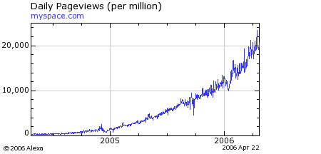
Here’s a sobering thought: If the operators of MySpace cleaned up the site and followed modern interface and web application principles tomorrow, here’s what the graph would look like:
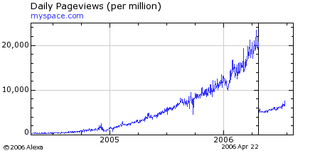
(Editor’s Note: I originally fat-fingered the first graph above when uploading it and used the Reach graph by mistake. Fixed. Both graphs show the exact same curve, however. Thanks to Owen Thomas of Business 2.0 for the heads-up.)
Read more…
Hacking A More Tasteful MySpace
UPDATE: (10/15/07) If you’re noticing jumbled text in Firefox while using this layout, simply change
"line-height: 1px" to "line-height: auto" in the body section of the CSS.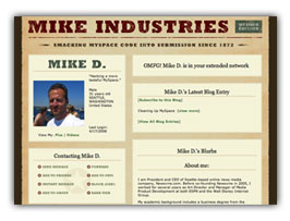 A guide to creating a more tasteful MySpace layout. Sample images and CSS are included at the bottom. End product: myspace.com/mikeindustriesThe social phenomenon that is MySpace is one I don’t fully understand, and yet, one I must fully respect. In fact, with over 50 million unique users, it is something everybody must respect. Any website which rolls up that amount of usership is doing something very, very right, and no matter what your thoughts on it as a vehicle for your own expression are, you must give it its full due for what it is to seemingly everyone else.
Several weeks ago, I finally signed up for an account, and within seconds I was instantly put-off by what had been created for me: a hastily-designed “profile page” with uninspired colors, misaligned tables, and a mish-mash of extraneous cruft and design elements which made this feel more like a halfway house than a “home”. Now, granted, I am a designer by trade so my tolerance for this stuff is orders of magnitude lower than most of the population, but clearly, this was not a place I even felt comfortable having my name on.
So with the default home page this underwhelming, what is a MySpacer to do? Customize, of course. One of MySpace’s greatest features is its ability to let you skin your own home page. Unfortunately, 99% of the customizations I’ve seen are chalkboard-screechingly awful, but what could a MySpace home page look like if some actual design thought went into it? That is the question I sought to answer.
But first — as Keith Robinson asked me when I first showed him what I was doing — “Ummm, why?” The answer is twofold. First, I love a design challenge. Second, we’ve been building a lot of new social components into Newsvine over the past several weeks and I wanted a good reference point for what is already done well online and what could be improved.
So without further ado, on with the surgery…
Read more…
Fun With Brits

What on earth is going on here? I don’t know, but I couldn’t pass up an opportunity to create another Brit Pack Vanity Fair cover.
Click for a larger image… suitable for wallpaper in size. Questionable, however, in content.
How to Use Gmail over IMAP
I had a very simple idea yesterday to get Gmail to work through IMAP and wanted to share it in case it is of use to anyone else.
Warning: This is clearly not rocket science and I’m positive that thousands of people have already thought of this and are already doing it. It just didn’t occur to me until now.
The problem: I like mail applications better than web-based mail. I am especially not fond of the way Google’s threads work. I understand that this format works for some people… it just feels weird to me though. BUT… a Gmail account is great to have because of its free storage, spam filtering, separation from my own domain, and search capabilities. So very conveniently, Google enabled POP access to Gmail accounts several months ago. That’s great, except I don’t like POP either. It’s fine for people who only use one computer, but the second you begin using a multiple machines, it’s a synching nightmare.
Enter IMAP e-mail. With Dreamhost’s IMAP e-mail setup, I can maintain an unlimited number of e-mail accounts with over 20 gigs of storage space and keep it all automatically synched between as many computers as I want. Awesome.
The only problem is that while Gmail supports retrieving of e-mail via POP, they don’t via IMAP. So what can I do if I want to continue using my Gmail address for filling out forms on the web and benefit from its excellent spam/phishing filters? Easy! Set it to automatically forward to a special IMAP account! Since Gmail’s auto-forwarding feature leaves headers for the most part intact, I can now receive fully synched, fully intact copies of all my Gmail messages to any computer I happen to be on. Here’s how:
- Set up a new IMAP mailbox with your mail provider. The address could be “abcdefg@yourdomain.com”… doesn’t matter. It’s not public-facing.
- Set your incoming mail server to its normal settings.
- Set your outgoing mail server to “smtp.gmail.com”, check “Use SSL”, and use port 465.
- Go to Gmail’s POP/Forwarding settings panel.
- Turn on forwarding and forward to the special address you’ve set up.
- Set Gmail to archive your mail after forwarding.
That’s it. You’re done. Gmail over IMAP. That such an obvious solution has escaped me for this long is evidence of possible senility. Excuse me while I go stir my fiber drink.
I Steal Television Shows Because I Have To
 This morning, via Cory Bergman and Lost Remote, comes word that Charter Communications has been sending letters to their customers telling them to stop BitTorrenting HBO shows. Essentially, HBO has been watching torrents and trackers looking for the IP addresses of everyone who is “sharing” one of their shows. Upon identifying an IP address and associating it with a filename like “The.Sopranos.S06E02.HDTV”, HBO will send a letter to the ISP who owns that IP address urging them to revoke that customer’s internet access altogether.
First let me say that I believe in HBO’s right to stop their shows from being shared online. Sorry, but I do. The Sopranos is property of HBO and the only license they grant is for you to either a) watch it on HBO, or b) buy/rent the DVDs. HBO is a premium channel so you pay for the right to watch their stuff and you don’t have to deal with commercials. Fair enough, as far as I’m concerned.
Notwithstanding the above paragraph, it’s interesting to note the steps that HBO must take in order for them to actually have these letters sent. They must first equip themselves with the same BitTorrent software that they seem to be fighting against. Then, they must seek out these Torrents, and I believe actually participate in them in order to verify that a file named “The.Sopranos.S06E02.HDTV” is actually the Sopranos and not a one-hour home movie from god knows who. So it’s clear they have to actually download the file. This would seem to be illegal, but I guess they’d let themselves off since they own the content. But with BitTorrent, when you download, you also upload, so not only are they sucking the file down to their machines, but they are also willingly distributing it to others. I know the goal is to just catch thieves, but isn’t this very entrapment-like? I don’t want to get any deeper into the legal aspect of this because a) I’m not a lawyer, and b) it’s probably possible to download from BitTorrent without uploading, but I just thought it was interesting.
Throwing HBO aside for a moment though, I’d like to publicly admit to my ISP (Qwest) and the rest of the world that I, too, steal television shows.
My cable provider is Comcast. I pay for a premium package including HDTV, an HD-PVR, way too many channels, and HBO. I watch stuff live whenever I can, and I don’t mind commercials. I take that back. I mind the Applebee’s commercial with the damn Gilligan’s Island theme song parody. I HATE that thing.
Occasionally, however, I am doing other things, such as working, when one of my favorite shows is on. In the past, I have either set my VCR to record these shows or set up the old Season’s Pass on the DirecTivo to do the trick. But since Comcast bugged me time after time to switch away from my DirecTV service and onto their HD Cable Service with PVR (that’s Painfully Volatile Recorder), I now have to rely on the technology Comcast has chosen for me in order to catch Survivor and 24.
So without getting into the ugly specifics of the Comcastorolasoft PVR (I’ve done that three times on this blog already), let me just say that this recorder obeys orders about as reliably as Internet Explorer renders CSS. That is to say, sporadically, sloppily, and at times, without reason. Not only have I missed entire shows but I also missed the final minutes of two extremely important basketball games even though I set the box to record well over the allotted time of the show.
So when you’re in the middle of a season of 24 and you miss an episode because your cable box was too busy, ummmmm, displaying the time, what do you do? What CAN you do? There are no repeats. There are no free downloads for cable subscribers. The only thing you can do is hop on Azureus and BitTorrent yourself the episode you missed.
And that’s what I do. About two or three times a month.
It’s not clear who is at fault here on the technology side so it’s hard to point fingers. It’s either Comcast (the providers of the service), Motorola (the makers of the PVR), or Microsoft (the engineers of the PVR’s operating system). Those who know me would guess I’d be most likely to blame Microsoft — and I do — but the only company I’m willing to give a bit of a free pass to here is Motorola. It’s not clear they have any control over what’s going on. Comcast, on the other hand, does. Even if the cause of this PVR’s instability is the Microsoft OS, they are the ones who approved and continue to approve its use in the Seattle metro area (other areas around the country do not use the Microsoft OS).
So who are the losers in this whole equation?
- TV Advertisers: When I download a show, there are no commercials for me to watch.
- TV Stations: When I download a show, I am not tuned to a TV station, so theoretically, if Neilson homes did this, ratings would go down.
- Everyone involved in creating TV shows: By bypassing the economics of television distribution and monetization, I am decreasing the amount of money in the system and therefore the incentive to create great shows.
- Qwest: Because I am downloading 350 megabyte shows, I am sucking up unnecessary bandwidth from my ISP.
- Me: I hate downloading shows. I have to watch them on my laptop instead of the HDTV and there is often a few day delay in actually procuring the program.
And who are the winners?
The only person I can think of is perhaps the person who doesn’t pay for TV at all and is receiving tons of shows by virtue of this growing TV-sharing environment on the internet.
So what’s the solution to this whole problem? Well, I have a few obvious suggestions:
- Cable companies, please fix your PVRs already. Buy Tivo if you have to. In three years using a DirecTivo, I never missed a show.
- Whether you’re a cable or satellite company, offer as many of your shows on-demand as possible. Comcast offers most HBO shows on demand, so even if I miss an episode, I can view it whenever I want. In other words, Comcast and HBO have seen to it that if you pay for HBO, there is no reason you should ever need to download an HBO show illegally. Good move.
- Continue the policy of prohibiting commercial-free, illegal copies of shows to be distributed over P2P networks but change the game entirely by offering perhaps both pay-per-download and ad-supported versions of shows online.
I have no indication that suggestion number one will happen anytime soon, but numbers two and three are already at various points of development. I can only hope that when these new models mature, the economic model for television will remain viable.
Until then though, I will keep stealing TV as long as technology forces me to.