Make Your Site Mobile-Friendly in Two Minutes
 After checking out B. Adam Howell’s excellent IYHY.com site a couple of weeks ago, I thought it might be a good idea to write a little tutorial about how to make your entire site more mobile-friendly without even touching your pages. You may think that since you write valid code and separate structure from presentation at all times, your site already works great on mobile devices. You may also think bad things don’t happen to good people. In both cases, you’d be wrong.
The fact of the matter is that the state of HTML rendering in the wireless world is all over the map right now. Some browsers, like Pocket Internet Explorer, are actually pretty good at parsing through standard web pages. Others can scarcely handle layout rules at all. And still worse are the mobile browsers that load all CSS and javascript files, attempt to use them, and screw up the experience even more in the process.
What’s really needed until HTML/CSS/JS support is improved in mobile devices is a little server-side filtering. By pulling out everything a mobile device can possibly choke on before it even gets to the mobile device, we can create a mobile version of our site which is not only viewable on more devices but is much quicker to download as well.
And you know what? The mobile version of your site is probably going to be much easier on screenreaders too.
Four easy steps
Outlined below are the four steps to get this done in a matter of minutes, provided you are in an Apache environment and can run PHP. If you’re not, these steps can easily be adaptable to other technologies.
Step 1: Set up a domain mirror
If your site lives at www.myawesomeblog.com, you’re going to want to set up a subdomain at mobile.myawesomeblog.com. How you accomplish this is usually pretty straightforward but differs depending on your host. I use Dreamhost and from their control panel, I can add subdomains effortlessly until I pass out from excitement. You want to set up your subdomain as a “mirror” of your main site, meaning the subdomain is really just pointing to your existing site.
Step 2: Create global_prepend file
The next thing we’re going to do is a create a PHP file which will be automatically prepended to every page of our site. Call this file something like "global_prepend.php" and throw it at the root of your server:
This code uses a PHP function called ob_start() to read in your entire HTML source, run some rules on it, and then send the output to users’ web browsers… all in real time. The first "if" statement simply checks to see if the user is coming from our special “mobile” URL, and if so, runs seven replace statements on the code. Here’s what each line does:
- Changes all URLs to “mobile”-ized URLs.
- Strips all linefeeds, carriage returns, and tabs.
- Trims multiple spaces down to one (HTML doesn’t recognize more than one space in a row).
- Changes any anchored images with alt text to plain text anchors.
- Strips all stylesheets, images, inline styles, scripts, and comments (including RDF).
- Tells search engine robots not to index or crawl the mobile version of the site so as to not create duplicate listings.
Step 3: Create global_append file
Next, we need to create a tiny PHP file which will automatically get added to the end of every file on our site. This is the code that actually outputs the page to the browser. So the flow is like so: Suck code into buffer, siphon fat away, spit contents of buffer into browser.
The code for the global_append file is below. Call it something like "global_append.php" and throw it at the root of your server:
Step 4: Enable prepends and appends using .htaccess
If you don’t already have an .htaccess file at the root of your server, open up a new text file and add these lines to it:
php_value auto_prepend_file /localfilepath/global_prepend.php

php_value auto_append_file /localfilepath/global_append.php
Then save it to the root of your server with the filename ".htaccess". If you already have an .htaccess file, just add the above lines to it.
* Important Note: If you copy these two lines from your web browser, you might need to delete the carriage return and make your own. Sometimes a browser’s carriage return will cause your .htaccess file to fail (you’ll know immediately if it has failed because your site won’t come up).
Assuming your subdomain is live, you should now be able to hit your site in a web browser using the special mobile URL and see a nice, compact, imageless, styleless, scriptless version of your site. Voila!
Here is what Mike Industries Mobile looks like.
A look at the results
Let’s look at some before and after shots of Mike Industries and a few other notable sites when taken “under the knife” (screenshots are from a Treo 600):
Mike Industries |
|
|---|---|
 Size: 72k Time to render: 33 seconds |
 Size: 26.1k Time to render: 5 seconds |
Mezzoblue |
|
 Size: 31k Time to render: 22 seconds |
 Size: 8.3k Time to render: 5 seconds |
Stopdesign |
|
 Size: 68k Time to render: 28 seconds |
 Size: 15.7k Time to render: 5 seconds |
Zeldman |
|
 Size: 29.8k Time to render: 17 seconds |
 Size: 25.3k Time to render: 13 seconds |
Shaun Inman |
|
 Size: 101k Time to render: 39 seconds |
 Size: 18.9k Time to render: 5 seconds |
Joe Clark |
|
 Size: 97.1k Time to render: 23 seconds |
 Size: 58k Time to render: 7 seconds |
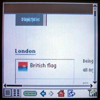
Gizmodo |
|
 Size: 177.6k Time to render: 62 seconds |
 Size: 46.2k Time to render: 7 seconds |
The figures above illustrate both speed and compatibility improvements in all cases and this is with image loading turned off on my device. Flip image rendering back to its default setting of “on” and the improvements are staggering.
It’s important to note that the tests above do not point to any coding problems or inefficiencies on the part of the site authors (except for mine, which is just a big pile of crap). The fact that sites above average about 30 seconds to even begin rendering is more a function of the speed of cellular networks and the inability of some mobile devices to efficiently display content. Since we can’t change either of those things, we do what we can in the meantime, and that’s what this is all about.
Notes and thoughts moving forward
- I openly invite anyone reading this article to suggest improvements to my replace statements in the
ob_start()code. The Wolf has spit milk through his nose checking my regular expressions in the past, but with his help and the help of the best tutorial in the world, the regexes are pretty tight now. If you have any modifications or additions, post them in the comments and I’ll merge them in if appropriate. - Using
ob_start()requires PHP to parse through your pages, thus creating additional server load. Dreamhost lets me test CPU load and I don’t notice any problems or performance degradation, but if you’re hosting on a Commodore 64 or in an extremely high traffic environment, just make sure everything is still humming along after you’re all set up. - In order to use auto prepending and auto appending, you must be running PHP as a standard Apache module and not “as cgi”. If need be, you can run PHP as Apache sometimes and CGI other times by using your .htaccess file to specify rules.
- I specifically left out much mention of accessibility in this article because each site and each screenreader are different, but you can begin to see how radically we can simplify pages on the server-side to improve such things. In the world of accessibility, simpler is almost always better. It’s the reason why Joe Clark’s name is only two syllables.
- Finally, there are all sorts of ways to expose your “lite” version to users. I
will probably simply add a “lite” themehave added a “Mobile Version” link to my selection of themes in the sidebar, but you could just as easily write a snippet of javascript to automatically send people with screen resolutions of less than 640×480 or certain known wireless user agents to your lite site. - Note to Dreamhost users: Dreamhost runs PHP as CGI by default. To switch it over so it runs as an Apache module, just go to “Domains > Manage > Edit” in the control panel. Then, uncheck the “run PHP as CGI” box. Also, if you have HTML pages on your site that aren’t PHP, you can force them through the PHP interpreter by adding this line to your .htaccess file:
AddType application/x-httpd-php .html .htm
…and accessiblity on the server side begins (returns?). ;) I like this method very much – it makes perfect sense to me.
Minimal overhead and maximum result.
Very good. I’ll implement this at once.
Very nice. Although this assumes the content/content strategy of the site in questions is appropriate for a mobile device.
I’d argue that in many cases (and in addition to the rendering) the content itself may need to be tweaked for mobile consumption. But I suppose that’s another conversation altogether.
Excellent tutorial, Mike. The real problem has been the mobile browsers, on the TREO for example, that attempts to load the js and the css and render them as if its a big-boy browser. Your method solves that.
It would also be nice, if it can be systemically detected, to replace all form objects that have an “onchange” submit, and dynamically add a “submit” button. I found this out hard way while testing several of my sites.
Great work.
For full mobile support, it would be a better idea to use WML, HDML or XHTML mobile profile, instead of a two-minute hack. But, very nice.
Since Unobtrusive Javascript (or progressive enhancement, pick the one you prefer) practices forbid that kind of things (in favor of removing the submit button and adding an onchange handler at runtime) and Mike’s script removes the scripts calls, this shouldn’t be too much of a problem on a well coded website.
Or would it?
It would also be nice if any of those were supported consistently across devices.
I shall like to do this here at K-State. As we don’t do PHP, it will have to be re-done in Java, but that shouldn’t be an issue. Great technique!
1997 all over again! Can’t we just skip over the next 8 years and just get to the good stuff? ;-)
Amazing! Completely in-depth. Just the resource I’ve been looking for.
I was thinking about something: in the current state, you need subdomains for the technique to work, but not everyone has access to subdomains, especially on some free or lowly princed hosts (students and the like can’t always affort a “true” hosting solution).
I guess the solution would kinda look like that:
First of all let’s change the “if” check to
then add a rewriting entry for to map /mobile to ?mobile (no need for a value) (or modify existing rules accordingly), and finally change
str_replace('http://domain.suffix', 'http://mobile.domain.suffix', $buffer);to
str_replace('http://domain.suffix', 'http://domain.suffix/mobile', $buffer);would anyone care to test?
It would probably be possible to get rid of the rewriting need through some work with regular expressions powered replaces.
Anyway, truely great and inventive solution Mike, kudos to you
Great tutorial Mike.
This is a nice solution to the problem of cross publishing to the mobile devices. A couple of quick notes to add to the discussion.
1. Tom is right, it is better to make a WML or XHTML-MP version of your site, getting the target size of your pages down to less then 20k per page. But to Kevin’s point, most modern mobile devices support WAP 2.0 and if you write good XHTML-MP content you should be good on most devices.
If you are worried about supporting the maximum amount of devices, WML is still the way to go.
2. Most carrier styleguides call for a maximum of 10-12 links per page (here is a link to Cingular’s) For the maximum consistency across multiple devices, it’s worthwhile to checkout a few mobile styleguides.
3. The Treo 650 has a 312Mhz processor, significantly more powerful than most mobile devices, which will impact your rendering time.
4. PHP has spotty support on a lot of phones. For example a lot of Samsung phones will choke on PHP.
Sad, but true for both mobile browsers and web browsers…
Mike: Well, you certainly beat me to the punch, didn’t you? Very nice. I thought the idea was great when you first suggested it and now seeing it in action I’m still just as impressed.
Now, the only question is, should I make a mobile.iyhy.com version of IYHY? ;)
Brian wrote:
Brian, could you elaborate? As PHP is completely server-side, do you mean that Samsung phones choke on URLs with query string variables? Or do you mean that Samsung phones don’t like the .php filename extension? Or is it a content-type header that’s returned by the webserver that Samsung phones don’t like? Any of those things can be overcome, and I can’t see how a browser can tell if a webserver is using PHP behind the scenes to handle requests, or if the webserver is pulling static HTML files.
</tangent>
Mike, here’s a thought worth considering if it doesn’t stray too far from the topic at hand; one I had to face while preparing my presentation: I’m all for hacks like these, as they’re shamelessly easy to implement.
But are we ignoring the content-, context-, and feature-specific needs of mobile users? If I can afford only a few minutes to produce a mobilized version of my site, what’s presented here is excellent. But should it be used across the board, or should I first understand how/what/when mobile users will access my site, and then address the display issues once I understand that?
Regardless, resources like these can only help push us in the right direction regarding mobile web design. (And feel free to kill this comment if it’s too far off topic.)
This is great stuff. This home mobile accessibility thing is really picking up pace. nice
Kevin and Cameron: Yes, I feel the same way about content for mobile devices as I do about content for the completely blind — without specifically crafting the experience for them, you’re not really optimizing their experience to the fullest. That said, however, unless you have the time and desire to do that, this two-minute solution gets you decently close to where you need to be.
Tom: WML, HDML, and and the like will work on some devices but not all. Simple HTML is the same way. Depending on your needs, you could easily tweak the regular expressions to spit out whatever language you’d like, as long as it’s a tag-based SGML derivative.
Masklinn: Yep, doing this with cookies instead is a great method if you can’t set up subdomains. I originally thought about doing it with cookies anyway, but I just like having a special mobile URL I guess. Thanks for posting that code.
Brian: Thanks… good info. With regards to mobile styleguides, however, I’m not real big on them. Phones change so quickly that the spec someone wrote last year is scarcely relevant anymore. The only thing I know for sure in the mobile world is that the simpler you make things, the more devices will be able to display it and that’s really all this method does: strip things down to their bare bones. Also, to echo another commenter, what is the issue with PHP? PHP is server-side and no mobile device could possibly even know PHP was running… unless I’m missing something.
B. Adam: Yes, it’s amazing how much work you can get done on your blog when you quit your job!
Mike, obviously, not mobile browsers support them. I agree. But for a bit more full and better support, it would be nice if we started with something that was designed for Mobile devices. That will also provide a little help to standardize all the mobile browsers in the long run.
I also disagree on using PHP regex to spit out to another language. That means you are doing more work than necessary. PHP was not designed to be a transformer for different markup languages originating from XML. Always starting from XML and using XSLT, XPath or any for-XML method to transforming is faster and a better idea.
Tom: I totally agree. Ideally, your templates will pull the same data from your database and spit it out in whatever language you need. In a best-case scenario, everything happens at the template level. XML with XSLT may be the best solution for the future as well.
My solution in this article is more of a “retrofit” solution. If you don’t have the time or desire to do what’s mentioned above, this gets you to a decent and practical place… in about two minutes.
You are right Mike. It is indeed a good two minute hack. Obviously, this hack would be ideal for majority of the readers and web developers out there. It would be too much for them to sit around and have a truly accessible site. I certainly understand what you’ve done, and appreciate it. :)
Mike –
Cool tutorial, but I have one question. All the sites you give examples of are blogs. Have you tested this out on any corporate type sites which aren’t blogs or designed completely with CSS?
Looks interesting Mike, but what I really want to know about is that first picture in the article and that great powder blue suit and tie ;-)
…or you could implement XHTML, Web Standards symantic code and a stylesheet with media=”handheld” declared…no?
My own site and those of my clients looks pretty much like your ‘after’ screen grabs on small devices Mike and I’ve never had to resort to any server side hacks despite tesing on a wide range of different handheld platforms. Opera for small devices or ‘Dorris’ are pretty good at rendering XHTML pages I find as well.
Don’t get me wrong – your example above is a nice idea for those who are not on board the Web Standards movement yet and need a quick fix but I do feel that ultimately it’s just a lazy shortcut instead of bitting the bullet and forging ahead by implementing projects with Web Standards in mind.
The whole idea behind Web Standards is that it sets a design/mark-up standard by which we should all [by now] be working to. After all, they are designed so that Web content is accessible and available for display on a wide range of devices that’s the whole purpose.
Both the Web design community and the manufacturers (espec) of Web enabled devices need to wholeheartedly embrace the concept and actualities of modern web page building instead of looking for the quick fix shortcuts and muddy workarounds – currently we are still in that transitional phase between the old tag soup way and the new cleaner, clearer global standard – if we adopt work arounds and short term hacks, surely we all might as well pack up and go home?
Adam,
Support for media=”handheld” is very very spotty – particularly in my testing on Palm’s web browsers. Beware.
Remember too – that maybe the *newest* browser supports some feature but most mobile users are stuck with whatever browser shipped with their handheld – it is very hard to upgrade to newer browsers. Almost every one I see requires a certain OS revision level or hardware requirement. Another gotcha might be that the mobile device are managed by an internal IT dept. and they’ve only certified browser X because they don’t have the money to train their staff on anything else.
Finally, as stated above… this is a good two minute hack. The CEO came downstairs and said “I tried our company site on my new widgetdoohickey and it crashed the device.” In two minutes you could have this fixed so that you could actually spend the time looking into doing it the right way for your business. That makes a *whole* lotta sense to me.
(And I’ve seen CSS, apache redirects, and server side coding crash Palm devices. web browser 2.0 and pro in particular can get all crashy crashy. It’d be nice if Palm provided *way* better testing environments to web devs.)
Shawn
Not using cookies here, using GET variables, but I guess it’s a typo thingie on your part.
AFAIK the code output by his rewriting script is semantic code, it’s pure HTML/XHTML (whatever the modified website uses), the only modified things in the (X)HTML source are the links which are mobilified… and some lightification of the code (stripping of whitespaces and newlines and such) to reduce the burned bandwidth.
The issue with @media handheld is that I think some devices don’t use it and always try to use @media screen.
Unstyled content (which is what is fed to the device by this snippet of code) always is a good base anyway.
I don’t really get your ‘standard’ issue here, in fact, since Mike’s snippet only output 100% (X)HTML standard compliant and purely semantical code if the source page complies to the standards… he’s not creating a new page in a new language, he’s just getting rid of presentational and behavioral informations to bare the structural markup to the user agent… and it’s not even like he was creating a new version of the site, duplicating content and updating efforts here…
And you can see how long it has been since I left comment on a weblog… I just put my last name after it like it was an email. Shoot me now.
Tom, I don’t know if it’s that it would be “too much” for the majority of us to “sit around and have a truly accessible site”, but what’s particularly good about Mike’s approach from my point of view is that it can be easily applied.
The more of this work I do the more I am thinking accessibility from the ground up (XML/XSLT as you describe) but for existing projects, it’s great to have a quick fix like this that I can apply to stop the gap until I can rewrite code from the ground up.
…purely semantical code if the source page complies to the standards…
Sure….and if they are not…?
My concern, is that a designer who is still trundling along using tables and spacer gifs comes and see’s this here quick fix Mike has kindly put up on how to offer a mobile version of his tag soup for little effort – a quick fix bandaid if you will. It means he/she is not pushed to adopt current Standards to improve their game and ultimately the end product for the greater good, it’s just a quick ‘Get out of Jail’ card no? – maybe I’m wrong – Shawns CEO example makes perfect sense to me and can see how in those kind of situations it would be a Godsend to an inhouse Web Admin.
Don’t get me wrong it’s a great idea and a clever solution – I suppose in an ideal world we would access web content and the device being used would not only be complient with current standards it would also be able to determine, via the mark up rather than the server, how to display said content – like I said we are still in that transitional phase – double jeopardy I guess :o\
At the end of the day guys, this is still a nice quick fix. Not a catch-all, mind you, but an option worth considering.
Adam: Just a heads up, on a Treo 600 your site’s unreadable because half of your content is on the screen and the other half’s not.
So, if I wanted to actually read what you and your design firm were selling, I’d have to use Mike’s solution, or something like IYHY, in order to do it quickly and easily.
Just, you know, a little FYI.
Snarkiness aside, Adam, almost every mobile device does the web differently and hacks like this are, for the moment, required unless you want to spend literally days troubleshooting every device you can get your hands on.
Like my Treo 600, which can’t conveniently view your site without Mike’s hack or a site like IYHY. Oh, wait, did I already mention that?
Mike –
Do you currently have this feature enabled on your site? Pulling it up just now on my Treo 650 gives me the exact same GUI layout that I’d have on a “traditional” browser – not the stripped down version you indicate in your screenshots.
Adam: Yeah, as others have pointed out, you are missing the point here. Also, the assertion that sites like mine and the other several that I list in the examples are “tag soup” shows a clear lack of effort on your part to even understand what we’re talking about here. My site isn’t tag soup. Mezzoblue, Stopdesign, Zeldman, and Inman aren’t tag soup either. And in fact, the method discussed in this article actually works much better on standards-conscious sites than it does on tag soup sites. The better organized your code is, the better this method will work.
I also echo B. Adam’s comments that your site is completely unreadable on my own mobile device and probably many others as well. You fall squarely into the category I spoke of in the very first paragraph of the article:
Masklinn: Yep, HTTP GET requests, no cookies. My bad. My initial thought was cookies, but even cookie support in devices is spotty.
Mark: Are you pulling it up at “mobile.mikeindustries.com/blog/” ? I don’t have any automatic detection in there (yet) to try and catch you at the normal address.
Mike: – I no way inferred that your site was tag soup anywhere in my posts!!! – if you re-read my comments, I am referring not to obvious people like yourself who are coding semantically but rather to those out there that maybe would see this as a quick fix for possible bad code and yes it’s obvious that the hack would work a lot better on semantic code – that’s a given.
Think you have mis-interpreted my comments far too personally I am really genuinely sorry if you found offence at my feedback, it was not intentional – it’s a great hack okay! kudos – really!
B. Adam: – Thanks for the heads up – shame you felt the need to put it across in such a triumphalistic manner – I really wish I hadn’t bothered you lads – sorry – unfortunately some peeps seem to have missed the point I was trying to make [badly apparently] that I’ve not had a problem with devices I’ve tested – but it seems not all eh B. Adams
Have fun…
Adam: The reason your comments came across that way is that you are basically saying “If you code your sites with web standards in mind, your sites will work optimally on mobile devices”. This is simply not true, and is a main point of this article in fact. Furthermore, you went so far as to mention your own site as an example of this theory and all B. Adam, myself, and others are doing is calling you on that. Your site doesn’t work optimally on mobile devices… and it has nothing to do with the quality of your code. That’s what this little trick helps with.
And, come on, I said “snarkiness aside”. The snarkiness — all of it — had been set aside! The comment was 100% snark-free from then on.
Snark-lite. Reduced snark. 1/2 the snark of leading snarks.
Sheesh ;)
Ah this is an excellent little hack to accomplish a desired effect until browser standards become more upto date
In the global_prepend.php code, what is this for: <script src=”/mint/mint.js.php” type=”text/javascript” language=”javascript”></script>
And also, the script changes all urls to a mobile one, right? But I use relative urls on my site, so it won’t work.
Could you please explain the “mirroring” the subdomain? I have it set up but I don’t understand the process of having it point to the existing site. Thanks.
qwerty: Oooops, that Mint line shouldn’t have been in there. It’s removed now. With regard to relative URLs, they are fine. Since your visitor will already be at the mobile subdomain when they click any URLs, they will continue to be at that subdomain if they click a relative URL.
Tyler: Mirroring is basically just a setting on the server which says “point mobile.myawesomeblog.com to the same place as http://www.myawesomeblog.com“. It’s a setting that is generally available in the control panel of whatever your ISP is. Basically, it creates a DNS entry for “mobile.” which points to “www.”.
If you’re not using Dreamhost, the whole “mirroring” thing will probably confuse you (just as Mike has already said in the original post). I have not seen this feature anywhere else called as such.
If I was with some other hosting company besides Dreamhost (luckily, I am not), then I would write to support asking them how to accomplish this task, explaining it exactly like Mike did above (in plain english).
Great solution btw Mike, although a little Dreamhost centric at the moment.
Oh yeah, Tyler Durden? Is that your *real* name, because if that was my name I would be freaked out (Fight Club, for the uninitiated).
Justin: Is the ability to set up subdomains that point to your site root really that rare? I mean, I think I can even do it at the registrar level (GoDaddy) if I need to. Additionally, many hosts like Media Temple automatically point every subdomain to your root. For instance:
shreddedwheat.shauninman.com goes to Shaun’s root automatically.
I do agree with you that some of the lamer ISPs probably don’t let you do subdomains, but it seems pretty common, no?
Perhaps I misspoke. I know it is really easy to do with Apache and is probably common with all Apache-based solutions. Finding it on Dreamhost was the first time I’d seen it, maybe because it’s usually more hidden or maybe because the wording is different than other (more orthodox) hosting companies.
For the cost, Dreamhost lets you do really amazing things that I never thought I could do for $7.95 a month.
Doing subdomain aliasing at the registrar level is different though, because that would usually just redirect to your primary domain whereas a mirror on the server will actually function identical to your primary domain.
Yeah, I’m kinda having trouble with this mirror thing.
In cpanel, is there a way to do it? What about .htaccess? If so, what is the code I need?
Thanks.
Can’t do it with .htaccess. Why not just email your hosting company’s support staff, you know: support@hostingcompany.com
It’s always worked for me.
It is possible to fake sub-domains with mod_rewrite (in your .htaccess file). Not the best solution in the world, but it’ll work.
Example:
RewriteEngine on
# Ignore [url]www.yourdomain.com[/url]
RewriteCond %{HTTP_HOST} !^www\.yourdomain\.com [NC]
# Treat these request like a subdomain
RewriteCond %{HTTP_HOST} ^([a-z0-9-]+)\.yourdomain\.com$ [NC]
# Make sure that a directory matching the name of the subdomain exist.
RewriteCond %{DOCUMENT_ROOT}/%1 -d
# Tweak the URI to make it match the requested hostname and pass the result on to the next rewrite rule
RewriteRule ^(.+) %{HTTP_HOST}/$1 [C]
# Translate subdomain.yourdomain.com/sample to yourdomain.com/subdomain/sample
RewriteRule ^([a-z0-9-]+)\.yourdomain\.com/?(.*)$ [url]http://yourdomain.com/[/url]$1/$2 [L]
Mike, a quick question that has nothing to do with your current entry.
How do you set up your comments so that whenever you comment, you have a different looking comment body from the rest of the comments. It’s easy to see that in your CSS you use class=”lightcomment mike”… but I still can’t figure out how you doing it. I am sure you’ve been asked this before, but if you could shed some light on what you’re doing here I would greatly appreciate it.
Pete > Since he’s the blogger, he probably has some kind of logging in the blogging software which causes his comments to get the right classes automagically.
It’s a quite common thing, to distinguish the author(s) from the visitors/fakes. You can check it at Malarkey’s blog too, logged in users get to set a little flag on their comments and the arrow at the left is colorized (black for visitors, blue of Ian Lloyd and red for Malarkey)
The software just needs to check if you’re logged in (by checking $_COOKIE for example) and tag the comment appropriately at posting, the tag is then converted to classes at display time.
Late to the party, but I must say this is a nice, quick and convenient little solution to some of the problems we face with mobile web-users.
It’s no end-all-be-all solution, but it doesn’t have to be. Just the fact that it vastly speeds up the experience for said users makes it worthwhile, especially given its insane ease of implementation.
Good job, Mike. Very well-done!
Of the unlimited gayness available on my personal Weblog, you would of course screen-grab a quotation from Fran Liebowitz.
En tout cas, I already have a handheld stylesheet. So.
Or, more correctly, an handheld stylesheet.
Joe: Ha! True that a handheld stylesheet works well when it’s recognized, but it often isn’t. Also, CSS issues aside, the server-side solution shrinks your HTML quite a bit by removing the white space and the RDF stuff.
Also, I believe “a handheld” is actually the correct usage. When deciding between “a” and “an”, you go by the sound. If the following word begins with a vowel sound, you use “an”. So unless you pronounced it “andheld”, it’s “a handheld”. This is why “historical” can go both ways. “An historical” sounds like more “An istorical” when some people say it.
Somebody correct me if I’m wrong.
I’ve always just gone by how it sounds. If that’s because the word following an ‘a’ doesn’t have a consonant then so be it.
Hey, I just specify “media!=handheld” on my stylesheet, that works for me and my Pocket PC. (that’s a joke).
Mike, you’re correct. The choice between “a” and “an” is decided by the sound that follows it. An hour, a human being.
Historical should still be pronounced HIStorical and not “istorical” though, no matter how many people (wrongly) do the latter.
I don’t think you can argue pronunciation Faruk, that is too culture dependent. If you want to get technical, look at the dictionary for “proper” pronunciation.
HIStorical sounds too masculine for my liking anyway.
Hi,
I tried to follow your (simple) four-steps with no success.
I still see the regular site, instead of ‘text-version.’
Like you, I’m DreamHost’ subscriber. Actually recommended by you…
Q: Does this sound correct? (.htaccess file)
php_value auto_prepend_file /home/arthaus/arthauscommunications.com/global_prepend.php
Thankx in advance,
Arthur
Good, quick hack; however, there is one flaw in particular that stuck out to me. If you use the <pre> element and white-space matters, you might want to improve the preg_match() by not removing duplicate spaces and linebreaks within <pre> elements.
Arthur,
I may be wrong here, but I put my paths relative to the webroot, not the physical root. So in your case, it would be:
php_value auto_prepend_file /arthauscommunications.com/global_prepend.php
Nice! One question though, it appears that if $_SERVER[‘SERVER_NAME’] yields the server name set in Apache, so the result would be the same regardless if it was typed in mobile.myawesomeblog.com or http://www.myawesomeblog.com, at least that is what happened for me.
I found that the $_SERVER[‘HTTP_HOST’] worked better as that provided the URL typed in the browser…
Then again I may have screwed something else up in Apache so…
There should be no difference between those two variables, but I would use SERVER_NAME if anything just because that is the typical method of retrieving the domain name as typed in the browser.
You can see what this variable (along with many others) is set to by making a simple PHP page that looks like the following:
<?php phpinfo(); ?>
If you are seeing a difference between these two variables, your server may have a problem.
Arthur: Dreamhost runs PHP as CGI by default. To switch it over so it runs as an Apache module, just go to “Domains > Manage > Edit” in the control panel. Then, uncheck the “run PHP as CGI” box. Also, if you have HTML pages on your site that aren’t PHP, you can force them through the PHP interpreter by adding this line to your .htaccess file:
AddType application/x-httpd-php .html .htm
Jordan: Good idea. Let me tweak the regex (or you could if you’d like, and I’ll get it merged in).
Justin: If Apache has been set up with one server name “mydomain.com”, I would assume that this is the name that is returned when using SERVER_NAME regardless if the address typed in is “mobile.mydomain.com” however the HTTP_HOST will return the typed address.
When trying phpinfo via localhost, HTTP_HOST indiates localhost, while SERVER_NAME indicates mydomain.com
As you said, there may be something wrong with the setup of the server.
Mike; I still cant get your hack to work just right, but again that may be the way my page is built up, or the serverconfig…
I have “similar” problems with htaccess where I try to implement a rewrite rule to change the way the address appear on my site, that won’t work either.
So I guess its likely to be something in the server set up.
If anyone have any idea of what may be wrong, I would appriciate the help.
Thank you.
> uncheck the “run PHP as CGI” box
How’d you leave that one out of the original article? I wonder what the effects of doing this are, since Dreamhost highly recommends that PHP is run as CGI (to put it in their words)?
Justin: I just added the note about PHP-as-CGI to the end of the original article. As for Dreamhost “highly recommending” running PHP as CGI, the only difference is that you won’t get to use some advanced things like the “exec()” command. You can always run it as CGI in the instances when you may need to.
Hi Mike,
I switched PHP to run as Apache. And still I see the same site (while loading http://mobile…)
I have all of the three files on top level. Since my Dreamhost account hold 15 domains. The three files (.htaccess + global_prepend.php + global_append.php) reside top-level of one of the domain.
My .htaccess file hase the following…
—
AddType application/x-httpd-php .html .htm
php_value auto_prepend_file /home/arthaus/arthauscommunications.com/global_prepend.php
php_value auto_append_file /home/arthaus/arthauscommunications.com/global_append.php
—
I must be doing something wrong!
Mike et al,
PHP as CGI is more secure and safe to use than PHP as module. There are a lot of aspects to it, and it’s much more than not being able to use some functions. However, increased security, good thing :-)
(and if anyone wants it, I can ask our sysadmin what all the major benefits and drawbacks are; I work at a webhost & webdevelopment company :-))
If you simply strip out all whitespace between brackets, what happens when you get something like this:
<b>Something in bold</b> <i>something in italics</i>
it will come out as
something in boldsomething in italics.
which has bitten me before.
I think it’s safer to just reduce all runs of whitespace to a single space, unless you want to use a more complicated regex.
Nice! As I am working on a redesign I will have to include this. Thanks!
What if you have ob_start() somewhere else in your PHP code (cached content)? Existing <meta name=”robots” content=”all”> – do the spiders only honor the last one found?
Great tutorial Mike!
(Editor’s Note: Not sure what happens in the case of multiple ob_starts. Should be easy to test though.)
Faruk, I would like to hear what the admin has to say about PHP as Apache vs. PHP as CGI. I know the CGI flavor is safer…but I don’t know why.
I don’t really know the current state of phone browsers as I haven’t been programming web sites for phones for about two and a half years. In the past most phones (I mean phones, not PDAs or PDA phones) ignored the CSS. My old Treo 600 didn’t support the handheld media type, but my Treo 650 does while also reading the other CSS files. The Blackberry units have horrible web support. The new units do support some CSS though, but don’t seem to recognize the handheld media type. For my site I provide a handheld CSS file that turns off what my screen CSS file does and pretty much follows the principles of creating a “zoom” layout.
Thanks for giving me the inspiration to take my website mobile. http://www.knoxvegan.com
This doesn’t look like it’s stripping style sheets that are referenced with @import. Is that the case? Any ideas on how to add that in?
(Editor’s Note: Thanks Dan. You’re right. I’ve just updated the code to fix this issue. Now all style tags are stripped as well.)
Thanks mike great tutorial :)
I’m willing to buy a mobile phone to show clients my site on the phone,
what phone do you guys think will be best for the job :)
There are various pros and cons to using php as CGI vs mod-php, the apache module.
URL frobbing: url?var=val&var2=val2 will work, but nothing tricksy will work with php cgi unless you use mod-rewrite.
Security: if you are using mod-suid, then cgi scripts will run as you, which means the files that your website holds will not be accessible to the scripts running in the websites of other users on the same machine. This is a significant security gotcha, but correctly setting apache’s ‘suexec’ setting should resolve it.
I think there’re ways to make mod-php run suid, too, but I won’t swear to it.
More Security: mod-suid CGI scripts run as you, which means they have full access to your directory, and all your info, public or private. Major security gotcha, hard to getaround, but at least you’re not making other users vulnerable.
Directives: Custom PHP .htaccess directives require mod-php.
$_SERVER[‘SCRIPT_NAME’] evaluates wrongly under cgi php.
Custom 404s. I think php-ified 404 pages need mod-php. At least, doing them with CGI is a bit of a pain.
Processes: as I understand it, cgi php launches a new process and loads in all the source and recompiles it every time you run a php script. mod-php caches the compiled versions of frequently used scripts instead.
On balance, mod-php is more powerful and can be more secure than cgi php, but requires a little more caution.
Hi Mike, I post my simple solution at the problem of set up subdomains that point to main site. It is probably the operation Dreamhost automatically makes. I have Cpanel and it works.
The steps are:
1. Create a subdomain “alfa” with your Control Panel
2. if the directory”alfa” in your web space has been created, remove it
3. Create symlink named “alfa” to public_html
4. End.
In Windows host, I don’t know if works.
Mike Just one thing I would like to point out ,aren’t mirror pages a bad thing for the search engines, as they penalize sites that have duplicate pages and mirror pages, is there another way without have to create the subdomain?
Regards Paul
OK, if we don’t get it listed in the engines – how do we let people know where the mobile version of the site is?
Looks great, but how do we get the faces in front of it?
It would also be interesting to not have the search engines banned from the subdomain – the changes listed may well be enough to make it ‘different’ content. I won’t be testing it though ;)
Paul: That’s what the “no-follow” thing in the replacement code takes care of. It makes sure the mobile pages don’t get indexed.
Lea: Yep, that’s an interesting question. I just have a little button in my sidebar. Ideally, the prefix “mobile.” would work on every site.
Isn’t the .mobi domain intended to do similar? Be a mobile variant of every site? (Silly idea.)
I wonder how one would convince the mobile makers to preset their browsers to check for existance of mobile.mydomain.com first when sent to http://www.mydomain.com?
:)
Hi Lea,
When the .mobi domain name comes you problay would only have to change the mobile.doamin.com url in the “global_prepend.php” to domain.mobi.
Is that correct Mike?
(Editor’s Note: Theoretically, yes… but you’d have to make a separate DNS entry for it I believe.)
Hi Guys
Just seen this article tried it out – fell over. Can make sub-domains. Pointing, do you mean redirect ’cause pointing I thought meant you needed to ‘park’ a domain first! And they have to be registered.
Ok when I enter the 2x lines into .htaccess (below) the whole website falls-over.
—
php_value auto_prepend_file /localfilepath/global_prepend.php
php_value auto_append_file /localfilepath/global_append.php
—
Anybody else get this or am I just a nobrainer. I did edit the .php files to reflect my site and subdomain by-the-way.
Anyone?
Regarding the poster earlier worried about people not following “web standards”. The real question is, is the “standard” better then a quick way that happens to get the job done exactly the way it needs to be?
Most people don’t know about “best practices”. In order to apply them, they would have to spend time learning something new. Perhaps many years. When do you stop learning and actually do something with what you’ve learned? Who do you trust to tell you what the “best practice” is? Industry? Someone who’s famous? A friend? An “altrusitic” organization? Suppose you apply it and it doesn’t work for you, who is at fault? Could it simply be that you are a different person then the one who tried it and succeeded doing it that way? And even if you decide you simply haven’t applied it correctly, how do you know that you will get the same end result that the successful person has?
The best advice any person can give to another is for them to simply do WHAT WORKS. I.E., if they like the result and it works for their situation, then that’s the correct practice, end of story. Telling them they have to go and learn a whole new way of being when they don’t want to because they are already getting what they want is counter-productive. The person simply won’t do it, and no amount of “but standards are better!” logic is going to convince them to change their minds. Nor should you try. They are happy, so you should be happy for them. And realize that YOUR way can be different, because you are different. So use the standard if it appeals to you, but realize that there WILL be people who don’t like the standard because it doesn’t meet their needs. Is that the fault of the person, or the standard itself?
Great tutorial. I posted an article on my blog about my integration experience (using Dreamhost, of course).
This will be super-easy to fix, just a matter of trial and error. Anyone recommend one route or the other?
Great tutorial, perfect for my needs, only I can’t get it to work. Setup the mirror subdomain no problem, set both auto_prepend_file and auto_append_file no problem, I have checked this by running a simply phpinfo script whichs shows my files are assigned. When I access any of the html files in the site there are no changes. I’m virtually sure you won’t have time to deal with my problems but I thought it was worth an ask seeing as I have spent 48hrs on a 2 min tutorial.
Wow this is great info.
I have been using .htaccess and am surprised at the awesome power of it.
I have been using Crucial Paradigm for hosting and they treat php scripts just great
Hope that helps
Rob
A nice link telling users to vistit your mobile friendly site — if they vistit your normal not friendly site myawsomeblog.com?
This php script is great however what if a user comes to your regular website – not knowing you have a mobile friendly version. It would be nice to direct them automatically – though I don’t know how to do that – do you? A nice solotion is to provide them with a friednly link to your mobile.myawsomeblog.com. Try this:
screen.css
#handheld {display: none}
handheld.css
#handheld {display: block}
head:
<link rel=”stylesheet” type=”text/css” media=”screen” href=”screen.css” />
<link rel=”stylesheet” type=”text/css” media=”handheld” href=”handheld.css” />
body:
<div id=”handheld”>
<a href=”mobile.myawsomeblog.com”>visit my mobile friendly website.</a>
</div>
<div>
your normal page stuff
</div>
This way the friendly link only appears when a user comes to your site using a mobile device.
Disclaimer: if you go to my site right now – it SUCKS. I’m in the process of a coplete overhaul – come back in Jan – it should be WAY better
Thanks for the script!!!!
If your web host uses suPHP, you will need a different approach.
Add this in your .htaccess file
AddHandler x-httpd-php .php .htm .html
suPHP_ConfigPath /path/to/your/new/php.ini
You need to copy your web host php.ini file, change the prepend and append entries in the ini file and upload it on your server. The .htaccess file will then tell suPHP to use that new php.ini file.
Hope I save people some time, I had to dig this one for a while.
I followed your instructions to the letter but still it isn’t working they way it appears on yours. All the graphics are still in place. Take a look http://mobile.iamwhistler.com.
Do you have any suggestions?
well ive tried it but having some problem with mirror :(
Sorry for my bad english..
I am very happy to find this interesting page and i agree with Tom about XML, as i thank Mike for this great “hack”.
But in fact i think that the problem, concerning 3G phones, in to target the proper contents for the service.
For example, even if i can correctly put in the mobile browser all the informations of the original website i can see that the texts are too much long, that the informations not essential, the menus too longs, and so on.
These conclusions come from a test i made this week (based on php and ereg too, but using fopen).
So i think that the mobile internet version of a site (for example for the internet site of a town like Rennes) should concentrate the very useful services for a mobile user. Car traffic, air and water quality, brief news, and especially link to phone numbers with the ability to click and call.
So the ability to catch quickly rss, xml, used by the “classic web pages” in a tree structure especially selected for the mobile version seems to be more efficient to offer a good service.
I would be interested to know how to put “click and call” links in the pages. If anibody knows (i am no more a professional webmaster) i thank per advance.
Best regards from France.
Huggy
I just tried this method and it fails everytime. Am I changing the “/localfilepath/” to my server’s local file path? If so that didn’t work either. I know that I have a php enabled site so I’m a little confused as to why it won’t work. I get error 500 when I visit my url in a browser after changing the .htaccess file as well as when I try to view it on http://www.wapsilon.com.
I’ve tried putting a new .htaccess file on the server but no luck.
-Gerry
Question for all you experts. My target audience is truckers. I have two sites that I want mobile friendly; http://www.TheTruckersReport.com and http://www.TruckerTradingPost.com. Of course, truckers need mobile friendly sites. Therefore, my question is when I make this mobile will users be able to take a picture on their cell devices and upload to my site from those devices as if they were uploading from a normal hard drive? Say they hit my site and click on the “add image to post” link, will they be able to upload the image from whatever mobile device they are utilizing? I greatly appreciate anyone’s suggestions!
This tutorial is really great. I thank you very much for sharing it.
I use cpanel and had a lil bit of a prob using this as is.. This is what I ended up doing..
1. I didn’t create a subdomain I just created a cname for mobile and made that point to my domainname.com
2. $SERVER[“SERVER_NAME”] didn’t have “mobile.mydomain.com” so I ended up using $SERVER[“HTTP_HOST”] instead
everything worked as is..
I had some trouble testing the code with wordpress, most likely because it would overlap somehow.
I used wp-mobile plugin to “mobilize” my WordPress blog, but I plan on using the code for some other sites, with a few custom extra features that will (for example) strip the background image from CSS.
Thanks for a nice tip Mike.
Wonderful article. Easy to do also. My question is this. Since you’re putting up a mirror, will this cause google to ban a site or penalize it as it would be duplicate?
Could anyone provide me with the java script version of this code?
Kevin R Watts, check out MMS, that should be able to do what you are talkng about.
Is there anyway you can use this with blogger? If you can’t can you please write one for me?
I have been looking for this for a while.
As soon as I saved my .htaccess file my site gave me 500 error.
I know you say copy and paste the 2 lines in .htaccess, should I replace /localfilepath/ with my path?
A Rookie to programing,, I am very interested in this mobile thing and am going through your steps. at the end the .htaccess file.
I’m not sure how to make this file.
I use Dreamweaver and I open a new html doc and past your code in then save it with the .htaccess name. I get a message that Names that begin with a dot are reserved for the system. If you decide to go ahead and use it it will be hidden.
What do I do? am I doing something wrong.
Sorry about being a moron on thing.
Thanks for any help.
Denis
There’s a reason it’s saying that, and it means that everything is working correctly. You are doing nothing wrong.
You don’t want people to go to you.web.site/.htaccess and see the contents of your .htaccess file? Their browser also has no reason to see this file, since it is just for the use of your Apache server (the “system” that Dreamweaver speaks of).
So the system hides those files from the visitors to your site, as it should. This is secure and good, and nothing to worry about.
read my cheats
Instead of creating a seperate domain, why not check to see if the user agent is mobile, then if it is implement your solution, if not proceed as normal. Check out http://wurfl.sourceforge.net/index.php for help with this.
Hello, I tried the step by step method but after I updated the .htaccess it won’t let me access my site. Any suggestion?
Thank you :)
If the script does not seem to work your server might not be detecting the subdomain correctly with $_SERVER[‘SERVER_NAME’]. $_SERVER[‘HTTP_HOST’] worked for me when SERVER_NAME did not.
Hello Mark, thank you for your reply :)
where should I changed the SERVER_NAME into $_SERVER[‘HTTP_HOST’] ?
Thanks..
I am having the same issue as many people– the two php lines in htaccess stop my web site from loading, even when I check the carraige returns. The redirect is working, however, if I go directly to mobile.comiclist.com, as long as I don’t change htaccess. Of course, my site then doesn’t get reformatted for phones.
Nice.
I’m implementing this on my site, however, I have added a line just below the first str_replace:
$buffer = str_replace('http://www.cubegames.net', 'http://mobile.cubegames.net', $buffer); $buffer = str_replace('http://cubegames.net', 'http://mobile.cubegames.net', $buffer);My understanding is that Dreamhost no longer allows you to set up PHP on a new domain using the Apache module. Site that had already chosen this option are not affected. But, new sites cannot attempt this technique.
Read more about it here:
http://blog.dreamhosters.com/2006/04/11/end-of-php-as-an-apache-module/
So, is there any way to achieve this on PHP5 without the Apache module?
Hi Mike, I’m presenting Mobile Search information in one of Search Engine Strategies (SES) learning sessions and would like to source your page here as a great place to visit. The audience will benefit and I would trust the exposure for you would be useful also. Please let me know if you approve.
SES is http://www.searchenginestrategies.com/sew/chicago06/index.html
Best regards,
Paul J. Bruemmer
I’m assuming this mirror can’t simply be a CNAME entry in my DNS records, right? I ask because that’s not working.
Are you sure that this all works? I setup a mobile.mysite.com and its path is to mysite.com. I also have the .htaccess and the 2 php files, yet no luck.
Stevo, I did get this to work eventually today.
Being on Media Temple’s new grid system, however, I had to add the auto_prepend_file and auto_append_file values to my php.ini instead of my .htaccess file.
Not the most ideal solution, but that’s the host’s problem, not Mike’s scripting.
Hopefully soon (mt) will get their .htaccess bugs sorted on the grid and I can go back to normal.
This script is working fine at main domain but nor behaving well on subdomain. Please help…
I am on godaddy’s server, so I am not sure what I am doing wrong. Should I be changing any of the code that should be in the .htaccess? It doesn’t seem to be changing anything. For the subdomain redirect, should I have ‘mobile’, or ‘m’ go to ‘/’ (without parenthesis)?
Stevo: It is entirely possible that godaddy’s servers do not allow auto_append and auto_prepend functionality in .htaccess. That’s actually why I had to add it to my php.ini… media temple is temporarily not allowing this option in .htaccess until they get some kinks worked out.
Jeremy: I tried the php.ini and it did not work at all, I try my mobile phone and nothing appears to be changed. I am trying now to just go with a handheld css and have it automatically change according to the browser type.
http://www.w3.org/TR/REC-CSS2/media.html
That’s probably the best way to go in your case. I’ve done that myself in the past. It works quite well, it just takes more code than this solution.
Thanks for the great tutorial, I have been looking for something like this for a while now.
Hello All,
I tried the same thing.. but sumhow its not showing up.. Its something related to .htaccess. I removed all the carriage returns and added on my own.. but still its not working.. Removing the changes done to .htaccess shows the site fine as originally but can’t see the mobile friendly look of it.
TIA,
Priya Saini
I tried this script but doesn’t work for me.
I made subdomain
Made append and prepend file and uploaded to root
then added the htaccess lines
php_value auto_prepend_file /localfilepath/global_prepend.php
php_value auto_append_file /localfilepath/global_append.php
Then mobile.dassnagar.com shows nothing.
I also followed the instructions to the letter. I modified the “localpath” to the exact path on my server and yet when I compete the .htaccess step of the instructions, my website will not come up. I just get an “Internal Server Error”.
wud this code help me in case my website provides major information such as flight timings and other detail.
while creating the mobile version for this type of a website does this method alters any information or it is to do only with the spaces and images etc …………
Mike, thanks for this great idea. But what if you want to mirror a specific page within your domain?
for example:
my home page is http://www.mysite.com but I have a blog at http://www.mysite/blog.html. (“mysite” is not actually the name) Dreamhost will only let me mirror mysite.com, not mysite.com/blog.html.
Got a suggestion?
Mobile-friendly Web pages in two minutes
Mike Davidson demonstrates with a few lines of PHP code how you can transform your cluttered homepage into clean HTML code that is supposed to work better and faster with mobile devices. Not sure if this automated solution works for every Web…
links for 2005-07-20
Mike Davidson: Make Your Site Mobile-Friendly in Two Minutes “Outlined below are the four steps to get this done in a matter of minutes, provided you are in an Apache environment and can run PHP. ” (tags: HOWTO Mobile…
HOW TO make your site mobile-friendly in 2 minutes
…a little tutorial about how to make your entire site more mobile-friendly without even touching…
Top Weblog Posts From 7/20/2005
I’ve been a little busy at work this week and haven’t had much time to post – the Mariners have lost three in a row and I’ve been busy around the house as well. So, thanks to BlogPulse – here’s a linkfest:
Michelle Malkin: SCOTUS WATCH: ROBERTS FILE
links for 2005-07-22
Google Moon – Lunar Landing Sites In honor of the first manned Moon landing, which took place on July 20, 1969, we’ve added some NASA imagery to the Google Maps interface to help you pay your own visit to…
TraderMike.net, Now Mobile-Friendly
By popular demand (ok, just me and 1 other person) I’ve created a mobile-friendly (cell phone, PDA, etc.) version of the site. Just go to mobile.tradermike.net on your trusty mobile gadget. The site should load much faster but the tradeoff…
Make your web site mobile friendly
This is for those of you who have your own web sites and would like to make it much easier to view on mobile devices like phones, smartphones and PDAs. Mike Da…
Mobile Web Design
There has been more and more chatter recently about web design and mobile devices. While most of the talk around Flash Lite focuses on Games and Applications, there is another crowd discussing designing and prepping websites for these tiny screens….
MPREO
image=mpreo.jpg
Howto make your site mobile friendly
While your server needs to be able to take on PHP, this is a quick way to make all of your sites run in four quick easy steps in a mobile environment. Very cool for mobile device web design, without…
Making a Site "Mobile-Friendly"
Mike Davidson has posted an interesting article on creating “mobile-friendly” websites. Although this…
MobileFHO Beta 1
Mobile From Here On. Erg pakkende titel voor iets dat eigenlijk alleen een handige combinatie van regular expressions is, of niet? Nu is mijn regex kennis alles behalve groot, maar desalniettemin heb ik met wat hulp van Mike Davidson een handig script…
Mike,
This is excellent, I never thought that we can do it so easily. But do you think if we make seprate pages for mobile and it will more efficient than using this tiny php. Please clearify following
1. You are stopping Spider but some new mobile spider are also visible now, so stopping would not be good idea, instead you should restrict google, yahoo and other common engine who hate duplicate content.
2. Current mobile technology is going top and figures (images) could be included into site, so how they should be added and what would be size of image.
[…] Want to make your website mobile friendly? Read This. […]
Mike,
Thanks for your tutorial. I think I got most of your procedure right, but I cannot get this to work for me. I am on Hostgator and I am not sure if I need to tweak the php.ini file or not.
How would one rephrase the global_prepend and apend statements in the correct php language/code?
[…] There are numerous articles out there describing the process of making your website mobile. I found an article on Microsoft’s Small Business Center website titled, “5 Tips for Making Your Website Wireless Friendly.” There are also a number of blogs that discuss ways to make your site work well on mobile devices. One of the best posts I found was on the Mike Industries blog. The post was titled, “Make Your Site Mobile-Friendly in Two Minutes.” […]
[…] I read this post on how to do some work on getting your site mobile friendly. Great post. Must read. https://mikeindustries.com/blog/archive/2005/07/make-your-site-mobile-friendly […]
This is a great way to quickly “mobilize” a site. Thanks mike! I’m in the process of updating an old site right now, and this will be great to help me get it mobile/pretty accessible right now.
I do agree, however, that it is much better to build a separate mobile-optimized site from scratch if possible. I just want to take a moment to mention HAWHAW to those who might be interested, as it will automagically detect device compatibility and output the correct markup. http://www.hawhaw.de/ – I’m not affiliated, but it is a REALLY great tool to help develop mobile sites/apps. Also, it’s gpl’d which is always nice :).
[…] see: 4 Easy Steps To Make Your Current Site Mobile-Friendly by Mike Davidson. He offers some easy tips to accomplish this in a matter of […]
Would there be a way that this could be used as a redirect to a totally different page for the mobile verison, cutting out really everything but the redirect?
I need to be able to redirect someone to a mobile version of a website, but I don’t think I can use PHP because the index, which needs to be redirected has to be a .shtml page.
Hi Mike, you mentioned “these steps can easily be adaptable to other technologies.”
I’m on a windows server :( how do I get around the htaccess (lack of)? or might it still work?
Any info would be appreciated, this is a great solution though – most people aren’t certain that mobile is worth the effort to invest in the holistic approach. This is a great way to get started and see if the mobile traffic is worth the effort (depends on your site/product I guess).
Thanks in advance for any windows advice :)
Interesting article,but what if I have my blogs on say Blogger.com then how can I make my website mobile friendly? Any thoughts on that…
thanks so much for this tutorial… but one question… when copy-pasting the php code provided (using dreamweaver) do i erase the pre/new php page content automatically inserted by dreamweaver? or like notepad, i only past what you’ve posted on your site…
It’s great that you posted this how-to article, but you never seem to answer any questions it seems.
Hi John. Sorry, but I don’t know the answer to your question. Cheers…
Great tutorial by the way. I am currently confused as to where within my .htaccess fil am I suppose to put the two lines of code per your instructions.
php_value auto_prepend_file /localfilepath/global_prepend.php
php_value auto_append_file /localfilepath/global_append.php
I have tried a few different locations but it fails each time. I am not sure if I am looking in the wrong place or what. I am using WP v2.3.1 with HostICan and cPanel and all that.
Mike
Everything seems to be in place but when I run it gets he following error
Parse error: parse error, unexpected ‘<‘ in /hsphere/local/home/bpainter/all-about-solutions.com/global_prepend.php on line 2
Help Please!!
Will
[…] best read on this can be found at Mike Davidson’s blog. He has a great mobi friendly version as […]
hi,
great work !
but http://mobile.mikeindustries.com/ does not work…
chak!
(Editor’s Note: Thanks for the heads-up, Chakal. When I switched to WordPress, I apparently lost the ability to host mirrored domains. I’ve now gained it back, however, via the Domain Mirror Plug-in. All fixed!)
[…] Make Your Site Mobile Friendly in Two Minutes. Really, just two minutes! […]
Can anyone provide the java script to automatically redirect a mobile user to the mirrored site?
Thanks for all the tips in this tutorial
[…] MikeIndustries.com Blog […]
[…] Make Your Site Mobile-Friendly in Two Minutes Mike Davidson; requires PHP […]
I found this page via Google search for words “make mobile web page”. Very useful tutorial. Example compact screen shots with size and time to render is giving some idea. Thanks for Great tutorial that I have gone through first time about Mobile Website. :)
Accessing mobile website using your computer:
If you like to access a mobile version of any website using your computer rather than your mobile phone, use the following link
http://tiltview.com
The website automatically directs you to a mobile version of the site you are trying to access.
You can also set your mobile phone type. I noticed if you select iPhone and enter facebook.com, you will be directed to http://iphone.facebook.com. But if you select Windows Mobile, you will be directed to http://m.facebook.com/?w2m
Great info for mobilizing with PHP! We have a service that operates as a proxy like IYHY.com, but allows a publisher to point an m.* domain at us to get a mobile version they still control the name of:
http://pub.mowser.com/wiki/Main/DomainRedirect
Might be an easier setup for some people, but still gives them full control.
– Mike
[…] I found the following article that gives you some tips on making your website more handheld device friendly. Make Your Site Mobile Friendly in Two Minutes […]
Seems like a great tute. I am anxious to try your steps. Thank you.
[…] Mobile-Friendly in Two Minutes by Mike Davidson […]
[…] Mobile-Friendly in Two Minutes por Mike Davidson […]
Hello all,
Mike thanks for the tutorial. I tried the tutorial and I keep getting a syntax error (Parse error: syntax error, unexpected ‘(‘ in /website/public_html/global_prepend.php on line 7).
This is what I have…
<?php
function callback($buffer) {
if ($_SERVER[‘SERVER_NAME’] == ‘mobile.myawesomeblog.com’) {
$buffer = str_replace(‘http://www.myawesomeblog.com’, ‘http://mobile.myawesomeblog.com’, $buffer);
$buffer = preg_replace(‘/[\n\r\t]+/’, “, $buffer);
$buffer = preg_replace(‘/\s{2,}/’, ”, $buffer);
$buffer = preg_replace(‘/(]*>)(]+alt=”)([^”]*)(“[^>]*>)()/i’, ‘$1$3$5’, $buffer);
$buffer = preg_replace(‘/(]+rel=”[^”]*stylesheet”[^>]*>|]*>|style=”[^”]*”)|]*>.*?|]*>.*?|/i’, “, $buffer);
$buffer = preg_replace(‘//i’, ”, $buffer);
}
return $buffer;
}
ob_start(“callback”);
?>
[…] Make your site mobile-friendly in Two minutes […]
[…] these two will help you a little bit WAP Introduction Mike Davidson – Make Your Site Mobile-Friendly in Two Minutes […]
Anyone know how to make my windows web server 2003 with iis6 to redirect surfers after it detect using mobile devices to a mobile friendly website?
You indicate that we should copy the example files, modify them with our own domain names, and then “throw … at the root of your server”
I’m using an Apache-based server whereby there is nothing in the “root” that the public sees via HTML browser. It has subdirectories like mail, public_ftp, public_html, tmp, access-logs … stuff like that. /public_html is where the web stuff is. And when I used cPanel to create my subdomain (mobile), the subdirectory ended up in /public_html/mobile …
So, while I’m waiting for the DNS network to be updated, I’ve put the three files in /public_html … or should they be in /public_html/mobile ?? Because the way it is now, the /public_html/mobile subdirectory is empty!
the addition of the following to my .htaccess file seems to kill my site everytime can anyone help me?
php_value auto_prepend_file what2fly.com/global_prepend.php
php_value auto_append_file what2fly.com/global_append.php
way to go mike, CEO of newsvine and you still answer the little people like me. Thanks!
how do you make a subdomain mirror your main site? I am hosted and use plesk 7.5 Reloaded. I did not see an option to mirror. Can you please let me know.
Thanks!
Ryan
I believe I followed everything to the t, but when I upload the .htaccess file i get an internal 500 error. but I did what you said I put in my own carage return, taking the one you had in between the lines. can some one tell me if the line /localfilepath/global_prepend.php is the /localfilepath/ suppose to be there or do I put something else there like my domain or something theblindtechsnetwork.com please help
Hey Will. Thank you for the reply. I did set up a subdomain, it is mobile.mysite.com, but the only option it gives me when i go into its preferences is either “use the same ftp username and password” and other thinks like allow php and stuff like that. Under my site it creates a folder under subdomain called “mobile” for my mobile.mysite.com but it is empty. It doesnt have anything in it except the default folders.
I am really new to subdomains. What do you mean by “this program is supposed to let you “mirror” your site by parsing down your site once you set up a subdomain. So set up a subdomain on your site.”? I have the subdomain setup, so how do you parse it down? Please let me know if you can. Maybe a step by step or something. Sorry, I am really new to this.
Thanks for all your help though. I’m glad someone has a solution. :)
Thanks!
Ryan
two things, one a help on mirror, the second a question on content.
1) the mirror concept is called redirect on my version of cpanel v3, I have a section towards the bottom called “domains”, the first icon is subdomains. Here I can create a mobile subdomian, the root is created as:
Home/public_html/mobile
and then I have the option, bwlow where a list of my subdomains is found called “manage redirects” here I just follow the instruction to append a /at the end of the redirect if I want to access files I need to end the url with a trailing/… this is the mirror part, so you effectively redirect mobile.me.com to me.com/
2) on the “throw global_apend.php at your root” Mike, do you mean the main root “public_html” root or the new subdomain root?
Home/public_html/mobile
mine failed either way on the note in green on CGI… I will add the .htaccess rule for using html content when I recover from the 500 error of my last dabbling with .htaccess….
[…] abounds about how to adapt an existing site to mobiles like Make Your Site Mobile-Friendly in Two Minutes. This information is easy to find, and is a good step I […]
[…] Davidson wrote a really great article about how to use PHP to make a mobile site processor. I want to give that a try on my blog and see […]
Oh help, please.
I have got a mobile.mysite.co.uk set up and I have created the php and text file as instructed and saved them in the same place as my main mysite.co.uk am I supposed to create a new lot of files seperate from my main site (using dreamweaverMX 2004) or do they all just go together?
when I try to visit mobile.mysite.co.uk I get the following:
Forbidden
You don’t have permission to access / on this server.
Can anyone help please?
I am a complete novice and all self taught.
I would be most grateful for any help please.
Many thanks.
Hi Mike,
Do you have a ready made answer for the old
“Internal Server Error
The server encountered an internal error or misconfiguration and was
unable to complete your request.
Additionally, a 500 Internal Server Error error was encountered while
trying to use an ErrorDocument to handle the request. ”
problem. It’s so close to being a perfect answer that I really want it to work
Got it working my php generated files. Is this also supposed to work on files ending in .html?
Peace,
Bud
Bud: It can, but you need to run all of your html files through your PHP interpreter. You can do this with a quick addition to your .htaccess file:
AddHandler application/x-httpd-php .html .htm .php
I must say i will be using tihs for my works site when i get sorted. maybe just for the e-mail forms.
bravo
[…] information there. Since I was looking for a way to turn a website to mobile friendliness, I found this guide. Quick and dirty method, just the way I like it. Duplicate content issues though… TLA has […]
Do you mind if I translate your tutorial an post to my blog?
Of course I’m gonna cite my source. =)
Forgot to mention: translate it into Portuguese.
Geek Girl: Sure, go ahead! Thanks…
Hello. I can’t seem to get this to work.
I create a blank PHP file with DreamWeaver, entirely blank, add the given codes, transfer to root, add lines to .htaccess file, but nothing.
All I get is an internal 500 error.
I am running WordPress as a core application and it has it’s own things written into the .htaccess file, could this be the reason?
Please help, this seems like an awesome idea.
Here are the files:
global_prepend.php:
global_prepend.php
<?php
function callback($buffer) {
if ($_SERVER['SERVER_NAME'] == 'm.blackberryrocks.com') {
$buffer = str_replace('http://www.blackberryrocks.com', 'http://m.blackberryrocks.com', $buffer);
$buffer = preg_replace('/[\n\r\t]+/', ", $buffer);
$buffer = preg_replace('/\s{2,}/', ' ', $buffer);
$buffer = preg_replace('/(]*>)(]+alt=")([^"]*)("[^>]*>)()/i', '$1$3$5', $buffer);
$buffer = preg_replace('/(]+rel="[^"]*stylesheet"[^>]*>|]*>|style="[^"]*")|]*>.*?|]*>.*?|/i', ", $buffer);
$buffer = preg_replace('//i', '', $buffer);
}
return $buffer;
}
ob_start("callback");
?>
global_append.php:
global_append.php
<?php
ob_end_flush();
?>
I ended up recreating in case it needed all the extra stuff (html,body,xhtml,etc) but still nothing.
Can anyone help?
Mauricio: Make sure you don’t have any “smart quotes” in there. I’m not sure if it’s just WordPress that’s doing that, but smart quotes and other weird entities will cause your .htaccess file to error out every time.
Should I send you what I have in the .htaccess file so you can maybe see what’s wrong? I don’t mind if you send me an email so we can collaborate off site.
what file(s) do you put in the mobile directory?
Gary
In the main root folder.
So it would be in mysite.com/HERE
Where the main .htaccess file is. It says “throw it at your root folder” in the instructions.
Since I was getting server errors, I placed the prepend and append scripts in an individual file, and part of the script appeared in the browser.
I’m using siteground with no other PHP problems. I even added a Handler in the htaccess file to make sure.
Perhaps after 3 years, there are compatibility issues with Apache 2 or PHP 5?
I use Godaddy as my server and could not get this procedure to work. I suspect I have not setup the mirror site properly. Godaddy does not support mirror sites and could not advice me how to setup a mirror site. Any tips?
Is it possible to do something like, if any site(like sitename.com) accessed from mobile phones then it should redirect to mobile.sitename.com rather than asking the mobile users to go to mobile.sitename.com?
It would be great if anyone have any idea.!
regards
pragan.
Pragan: Sure, you can use something like WURFL to do mobile device detection if you want.
hi Mr.Mike,
thanks for the reply. I will check about wfurl but I would like to know is this some xml file that we have to just upload on to our site. These things are completely new so it would be great if you can direct me to a good example on doing this. I checked this page http://wurfl.sourceforge.net/php/index.php but not clear how this works.
Also, one more question about SEO, how this is going to be if we access the site via mobile phones?Will google index work properly if users browse from mobile phones. Same SEO value will be still there?
Sorry to bother with many questions! It would be really helpful.
regards
pragan.
This is no-go in wordpress–that .htaccess voodoo just kills it and I get a 500 error. Does anyone have complete instructions on a wordpress install?
@michael, (if needed) what host do you use? Not all host allow to upload .htaccess files by FTP. This might be the reason why you get 500 error. What can be done easily is to upload the content of the .htaccess file by renaming it to to e.g. htacces.txt (simple .txt extension) and when in server rename it to the accurate .htaccess , if needed. What’s in this article worked for me fine and I have now mobile website as well. Ta! works for me.
This thread has grown to about 1900 lines. It’s all very confusing. If someone who has successfully implemented these various tips and tutorials in a mobile-friendly site, it would be helpful to the whole community if they were to publish a series of steps on how to do it. I have one site with over 1000 pages, most of which were written using server side includes, thus allowing me to include with one stroke a few lines of of code (php?) if necessary in these shtml pages. I sure would like to make it mobile friendly, but through the months have been confused with what really needs to be done.
Anyone game ??
> standards, best practices v. what works
The only things leading to effective design are intuition and convention.
Intuitive designs are best, because no prior knowledge is required.
Conventional designs are an okay alternative, because only established, standard, prior knowledge is required.
Standards are important because they allow designs which will never be inherently intuitive to be usable and accessible.
What works should mean what is effective design: usable and accessible. In no way is anything web based extremely intuitive without standards.
What if every website had a different, home-grown communication protocol? (i.e. not HTTP/HTTPS)
Geez.
Great post. I love the old-school cell phone in the pic too. I would love to walk around town talking on one of those now.
Hello Mike.
i see the same question pop up every time, hoping somebody could answer it, because i have the same problem.
with the .htaccess file, it errors me out everytime i add an url of some sort to the prepend and append file.
php_value auto_prepend_file global_prepend.php
php_value auto_append_file global_append.php
is the only way it doesnt error me, but it doesnt work that way.
when i googled a bit, i saw something suggesting the problem might be in my PHP.ini file.
but i dont have access to that, because its hidden in “/usr/local/lib” somewhere.
when i test the site on a mobile simulator, it gives a blank page.
(tested the simulator for other sites, like photobucket, and the simulator works perfectly)
http://ready.mobi/results.jsp?uri=http%3A%2F%2Fwww.sosds.nl&locale=en_EN&em=null&ch=null
Can you reply to this, even if you dont know a solution to this problem?
Regards; Daniel
Totally agree wit you Daniel, that questions pops up again and again yet it has never been answered for some reason. I have now decided to ditch the entire script becuase of this and am looking at other alternatives.
Damian
Daniel and Damian: No idea. Maybe you are running PHP as CGI or something. That would prevent the auto_prepend and auto_append functions from working. All I can say is that the script is fine. If there’s something about your setup that isn’t allowing it to work, some Googling should eventually yield the problem. Also, make sure to manually add newlines and other special characters like quotes when you create your .htaccess file. Copying and pasting from the web sometimes borks stuff.
Nice way to implement a mobile website……good quick hack!
Hello- I am a non-tech who needs the exact functionality described in this article. I followed all of the instructions, however it didn’t work, and I have since learned that our web site is .net and won’t run PHP.
I’m trying to find the exact same functionality for .net, but apparently I’m not describing it well. Is there any chance you can point me to the .net equivalent?
Thanks in advance!
Michael
A tiny improvement to the image regexp – you can ditch the unused backreferences, so:
$buffer = preg_replace(’/(]*>)(?:]+alt=”)([^”]*)(?:”[^>]*>)()/i’, ‘$1$2$3’, $buffer);
My code got scrambled. Basically the backrefs to the second and fourth parenthesised groups aren’t used, so we can eliminate them using (?:…) instead of (…), then renumber the backrefs in the replacement pattern accordingly.
hey Guys
Need some help
when i try accessing the .htaccess on my broswer it says “You don’t have permission to access /.htaccess on this server”
What do i do…?
Hi…
I have some problems with my website, wrote this in .htaccess:
php_value auto_prepend_file /192design.com/global_prepend.php
php_value auto_append_file /192design.com/global_append.php
AddType application/x-httpd-php .html .htm
with a plain text editor and it doesn`t work.
Can you help me please?
Thanks,
Andy
Really Cool stuff.
It really works.
However I had to replace the tag in the php code.
I don’t know why the code is like this:
<?php
The original code give an error.
I changed every in PHP like this:
<?php echo "”;
And it works.
Thank you for the script, really nice.
The tag BR in the comment was replaced. I mean that in order to make it works I replaced every BR tag in the PHP code with an echo command that prints the BR tag.
Hi
This is just what I need but I have set it all up and now I am getting this error:
Site error: the file /home/kit/public_html/dbconnect.php requires the ionCube PHP Loader ioncube_loader_lin_5.2.so to be installed by the site administrator.
this is due to my site script being part encoded I get this error on the on both http://mydomain.com and http://mobile.mydomain.com so it looks like the above code is stopping the ionCube PHP Loader from loading. Yes I have got ionCube PHP Loader installed on the server and it all works when I remove this code from my custom php.in in the root:
php_value auto_prepend_file /home/kit/public_html/global_prepend.php
php_value auto_append_file /home/kit/public_html/global_append.php
so can any one help me with this.
Thanks
One consideration that I didn’t see mentioned, although I just skimmed all the comments…Do you really need to present everything in your current website for mobile phone users? Obviously that depends on your company, but for some companies, you should really be asking – is someone on a phone really going to read everything.
Couuld you make a separate mobile version from scratch, which just provides a list of products, or a contact page, or a description of the company and a link to the full page, if someone wants to view it or their phone is capable. Can you really provide the information as you’d like it seen in plain text 2×3 inches? Not everyone has an iphone…yet. Just thought I’d throw that into the discussion.
Auto sending people to a new domain is all well and good, but you need some kind of $_SESSION to stop hilarious loopings!! As what if I have a mobile but wish to view the full site?
Hi Mike i am a newbie here, i’d like to make a web without a subdomain or mirroring and pointing to main domain, but it would be seen both from web browser and look nice too in mobile phone. can you or anybody help me? thank you in advance
and how about if a subdomain is different from the main exactly the content one but this subdomain viewed as mobile.
i tried not working,can u tell me how to make the subdomain mirror of the site?
Gee you are pretty good with coding.
My question is can I make a website only for mobiles?
How about I use a full .com for it instead of a subdomain and put some code in my htaccess to tell to load the site only for mobiles and if its a regular site it gives a redirect to the regular .com site?
I am not to found on subdomains as i noticed with mine they dont score as good on the search engines.
Is there a way to do it this way?
thx
Paul
Mike, thanks for the very easy to use script i did notice the 2 lines of code had question marks in it
<?php
ob_end_flush();
?>
I took the question marks out and my site came up, only thing was it redirected my entire site to the mobile version. So when i go to mobile.hearingdesigns.com its the same as my regular site. Any suggestions? Thanks
will someone post a demo of their completed
mobile.yoursite.com
I want to see this before I jump into it..
just use mobify http://mobify.me/
http://mobify.me/
I just looked at these guys and they charge a monthly fee… does not meet the need. I want to know how to transform my site or have a version on the mobile without it looking cluttered?
This is an excellent post, thank you. I will be attempting some mobile surgery on my code in the near future and will refer to your information. Thanks again!
The same question again, how do I get rid of the 500 error ? If the code was changed, can someone post it here with the solution ? Great script Mike, does not work for me but I’d love to see it working.
Tony: I don’t know what’s causing your HTTP 500 error. Sorry.
had the same problem before,.got an 500 internal server error,.
i aksed the hosting company and they said the server would not allow php auto append and auto prepend in .htaccess file..
they suggest me to do it in the php.ini instead, and now it works perfectly..
great tutorial mike,.thx..
however flash files still appear,
any idea how to make them gone in the mobile version?
How did you do that in the php.ini ? I can access the php.ini but don’t know exactly what to do.
Don’t bother answering my question…here’s my provider’s answer to the same question…
“I would like to add that unfortunately these particular PHP values cannot be modified from either the .htaccess file or the local php.ini for your account and cannot be used on the server.
If there is anything else we can be of assistance with, please let us know.”
Thanks all, Thanks Mike… that’s why I was not able to make run.
If you want to make a quick mobile site, and manage the images to adapt them on the mobile devices. Try to see this open source project called Apache Mobile Filter.
For more info: http://www.idelfuschini.it/en/apache-mobile-filter-v2x.html
Mike, have a question. I like the idea of converting present site into mobile site instead of registering a mobi domain. and start over.
My question is, if the site is partyly static php pages and partly wordpress permalink urls, still this method works?
thank you!
Does this work with Flash Site with Video, or is there a different procedure to get video to play on mobile devices.
Thanks
radhika: It will work on all PHP pages. Sounds like you have all PHP pages (WordPress is PHP).
Shedrick: Nope.
Mike, Not all pages are wordpress derived. Some are STATIC php pages.
So same code works for both static pages and WPblog pages?
radhika: Like I said, “sounds like you have all PHP pages”, so it should work fine. If what you mean instead is that you have static HTML pages that do not run through a PHP interpreter, then no, it will not work.
Mike,
Are there any good online mobile browser emulators to check my site?
I searched google and checked on some but I am not sure the emulator is not working or this global_prepend and global-append files.
radhica: for device emulator look this url http://emulator.mtld.mobi/emulator.php
Site is displaying same as before. All stylesheets, images etc are all displaying.
What am I doing wrong? mmmm …
I’m following at least some of this, but need to do it in ASP not PHP. Any suggestions for translating?
Great script! I’m pairing it with a PHP user_agent sniffer which allows me to use one site, no sub-domains to render out a mobile “friendlier” site. Using switch triggered via the sniffer, I can explicitly send to each site its own styles, Meta, mast-header, navigation, footer and can nix columns in my columnar template that should not even render in my mobile site. Also, by writing new preg_replace statement to this script, I can further refine what type of HTML element should not be sent to mobile site. For example, I’ve added two preg_replace statements so that no inline images or flash objects render. Thanks again!
Charles, I am, I assume, amongst many who would like to see the “final work” when you get this done. I don’t understand all that you are doing, but it sounds exciting and promising. I hope this is on a site that will be public and not a closed Intranet site … please keep us informed!
not working for me! Followed all the instructions and got an error!
radhica: Did you edit the files and change “myawesomeblog.com” to your actual website? We made that mistake and now it is sort of working for http://mobile.411newyork.org
Since we use a base ref for http://411newyork.org we will have to go in and make a few changes to the pages then use robots.txt to tell the engines not to use anything there to avoid penalties.
i also get a 500 error page when i put the code into my .htaccess file..
please can someone suggest what i should do about this problem?
Would love to see this good-Mike fix work with the latest smartphones. I have a website with many pages. Made all the necessary changes including the .hta access file. I get no errors and the sub-domain points correctly. But I get no changes to the site. It’s as if the script is not there. Any suggestions what to look for?
I just realized that Mike had answered an earlier poster by saying if she had static html pages, this script wouldn’t work. My site is all html, no php. Could that be why I see no change in the sizing and display?
easiest to test by creating a blank html or php page for testing purposes – blank page with no other variables involved. php hosting version?
thank you for information…
how to make my blogger mobile friendly..
Is there anyway to implment Mikes methods in a free website publisher and host company such as google sites?
Hi,
We just tried this on our website after fully following the directions and when I try to use the global append and prepend directives in php.ini, I get
fatal errors on the website.
Has anyone else had this?
Regards,
Rob
Great post, Mikel. Actually if you have unusuall line feeds (\n\t) it is not captured by the line feed expression. You can update to [\n\r\t]+|(\r\n)+/
Thank you!
(\n\t) …. (\r\n)
Hi Elliot – do you think that would be the cause of my issue?:
“We just tried this on our website after fully following the directions and when I try to use the global append and prepend directives in php.ini, I get
fatal errors on the website.”
Regards,
Rob
Bump for any help with this
Robert -I don’t think that’s your problem. That reg exp would not cause fatal errors.
Thanks Elliot.
Why would this procedure cause fatal errors? Would you know what would cause those type of specific errors?
Regards,
Rob
What message do you get or do you get one? If not – consider looking at the logs…
It’s a strange File not included error when trying to include the global appends and prepends. It appears we cannot set a path for these files via php.ini
Look here:
http://www.php.net/manual/en/ini.core.php#ini.include-path
Is it in php includes directory?
Hi Elliot – Yes, had it in that directory and had it all working. The global_prepend messes up the sessions that are required for using the members admin section.
Any other suggestions/workarounds?
Regards,
Rob
Hi Elliot – any ideas re: this?
I’m at a loss
Regards,
Rob
I am confused when you say :”Yes, had it in that directory and had it all working.”
May be the sessions that require admin access should not use this…
Thanks Elliot…Well, the thing is that with a global prepend, I cannot see any way to exclude files….?
Regards,
Rob
Hi Elliot,
Sorry for my late reply, but I needed to delve into this. Basically, it looks like as long as you have to use sessions, this will not work as you cannot pick and choose which files to want appended and prepended. It is a php.ini setting that applies to all files on the server.
What are your thoughts on this?
Regards,
Rob
Hi Elliot,
What were your thoughts on the above findings?
Regards,
Rob
Can anyone please help?
Basically, it looks like as long as you have to use sessions, this will not work as you cannot pick and choose which files to want appended and prepended. It is a php.ini setting that applies to all files on the server.
What are your thoughts on this?
Regards,
Rob
Can anyone help with this?
Elliot or anyone who can suggest?
Regards,
Rob
Robert: I suggest you post your question to some place like stackoverflow.com. This isn’t really a tech support forum. Thanks…
Mike, Thanks for this shortcut way to make website mobile friendly, however, I’ve only 1 doubt that this post is approx. 5 yrs. old. Will this technique work now-a-days?
If yes then I’m going to define it…
Will this hack work with Joomla?
Hi Mike(?),
In your script, is there anything I need to do to replace [‘SERVER_NAME’] with my server (GoDaddy.com), like I of course have to replace mobile.myawesomeblog.com with mobile.golfntours.com?
Many thanks
Hi Sir,
I uploaded files as recommended but my site became inaccessible on my laptop – ‘Error Alert’, so I had to quickly put everything back as before.
Note: Other than the subdomain of mobile, we already have several subdomains within our directory; does it interfere?
Many thanks
When trying to use the .htaccess file I get this error:
[Thu Sep 23 16:24:05 2010][alert] [client 68.64.217.2] /data/20/1/2/81/1980896/user/2164097/htdocs/.htaccess: Invalid command ‘php_value’, perhaps misspelled or defined by a module not included in the server configuration, referer: http://mobile.lohicannabisclub.com/
What is the problem?
Here is an easy solution that works, never got Mike’s to work. http://wilcoads.com/?p=143 works! But the link I am posting does although you will have to create some mobile pages for your site. BTW I tried his several times several years ago…
Will – nice post !!
Do you also have a process like that for Blogger Blogs…and Websites in general?
Regards,
Rob
Ok, I have been trying for two days to get this right. Maybe this will help some that are getting the 500 server error.
If you are getting the 500 server error place the following into your .htaccess file:
suPHP_ConfigPath /home/usr/php.ini
order allow,deny
deny from all
Then in your ROOT Directory NOT the public_html create a file name it php.ini then place the two php_values in it.
php_value auto_prepend_file /home/usr/public_html/global_prepend.php
php_value auto_append_file /home/usr/public_html/global_append.php
Replace the /usr/ with your sites user name.
At least I thought that would do it, but when I do the emulators they return a 502 (invalid gateway error) So something else must indeed be wrong.
I tried both SERVER_NAME and HTTP_HOST
Does anyone have a suggestion as to why I am getting the 502 on the phone emulators.. I really think I am close to having this.
Thanks.
I found a similar tutorial here
http://www.intac.net/how-to-make-your-site-compatible-for-cell-phones/
Why do I need to convert to .php from html fo his to work and not yours?
If i must convert to php then how do you suggest I do so?
I understand a good amount of how to use the different html css and javascript codes but have very little knowledge of php. I’d greatly appreciate any help you are willing to give.
Daniel – great site link !
I’m dying to make this work, but my developer said that the instructions on the link you sent are basically the same as in this post, thus, it will result in the same error.
We tried this on our website after fully following the directions and when I try to use the global append and prepend directives in php.ini, I get fatal errors on the website. It’s a strange File not included error when trying to include the global appends and prepends. It appears we cannot set a path for these files via php.ini. We had it in that directory and had it all working. The global_prepend messes up the sessions that are required for using the members admin section.
Also, the thing is that with a global prepend, I cannot see any way to exclude files….?
Basically, it looks like as long as you have to use sessions, this will not work as you cannot pick and choose which files to want appended and prepended. It is a php.ini setting that applies to all files on the server.
Any suggestions?
Mike,
I followed your Four-Step instruction trying to make our company site mobile friendly.But this step #4 keeps making our site disappear. I guess I just do not have the knowledge to make the correct carriage returns after copying the scripts using my browser. Is there any way to show me how to complete this step correctly? I will appreciate it so much.
Steven Zhang
ESSC Group
Hi,
I have setup the code above to mirrow my site but I keep getting errors as below. Can anyone help please
Parse error: syntax error, unexpected ‘<' in /home/wsitepro/public_html/mobile/global_prepend.php on line 3
Not sure if it was mentioned, but you have to remove all the from the apphend/prepend files as they should not be there. Should work for most people after that. To see an example, I used it on a site here: http://mobile.marianoagency.com. There is a link to the full site so you can see the difference. Of note, I added a logo to the output so there is some color on the page. I may at some point alter the code so I can add tags to the page templates which would allow me to control the mobile site content. Overall, this is a great way to go mobile without building a true mobile site.
Hi, I have looked at the comments and am confused by your last comment- it appears to leave out some pertinent info.
“Not sure if it was mentioned, but you have to remove all the from the apphend/prepend files as they should not be there. ”
What exactly needs to be removed? It doesn’t say.
I’m on Dreamhost, but as others have pointed out, specifying PHP to run as non-CGI is no longer an option. Is there a work-around? Thanx!
Thank you so much for this info. I had forgotten I used this on one of my other sites. I have just carried out your instructions from my new site, but when viewing on a Nokia phone it still isn’t quite right and don’t know how to fix it. Not all the table widths are the same, you will see my navigation (top) and navigation (bottom) and bottom table are bigger than the rest, HELP. Now please, you have a real dummy here and most of your techy instructions I would not understand, I am all self taught, hence my sites are very basic. If anyone can help, I would be most grateful as the majority of visitors seem to be viewing my site via a mobile phone. You are all amazing and don’t know what I would have done over the years without. :-)