Interview: Producing a Reaction Through Design
Interviewer: James Jewell, for The Design Authority
Mike Davidson is a designer, not to be confused with an artist. “I didn’t get into design to be an artist,” Davidson says. “To me, an artist creates things to evoke emotion. … Being a designer goes a step further than that, not only trying to evoke emotion but trying to make a reaction. … It is very objective-driven, and that’s what makes it interesting.”
Approach to design
Based on his work, Davidson maintains a clear vision of those objectives. His designs, which have increasingly focused on the interactive side in recent years, have been described as uncluttered and conveying simplicity, but most importantly, they’re effective. Davidson’s interactive design utilizes navigation that makes intuitive sense to first-time users, yet always in new, refreshing and engaging ways. They are full of unobtrusive fluid motion, as scenes dissolve and reform into new schemes that are both visually arresting and familiar. This sense of motion may well be a carry-over from some of his early print work, of which professional sports clients are a large part. His poster designs in particular, which include the likes of Michael Jordan, Kobe Bryant and the Seattle Mariners, capture the movement and energy of their larger-than-life subjects.
The preponderance of sports-related designs in Davidson’s portfolio is a natural outgrowth of both his approach to design and his leisure time pursuits. As an avid sports fan, he knows what messages fans want to consume, and knowing the messages are the most important part of what Davidson does. He prefers that content drive the design process. “I don’t start with a design objective, I start with a communication objective. I feel my project is successful if it communicates what it is supposed to communicate.”
Which isn’t to say that aesthetics and innovation are unimportant to Davidson. He draws inspiration from finding work that pushes the envelope, and that’s precisely why he has gravitated toward Web design. Davidson sees the Web as a huge opportunity to break new ground and enjoys seeing new styles emerge. “When I see a style that I have never seen before on the Web, that inspires me, makes me say `wow`,’ there is a lot more to be done with this medium.”
Still, Davidson never forgets his core objectives. He understands that the message is the most important part of any communications piece, as is evidenced by the proven appeal of his sites. Davidson recognizes that designers must strike a balance between artistry and communication, but won’t accept that either must be sacrificed. “You can have information and ease of use and have artistic integrity at the same time. The art of being a good Web designer is getting yourself into that middle ground and treating it as a final destination instead of as a compromise.”
Profile
Davidson’s career has been successful for much the same reason his designs are: a strong foundation in the fundamentals. The clear marketing communication objectives with which he approaches projects are thanks to a Business Administration degree from the University of Washington, pursued at least in part because the school gutted its communications department right around the time he entered college. Davidson says he had to work hard to find whatever creative outlets he could, and further bolstered his experience with a year abroad studying international advertising at Oxford University. Obviously, the extra work and focus paid off; Davidson has yet to hold a position without “director” in the title, and has developed into one of Seattle’s best and most respected interactive designers.
All the more impressive is the fact he’s largely self-taught. Davidson remembers starting young, with a 1200 bps modem and an appetite for bulletin boards that his parents finally had to curtail. His first design job was laying out newspaper ads for the University of Washington athletic department, an experience he now considers invaluable. He credits the newspaper’s technical limitations with his ability to create clean, technically viable designs. It was also here that he first focused on the direct effects of his work, tracking attendance at events for which he created the advertising. To this day, he takes site testing very seriously, and is willing to scrap entire designs if they’re not meeting his communication goals.
One of Davidson’s favorite recurring gigs is the Seattle Mariners’ season ticket design. Similar hometown pursuits include participating on the board of directors of the Seattle Show, a regional awards show, and teaching interactive design at the School of Visual Concepts, an advertising and design school whose classes are taught by working professionals. Davidson moved to Seattle from Los Angeles when he was 15, which is as close to a Seattle native as one ever gets, and smiles when asked if he considers himself a hometown guy. “Oh yeah, definite homer. I do have a stronger emotional attachment to things that relate to this city.”
When asked for advice for younger designers, Davidson offered a reply he said he gives to his classes. “It’s all about people. It’s about networking and being nice to people and not burning any bridges. … Your book is going to impress, but in the end it is people that are going to hire you.” His Web site is located at www.mdavidson.com.
Figure 1: Project Guides is a marketplace for buyers and sellers of professional services within the architectural, engineering and environmental markets. This logo was meant to marry the technical characteristics of the subject matter with the colorful personalities of Project Guides’ management.
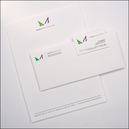
Figure 2: Michael Jordan, now Chicago’s immortal king.
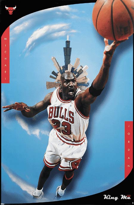
Figure 3: The Chicago Bulls won six NBA titles in the `90s and this poster commemorated what would be the final shot of Michael Jordan’s Bulls career.
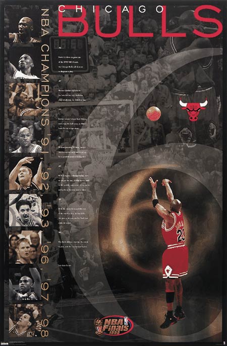
Figure 4: This poster portrays Seattle as the center of the baseball universe.
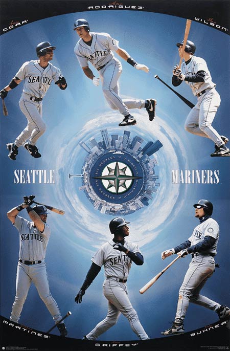
Figure 5: Mike’s all-time favorite poster to design, this was inspired by Salvador Dali and contains elements from the master himself, such as melting basketballs, impossibly high backboards, and the Crutches of Reality.
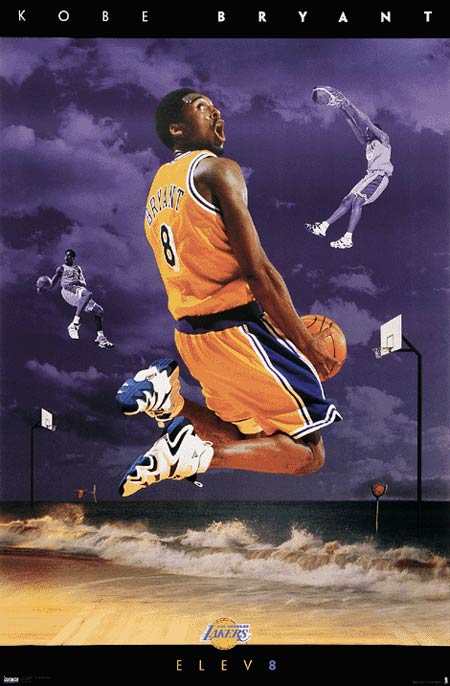
Figure 6: This poster depicts three Sonics rising over Puget Sound at Pike Place Market. Mike climbed to the top of a downtown condo to take this shot, composed the scene in Photoshop and then relettered the Public Market Center sign to read “Payton Baker Schrempf.”
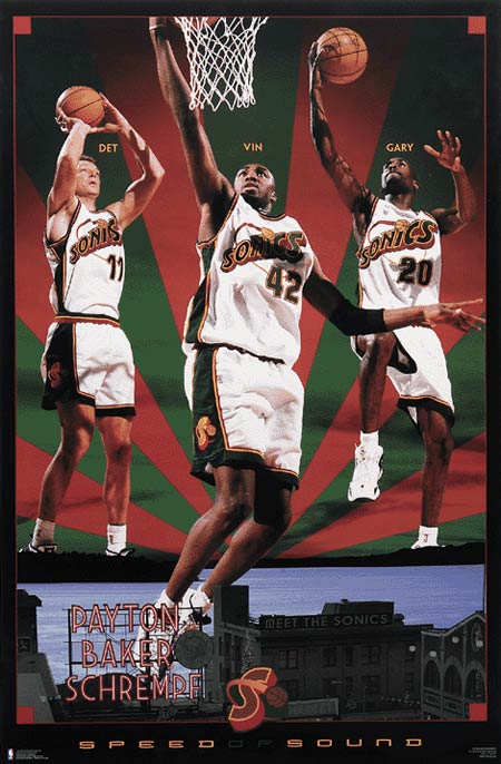
Figure 7: This poster was created to showcase Keith Van Horn.
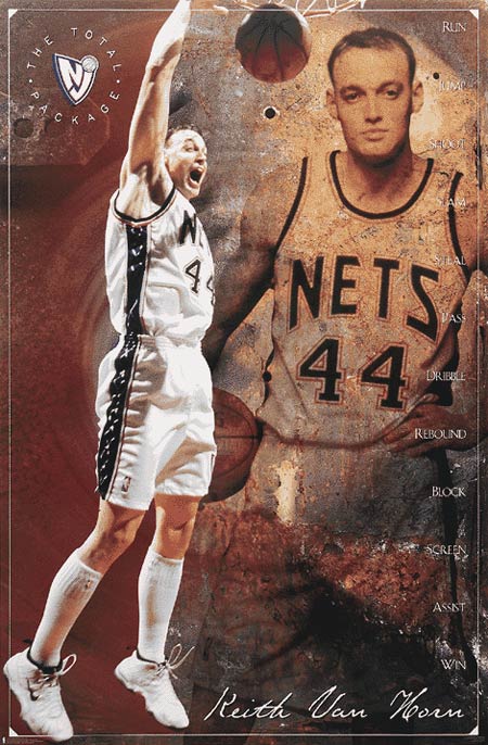
Figure 8: Bellevue Square is the premier retail shopping destination in the Pacific Northwest. Its Web site was designed to promote the upscale reputation of the mall and provide information to shoppers.
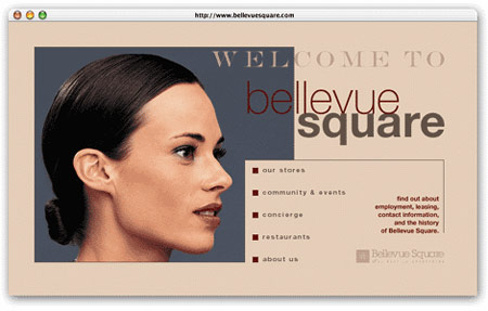
Figure 9: K2 Skis wanted a hybrid Flash/HTML site to show off its new line of award-winning skis and to promote K2 out on the slopes. Joel Scherzer and Danny Mavromatis helped in the creation of this site.
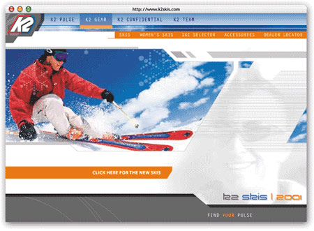
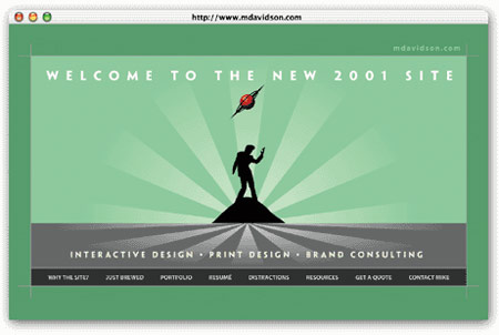
Figure 10: This site contains a collection of traditional and interactive design projects created by Mike Davidson.
[…] recently came across an interview with designer Mike Davidson. This is the main pull-quote from the interview: Â “I didn’t get into design to be an […]